Your traffic numbers look fine. But conversions are flat, bounce rates are climbing, and you can’t figure out why users are leaving. Your analytics show where the problem is, but not what is causing it.
That is exactly the gap that website usability survey questions are designed to close.
The right questions, asked at the right moment, give you direct access to what your visitors are thinking. Not what you assume they think. What they actually experience.
As UX researcher Steve Krug, author of Don’t Make Me Think, puts it, “If you want a great site, you’ve got to test.
After you’ve worked on a site for even a few weeks, you can’t see it freshly anymore. You know too much. The only way to find out if it really works is to test it.”
The most effective usability surveys are contextual: triggered by a specific behavior, shown to a specific segment, asking about the exact interaction the user just had.
This guide gives you 65 ready-to-use website usability survey questions organized by category, a step-by-step guide to building and launching them in Qualaroo, and a method for turning responses into design changes that move the needle.
What Is a Website Usability Survey?
A website usability survey is a short, targeted questionnaire shown to real visitors while they are on your site, designed to capture direct feedback on navigation ease, content clarity, task completion, design, and overall experience. The goal is to surface friction points that behavioral analytics alone cannot explain.
Unlike session recordings or heatmaps, usability surveys let users tell you in their own words what frustrated them, what confused them, and what they wish worked differently.
That qualitative context is what turns a data signal into an actionable fix.
The most effective usability surveys are not one-size-fits-all questionnaires.
They are contextual: triggered by a specific behavior, shown to a specific segment, asking about the exact interaction the user just had.
65 Best Website Usability Survey Questions to Ask
Here is the full library organized by category. Each set is designed to diagnose a specific type of friction.
Pick the category that matches your current biggest problem, start with the ready-to-use template, and layer in additional questions as needed.
What Are the 10 Best Navigation Survey Questions?
Navigation issues are the most common usability complaint. Use these to determine whether users can actually navigate your site as you designed it.
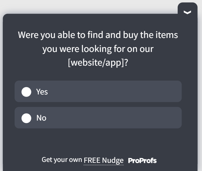
Ready-to-Use Navigation Survey: Best triggered on pages with high exit rates or low scroll depth.
| # | Question | What It Gauges |
|---|---|---|
| 1 | How easy was it to find what you were looking for today? (1 to 5 scale) | Baseline ease-of-navigation score you can track over time |
| 2 | Did you ever feel lost or unsure where to go next on our site? | Whether your information architecture matches user mental models |
| 3 | Were the menu categories clear and logically organized? | Label clarity and logical grouping of top-level navigation |
| 4 | Did you use the search function? If yes, how helpful were the results? | Search relevance and whether users are forced to rely on it as a fallback |
| 5 | Is there anything about our navigation you would change? | Open signal for issues you haven't thought to ask about |
Use this user effort score template for navigation feedback:
Additional Navigation Questions to Deploy Based on Your Specific Goal:
- Were the drop-down menus intuitive to use?
- How helpful was the breadcrumb trail in understanding your location on the site?
- Were you able to return to the homepage or a previous page easily?
- Did internal links help you move between relevant pages smoothly?
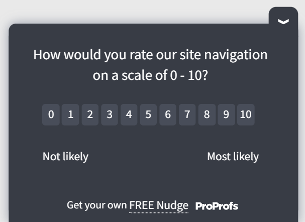
- On a scale of 0 to 10, how would you rate the overall ease of navigation?
Here’s another navigation survey template for you:
What to Look For: If users consistently report feeling “lost,” the problem is usually in your information architecture, not your visual design. Audit your top-level navigation labels and test whether they match the language your users actually use.
What Are the 10 Best Content Clarity Survey Questions?
Poor content clarity kills conversions quietly. These questions surface confusion before it becomes churn.
| # | Question | What It Gauges |
|---|---|---|
| 11 | On a scale of 0 to 10, how clear is the information on this page? | Quantifiable clarity score; easy to track page-by-page over time |
| 12 | Did the content give you everything you needed to make a decision? | Decision-enablement; whether the page removes purchase or action hesitation |
| 13 | Were there any terms or labels on this page that confused you? | Jargon and terminology mismatches between your language and the user's |
| 14 | Was any important information missing from this page? | Content gaps that prevent users from completing their goal |
| 15 | Did the content guide you clearly toward a next step? | CTA clarity and whether the content creates forward momentum |
| 16 | How would you rate the helpfulness of our help documentation? | Support content quality; useful for SaaS and product pages |
| 17 | Were there moments when you wanted more detail on a specific topic? | Depth gaps, like which sections need more explanation or supporting content |
| 18 | Did you feel confident enough after reading this page to take action? | Trust and persuasion effectiveness of the page copy |
| 19 | What one thing would make this content more useful to you? | Open-ended priority signal directly from the user |
| 20 | Did you encounter any error messages that were confusing or unhelpful? | System feedback quality flags poor microcopy or cryptic error states |
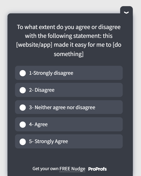
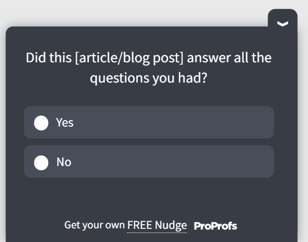
Here is a content clarity survey template:
Ease-of-Use Survey Question Tip: Pair a rating scale with an open-ended follow-up question. “On a scale of 1 to 5, how clear was the information on this page?” followed by “What could be clearer?” gets you both a measurable score and a specific fix direction.
What Are the 10 Best Task Completion Survey Questions?
These website user testing questions are the most directly tied to conversion outcomes.
If a user cannot complete their intended task, you have a usability failure regardless of how clean your design looks.
For teams tracking task difficulty as a formal metric, a Customer Effort Score (CES) survey runs alongside these questions and gives you a standardized benchmark.
Ready-to-Use: Task Completion Survey: Trigger this after a key action: form submission, checkout, signup, or feature use.
| # | Question | What It Gauges |
|---|---|---|
| 21 | Were you able to accomplish what you came here to do today? | Binary task success rate, your most important single usability metric |
| 22 | How easy or difficult was it to complete your task from start to finish? | Overall perceived effort, the core Customer Effort Score question |
| 23 | Did you encounter any obstacles along the way? If yes, what were they? | Specific friction points at any stage of the user journey |
| 24 | How easy was it to find the specific page or feature you needed? | Discoverability of key features or content within the site structure |
| 25 | What would have made this process easier? | Open-ended redesign signal directly from the user's experience |
| 26 | Were interactive elements like forms and buttons easy to use? | Micro-interaction quality: form fields, button states, and input behavior |
| 27 | Did you feel the steps in the process were logical and in the right order? | Flow logic, whether the sequence of steps matches user expectations |
| 28 | Were the calls to action clear enough to guide your next step? | CTA visibility and copy effectiveness in driving forward movement |
| 29 | How many attempts did it take before you could complete the task? | Retry rate, a strong proxy for task complexity and error recovery |
| 30 | Did you need to go outside this site to find information to complete your task? | Self-sufficiency of your content; high rates signal critical information gaps |
What to Do With Responses: Segment task completion answers by page. A consistent complaint about a specific form field or checkout step is a direct indicator of what needs redesign.
What Are the 10 Best Website UI and Design Survey Questions?
Design affects usability as much as aesthetics. These questions help separate visual preference from functional friction.
| # | Question | What It Gauges |
|---|---|---|
| 31 | How would you describe your first impression of our website's design? | Immediate aesthetic reaction is useful for A/B testing design variants |
| 32 | Did the layout make it easy to focus on the content? | Visual hierarchy effectiveness: whether the layout guides attention correctly |
| 33 | Were the fonts and color choices easy to read and visually comfortable? | Readability and accessibility of typography and color contrast |
| 34 | Did the design feel consistent throughout the site? | Design system coherence; inconsistency erodes trust and credibility |
| 35 | Were you able to understand how information was organized just by looking at the page? | Scanability and information architecture clarity at a glance |
| 36 | What one design change would most improve your experience? | User-prioritized design fix cuts through internal debate about what to change first |
| 37 | On a scale of 0 to 10, how satisfied are you with the overall design and layout? | Composite design satisfaction score for benchmarking over time |
| 38 | Did any visual elements distract you or make the site harder to use? | Identifies competing visual elements, aggressive animations, or cluttered layouts |
| 39 | What do you think of the terminology and labeling used on this site? | Language-design fit: whether labels and button text match user expectations |
| 40 | Did fonts and colors enhance or detract from your overall experience? | Emotional tone of the design; whether visuals support or undermine the brand |
Here’s a quick UI and design template for you to use:

Insight to Apply: If users score visual design highly but still report task difficulty, the issue is layout and hierarchy, not aesthetics. Check whether CTAs are visible without scrolling and whether key information is buried below the fold.
What Are the 10 Best Mobile Usability Survey Questions?
Mobile accounts for the majority of web traffic on most sites. If your mobile experience is broken, your conversion rate is broken too.
| # | Question | What It Gauges |
|---|---|---|
| 41 | How would you rate your overall experience on our mobile site? | Top-level mobile satisfaction score: your baseline for mobile UX health |
| 42 | Were text and images appropriately sized and easy to read on your device? | Responsive typography and image scaling across different screen sizes |
| 43 | Were you able to find what you were looking for on mobile? | Mobile navigation effectiveness and content discoverability on small screens |
| 44 | Did the site respond quickly to your taps and scrolls? | Touch responsiveness and interaction latency on mobile |
| 45 | Did you notice any differences between the desktop and mobile versions that affected your experience? | Feature or content parity gaps between the responsive and desktop versions |
| 46 | Did the site load quickly on your mobile device? | Mobile page speed is critical since mobile connections are often slower |
| 47 | Were buttons and interactive elements easy to tap without errors? | Touch target sizing; buttons under 44px are a common mobile usability failure |
| 48 | Did you encounter any layout issues or overlapping elements? | Responsive breakpoint failures and CSS rendering issues on specific devices |
| 49 | Were error messages on mobile clear and helpful when they appeared? | Mobile microcopy quality; error states are often neglected in mobile design |
| 50 | Based on your mobile experience, how likely are you to recommend this site to others? | Mobile NPS reveals whether the mobile experience is strong enough to drive referrals |
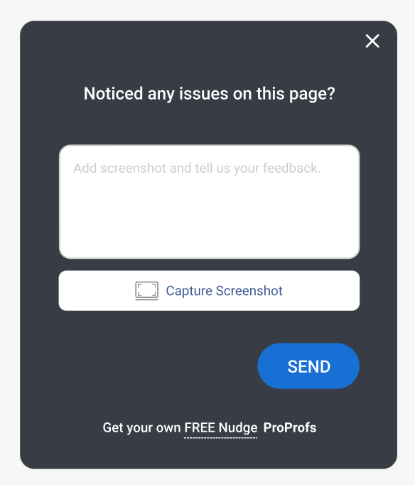
Here’s a screenshot-capturing survey template for your mobile app users:
What Are the 8 Best Website Performance Survey Questions?
Slow sites drive users away before they engage with your content. These questions help you quantify performance friction that your own testing environment may not catch.
| # | Question | What It Gauges |
|---|---|---|
| 51 | Did pages on this site load quickly enough for you? | Perceived load speed: subjective but more predictive of bounce than lab metrics |
| 52 | Did you experience any delays or lag while browsing? | General performance friction across the session, not just on landing |
| 53 | Were there any technical issues, such as broken links or error pages? | Site reliability, broken links, and 404s directly damage trust and task completion |
| 54 | How would you rate the loading speed of images and media on this site? | Media optimization; images are the most common cause of slow perceived load times |
| 55 | How responsive was the site to your clicks and scrolls? | Interaction responsiveness; lag between action and response is a major frustration trigger |
| 56 | Did you try to access this site from multiple browsers? If so, were there performance differences? | Cross-browser compatibility issues that lab testing on one browser would miss |
| 57 | Were there delays during the checkout or payment process? | Conversion-critical performance; checkout lag is directly tied to abandonment rates |
| 58 | Are there specific areas where this site performed slower than you expected? | Locates performance bottlenecks to specific pages or features rather than global issues |
What Are the 7 Best Overall Satisfaction Survey Questions?
Use these as bookend questions: at the start to set a baseline or at the end to capture a net impression. They are also useful for tracking experience quality over time.
| # | Question | What It Gauges |
|---|---|---|
| 59 | On a scale of 0 to 10, how would you rate your overall experience on our website today? | Composite satisfaction score: your single most trackable UX health metric |
| 60 | How does this site compare to similar sites you have used? | Competitive benchmarking directly from the user's frame of reference |
| 61 | Would you return to this site to accomplish a similar task in the future? | Retention intent: a leading indicator of loyalty and repeat engagement |
| 62 | How likely are you to recommend this website to someone with a similar need? | Net Promoter Score proxy gauges whether the experience is referral-worthy |
| 63 | What is the single most important improvement we could make to this site? | Forced-priority open signal cuts through noise to reveal what matters most to users |
| 64 | Did you get everything you needed from this visit? | Session success rate gauges whether the site fully served the user's intent |
| 65 | Is there anything else about your experience you would like to share? | Catch-all for feedback that didn't fit any other question; often surfaces unexpected issues |
Here’s a quick website feedback template:
How Do You Create a Website Usability Survey Using Qualaroo?
Having the right questions is only half the equation. Where and when you show them determines whether you get useful data or noise.
Here is how to set up a website usability survey in Qualaroo from scratch:
Step 1: Define Your Survey Goal
Before you open the survey builder, decide what specific friction you are trying to diagnose.
- Is it checkout drop-off?
- Navigation confusion on the pricing page?
- Mobile experience on landing pages?
One goal per survey produces far more usable data than a general “how was your experience?” survey shown to everyone.
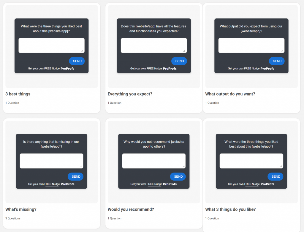
Step 2: Choose a Template or Build From Scratch
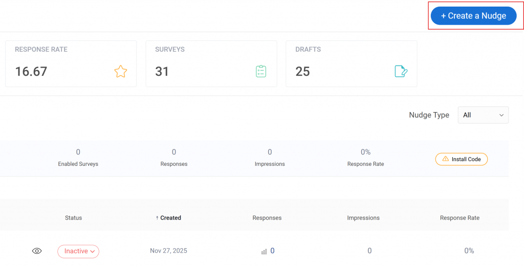
On your Qualaroo Dashboard, click on “Create a Nudge.”
Qualaroo offers a library of ready-to-use website feedback survey templates.
Select the one that matches your goal, such as a task completion survey, NPS Nudge™, or exit intent survey, and customize the questions, branding, and response options to match your site.
Here are a few usability survey templates you can pick from:
Step 3: Set Your Trigger and Targeting Rules
This is where Qualaroo’s advanced targeting separates it from passive feedback tools. You can trigger the Nudge™ based on:
- Time on page (e.g., after 60 seconds of inactivity)
- Scroll depth (e.g., when a user reaches 75% of the page)
- Exit intent (when a cursor moves toward the browser close button)
- URL or subdomain (to target specific pages only)
- Visit history (first-time vs. returning visitors)
- Device type (to separate mobile and desktop surveys)
- Custom variables from your CRM or user data
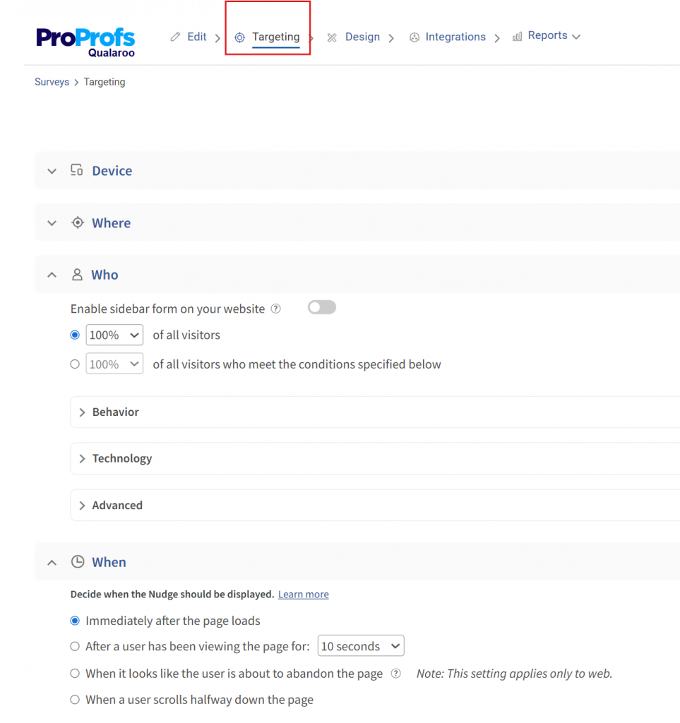
Set your targeting to match the friction point you are investigating. A survey about checkout difficulty should appear only to users who have reached the checkout page, not to every visitor on your site.
Step 4: Add Branching Logic
Use Qualaroo’s question branching to keep surveys short and relevant. If a user answers “Yes, I found what I needed,” route them to a satisfaction rating.
If they answer “No,” route them to an open-ended question asking what was missing. This way, every user sees only the questions that are relevant to their actual experience.
Here’s how you can use skip logic in your usability surveys:
Step 5: Launch and Monitor Responses
Once live, Qualaroo’s AI Sentiment Analysis automatically flags emotional tone in open-ended responses and clusters themes across your dataset.
Instead of reading 500 individual responses manually, you see: “37% of responses in this survey cluster around navigation confusion on the pricing page.” That is the signal you act on.
The Word Cloud view surfaces the most frequently used terms across open-ended responses, letting you spot language patterns across hundreds of submissions at a glance, without manually tagging a single entry.
Here’s a video for you to learn more about sentiment analysis:
Step 6: Close the Feedback Loop
After making a UX change based on survey data, run a follow-up survey on the same page segment to measure whether the fix worked. This is how you turn a one-time feedback exercise into a continuous improvement system.
GraphicSprings, an online logo design tool, used Qualaroo to run targeted in-context surveys on its design customization flow.
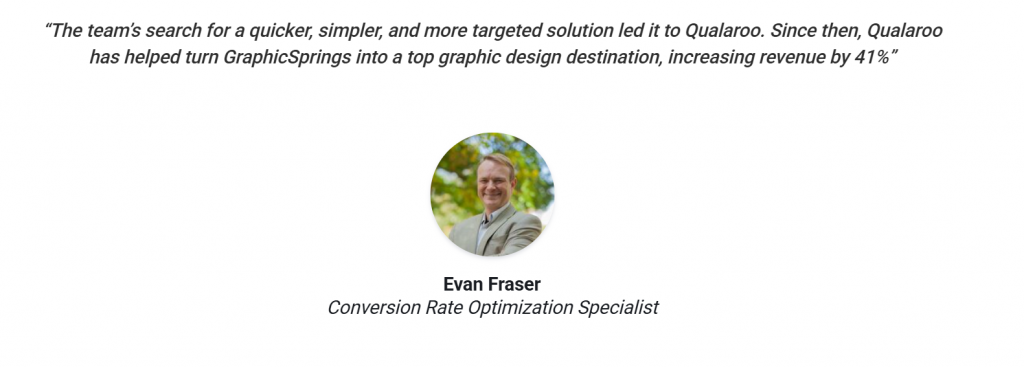
Survey responses revealed that users were abandoning the process at the font and color selection step, not because the options were bad, but because the interface did not make it clear which choices had been applied.
The team redesigned the selection UI based directly on that feedback. The result: a 41% increase in revenue. The insight did not come from analytics, which showed the drop-off but not why.
It came from asking the right users a focused question at exactly the right moment in their session.
Stop Guessing What’s Broken. Start Asking the Right People at the Right Moment
A list of questions is a starting point. What actually moves your metrics is showing the right question to the right user at the right moment, and then knowing what to do with the answer.
Qualaroo makes that possible without disrupting your users or requiring a developer for every survey update.
You get advanced targeting, branching logic, AI-powered sentiment analysis, and templates that are ready to deploy in minutes, not weeks.
Frequently Asked Questions
Why are website usability surveys important for UX improvement?
Analytics tools tell you where users drop off. Usability surveys tell you why. A frictionless user experience can increase conversion rates by over 400%, and 88% of users say they are unlikely to return after a single bad experience. Surveys surface the specific friction points causing those outcomes, so you can fix them before they compound.
When should I trigger a website usability survey?
The best time is within 30 seconds of a key user action: form submission, checkout completion, feature use, or exit intent. Surveys triggered immediately after an interaction capture feedback while the experience is still fresh. Surveys that appear on page load, before the user has done anything, produce low-quality responses.
What is an ease-of-use survey question for websites?
An ease-of-use survey question measures how effortlessly a user can complete a task on your site. A strong example: "How easy or difficult was it to complete your task today?" with a scale from "Very easy" to "Very difficult." Always follow it with an open-ended question to get the specific reason behind a low score.
How many questions should a website usability survey include?
Keep it to 3-5 questions per survey. Response rates drop sharply beyond five questions. If you need to cover multiple areas, run separate short surveys targeted at different segments or trigger points, rather than combining everything into one long form.
What is the difference between website usability testing and a website usability survey?
Usability testing involves observing users completing specific tasks, often in a moderated session. It is richer but resource-intensive. Usability surveys are unmoderated and scalable, collecting feedback passively from real visitors at scale. Surveys tell you what is broken; usability tests show you exactly why in real time.
Should I use open-ended or closed-ended questions in a usability survey?
Use both. Closed-ended questions (rating scales, yes/no, multiple choice) give you measurable data you can track over time. Open-ended questions give you the specific "why" behind the ratings and often surface issues you did not think to ask about. A practical rule: use closed-ended questions to measure, and open-ended questions to understand.
How do I avoid bias in website usability survey questions?
Write in neutral language. "Was our checkout process easy?" leads the respondent. "How would you describe the checkout process?" does not. Avoid double-barreled questions that ask two things at once, and never ask users to speculate about future behavior. Present rating scales symmetrically.
FREE. All Features. FOREVER!
Try our Forever FREE account with all premium features!
 We'd love your feedback!
What did you like & how can we make it even better?
 Thanks for your feedback!
 Ask Your Question
Have a question? Get expert help to make your decision easier.