


Your website has traffic. People land, browse, and a good number of them leave without buying, signing up, or coming back.
Your analytics dashboard shows exactly where they dropped off. It never tells you why.
A website feedback form closes that gap. Instead of guessing whether it was pricing, confusing copy, or a broken step in your flow, you ask the person who was just there.
And a good website feedback tool presents this as a short, on-site prompt that appears while the visitor is still on the page, not three days later in their inbox.
This guide covers what a website feedback form is, how to build one using an AI Survey Creator and templates, where to place it, and what to ask to ensure the answers are worth reading.
What Is a Website Feedback Form?
A website feedback form is a short, targeted survey placed directly on a web page that asks visitors what confused them, what stopped them, or what they liked, while they are still using the site. It replaces guesswork from analytics with a direct answer from the person who was just there.
Not every website feedback form looks the same, and picking the wrong format for your goal is one of the most common reasons teams end up with a low-response, low-value feedback form on website pages that matter.
Website Feedback Forms Come in Four Main Formats
| Reader Goal | Form Type to Use | Trigger That Works Best |
| Find Out Why Visitors Leave a Page | Exit-Intent Popup | Cursor Moves Toward the Close Button or Back Arrow |
| Review a New Design or Layout | Embedded In-Page Widget | Page Load or a Set Scroll Depth on the Test Page |
| Collect Ongoing, Self-Selected Feedback | Persistent Sidebar Button | Always Visible, Visitor-Initiated |
| Test Usability of a Specific Task | Embedded Widget on the Task Page | After the Task Is Completed or Abandoned |
A web feedback form built as a full-screen popup interrupts the visitor completely and demands a decision before the page is usable again.
A sidebar button asks for nothing and waits. Both are valid. The difference is whether you want volume or you want quality from people who choose to speak up.
How Do You Create a Website Feedback Form Using Qualaroo’s AI Survey Creator and Templates?
Most teams stall at the builder screen, not because the tool is hard, but because nobody decided what to ask before opening it.
Here is a clean, repeatable process from a blank dashboard to a live, targeted form.
1. Define Your One Question Before You Open Qualaroo
Write one sentence that completes this prompt: “I want to know why visitors are __________ on __________ page.” That sentence decides your question, your trigger, and your targeting.
Skip it, and you end up building a form around what the tool can do instead of what you actually need to learn.
This single step is the difference between a form that produces a theme you can act on and one that produces forty replies that all say something different.
2. Build the Form With AI Survey Creator or a Ready-Made Template
Step 1: Open Qualaroo and start a new survey. From your dashboard, click Create New. You get two paths here, and both get you to a working form fast.
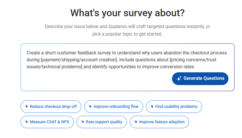
Step 2: Let AI Survey Creator draft the question set for you. Describe your goal in plain language, for example, “understand why visitors leave the pricing page without signing up,” and AI Survey Creator generates a relevant question, an appropriate answer type, and suggested follow-up logic. This is the fastest path when you know your goal but not the exact wording.
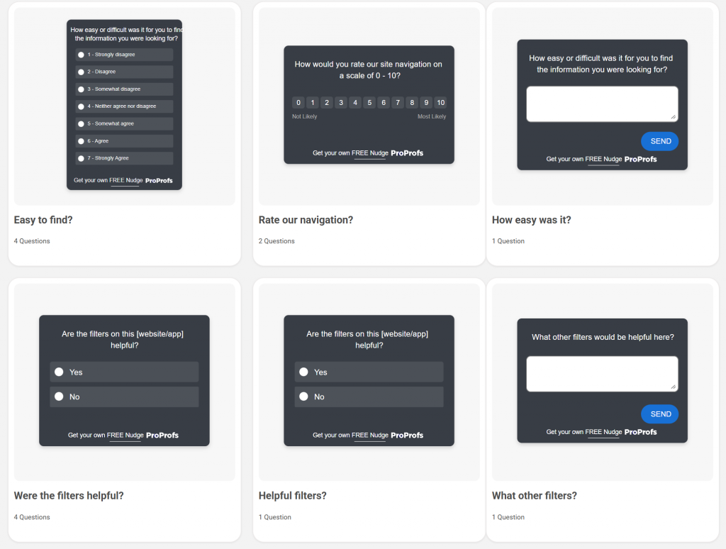
Step 3: Or start from a prebuilt template instead. If you would rather adapt something proven, choose from the website Feedback template library, designed for use cases such as general site feedback, usability reviews, and design critiques. Pick the one closest to your goal and edit from there instead of writing from scratch.
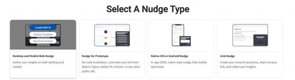
Step 4: Choose your channel. Select Desktop Web for an on-page Nudge, or Sidebar Form for a persistent, low-friction button instead of a popup. Enter the domain you want the form to run on and click Create to open the editor.
3. Target, Preview, and Publish the Nudge
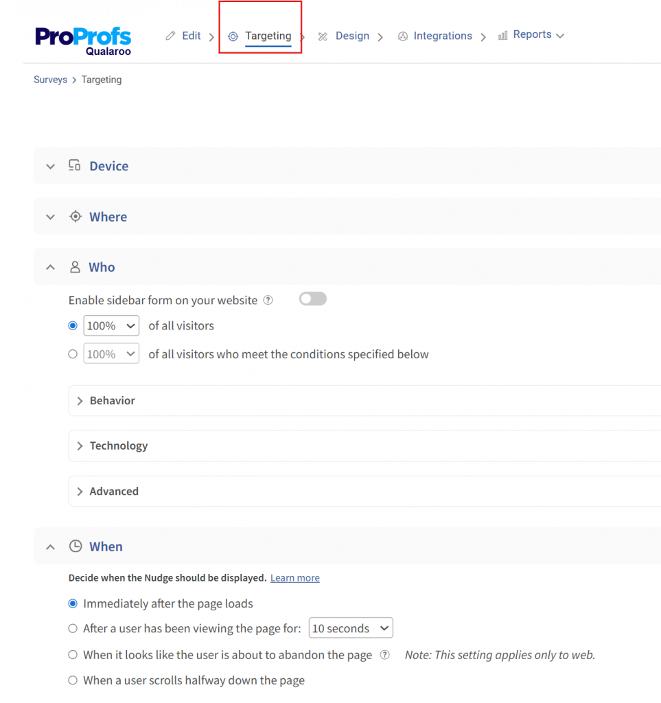
Step 5: Set advanced targeting before you publish. Use advanced targeting to control exactly who sees the form and when, by URL, by behavior like time on page or scroll depth, by geography, or by device. A pricing-page form should only ever fire on the pricing page, for visitors who have been there long enough to have formed an opinion.
Step 6: Add branching so one answer leads to the next relevant question. Question branching lets you skip the follow-up entirely for a happy visitor and dig deeper only when someone flags a problem, so you are not asking everyone the same second question regardless of their first answer.
Step 7: Preview on both desktop and mobile, then publish. Check that the trigger fires correctly, that the thank-you message displays, and that frequency capping is active so the same visitor is not asked twice in one week. Once it looks right in preview, publish it and connect your integrations so responses route straight to Slack or your CRM instead of sitting in a dashboard nobody opens.
Where and When Should You Show a Website Feedback Form?
Timing decides whether your form gets ignored or answered. The same question, shown at the wrong moment, gets a fraction of the response it would get at the right moment.
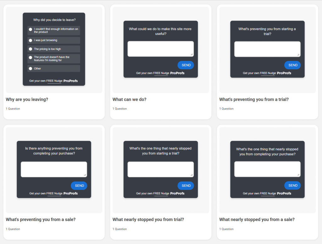
Exit Intent Belongs on Pricing and Checkout Pages
These are your highest-stakes pages, and an exit-intent trigger catches the visitor at the exact moment they decide to leave. There is nothing left to interrupt, so the question reads as helpful rather than pushy.
Here are a few exit intent survey templates you can use:
Embedded Widgets Fit Design and Usability Reviews
A website design feedback form works best embedded directly on the page being tested, triggered after a set scroll depth or a few seconds of dwell time. For a website usability feedback form, trigger it after the visitor attempts or abandons a specific task, like completing a signup flow or using a search bar, so the feedback ties to a real action rather than a general impression.
Sidebar Buttons Capture Feedback You Did Not Know to Ask For
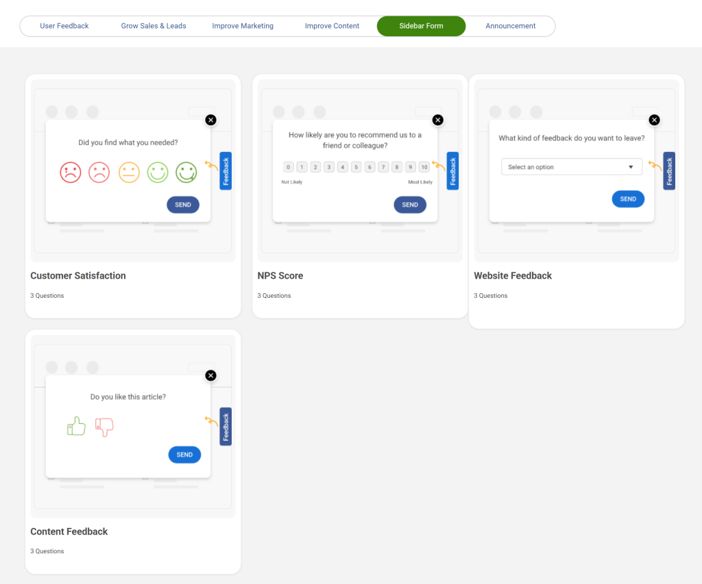
A persistent sidebar button produces the lowest volume of the four formats but often the highest-quality responses, because only visitors with something specific to say choose to click it. Keep it visible on every page rather than limiting it to one section of the site.
Here are a few sidebar form templates you can use:
On mobile, avoid corner-pinned overlays. Bottom-sheet prompts that slide up from the screen edge, or inline prompts triggered after a specific action, work better than a floating button that competes with native navigation.
What Questions Should You Ask to Get Answers You Can Act On?
Most feedback forms fail on the question, not the placement. Vague questions get vague answers, and questions that lead the visitor get polite ones instead of honest ones.
Keep It to Two or Three Questions, Never More
Every additional question lowers the odds that someone finishes the form. Each one signals that you value your data more than their time. Use one primary question, a conditional follow-up only when needed, and stop there.
Ready-to-Use Website Feedback Form Template
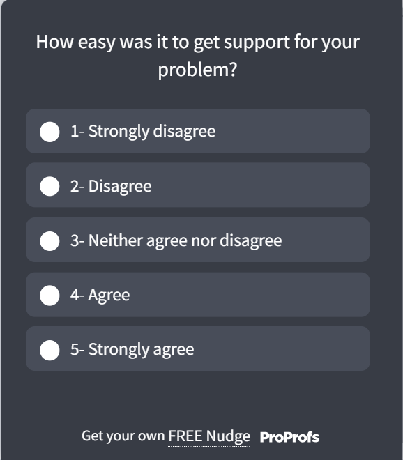
- Question 1 (Rating, Required): “How easy was it to find what you came here for today?” (1 to 5 scale)
Here’s a template you can use:
- Question 2 (Open Text, Shown Only if Rating Is 3 or Below): “What got in your way?”
- Question 3 (Optional, Open Text): “Anything else we should know?”
- Thank-You Message: “Thanks. We read every response and use it to fix what’s not working.”
FREE. All Features. FOREVER!
Try our Forever FREE account with all premium features!
How Do You Turn Feedback Into a Measurable Outcome?
Collecting responses without acting on them is the fastest way to make visitors stop answering. The value is not in the reply count. It is in what changes because of it.
From Anonymous Comments to Named Accounts and Shipped Fixes
Open-text replies pile up fast, and reading each one individually does not scale.
Qualaroo’s Customer Feedback Analysis AI, built on native AI Sentiment Analysis and word cloud generation, automatically groups responses into themes, so a hundred comments become three or four patterns worth acting on.
The other half of the problem is knowing who said it. A comment from an anonymous visitor and the same comment from a paying customer on your highest plan carry very different weights.
Qualaroo’s Identify API links every response to a real account by email or customer ID, so feedback from your most valuable users never gets buried in a pile of anonymous replies. Pair that with Heatmaps and Session Recordings to confirm the theme against actual on-page behavior before you commit engineering time to a fix.
According to Hootsuite’s case study with Qualaroo, using Nudge-based on-site feedback contributed to a 16% lift in conversion at 98% statistical significance. That is the kind of number a feedback form should be judged on, not response count alone.

Ask While They’re Still There
The visitor who almost converted and then left is not gone for good. They are one well-placed question away from telling you exactly what stopped them, if you ask before they close the tab, not three follow-up emails later when the moment and the memory of it are both gone.
You do not need a company-wide feedback overhaul to see this work. You need one page you are genuinely unsure about, whether that is pricing, checkout, or a design you just shipped, and one sharp question placed at the moment a visitor is already reacting to it.
That is the entire loop, and it repeats: ask, read the themes, fix the loudest one, tell the people who flagged it. Each cycle makes the next round of feedback more specific, because visitors notice when a site actually responds to what they said.
Qualaroo gets you from a blank dashboard to a live, targeted Nudge in less time than it took to read this guide. The harder part was never the setup. It was deciding to stop guessing.
Frequently Asked Questions
What is the difference between a website feedback form and a contact form?
A contact form routes a specific request to your support team and expects a reply. A website feedback form asks an open question about the visitor's experience, usually anonymous or lightly identified, and feeds a pattern your team acts on later rather than a one-to-one conversation.
How many questions should a website feedback form have?
Two questions for most on-site forms: one rating or closed question, plus one conditional open-text follow-up. A third optional question is fine if it is clearly not required. Beyond three, completion rates drop fast because each added field signals more effort than the visitor expected to give.
Should a feedback form be a popup, a sidebar button, or an embedded widget?
It depends on the goal. Use a popup with exit intent for high-stakes pages like pricing or checkout. Use an embedded widget for design or usability reviews on the page being tested. Use a sidebar button for always-available, visitor-initiated feedback across the whole site.
What is the difference between a website usability feedback form and a general feedback form?
A website usability feedback form is tied to a specific task, like completing checkout or using a search bar, and fires right after that task is attempted or abandoned. A general feedback form asks for an overall impression of the page or site, without linking the question to one action the visitor just took.
What is the difference between a website design feedback form and a general feedback form?
A website design feedback form asks specifically about layout, visual clarity, and branding, usually embedded on a page you are actively testing or redesigning. A general feedback form covers the whole experience, including content, navigation, and functionality, not just how the page looks.
Do I need a developer to add a feedback form to my website?
No. Tools built for this, including Qualaroo, run on a lightweight script you add once, after which every new survey, question, or targeting rule is managed from the dashboard. You do not need a developer involved each time you want to change what you are asking or where it appears.
What's a good response rate for a website feedback form?
There is no single benchmark, because format and trigger both swing the number significantly. A sidebar button will always get fewer responses than an exit-intent popup, but the responses tend to be more specific. Judge the form by whether the answers you get are usable, not by chasing a target percentage.
Does adding a website feedback form actually improve conversions?
It can, when the feedback is acted on. According to Hootsuite's case study with Qualaroo, on-site Nudge feedback contributed to a 16% lift in conversion at 98% statistical significance. GraphicSprings, in a separate case study, saw a 41% increase in revenue after using feedback to guide UX changes.
FREE. All Features. FOREVER!
Try our Forever FREE account with all premium features!

 We'd love your feedback!
What did you like & how can we make it even better?
 Thanks for your feedback!
 Ask Your Question
Have a question? Get expert help to make your decision easier.