Exit popups work. They really do!
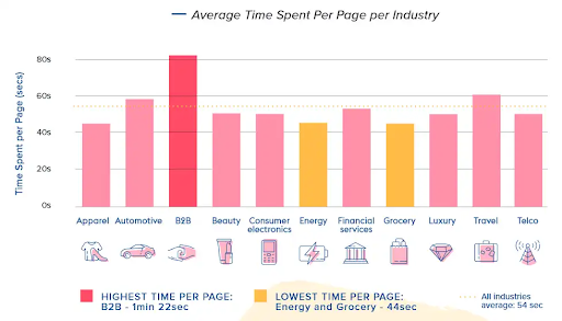
To give you a perspective, the average time spent by a person on a webpage is around 54 seconds across all industries.
But exit popups can stop the user right before they leave by giving them something valuable so that they spend more time on it.
The longer your visitors stay on your website, the higher are the chances they take action and move towards the end of the conversion funnel.
That’s the whole point of exit popups.
But that’s not all because there’s a lot to like about exit popups.
You get the ability to customize them for each visitor, and you can also use them to segment the audience.
Alright, so exit popups are great. But from where do you get the inspiration to design the right ones?
Fortunately, you’re at the right place.
In this blog, we’ll go through what exit intent popups are, why you need them, their benefits, some of the best exit popup examples along with the tools that can be used to deploy them to help you design great popups and improve conversions.
31 Best Exit Popup Examples for Conversions & Getting More Emails
The exit popup examples you’ll see here are one of the last resorts to prevent customers from leaving the website. You can get some ideas from these examples to design some brilliant popups.
Get Started Popups
This category of popups is specifically designed to allow visitors to get an understanding of the product by getting started on a small scale for completely free. These exit popups work great for SaaS products as they give users a taste of their offering without a penny and improve conversions.
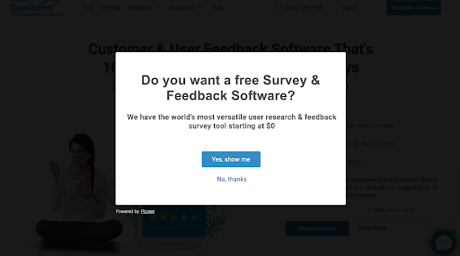
1. Qualaroo
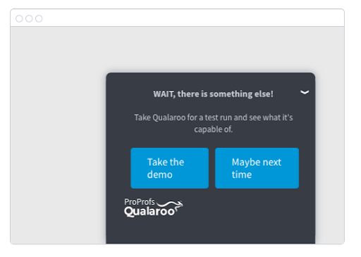
Qualaroo displays popups for visitors/prospects to get started with a demo of their tool
For example, if they don’t wish to see the demo and click on a CTA that says “Maybe next time”, your next Nudge can ask what is it they wish to see — the pricing, a product tour or something else.
A great thing about these popup Nudges is that they’re completely discreet and pop up on one side of the screen with complete subtlety.
2. Picreel
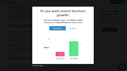
Picreel presents another incredible exit popup example of influencing visitors to get started. Similar to Qualaroo’s exit popup, Picreel offers value to the customers by giving them a free trial to get started and get themselves familiarized with the tool before committing to it.
But that’s not all; Picreel’s popup starts with a simple question about instant business growth and then pins down a claim to improve inbound leads and conversions by backing it with super-attractive numeric data.
In addition, the bar graphs displayed in the popup are dynamic, which catches visitors’ eyes and further improves the chances of taking action on the site.
3. ProProfs Quiz Maker
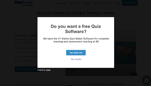
ProProfs Quiz Maker’s exit popups also fall in line with what Qualaroo and Picreel have to offer. The popup is extremely simple and starts with a question asking visitors if they want free quiz maker software.
The exit popup also claims the tool to be the number one online quiz maker software that can help users with all their learning and assessment needs. A clearly labeled and highlighted CTA follows this message, redirecting users to the signup page.
4. Sumo
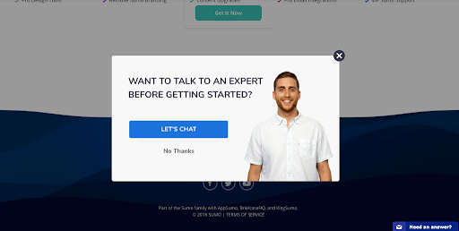
Sumo’s exit popups have a slightly different idea behind stopping visitors from bouncing. Sumo believes that most leaving visitors would consider staying and converting if they have an engaged conversation with a real person.
Sumo’s exit popups work amazingly well because they enable users to schedule a free call with the expert, which humanizes the brand and makes the touchpoint non-pushy. Also, the tool has a free version that users can learn about once they talk to an expert.
Looking for a versatile exit-intent tool? Try Qualaroo today!
5. Zendesk
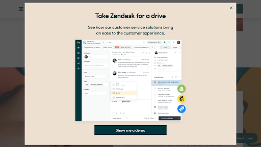
Zendesk is one of the most popular customer experience tools, and it clearly reflects in their exit popup. Zendesk’s exit-intent popup features a clearly stated headline that reads- “Take Zendesk for a drive,” followed by a message that claims to improve customer experience through their solution.
Zendesk’s exit popup works amazingly well because, unlike others, it clearly shows a snapshot of the UI, including some popular features and integrations, making it much more engaging and impactful.
In addition, the color scheme of the popup and the clearly labeled CTA button add up to the overall intent of keeping visitors on the page.
Discount Code/Offers Popups
People love receiving discounts and offers because they add a lot of value to the time and money spent on a website. Offering discounts and coupon codes are a great way to tempt and retain visitors for longer.
6. Zutano
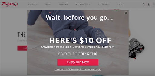
Zutano makes a solid effort to keep the visitors on their website by directly offering a $10 discount on the next order. The offer is extremely attractive because the visitors get the coupon code without committing to anything or giving out any information.
In addition, the overall exit popup is pretty solid because it has a catchy headline and visuals that match the brand’s identity, making it an eye-catching affair. You can simply give out a small discount code without any customer information for easy conversions.
7. Norwegian Cruise Line
Norwegian Cruise Line takes a different approach to keeping visitors on its website. They upsell their existing product by adding upgrades and a ton of amenities for completely free. Their exit popup asks for a few personal details from visitors to send attractive offers.
If you think your visitors leave because what you offer is not robust enough, then making an offer they can’t resist is the way to go about it. You can design your exit popup to collect all the personal information from your visitors and, in return, offer a sizable discount or an upgrade with substantial monetary value.
8. Nguyen Coffee Supply

Nguyen’s exit popup makes it clear that they don’t want to send you a discount in exchange for your email. Instead, they just want your contact information so they can send you one before you leave.
This is another brilliantly designed popup because it’s easy to read, has a simple and aesthetic design, and offers instant value without any commitment from the visitor’s end.
9. Mochi Kids
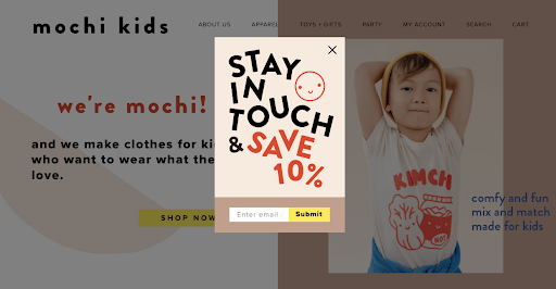
Mochi Kids uses typography to attract the audience’s attention. They ensure that the attention doesn’t go to waste as they offer their visitors to save 10% by simply entering their email addresses.
This popup is extremely effective because it’s simple, concise, and matches the brand identity with funky typography. Just design a simple and creative message with an email field to get the data you want in exchange for more conversions.
10. Boxed
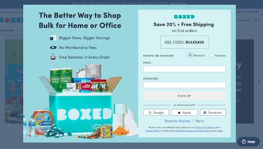
Boxed takes it a notch further by offering both product discounts and free shipping, but that is not the most exciting part of this exit popup. The real deal of this popup is that it shows the discount code before the visitors even provide any information on the website.
By doing so, they tempt their new visitors to create an account and enjoy more such offers in the future, and rightfully so, there are all the necessary fields listed below the message for easy signup. Unlike most exit-intent popups in this list, this one has a lot going on. It’s not just an offer but a clever play on visitors’ behavior and intrigue.
Email Signup Popups
Email signup forms are quite straightforward because they enable brands to build an email list and offer personalized marketing campaigns in the long run for better conversion rates. In return, the website visitors also get some value out of it in the form of offers and discount codes — a win-win for everyone involved.
11. Everlane
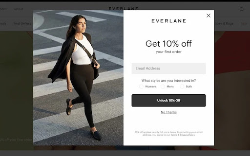
Everlane has a simple way of gathering emails from its visitors. Their exit popups have a simple message: ‘Get a 10% discount on the first order.’ The visitors can claim it by providing their email and other details like shopping preferences
The exit popup works because it’s aesthetically pleasing, minimal, and reflects the brand identity. Plus, it helps Everlane to identify and segment its new visitors based on their shopping behavior and interests. In addition to the email field, you can always add a demographic or personal interest section to identify the dominating characteristics of your target audience.
12. Shockbyte

Shockbyte is a Minecraft server hosting platform that also deploys a beautiful-looking exit popup reflecting its brand identity.
Their popup has an easily visible and catchy title that reads “WOAH, HOLD ON THERE“- which quite frankly is hard to miss. This is followed by a message that offers a 50% discount code for new users to celebrate their new web experience. The viewers only have to give their emails to claim the discount, which is more than enough for them to stay.
13. J.Crew
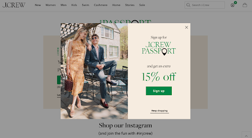
J.Crew deploys a simple yet elegant exit popup that asks visitors to sign up for a J.Crew passport for an additional 15% discount on the purchase order. The passport also offers other benefits, such as exclusive perks and points, which makes it even more attractive to visitors
The exit popup also looks quite vibrant and has a great color combination and a well-designed CTA button, supporting the cause even more so.
14. Quince
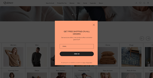
Quince comes up with a very bold offering where they let their customers redeem free shipping not just once but on all orders. Not just that; they even promise to send exclusive offers and product discounts, and the only thing the visitor has to do is share their email.
It helps Quince build a comprehensive email list; for visitors – it’s a deal people simply cannot pass up on. Apart from that, the color scheme and the minimalism of the popup also catch the eyes of the visitors.
15. BaubleBar
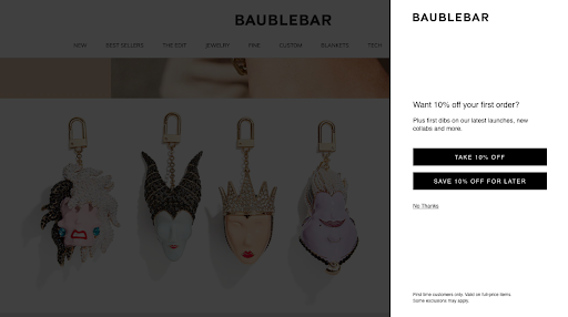
Baublebar offers an extremely intuitive exit popup. Unlike an overlay in the center of the screen, they show a sidebar popup on the right, offering a 10% discount.
This popup works very well because the messaging takes a little intuitive approach and asks the visitor if they want to use the offer for the current order or save it for later. The visitors can then save their details and choose the right option. This way, you can enable your users to be flexible when using the discount code and potentially convert at a later date or time.
FREE. All Features. FOREVER!
Try our Forever FREE account with all premium features!
Newsletter Popups
Newsletter popups are also extremely popular as they help brands build an extensive email list and run personalized campaigns for better conversions. On the other hand, subscribing to newsletters benefits visitors as they receive information about upcoming products, features, sales, and much more.
16. HEYMAEVE

HEYMAEVE collects its visitor’s data through an unobtrusive exit popup on the screen’s right side. The company offers 10% off on the first purchase for people who don’t think it’s worth the hassle; they even claim not to spam the inbox so that people don’t skip signing up.
The popup also asks for a product preference to customize the newsletter, and the CTA button features a hashtag that reads “Become a MAEVEBabe,” which adds a bit of spice to the popup. Along with the email field and personal preference tab, you can build a slightly fancy CTA for a bolder statement and make visitors click on it.
17. Elaluz
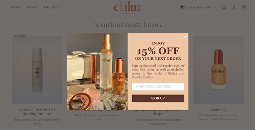
Elaluz keeps it simple with their exit popup, whether it’s their headline, messaging, or the lead generation form. The popup asks the visitors to sign up for an online newsletter to get 15% off on their next purchase.
The more attractive part of this popup is that it even gives exclusive access to the world of Elaluz and Camila Coelho, which adds brand value for customers in exchange for an email. The pop-up also showcases its products and matches the theme for better aesthetics.
18. The Sill

The Sill’s exit popup starts with a straightforward question asking visitors if they want 15% off on their first purchase. The messaging is also slightly funky and pleasing to the eye.
The visitors even get an option to enter their phone number, and the good part is that the terms are clearly laid out at the bottom, where it mentions that visitors would receive recurring automated text messages. It’s a great way of enforcing trust.
19. Curls

Curls get straight to the point with their exit popup as they clearly ask visitors to sign up to get 20% off on the first order.
The pop-up is positioned at the page’s center, so whenever a cursor hits the center, the pop-up is triggered and seen by most visitors. It even says that visitors who sign up will join the CURLista community.
20. Push Living

Push Living doesn’t try to be flashy with its exit pop-up or offering. Instead, it asks visitors to subscribe to the newsletter, and in return, they would receive new features, podcasts, travel opportunities, and more.
This popup works great because it’s simple, the information is clearly laid out, the subscribe button is easily visible, and they offer tangible resources to attract visitors.
Online Contest Popups
Popups that encourage visitors to be part of the brand’s online contest are great for creating engagement, growing your email list, attracting warm leads, and generating more paying customers. Online raffles and contests attract a ton of eyeballs because who doesn’t like to be lucky and win something once in a while?
21. JewelScent

JewelScent offers a very conventional yet effective scratch-&-win contest to their visitors, and all they have to do is fill in their email and try their luck.
This popup prompts engagement because of vibrant colors, design, and simplicity, which the visitors can easily decode without wasting time. You can easily build popups like these with an email field and a game that runs in the overlay because they don’t require redirection to a different site and give instant results to the viewers.
22. Misen
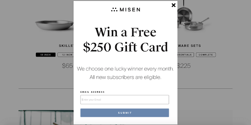
Misen doesn’t shy away from organizing contests that are irresistible for anyone who comes across them. The company offers $250 prize money to one lucky winner every month, and the raffle is played through the emails visitors submit while filling out the form.
The popup is simple, minimal, and has an unmissable contest headline offering a sizable gift card to all new subscribers. It’s also great for the company because it doesn’t have to offer any product or shipping discounts and can easily leverage this contest to build its email list.
23. West Elm

West Elm’s sweepstake contest makes perfect use of convenience, rest, and relaxation by offering their female visitors a rejuvenation package. The visitors just have to enter their emails before the contest ends to be eligible for the contest.
The popup is quite detailed, and West Elm also adds a disclaimer about the data usage policy, which builds trust among its visitors and encourages fair participation. You can create a beautiful-looking exit popup with an attractive prize pool, an email field, and all the details of the competition clearly laid out so that your visitors are tempted to participate in it.
Once you’ve manually decided on the winner, let your participants know about it through email.
Free Gifts Popups
Who doesn’t love freebies at this point, right? Offering gifts to visitors is a great tactic for generating leads, improving your conversion rate, and building meaningful connections. As long as your gifts hold value for your visitors, they’d be happy to share their information.
24. Tim Ferris

Tim Ferris’s exit popup sends out a bold and powerful message through the headline, which talks about 17 questions that changed his life. The popup provides an option to unlock the ebook and access those life-changing questions for free.
Messages like these connect to the visitors personally, making them one of the most impactful exit popups. You can build an impactful message that sticks, has a value proposition and a clear CTA button for visitors to take action.
25. Ryan Robinson
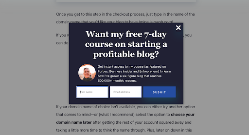
Ryan Robinson is a popular blogger who gives away his 7-day course on starting a profitable blog completely free. The course provides monetary value to visitors from the free course, which justifies collecting visitors’ data.
The popup also describes the perks of downloading this free course, which tempts the audience even more and improves the conversion rate.
26. General Assembly
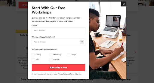
General Assembly starts their exit popup smartly by instantly telling visitors about their free workshop on the table. The popup then asks for three different sets of details from the visitors, including their personal preferences and interests with respect to the educational topics.
The most interesting thing is that the popup offers enough information to let the visitors know what the website offers, even if the visitor didn’t get enough time to scan it. Just like General Assembly, you can gather a lot of information from your visitors if you provide something for free that has a lot of value.
27. Social Triggers
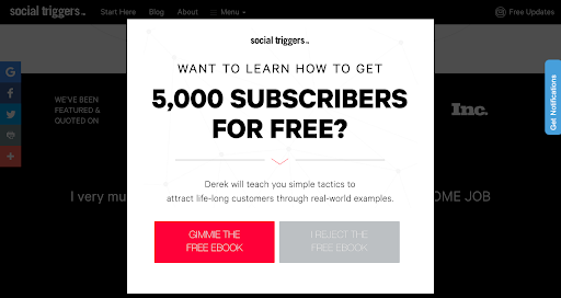
Social Triggers is an excellent example of emphasizing the value proposition in the exit popups. The messaging in the exit popup of Social Triggers starts with a small-sized font which instantly grows while mentioning “5000 subscribers for free.”
This is what makes it a great popup because it instantly focuses the visitors’ attention on the value proposition while including other details about the free Ebook for respondents. Know where you want your visitors to focus. It’s the value proposition. Make it stand out, create a supporting message and a clearly visible CTA.
Create Urgency/ Show Scarcity Popups
Exit popups that create urgency are designed to induce the fear of missing out (FOMO) to generate more conversions. When visitors come across an attractive offer that is only available for a limited time, it makes them more likely to act on impulse and buy it instead of waiting for another opportunity.
28. Pandora
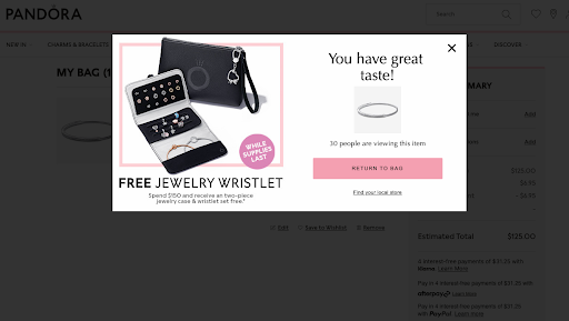
Pandora deploys a very subtle yet powerful popup that induces FOMO in its visitors. The exit popup is only available on the checkout screen or when visitors add an item to their bag and try to abandon it.
The brand lets its customers take action thinking they might not get this deal next time by showing how many people are viewing that particular item and also letting them know about the limited stock of the gifts. You can let your customers know the level of demand your product creates through stats, and without saying too much, you’ll have them figure out that the stock might not last.
29. Kiss My Keto

Kiss My Keto presents another impressive example of stopping cart abandoners by presenting a limited-time offer to induce FOMO.
Whenever visitors add something to their cart and try to leave before buying, they are shown a popup to finish the order within 15 minutes to get an additional 15% discount. A great tactic for creating urgency and making people act on impulse.
FREE. All Features. FOREVER!
Try our Forever FREE account with all premium features!
Early Access Popups
Early access popups are some of the most effective ones as they truly make use of the FOMO characteristic. These popups let visitors know that they are being given a limited-time opportunity, which, when paired with monetary benefits such as discounts, make them even more appealing.
30. Kate Sommerville

Kate Sommerville’s exit-intent strategy makes visitors focus on two messages primarily, one of which is the ‘Early Access’ to induce FOMO, and the other one is the 20% discount to reinforce their messaging.
But that’s not all; Kate Sommerville offers even more gifts to their visitors so that people who do not turn their heads with the early access do with other benefits on the table. They even give out $95 worth of products on purchases of $150 or more, which is enough incentive for visitors to stop and reconsider their exit decision.
31. Taylor Stitch

Taylor Stitch deploys an exit popup that’s not only beautiful to look at but also falls in line with their brand’s identity. Their popup straightaway talks about early access and the reward program, which the users can avail of by simply joining the club.
They offer multiple ways for their users to sign up, giving them more opportunities to convert. They also don’t give out a lot of information right on their popup, which leaves their users curious and in anticipation of what they might miss out on if they don’t sign up.
With that, we’re at the end of our list. But before you go, let’s quickly dive into some more related information about using exit-intent pop-ups to maximize ROI.
Watch: How to Create a Popup Survey
FAQs
What is an exit popup?
An exit popup or an exit intent popup is a website overlay displayed when a user attempts to leave the website and helps convince them to stay longer.
You can identify the exit intent by tracking the mouse movements and scrolling behavior of the website visitors, which detects when a user is about to leave the website’s frame.
When do you need exit popups?
An exit intent popup displays an overlay when it detects that your visitors are about to close their browser window.
These exit popups can make an easy-to-understand offer to the visitors right when they are about to leave to draw them back, keep them on the page and potentially convert.
Here are some of the times you would need to deploy exit popups:
- When you have a very low conversion rate
- When you have an extremely high bounce rate
- When you want to offer personalized offers and discounts
- When you want to gather valuable insights from leaving visitors
How do exit intent popups work?
Let’s try to understand this from an example. Suppose you have an ecommerce website and a random visitor is browsing through the products on your website.
Then, suddenly, their cursor starts to move towards the corner of the screen, which is when they decide that they want to leave. While the visitor is about to exit, a popup overlay offers them a coupon code, gift card, or something of value, entices them to say and probably even convert.
Several pop-up tools like Picreel offer built-in functionality to target such behavior. You only need to add a script to the website, and the tool does the rest.
But one thing to note here is that different popups react differently to the exit intent based on their type. There are primarily three types of exit intent popups, and they are:
Nudges are the most unobtrusive type of exit popups that show up on one side of the screen to display or collect information from visitors without hindering their browsing experience.

Nudges are extremely popular because they are pleasing to look at, don’t frustrate the user, and can be triggered when an exit intent is detected, making them highly effective and valuable.
- Screen Overlays
Screen overlays are the most popular kind of exit pop-ups designed in a way that they cover the screen by darkening or blurring the background.
These pop-ups can be a huge hit or miss depending on how you build them and the level of value they add to the visitors.
- Sidebar Popups
Sidebar pop-ups are very similar to what Nudges have to offer. As the name suggests, sidebar pop-ups appear on the screen’s left or right side and can run its entire length.
These pop-ups also trigger by detecting exit intent, but users can also click on the tab manually to view the pop-up. These sidebar pop-ups can include more details due to their flexible size, making them a prime choice for websites.
Drive more conversions effortlessly. Sign up with Qualaroo to get started.
How effective are exit popups?
Exit popups are effective; no one is debating that. But how effective exactly?
According to the data by Conversion Sciences, 10 to 15 percent of all lost visitors can be saved and brought back with exit intent popups. It means that under most circumstances, 10 to 15 percent of all visitors will respond positively to a well-crafted exit pop-up.
But there is no limit to the amount of success these popups can bring.
For instance, Digital Marketer, a community-run blog, saw a decrease in bounce rate from 66.46% to 53.39% and an increase in average time on site by 54% by deploying exit-intent popups in their five different retargeting campaigns.

It only goes to show that exit popups not only work but work wonders when you create good designs and offer something of value.
Pro tip: You should never show exit popups to the visitors who have already taken action on your website. You’ll just end up frustrating them to a point where they would stop coming back.
Related Read– 11 Best Exit-Intent Popup Tools to Increase conversion
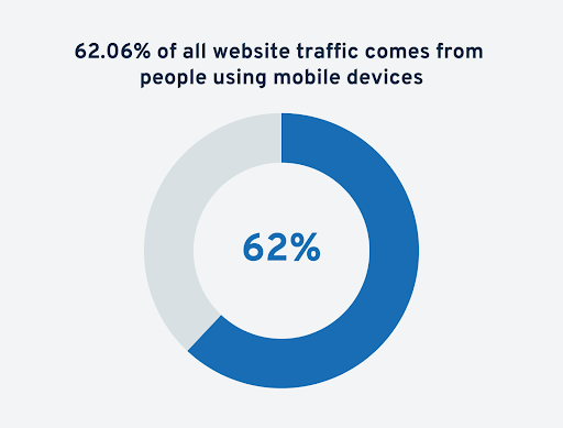
Are exit popups available on mobile devices?
The short answer is yes, but it’s a bit more complicated than that.
Even though more than 62% of the web traffic comes from mobile phones, the reliability of exit-intent popups is still an issue because there is no cursor for the tool to track the movement.
So, the exit pop-ups will work, but the triggers will vary based on your pop-up tool or how you personalize the triggering options. Some of the mobile exit popup triggers include:
- Pressing the back button
- Leaving a page idle
- Scrolling up the page
- Switching between tabs
- Staying on a page for a certain amount of time
- Triggering a JavaScript element
Also, it’s best to create separate exit pop-ups for your mobile devices and not copy the ones you use for your desktop version to ensure you offer the best possible experience to your visitors.
Related Read– Alternatives to Exit Intent on Mobile Devices
Boost Conversions With the Right Exit Popups
Customers have a plethora of choices online, and they won’t think twice before leaving. Then why not make the best last-ditch effort to retain them?
A context-specific and well-timed exit popup that provides value to the customers can do the job just fine.
Also, since this is the last opportunity you get to convert your visitors, make sure you design a strong CTA and support it with a compelling message.
The whole point of exit popups is to grab attention and improve conversions.
So feel free to use some ideas from the above examples and make a difference to your end numbers
FREE. All Features. FOREVER!
Try our Forever FREE account with all premium features!
 We'd love your feedback!
What did you like & how can we make it even better?
 Thanks for your feedback!
 Ask Your Question
Have a question? Get expert help to make your decision easier.