How many designers can say their UX design is flawless?
Not one.
A perfect UX design is not built in a single attempt but requires an iterative process foundational to a UX that works for YOUR users.
So, it’s okay to drop the ball on your UX design as long as you strive to pick it up, i.e., address the UX design mistakes.
But how can you avoid UX issues and mistakes when you haven’t a clue what they are?
Don’t throw in the towel just yet. You have this dedicated article to help you navigate the risky waters of common UX design mistakes and how to avoid them.
Here are the UX design mistakes that people make but you won’t:
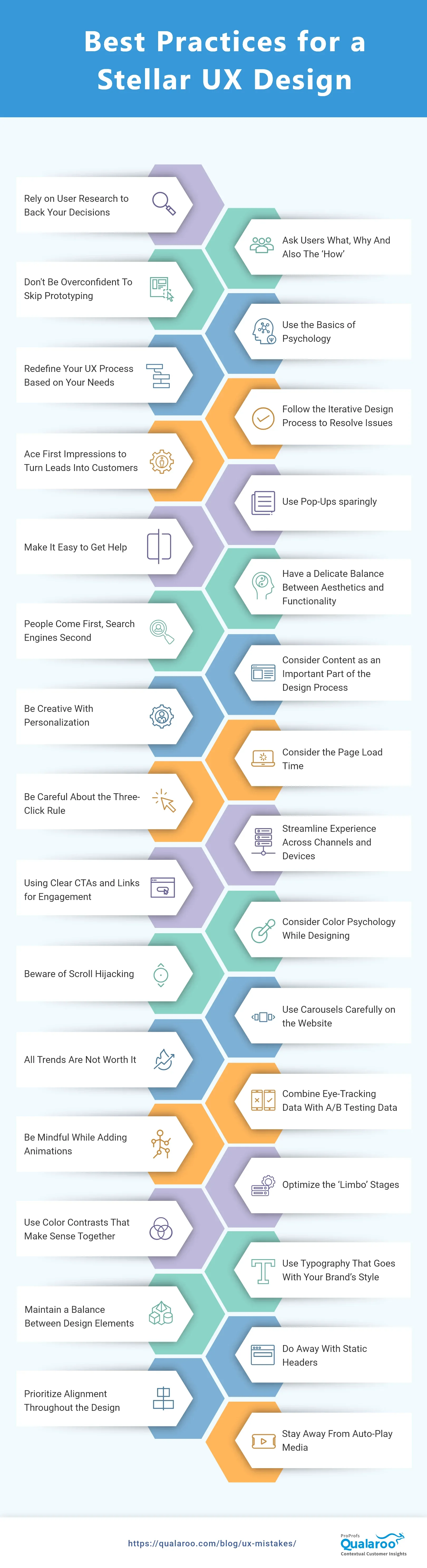
Avoid These 30 Common UX Mistakes for Soaring Conversions
Let’s dive straight into these critical UX mistakes you may be prone to make in your UX design. And even if you have already, how to fix those common UX problems.
UX Research Mistakes
1. Ignoring User Research to Back Your Decisions
You cannot design effective interfaces and seamless experiences if you don’t know who your target audience is.
You need to know your users’ preferences, backgrounds, and behavior to deliver what they desire. User research is an indispensable part of the UX design process, and missing out on it is a damaging UX mistake.
User research is an iterative process that you should ideally improve from time to time and not just at the beginning of a new project.
Since customers’ preferences and behavior change with time, you need to stay on top of these changes and trends with user research.
How to avoid this UX mistake:
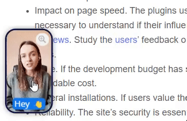
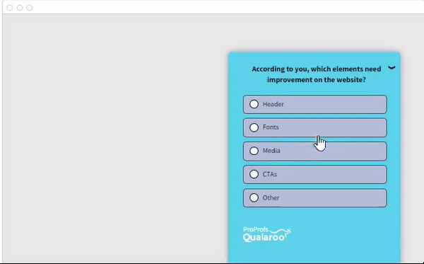
You can conduct user research surveys using tools like Qualaroo to gauge customer feedback.
You can conduct surveys at different stages of the customer journey to collect contextual feedback:
- UX surveys are useful at the beginning of a new project. You can add surveys to your prototypes and ask for feedback from a sample size of the target audience.
- Improve your marketing efforts to bring in quality leads.
- Design user personas and demographics.

- You can publish surveys on your website/mobile app to ask customers about the user interface and what they would like to be improved.
- You can collect in-context feedback during onboarding to find room for improvement.
If this is something you want to explore in detail, refer to our article “How to conduct user experience surveys: Templates & Best Practices.” It’ll help you avoid common research mistakes in UX and how you can conduct user research effectively.
2. Asking Users What, Why, And Also The ‘How’
Henry Ford once said, “If I had asked people what they wanted, they would have said faster horses.”
We also came across something similar from Steve Jobs, “A lot of times, people don’t know what they want until you show it to them.“
Although these tips apply to some cases, they would be hot UX mistakes in others. For instance, no one thought of an on-demand car hailing service until Uber did it.
In this case, Uber listened to the people, understood their pain points, and introduced a service that resolved the challenges in its own way.
Since some locations might have slow or troublesome connections, you should always ensure your VPN works. How to do it? Look up “What is my IP” to find out your IP address, and when you activate your monthly VPN plans, see if your location has changed. If it does, then your VPN is active, and you are protected. If you need to know how to change your IP address, using a VPN is one of the simplest methods to achieve this.
On the contrary, if you plan to introduce new features into your existing product after analyzing customer interactions with your website/product, you need to listen to their experience and feedback.
For example, Apple CEO Tim Cook knows that their users need data security and, at the same time, want the freedom to use social media freely.
Taking this feedback forward, Apple is trying to find an equilibrium between data security and the widespread use of social media.
This example tells us to identify:
A. When to focus on what customers want
B. When to focus on what they need
For example, if users ask for an onboarding process, it’s a viable request since it directly relates to their UX.
Users will tell you what they want, but acting on this feedback often won’t improve the user experience.
If you think customer feedback is relevant and based on how users interact with your design, you should consider it and ignore it if it’s trivial.
How to avoid this UX mistake:
Identify when to focus on what customers need and want. To know what they want, you have to ask them. But to know what they need, you must observe their interactions and behavior.
😀FUN INSIGHT!
Based on customers’ ever-growing demand for information, Google introduced Google Glass. It’s a classic example of the dangers of blindly listening to what customers want without considering if they would need it in the long run.
Soon after its launch, the revolutionary product was discontinued as customers realized it wasn’t helpful. Some speculated reasons for this devastating failure are:
- Health concerns over daily usage of the product
- Lackluster functionality
- Language limitations, and
- Battery issues
Everything eventually added to a poor user experience that people were unwilling to pay for!
3. Being Overconfident And Not Prototyping
One of the grave UX mistakes is conducting user research with countless benchmarks.
The best of us can fall into this trap, and it’s ok, but you can easily take care of this problem.
You need to start somewhere; the sooner you do it, the better. If you are designing a new product, you can create mockups to get user feedback and not rely on instincts and guessing.
For instance, you can add popup surveys to your prototypes and share them with sample users to get feedback.

You can also try rapid prototyping. It’s an excellent way to create mockups and channel your thoughts, conclusions, and insights into product design.
This technique can help you identify which ideas to reject as they won’t work well with the flow, information architecture, or other design aspects.
This way, you can test your prototype with different UX design ideas and ensure the success of your final product design.
How to avoid these kinds of UX mistakes:
Use different prototyping tools to create design mockups & prototypes and test your hypothesis to improve UX.
Prototype survey questions to ask:
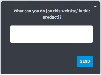
- What do you think you can do on this website/in this app?
- What information about shipping was missing, if any? (E-commerce and retail)
- What would you improve about this website at first glance?
- Was there anything you expected to find that was not there?
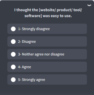
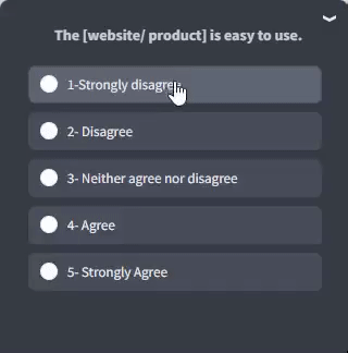
- What do you think about this statement: It was easy for me to use the [Tool/app/website].
Check out more in this blog on 29 Questions to Consider Asking Users During Prototype Testing.
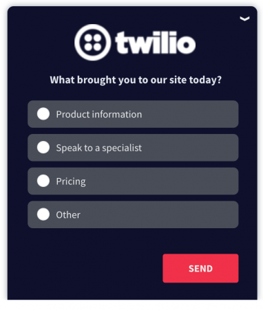
CASE STUDY: TWILIO
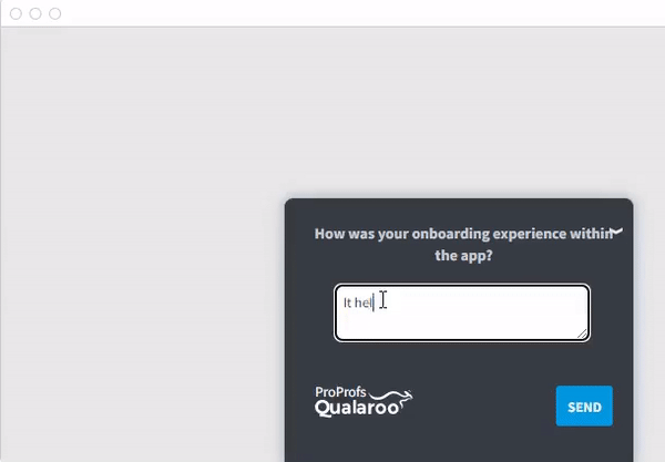
Twilio provides APIs to design apps like video-calling, SMS, messaging, etc., and has a diverse portfolio. Because of this, the team wanted to improve their onboarding process and experience.
They began using Qualaroo’s NudgesTM to ask customers about their onboarding experience and what they think can improve.
In the words of Laura Schaffer, Product Manager for Twilio’s Experimentation Platform, “There are so many ways to approach this challenge. The hard part usually isn’t coming up with the hypotheses for what might work best – it’s knowing which are the right ones to try first.”
Twilio was able to prioritize hypotheses based on customer feedback.
“In less than 5 minutes, teams can go from having almost entirely opinion-backed ideas to having ones that are data-backed by targeted customer feedback.”
4. Not Using the Basics of Psychology
When it comes to sketching, wire-framing, and prototyping, knowledge of psychology certainly comes in handy. Not considering it is one of the common UX mistakes designers make.
One of the UX design basics is understanding how your users perceive the world, think, and feel. It can prevent you from annoying them and help them use your product.
Areas within psychology that are particularly relevant for UX include:
- Cognitive psychology (memory, attention, information processing, learning, visual processing)
- Psychology of Emotion and Motivation
- Behavioral psychology
- Social psychology
Familiarity with these subdomains will enable you to understand how people perceive your design, how they make decisions, and ultimately how to enhance their experience.
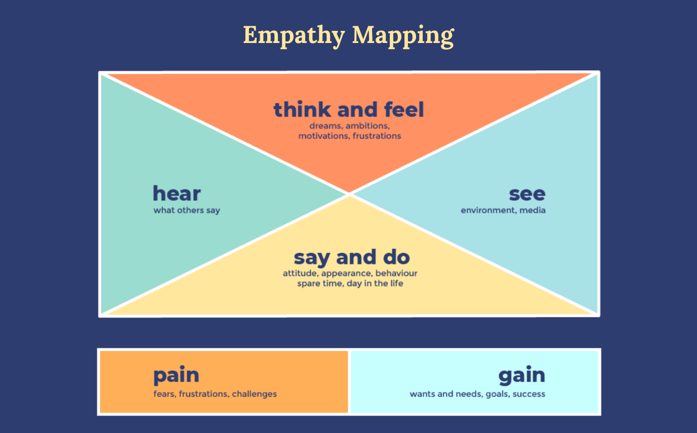
One way to go about it is to use empathy mapping to visualize users’ behavior on-site to design better experiences.
It helps you understand how users see your product and highlight any holes in the user data (something you can rectify with the coming solution).
Another way to understand customers’ psychology is through feedback and behavior analysis.
For example, you can use Qualaroo’s pop-up surveys to gather psychographic, behavioral, and technographic data and fill in user data gaps.
-
- Ask questions about your prospects’ and customers’ lifestyles, habits, online behavior, preferences, etc.
- Tools such as SessionCam also help you understand customers’ online behavior by analyzing how they behave on your website through heatmap technology.
- Ask questions about your prospects’ and customers’ lifestyles, habits, online behavior, preferences, etc.

-
-
- The technographic data (combination of technology and demographics) helps you understand which technologies customers prefer so you can align your product’s offerings with digital transformation.
-
How to avoid this UX mistake:
To properly implement the UX laws and principles devised by psychologists, you need to understand human psychology. An effective way to do that is through surveys and behavior analytics tools.
Several useful books combine UX knowledge with different tenets of psychology like:
-
-
- “Don’t Make Me Think” by Steve Krug
- “100 Things Every Designer Should Know” by Susan Weinschenk
-
UX Strategy Mistakes
5. Blindly Following Predefined UX Process
If you google “UX process,” you’ll find many opinions about what steps it includes. And if you don’t customize this process based on your business plan, you’ll be committing one of the top UX design mistakes.
If you take a closer look, you’ll find that it all boils down to the same following core stages.
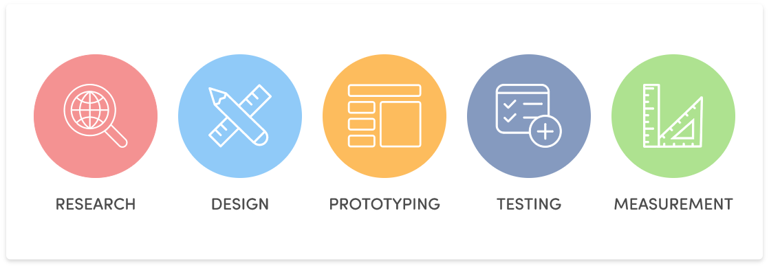
The stages in the UX process may have different names depending on who you ask, and the process can also change depending on the project/product.
So, you also need to create your UX process according to your product needs and stick to it.
How to avoid this UX mistake:
Tailor the UX process according to your product/project needs which comprise staple elements such as research, design, prototyping, and testing (validation).
6. Not Following the Iterative Design Process to Resolve Issues
Ignoring the iterative process for your UX design is one of the worst UX mistakes you can make.
We know what you’re thinking – how do I even get over this?
Well, UX design is an iterative process with ideation, prototyping, and testing. So, you get to learn a lot about your prototype’s issues and users’ needs and behavior.
You can test or resolve one problem at a time and iterate as often as possible until you have a product worthy of launching and testing with real users. It lets you redesign many elements and try out different things until you find what works the best.
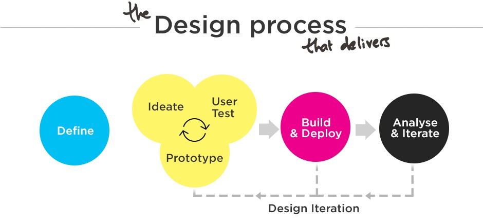
How to avoid this UX mistake:
Follow the UX design iterative process to work on different elements and challenges, one at a time. Trying to do everything at once may disturb the whole design.
It would even become challenging to pinpoint the actual source when the changes start affecting other design elements.
7. Not Acing First Impressions to Turn Leads Into Customers

Having an aesthetically-pleasing product/website is essential but will people like it if they can’t use it properly?
No.
It is not a typical UX usability mistake per se, but it’s surely a lost opportunity.
The first impression of your product will impact how users see it in the future. If they have a pleasant experience with your product/website, they will be more forgiving towards minor issues and stick to it.
You can use this behavioral trait to focus more on the design and UI of the products. A good design will enhance the usability and aesthetics of your products/websites.
How to avoid this UX mistake:
Besides mood boarding, you can conduct surveys on your website to ask customers what they think of the design and where you can improve. This way, you’ll get practical insights foundational to your design.
8. Considering Search Engines as Your Primary Audience
You won’t be like, “Oh, here’s a pretty useless article with a bunch of keywords with nothing to offer; let me give it a read,” if it only had keywords to rank higher on search engines with no value.
You wouldn’t bother wasting your time reading it, right?
Similarly, the purpose of your landing pages and mobile apps, much like anything else business-related, is not only to grab the attention of search engines but also quality leads and interested prospects.
And for that, you need an impeccable user interface across all digital assets and exceptional UX. Remember that the main priority of search engines is also PEOPLE.
Many designers end up making this mistake at times but interestingly, listening to the voice of the customer or user can help.
How to avoid this UX mistake:
Collecting feedback from the customers with user research will help you understand what your target audience wants.
You can also use tools like SessionCam (which integrates seamlessly with Qualaroo) to dive deeper into your visitors’ behavior online and figure out what works for them.
This way, you’ll be able to optimize your website for SEO to boost lead generation and provide a seamless UX to visitors.
9. Treating Content as Secondary to Design
If you think content is only a part of your marketing strategy — think again.
Even as customers, we consume content and judge a brand based on it. Meaning that it’s an essential part of the user experience.
Content is a way for customers to get to know your brand, use your products, and educate themselves. Design and content are two peas in a pod that make a wholesome experience together.
If you don’t consider content in your design strategy, you’ll only have a good-looking interface incapable of attracting decent customers. Similarly, only content without a proper design strategy will not be as compelling for the prospects.
How to avoid this UX mistake:
The content you create and where you place it in your design affect how customers interact with your website or mobile app.
Heat mapping tools with features like mouse tracking, eye tracking, click tracking, and scroll-tracking can help you find high-impact and visibility areas on your website to publish important content.
Your content is not an afterthought of UX design, so it’s better to design your user experience with a strong content strategy.
10. Getting Stuck on the Personalization Threshold
Personalization has become intertwined with good user experience in a way that first-name tokens like “Hi Joe” and “Welcome Jane” are rendered as shallow attempts to connect with the users superficially.
No wonder companies like Netflix, Spotify, Headspace, and thousands of others are spending millions of dollars and hours to take the lead in this personalization battle.
They use customer data to go beyond the threshold and offer highly accurate and personalized recommendations for their products, services, and everything in between.

Brands leverage onboarding as a crucial touchpoint in the customer journey to gather insightful data that helps them personalize the UX based on customers’ preferences and wants.
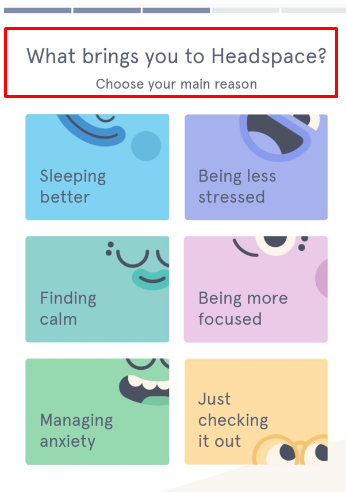
One fine example is the mindfulness app, Headspace, which customizes its recommendations based on why users downloaded the app.
How to avoid this UX mistake:
Much like everything else, personalization is progressive and has become “more personal.” If an elaborate onboarding process is something you can’t venture into, for the time being, you can use pop-up surveys during the onboarding stage.
You can understand your users’ motivations and intentions for your service/products, which can help you onboard the personalization bandwagon.
Usability Mistakes
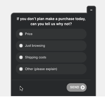
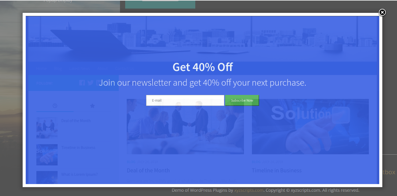
11. Going Crazy With Pop-Ups
We may not see eye to eye about Pineapple on Pizza, but we share common ground on the fact that too many pop-ups are just not cute.
Shooting multiple pop-ups on your landing page as soon as a visitor comes is a grave UX design mistake putting a damper on the user experience.
In short, users may not stick around.
Some users use pop-up blockers to get around them, but many don’t. So, you have to create a flawless experience for them.
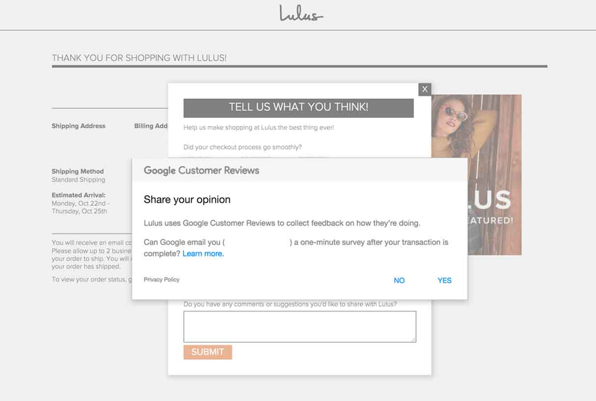
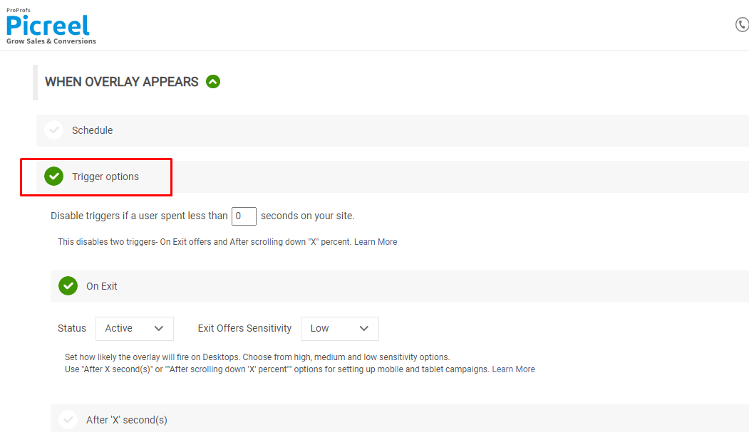
The design, placement, frequency, and pop-up timing are some factors that make or break your UX. You can use tools like Picreel to create interactive, dynamic, and non-intrusive pop-ups customized to your site’s aesthetics.
You should also carefully design and place exit-intent pop-ups to collect valuable feedback without disrupting customers’ experience.
How to avoid this UX mistake:
Here’s what you need to avoid and what you can do to optimize the pop-ups strategy:
-
-
- Don’t show multiple pop-ups at once or one after another.
- Ensure the pop-ups are relevant to the web page and the audience.
- Your pop-ups shouldn’t cover the entire screen.
-
-
-
- Give visitors a little time to explore your website.
- You can set suitable triggers for pop-ups to appear at the right time when certain conditions are met.
-
-
-
- You can use video pop-ups to attract customer attention without annoying them.
-
💁♀️Pro Tip:
12. Following the Three Click Rule Religiously
“Usability does not equate to a specific number of clicks, taps, pinches, and swipes” – John Morkes
At the onset of the internet age, the three-click rule was an ironclad principle when designing user-friendly websites.
The rule states that users should not have to click more than three times to achieve a goal or access desired information.
But following this rule religiously can lead to a series of grave UX mistakes.
Why?
Because this rule doesn’t translate into the website’s usability and will affect how you strategize your navigation menu.
There are multiple categories and sub-categories on a website, so if you apply the three-click rule, you’ll end up with a website that looks something like this (A little exaggeration never hurts) –

Instead of a streamlined navigation menu, you have a mega menu on the website header for accessibility.
Similarly, no one wants to take a lengthy survey with multiple questions displayed at once.
How to avoid this UX mistake:
The best way to dodge this error is to follow the three-click rule sparingly. You can analyze where to leverage this rule to bring positive results.
For example, avoiding this rule at the checkout is a good idea since customers need to ensure everything is secure and on point. Or, you can follow what Amazon does; it has both a multiple clicks payment process and a 1-Click checkout.
On the other hand, you can apply this rule while designing the menu for your eCommerce website so all the products are easily accessible to the customers.
You can perform usability tests such as card sorting and heatmaps to identify when to use this rule.
In the case of surveys, it’s better to create one-question pop-up surveys broken down into multiple screens with conditional logic and a progress bar.
13. Not Optimizing the ‘Limbo’ Stages
An impeccable user experience isn’t about making your customers go from Point A to Point B but the whole journey.
So, while you may be entirely devoted to the main touchpoints in your user journey, you can’t ignore the in-between states to deliver a wholesome UX.
For example, you may plan out everything for your eCommerce website or mobile app’s home page, product page, and checkout process.
But what about the stages where users are on your website and still haven’t added products to the cart?
That’s the in-between stage you shouldn’t skip.
How to avoid these UX mistakes:
While designing, these are the types of questions you should ask yourself:
-
-
- What will users see when they transition from one screen to another?
- What do users see when they abruptly lose connection?
- What will users see when an action is in progress?
- What will users see after an action is complete?
-
Look for the gaps in your customer journey and ensure you don’t leave any in-between states unattended.
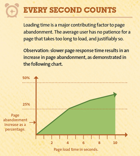
14. Your Page Loads Slower Than a Snail
The average web page load time is 10.3 seconds on desktop and 27.3 seconds on mobile, according to a study analyzing 5 million web pages. So, if your web pages are slower than this, you’re in big trouble.
Why?
Slower load time is a significant cause of user frustration and eventual churn. Even a second’s delay in load time adds to page abandonment and reduces conversions.
How to avoid this UX mistake:
A tool like PageSpeed Insights by Google helps you analyze your page speed and highlights elements on your site that contribute to increasing the load time.
For example, certain UI elements are heavy in size and reduce the loading speed. You can take suggestions from the tool and make changes accordingly, followed by A/B testing to compare the performance.
Accessibility Mistakes
15. Making It Difficult to Get Help
We LOVE a good hunt to find support on a website/app — Said no one ever.
Offering visitors quick ways to connect with your support service is the bare minimum of a decent user experience.
It’s a big UX mistake if you forget to provide it on your landing pages/ mobile app pages and customers have to hunt for them on every page.
For example, some companies make it difficult for customers to get in touch with customer support for the return/exchange of products. In that case, it takes multiple tries for customers to find a way to connect with support and resolve their issues.
Customers value their time more than anything and expect brands to do the same.
In fact:
If you offer quick customer support and resolve queries, customers are 2.4 times more likely to stick with you.
So, if the visitors don’t find a way to connect with you instantly, they’ll simply leave.
How to avoid this UX mistake:
There are many ways you can help your customers reach out to you in case they need help. For example,
-
-
- You can use a live chat widget on your website so that it’s always visible and accessible to your customers.
-

-
-
- Self-help is a big trend; companies use tools like ProProfs Knowledge Base with an answer library for all customer queries. It helps them resolve small issues whenever they want without depending on customer support.
-
16. Pfft, Who Needs Responsive Design Across Devices?
Imagine this scenario: You put your heart and soul into designing a fabulous website with an intuitive UI, yet high conversions elude you.
Why do you think that is?
One of the top UX mistakes you can make is not taking a holistic approach to user experience. Your customers see every interaction with you as a part of the overall user experience.
So, if your UX is not streamlined, it will not send a consistent message to your prospects. A different UX design across devices (mobiles, tablets, desktops), websites, and mobile apps will only convey half of your brand messaging.
For example, say you have a website optimized for desktop, but it looks shoddy and unfit on a mobile device. It will disrupt the UX of your users and doesn’t convey a very positive image of your company.

The same goes for surveys on your website and mobile app. You can’t have a survey on your website that isn’t optimized for a web or mobile app. For this, you can use a tool like Qualaroo to create powerful surveys optimized for all devices and platforms.
How to avoid this UX mistake:
To ensure your website is responsive, test your website design across all devices and resolutions. It’s best to streamline the UI design of your digital assets and adapt it to fit different devices across different platforms.
Just like optimizing your website’s design using heatmaps to track user behavior, you can do the same for your mobile apps.
Doing so will let you find the high-impact areas on your mobile app to improvise the design and make it more effective.
17. Using Misleading CTAs and Links for Engagement
Engagement at the cost of your UX is one of the common UX mistakes people make.
You risk affecting UX if you add links and buttons to the web pages or mobile apps that don’t perform the action they are supposed to. Users will see it as misleading and may even churn.
Is it something you want?
Absolutely not.
You must ensure that the buttons, links, and CTAs do what they are intended for. For example, a “Check out our pricing” button should lead users to the pricing page.
How to avoid these UX mistakes:
Heatmaps and session recordings can help you explore the CTAs, buttons, and links on your website that users gravitate towards the most but bounce right off as they land on the following page.
UX Design Mistakes
18. Missing the Delicate Balance Between Aesthetics and Functionality
There’s no one-upping the other when it comes to the aesthetics and functionality of UX design. It requires a perfect balance of both elements to create a seamless user experience for your digital assets.
If you focus too much on aesthetics, you may make UX designer mistakes like ignoring the design law of simplicity.
On the other hand, if you are too focused on functionality and providing everything at once, you may end up with a website/app that’s unpleasant and difficult to navigate.
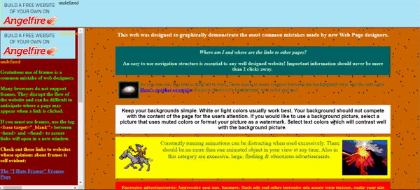
For example, this website focuses solely on functionality, making it non-responsive, dull, and unappealing.

Whereas this website focuses on aesthetics so much that functionality leaves much to be desired.

How to avoid this UX mistake:
You can always pack your design with useful information in a non-overwhelming way that’s relevant and easily scannable.
For example, you can skip highlighting your pricing on the homepage and focus more on the offering.
More so, try to make the most use of navigation menus by creating a clear user flow, choosing a color palette that works for your brand, and adding animation and dynamic elements in moderation.
19. Ignoring Color Psychology While Designing
Have you ever wondered why Apple chose black for its logo?
Why did Target go for a bright red color?
Or why do brands opt for green while presenting themselves as ‘eco-friendly’?
All these examples point toward the effects of colors on human psychology. Each color is symbolic and contains different meanings.
So, you need to ensure the colors of your UX design elements sync with your goals for those elements.
For instance, bright colors are great for CTAs to attract visitors’ attention compared to the subtle colors you will use in the backgrounds.
How to avoid this UX mistake:
Here’s a little something to get you started.

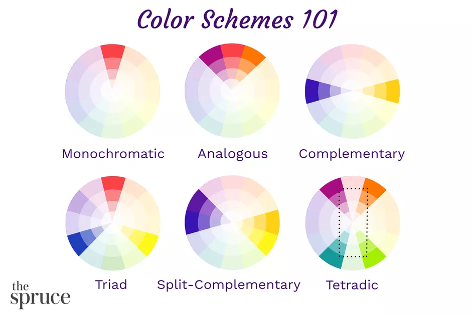
Study the psychology of colors and carefully pick the colors that resonate with your brand and what it represents.
20. Blindly Following Scroll Hijacking
Before moving to discuss why you should be careful with scroll hijacking or scroll jacking, here’s what it means in brief:
It’s a UX design technique in which users lose control of the navigation or behavior on a specific website section.
Many designers consider it one of the top UX mistakes because it takes the design away from Jakob Nielsen’s law of consistency and familiarity.

For example, scroll hijacking can include:
-
-
- Horizontal scrolling on a specific section of a website
- Animation triggers when users scroll
- Sudden change in the scroll speed of a page
- Parallax effect where images move at a different speed to create a faux-3D effect
-
For some companies, this design strategy may work and offer an immersive experience to the users. But for others, it’s not the best horse to bet on.
How to avoid this UX mistake:
You can A/B Test scrolljacking on your website to see if it’s something your target audience appreciates.
It’s best to start with the parallax technique since it doesn’t fully take over the scroll experience. For instance, Apple started with full scrolljacking but has now embraced the former.

21. Sprinkling Carousels Wherever on the Website
Carousels (no, not the merry-go-round kind) are the slide screens companies add to their websites to make them interactive. They contain essential bits of information the company wants to highlight.
With that said, it doesn’t mean they work for everyone and in every circumstance. If not used efficiently, carousels can backfire and affect your users’ experience.
Research by the Nielsen Norman Group mentions that users often scroll through the carousels, ignoring the slides’ crucial information.
So, does that mean carousels are as useless as botched plastic surgery?
Well, it depends entirely on how you execute them. Implementing good navigation and strategic content placement on your carousels can work wonders for you.
How to avoid these UX mistakes:
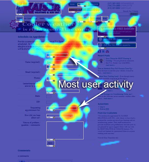
You can observe how visitors interact with your website using heatmaps, eye tracking, and session recording tools. This way, you’ll uncover the most clicked-on, viewed, or interacted places on your website and place effective carousels there.
But, it’s also okay to do away with carousels and stick with what Neilson calls “static hero” images that don’t distract users as much. Ultimately, the call is yours, and it would be best if you base it on your user research.
Small UX Mistakes You Can Easily Avoid
So far, we’ve covered some heavy-duty UX mistakes that take a lot more than just a few tweaks in the design to resolve.
So, why not glance at some small UX mistakes that may have gone under the radar while designing?
22. All Trends Are Worth It. Nope!
Not every trend is worth following; the sooner you realize this, the better for your UX. Your company’s unique image, experience, and messaging will not always go with the short-term UI/UX trends.
Some trends are empirical, and some are born out of hit and trial. Take all trends with a grain of salt and observe their utility for your business model.
For example, while scroll hijacking was feasible for some brands like Apple, others preferred to stay away from it.
How to avoid this UX mistake:
Before committing your resources to the cause, take your time to observe each trend, its origin, and its functionality.
Stay on top of competitor analysis to track their performance after adopting specific trends.
After all, why risk your business when you can learn from others’ mistakes?
23. Treating Eye-Tracking Data as Your Holy Grail
Heatmaps and eye-tracking practices have their place in the design priorities, but relying too much on them can backfire.
For example, eye-tracking allows you to observe the most eye-catching areas on your website.

This data can be arbitrary as it doesn’t give complete insights into whether users liked what they saw or simply stared at it because it was a bit confusing for them.
How to avoid this UX mistake:
Instead of only basing your UX design strategy on this kind of data, keep experimenting and A/B testing new changes to figure out what works best.
24. Dumping Animations in Your Design
Animations are a powerful element in making websites more lively and dynamic. But they can quickly become one of the top UX mistakes if you don’t plan them strategically.
You need to avoid the overuse of animated elements that can overwhelm users.
How to avoid such UX mistakes:
Try to avoid using animations where they are not necessary. It’s best to use them to highlight essential elements, content, and CTAs on your website.
Also, if your website page speed is slow, you’re better off without animations until you resolve that issue.
25. Autoplay Media That Undermines Users’ Choice
Consent is compulsory, and this notion extends to the UX as well.
Like scroll hijacking, where users temporarily lose control of their movement on a website, an automatic audio and video player can be equally detrimental to your UX.
Adding auto-plays for audio and videos on your website disrupts users’ experience as they get distracted from their goals. The bigger evil is the autoplay loop, which doesn’t stop upon completion.
How to avoid such UX mistakes:
Instead of leveraging autoplay media, you can embed videos and audio from other sources and allow users to play or stop as they see fit.
26. Color Contrasts That Don’t Make Sense
By now, we know that colors are critical when designing your digital assets’ UI. The color contrasts you choose to design your website and mobile app impact the UX.
You’re going down the wrong path if you use barely readable contrast combinations that only serve aesthetically.
Take the below website, for example. The poor contrast is so evident that we don’t even have to highlight the problem.

How to avoid these UX mistakes:
Carefully choose color contrasts that are aesthetic and also practical. You can refer to the color palette wheel to pick out the best combinations as per your branding preferences.
27. Terrible Typography Blunders
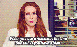
In today’s age, where most user interactions happen online on different channels, typography has become a significant contributor to the UX, now more than ever. So, you must keep typography high on your UX design priority list.
Every element on your website and mobile app conveys a message to the users. If you only focus on aesthetics, you may choose fonts that appear more creative and distinct. On the contrary, using standard fonts helps with readability and scannability.
How to avoid these UX mistakes:
Unless you have a solid reason to use a particular font type, it’s best to stick with the most common and web-safe fonts. You can choose any of these fonts which are perfect for HTML and CSS:
-
-
- Arial (sans-serif)
- Georgia (serif)
- Verdana (sans-serif)
- Trebuchet MS (sans-serif)
- Garamond (serif)
- Tahoma (sans serif)
- Courier New (monospace)
- Times New Roman (serif)
-
28. Imbalance Between Design Elements
To cook a great website, you need to use the correct ratio of ingredients like design, features, and content.
If you miss out on the perfect balance, you’ll end up with something like this (P.S. Eyes R.I.P):

The website is loaded with different design elements like animation and graphics and has tons of content and offering (don’t forget the unexplainable white space towards the end). And still, it fails to deliver a memorable or decent user experience.
How to avoid such UX mistakes:
Instead of focusing on using these three ingredients, prioritize the ratio in which you will use them.
Constant A/B testing, feedback gathering using on-site and in-app surveys, and leveraging tools like heatmaps and session recording will guide you through creating the UX design that works for your business.
29. Static Headers That Take up a Chunk of Real-Estate
Headers are a significant part of the website UI as they offer crucial information to the users. But it’s not necessary to make them static.
Why?
Sticky headers scroll with the website and take up space on the screen. As a result, users end up seeing less new content on the website.
More than the desktop, static headers can impact the UX of mobile users since they already have limited screen space.
How to avoid these UX mistakes:
Design your headers in the standard size of 1024 pixels wide. As for whether or not sticky headers are a UX design mistake for you, it’s best to test it with users.
A/B test your website with and without sticky headers and go with the one that yields the best results.
While you are at it, you can launch a survey for both test variations to gather contextual feedback from users about the headers and how it impacts the UX.
30. Inconsistent Alignment Throughout Design
Inconsistency of any kind in your UX births not one but multiple UX mistakes. One of them is the element alignment inconsistency in the UI design.
If your design is aligned, it’ll improve the readability and scannability of your digital products. But, if your alignment is botched, it’ll impact the usability.

How to avoid this UX mistake:
It’s easy to fix or avoid such UX mistakes by paying close attention to the design.
You can create multiple renditions of your design with different alignment styles and choose the one that supports scannability and usability per your UX design.
Good vs. Bad UX Design Examples To Learn From
A discussion on the worst UX mistakes isn’t complete without real-life examples of brands to inspire and learn from. Let’s look at both examples of good UX design and bad UX mistakes.
The Bad
1. Netflix and Its Autoplay
Imagine you’re on a break in your office and decide to open Netflix to see which show to binge next.
In the dead silence of your cabin comes a thundering sound from the trailer of “Friends.”
Well, unlike Phoebe, we’re not immune to embarrassment.
So, what happened there? Any guesses?
It’s one of the classic UX mistakes of autoplay we covered above. Netflix has the autoplay feature where a trailer from the show automatically starts to play when users hover over it.

So, what could Netflix do better to resolve this UX mistake?
Instead of the autoplay, Netflix can add an option like “Play the trailer” so users can watch it if they want to.
2. Twitter and Its Inadequate Filters
Twitter is one of the top social media platforms right now, but that doesn’t mean it’s without its flaws.
As this Twitter user pointed out, the platform doesn’t offer clear filters. On its profile page, it doesn’t allow users to see the original tweets only from a user. Instead, it has clubbed original tweets and retweets into one category.
It’ll add to the user experience if Twitter redesigns its filters to cater to such user requirements and make it more user-friendly.
The Good
3. Apple With Its Product Comparison
Apple is not only a customer electronics juggernaut but also a great brand to look up to for incredible UX design inspirations.
One feature that adds to the inspiring UX design is the comparison feature on Apple’s website.
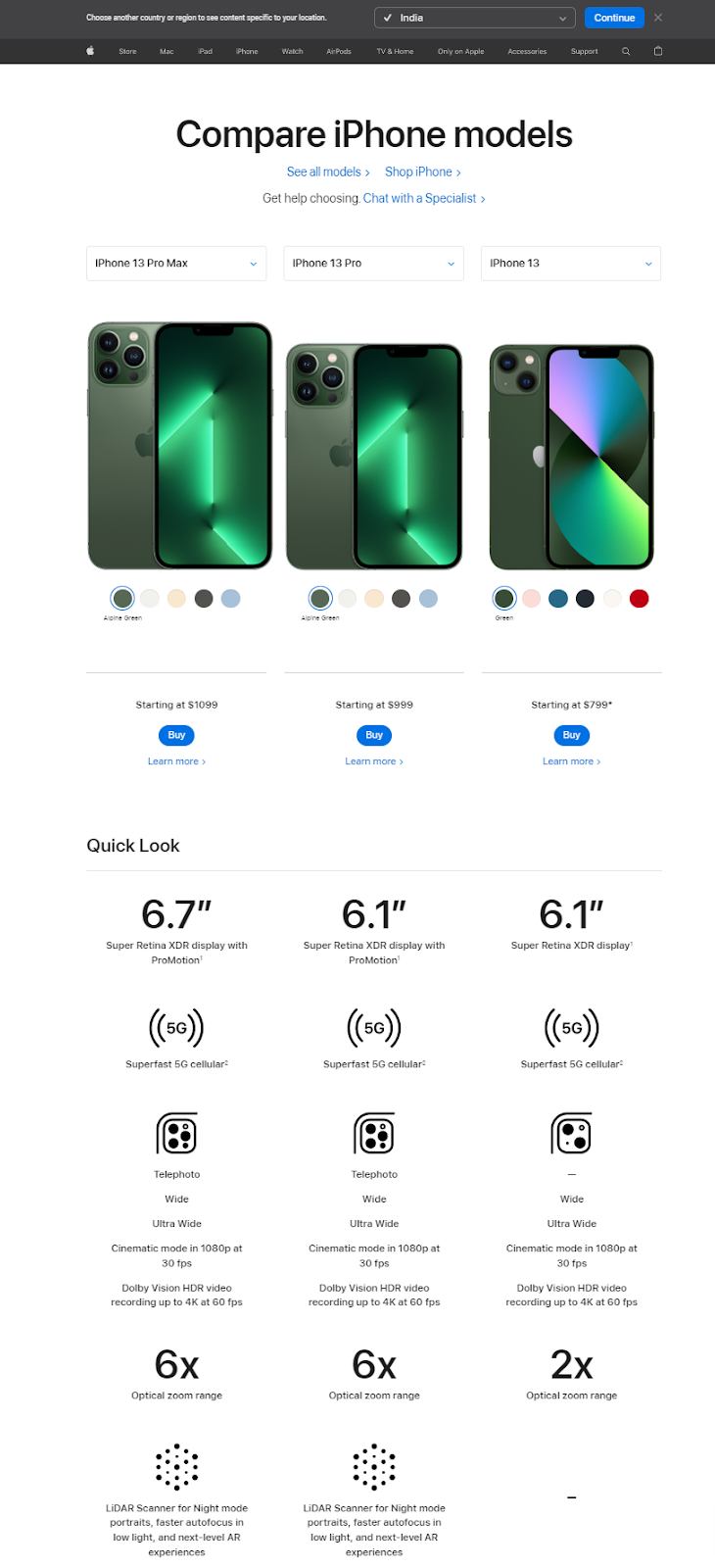
You can choose three different products simultaneously and compare their specifications side by side in a very scannable way.
Why is this a big deal?
Users do not have to check each product separately and make mental notes to compare them.
4. Duolingo With the Onboarding and Animations
Duolingo is a well-known language learning platform, and it’s safe to say that its popularity is legitimate.
One of the reasons why we had to include this platform as one of the best UX design examples is its smooth onboarding.
Besides an easy-to-navigate and simple app, the platform helps users follow simple steps to get them started with a new language.
Here’s how the flow goes:
-
-
- Asks you about language preferences
- Reasons for learning the language
- Duration you would like to practice each day
- Asks if you are a first-time learner or have basic knowledge
- Based on your previous answer, it creates a test you can take to practice
- After the user has taken the test, it asks to create a profile
-
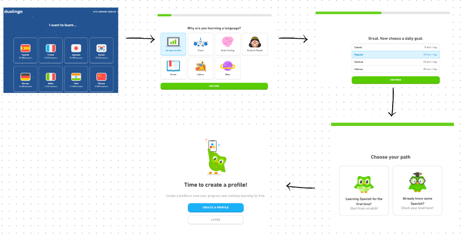
As you see, Duolingo did not ask the user to sign in immediately or create an account without trying the tool first.
It lets users get started without a sign-up and guides them on what they will get before asking them for any commitment.
And the perfect blend of content, animations, and color combinations throughout the process?
A Chef’s kiss for that!
Before you leave, here’s a useful UX design handout that can be your desk buddy to keep all these mistakes in check!
Nip These UX Design Killers in the Bud, and Voila!
A great UX design is not one that never has flaws but turns those UX mistakes into improvements.
So, if you’ve made any of these UX mistakes we discussed (or maybe more), it’s okay.
Like Hawkeye from Avengers, you haven’t run out of arrows just yet.
Here’s what they are:
-
-
- Follow the advice from the mistakes we discussed.
- Perform user research using tools like heatmaps, eye-tracking, surveys, etc.
- Diligently ask your users about their experience and feedback.
- A/B test based on the feedback
- And most importantly, continue to collect user insights to improve constantly.
-
And if you haven’t made these UX mistakes yet, it’s even better since you can avoid making them entirely.
FREE. All Features. FOREVER!
Try our Forever FREE account with all premium features!
 We'd love your feedback!
What did you like & how can we make it even better?
 Thanks for your feedback!
 Ask Your Question
Have a question? Get expert help to make your decision easier.