In the business landscape, the effectiveness of a company’s efforts depends on how it uses the survey data at its disposal.
To optimize it to the best of its potential, presenting it the right way to the right people is paramount.
Think of the survey data as a gold ore from which you need to filter out the gunk (i.e., unsubstantial and unuseful survey data).
But that’s not enough.
You need to know how to tell the story the survey data represents to others, such as stakeholders, department heads, and other decision-making authorities.
It’s how a company takes proactive measures to act on the feedback. Both survey data and storytelling are interdependent to bring out the best in each other.
If your survey data isn’t insightful, the storytelling will be nothing but an incompetent presentation. Similarly, if your storytelling has a weak narrative, it wouldn’t do justice to the feedback data’s ability.
To know how to tell a compelling story with feedback survey data, dive into this blog to understand the subtle difference between data storytelling and visualization, tenets of data storytelling, tips on how to make your storytelling compelling, and everything in between.
Let’s go.
Storytelling With Data: The Definition
Storytelling with data (in our case, survey data) is essentially a descriptive data analysis that presents information in visual form. It empowers all the company departments to absorb the crucial information and take swift action.
Data storytelling seeks to limelight specific features such as trends, common denominators, and the relationship between different data variables.
In the words of TechTarget, data storytelling is “the process of translating data analyses into layman’s terms to influence a business decision or action.”
For example:
Data: Gmail had 1.5 billion active users in October 2018.
Ineffective narrative: Gmail is one of the most popular email platforms as per the 2018 data.
Storytelling narrative: Gmail saw 1.5 billion active users in October 2018, which is equivalent to one Gmail user for every five people worldwide.
There are two types of storytelling:
- Narrative – It guides the audience through a story aiming to give way to a conclusion.
- Explorative – The audience is prompted to explore new angles and meaning in the data and draw their conclusions.
Such effective storytelling adds flavor to the tasteless data and appeals to the creative senses to derive innovative solutions. It helps visualize the data with a fresh perspective.
Speaking of visualization, people often confuse data visualization with data storytelling. Here’s our take on the topic before diving deep into the latter.
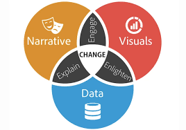
Data Storytelling vs. Data Visualization
It’s easy to confuse one for the other since data storytelling uses visual aids to represent the data correctly. But that’s what data visualization is.
It’s a part of data storytelling where we use analytics reporting, graphs, charts, and such visualizations to help others understand the compelling data, not just as hard facts but as a persuasive narrative with a touch of human communication.
Have a look at the Venn diagram visualizing the difference or, more aptly, the relation between the two.
Survey Data Storytelling: Tenets of Narrative To Remember
So far, we have been discussing how narrative is imperative to the storytelling process. Now, it is time to delve deeper into the whole concept and unravel the pillars on which the narrative, i.e., storytelling, stand.
Identify Your Audience
Have you ever noticed how comedians can take a simple instance and turn it into a series of playful jokes that floor the whole auditorium?
How?
The answer is very straightforward ― the comedians don’t just have the data to leverage storytelling but also know their audience. Just goes to show how it is pivotal to establish the nature of your audience before designing the narrative.

How well the audience receives your survey data representation wrapped with compelling storytelling depends on whether you used the correct storytelling technique for the targeted audience or not.
Here are some pointers to identify your audience:
- Understand their aspirations.
- What motivates them – the bigger picture or tangible plans?
- Their orientation – Are they supporters, critics, leaders, or blockers?
- Their challenges and concerns.
- Their role in the company’s decision-making process and how you can aid them.
Related Read: Best Online Survey Tools
Focus on the Main Characters – CUSTOMERS
The main characters in your storytelling are the ones you’re talking about – the customers. A company should always put customers at the center of everything, even when storytelling with data.
Although it is called data storytelling, the protagonist in your story should be the people.
Why, you ask?
Surveys are all about people and finding out how they feel about a brand or its services or products.
All this feedback data is the collective feelings of customers. It’s why presenting the emotional response feedback in just cold numbers can sideline the customers altogether. Whatever you’re going to tell in your survey data storytelling to inspire and instigate improvements, in the end, it’s all for customers.
Consider Audiences’ Aspirations
Your storytelling should be such that it prompts the audience to take action. You’re not presenting your narrative for its sake but to allow teams to come together and resolve customers’ concerns and challenges identified in their feedback from the surveys.
Try to communicate the mission and inspiring goals with your storytelling and not leave the audience (stakeholders, departments, leaders, and all other decision-making authorities) to read between the lines.
Data Storytelling: Benefits of Combining Survey Data And Narrative
For marketers, data-driven storytelling is a boon. It wields power to help them uncover insights hidden amid the cold numbers and statistics. Here are some of its benefits in detail:
Gives Numbers Meaning and Context
It’s understandable to feel overwhelmed by hard data displayed on Google spreadsheets or vaguely designed charts and graphs going in all directions. Such data is meaningless for the reader in that form, regardless of how meaningful it is in actuality.
In this hit or miss data situation, storytelling ensures that it is a hit for everyone involved. A smooth and straightforward narrative packed with and backed by facts beats every odd of being a miss.
It boosts communication on valuable insights and promotes transparency in all aspects. With effective survey data storytelling, once you narrate the core and crucial information from the data silos, it becomes easy for other departments to realize their shortcomings and customers’ bottlenecks.
All in all, for an organization to become customers’ favorite, it should value customer feedback from the surveys, derive and understand what customers are trying to say, and come up with actionable solutions in real-time.
Related Read: How to Analyze Survey Data – A Comprehensive Guide
Versatile for Repurposing
The narrative you prepare for storytelling is loaded with valuable survey data to repurpose into various media forms for broader consumption.
For example, you can utilize the insights and visualizations prepared for telling a story with data in various forms such as a brochure, blogs, infographics, PPTs, videos, reports, case studies, microcontent, interactive infographics, information snippets to use on social media, and much more.
Improves PR Impact
Putting forth original and unique stories is a great strategy to mark your organization on the map and rise above the crowd of competitors. But merely writing fluff will not get you anywhere.
Using your unique survey data to weave your original stories into an intriguing narrative invokes curiosity in the potential customers towards your brand and sets you apart from the rest.
It’s one of the best practices when it comes to PR. Stories based on the internal data offering impactful insights to others inevitably rank your brand image off the charts.
You can explore new angles or stumble upon unexplored revelations about your industry or customers, which no one has done before.
Such reports and insights attract big influencers in the publishing industry, and many even publish internal reports, which eventually boosts visibility and credibility.
Companies like LinkedIn do this all the time, and they don’t just do it; they nail it.
For instance, it releases its Workforce report every year to provide insights into the workforce trends and establish its stronghold on the industry.
Similarly, IBM also publishes original reports of the latest data related to numerous fields such as Finance, Advertising, Industry expertise, and more. As an example, you can see the impeccable narrative of storytelling in IBM’s annual report of 2019 on Innovative Technology.
Makes a Lasting Impression with Engaging Media
Leveraging rich media is a wise decision since it improves user engagement. Visuals work as an aid to your storytelling, an added tool to help you present your story in a better and more transparent way.
Visuals are a great way to tie your narrative with the data and make everything cohesive. The narrative stimulates thinking, and visual stimulation adds fuel to comprehension.
Here is a good example:
Fluff-Proof Data Representation
What people find more inconvenient than a spreadsheet full of overwhelming data is a content piece full of improbable fluff. People don’t want to know conjectures but facts. Data storytelling is the best of both worlds – Comprehensive narrative and credible data.
Credible data is always the best way to convey something. But what’s even better is explaining the highlights of what the data shows with an intriguing story.
Case Study
For example, Kelloggs uses data storytelling to create narratives from different data sets to procure actionable insights.
Joyce Chang, Kellogg’s Digital Manager Singapore, says, “Like every organization, we have truckloads of data. It can be overwhelming and confusing when you are just thrown into unstructured data. To get true benefit from it, it’s crucial for the whole team to be able to understand and utilize the data in a way that drives action. Data Storytelling allows us to visualize data in a simple way to answer important business questions.”
The team uses three main data stories – regional level, market level, and individual campaigns.
With the insights from regional data stories, they can identify the elements driving better results and apply them to the other regions. The market level reports give an overview of the performance of all the regions to the Country Marketing Manager.
This way, the team isn’t lost in conjectures but base their next decisive steps on the data story they see in reports.
FREE. All Features. FOREVER!
Try our Forever FREE account with all premium features!
Tips for Great Data Storytelling With Survey Feedback
Irrespective of how important data and numbers are for an organization, they’re too overwhelming in their raw form. Researchers may love to explore the puzzles inside the raw data and piece everything together, but other stakeholders prefer digestible information.
Although it’s not a piece of cake to squeeze the data and mold it into a story, it is certainly possible and something you should do as well.
Here are some tips on how to summarize survey results with data-driven storytelling.
1. Find a Story to Tell Within Your Data
To cook a good story, you first need all the ingredients, right?
Then how about starting with the base ingredient? – Data.
We already established earlier how good storytelling is a by-product of rich data, at least to some extent.
To collect data, you can create full-form or pop-up surveys using a survey feedback software like Qualaroo. Its NudgeTM feature allows you to create pop-up surveys with questions that matter and procures responses from customers in a non-invasive way.
Don’t just collect any data; it should be relevant to what story you want to represent or what you want to explore. You can frame and place questions accordingly to procure the most precise feedback.
For instance, say you want to understand your customers and their problems, then you should start by asking questions around:
How did your users get to know about your product?
What are the bottlenecks your customers faced with survey makers in the past?
Has your product helped them overcome those challenges?
What other features do your customers expect in a tool like your product?
Now, based on the gathered data, we can frame storytelling with the feedback. Here is a data storytelling example based on the above questions –
“Based on the recent survey, we found that X% of respondents were previously looking for a tool with sentiment analysis and advanced targeting, which lacked in other tools they tried. The majority of the customers believe Qualaroo is their ideal tool since it offers both functionalities. But there is a portion of customers who would like improvements in the tool in terms of more template options and dashboard visuals.”
This data will be your foundational information, so you always have a point of reference to track you back whenever you feel distracted while weaving a story with data.
2. Consider the Audience Type
As discussed in the tenets of narrative, you first need to identify your audience and then design a story based on their level in the organization. The level of the audience is a deciding factor for how complex or abstract your narrative will be.
Try to center your data visualization as per these audience types:
Novice level
This type of audience is new to your subject. Be a little more expressive and elaborative with data visualization. Don’t be patronizing or highly elementary.
Generalist level
This audience type is familiar with your discussion topic but wants a more general outlook. Try to segregate the data visualization into essential topics to make the narrative simple and effective.
Manager level
The audience from this category is active participants in the organization’s decision-making process. Give them all the gory details to help them understand the data and explore actionable insights.
Expert level
This audience already knows the topic’s specifics. Summarize the survey results and give them the new insights you procured from the data. While developing a story for them, use more of the data ingredient and less of the narrative.
Executive level
Focus on being more precise and conclusive. Appropriately highlight all the significant insights for them in the data visualization.
3. Offer Concise Narrative
If you do your research right, meaning you asked the right questions to the right people in your survey, you will have an overwhelming amount of data by now.
With so much data, you need to carefully filter out what you want to include in your storytelling and what you don’t.
Storytelling is all about identifying the crucial data points from a pile of data and weaving them into a cohesive story. So, pick the data wisely as you can’t use everything you find important.
The best way to do so is to look back at your audience and think about what part of the feedback data is more beneficial for them.
For instance, if your audience is developers, they are more concerned with what customers don’t like in the product and what features they would like added, not what customers think about the brand’s reputation.
Instead of providing everything with chunks of data using visualization, focus on giving the best value.
4. Leverage Advanced Targeting and Filters for Accurate Data
Use filters to gather the relevant data points.
For example, if you focus on location-based information to show the user base’s diversity, you don’t need data on emotional user feedback.
To make the data even more precise from the beginning, you can always leverage advanced targeting and target customers belonging to a specific demographic from which you want to collect data, i.e., particular income level, region, industry, profession, etc.
Combine these features to get valuable data and sort through the chunks to find the most relevant information.
On the other hand, if you want to understand how your customers feel about your company (emotional feedback), then you can leverage the Sentiment Analysis technology. It is an excellent way to identify data based on emotions when needed, like verbatim responses on surveys, comments on social media, etc.
5. Use Customers’ Word of Mouth as Data Points
Open-ended survey responses are a boon for an organization. Not only do these allow customers to speak their minds and elaborate their opinions, but open-ended responses also help organizations explore new points of view.
Customers may tell you what you already know a little bit or something entirely unanticipated with their free-winded answers.
The question is, how can you leverage these responses in your data storytelling?
One of the optimum ways is to use these verbatim responses as quotes to prove your points while storytelling with data. But there is a catch ― you would have to search manually for such a quote from the sea of survey responses.
Tools like Qualaroo offer features to cater to this need, i.e., reporting features like Sentiment Analysis. This feature brings users’ sentiment towards a brand or product/service into perspective. The AI algorithms assess the vocabulary used in the responses and present the data segregated by emotions they express.
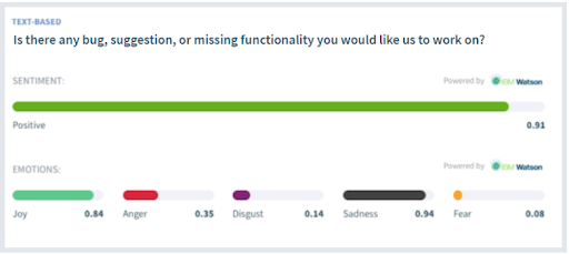
A sub-feature of Sentiment Analysis, word cloud enables you to see the keywords used to conjecture the emotional flow of survey responses.
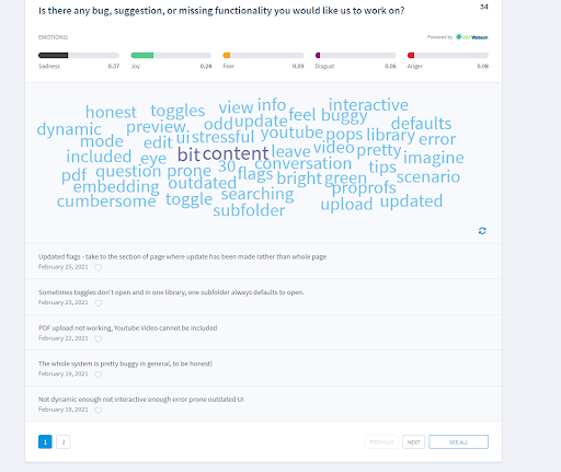
A word’s size indicates its occurrence in the feedback; for instance, the bigger the word, the higher is its occurrence. So, if you want your quote to convey a specific emotional tone, you can pick and browse through the responses using those keywords.
Although the process is still manual to some extent, it saves you the need to look at each response individually. You can also bookmark responses for future reference to avoid getting lost in the pile of data points.
6. Reassess Compiled Data to Ensure You Have Everything Crucial
All of the above steps boil down to your accumulated data. At this stage, you have ample hard facts you can use to present essential points. Before you begin to assimilate the data to turn it into a story, you need to be sure it’s relevant.
The fear of leaving behind valuable data is real, which is why we often end up choosing a lot. It’s easy to be intimidated by lots of data and lose track of what is actually relevant and what seems relevant. It’s okay to do so since this is the stage where you shortlist crucial data from the irrelevant data.
Once you have the core information you know is appropriate to present, you can start cooking your delectable and digestible story. Let’s find the best way to serve your story in the coming steps.
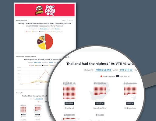
7. Employ Results Dashboard as Data Visualization
Survey tools with reporting and analysis features allow you to see survey results in the form of bars, graphs, charts, and other visualizations to make them understandable.
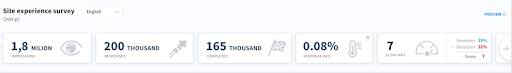
It can be as straightforward as the image above telling you the basic information about the survey conducted, or it can be as expressive as the image below.
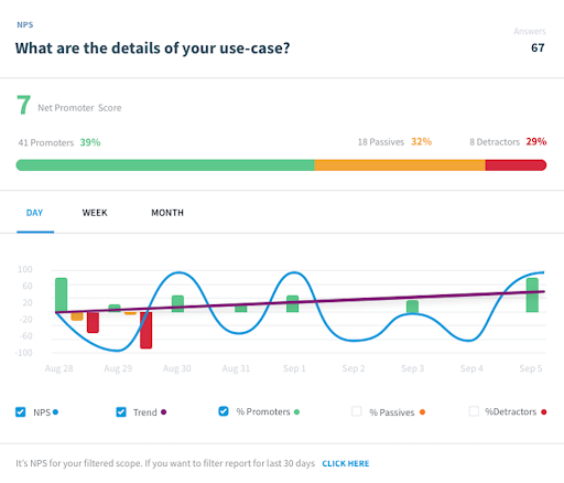
You can utilize this data and add your narrative to it as a part of your story. Sometimes, visual data alone isn’t the most effective way to bring your point home to others; thus, adding a little bit of text such as conclusions will help others understand your point.
8. Create Crosstab Reports to Present Overwhelming Data Effectively
You should not dump loads of data without strategically placing it into your story accompanied by an explanatory narrative for the same.
For your story to effectively present your point, you can leverage crosstab reports to display a lot of data in an organized manner. You can add some text to it to make it a part of your story and help others get the crux of the data you’re presenting.
Sometimes you may want others to draw their own conclusions from crosstab reports if the vital information is clear to notice, but if not, turning it into a story will help.
Ways to Create Clear Visuals for Data Storytelling
We’ve established how indispensable data visualization is for great data storytelling. While we’re exhaustively covering all parts, here are some tips to optimize the visuals while storytelling with data.
1. Make your point stand out visually. Whenever using visuals to represent the data in your storytelling, try to design it so that your audience instantly understands what you want to show. For instance, when you want to emphasize the rise in something, try to use bold colors to attract attention to the increase than any other visual component.
2. Don’t stress about the order of text and data in your visual aids. As much as you would like to set a predetermined visual journey for your audience, people tend not to follow any order while scanning a graph or a chart containing data and text.
Unlike reading a book, your audience may follow wherever their eyes take them on the visuals to make sense of the information. They might also focus on some parts more than others. So, try to keep the text as relevant as possible and easy to scan.
3. Provide only one crucial piece of information at a time. If you add more than one, people might get distracted and focus on something else to make their conjectures.
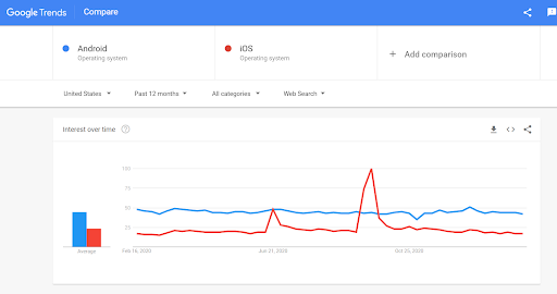
4. Find the right way to present a specific piece of data. For some data types, bars or pie charts may work, while line or column graphs may be better for others. For instance, if you want to highlight the difference in popularity of Android and iOS, instead of using a bar graph, a line graph will be more specific and straightforward.
Impeccable data storytelling may not start with data visualization, but it’s essential to bring the conclusion home.
Watch this in-depth conversation with Patrick Campbell, the CEO of ProfitWell (formerly Price Intelligently), where he talks about supercharging your revenue with a data-driven pricing strategy:
Start Telling Your Story with Data
In the end, data storytelling is the art of visualizing the narrative of the survey data. Every piece of information has the right place and the proper form of expression in the storytelling.
Once you hone arranging and presenting the data, your story will inspire others to act on the hard facts.
Are you ready to weave complex numbers and statistics into an easy-to-digest and comprehensible story? Let’s get you some feedback data with our incredible surveys!
FREE. All Features. FOREVER!
Try our Forever FREE account with all premium features!
 We'd love your feedback!
What did you like & how can we make it even better?
 Thanks for your feedback!
 Ask Your Question
Have a question? Get expert help to make your decision easier.