
You have a flow that’s bleeding users. Your analytics show the drop-off. They don’t show you why. That’s the exact gap a well-placed UX survey closes; not by collecting opinions, but by capturing the specific moment a user got confused, hit a wall, or decided it wasn’t worth the effort.
The goal is not to run formal research or impress anyone with data. The goal is to learn where people feel confident, where they hesitate, and where they quietly drop off.
This guide skips the orientation.
It assumes you already know surveys matter. What it gives you instead: a decision framework for choosing the right UX survey, proven question sets that surface real friction (not polite feedback), and a system for turning responses into decisions your team can ship.
What Do You Need to Know Before Running a UX Survey?
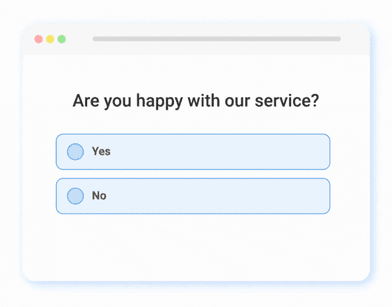
A UX survey is a targeted questionnaire used to gather user feedback on the usability, design, and overall experience of a digital product, website, or application. It typically includes questions about ease of navigation, visual appeal, functionality, and satisfaction. UX surveys help designers and product teams identify pain points, measure user satisfaction, and make data-driven improvements to enhance the user experience.
Before you write a single question, you need a clear goal. If you skip this part, you will usually end up with a survey that collects “interesting” answers but leads to zero decisions.
Start With One Clear Outcome
Ask yourself this question: What do I want to change after I read the responses?
Here are common goals that actually lead to action:
- Find Friction: You want to know where users get stuck in a flow, like signup, checkout, or onboarding.
- Explain a Score: You have a rating like NPS or CSAT, and you want to understand the reason behind it.
- Reduce Drop-Off: You want to know why people leave a page or abandon a key step.
- Validate a Change: You shipped an update, and you want to confirm whether it helped or made things worse.
- Prioritize Fixes: You have multiple issues, and you want to learn which one hurts users the most.
Use the Decision Filter
Before adding any question, ask: What decision will I make based on this answer?
If the answer does not change what you will do next, the question is not helping, and it is usually a fast path to survey fatigue.
Keep Your First Survey Small
If you are tempted to ask everything, you are not alone, and I have made that mistake too. A better approach is to run smaller surveys more often.
A practical limit that keeps surveys friendly is:
- Two to five questions for most UX surveys.
- One main topic per survey.
- One open-text question to capture the “why.”
How to Create a Website Feedback Survey (On-Site Nudge)
Collecting UX feedback directly on your website allows you to capture honest reactions while users are engaged, without interrupting their flow or redirecting them elsewhere.
On-site surveys (called nudges by Qualaroo) appear contextually, such as after a page load, on exit intent, or via a subtle feedback button, and can target specific pages, user segments, or behaviors. I chose this tool because it’s pretty easy to use, and on top of that, you need zero dev help!
Follow these steps using Qualaroo to set up a desktop web-based feedback survey:
Step 1: Start a New Survey
- Log in to your survey platform dashboard.
- Click Create New (usually in the top-right corner).
Choose the channel type suited for website feedback: select a web option, such as Desktop Web (or alternatives like Sidebar Form for a persistent side panel).
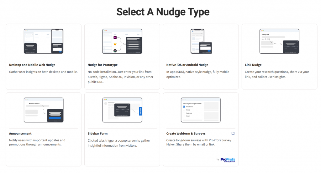
- Decide between:
- New From Scratch — Build everything manually for full customization.
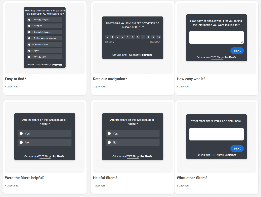
- Choose Template — Start with a pre-built template to save time. Look for options labeled for website feedback, user experience, CSAT, or similar. Common ready-to-use examples include:
- “Rate our website” (quick 2-question ratings)
- “Website feedback” (3-question mix of rating + open text)
- General UX prompts like “What 3 things do you like?” or “What’s missing?”
Here are a few UX survey templates you can choose from:
Step 2: Define Targeting Basics
For web surveys, specify the domain(s) where the survey should appear (e.g., yoursite.com or www.yoursite.com).
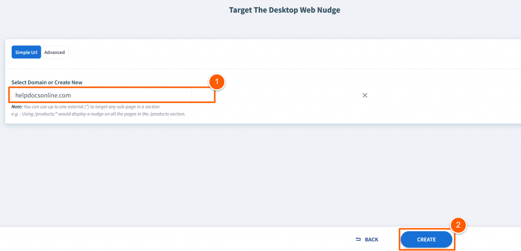
- Click Create or Continue to enter the survey editor.
Step 3: Customize the Survey Content
- Give your survey a clear internal name (e.g., “Homepage UX Feedback – Q1 2026”) for easy dashboard reference.
- The editor typically loads a default setup with a welcome message, sample question, and thank-you screen.
- Build out your questions to gather meaningful UX insights:
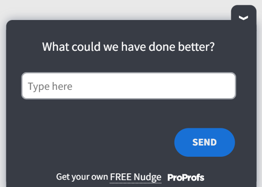
- Edit question text — Make it concise and specific (e.g., “How easy was it to find what you needed on this page?” or “What frustrated you most today?”).

- Add optional descriptions — Provide brief context or instructions if helpful.
- Mark as required — For critical questions where skipping would reduce data quality.
- Choose the best answer type for each question:
- Single-choice or multiple-choice (e.g., “What brought you here today?”)
- Free-text / open-ended (great for suggestions or pain points)
- Emoji / smiley faces or star ratings (quick sentiment capture)
- Numeric scales (e.g., 1–10 satisfaction)
- Likert scales (e.g., Strongly Agree to Strongly Disagree)
- Net Promoter Score (NPS) for loyalty measurement
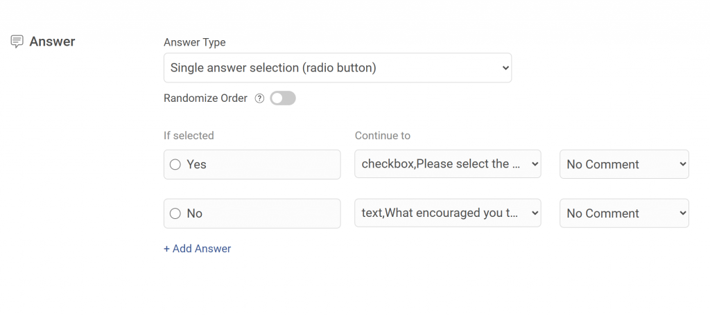
- Add advanced features as needed:
- Branching logic — Show follow-ups only when relevant (e.g., “What specifically was confusing?” after a low rating).
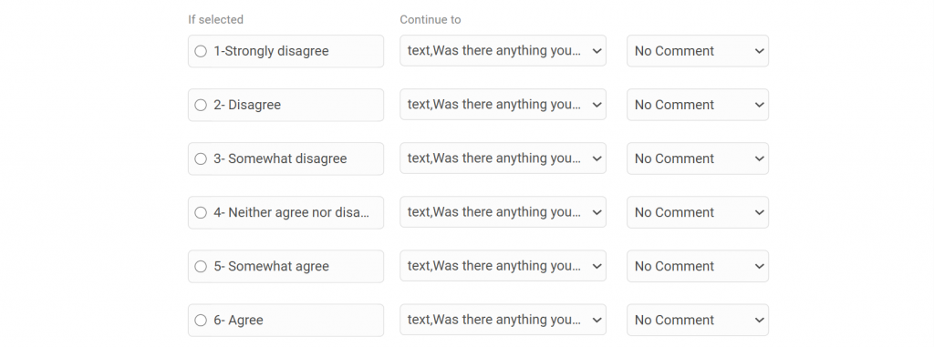
- Multiple questions, screens, or customized thank-you messages.
- Use the built-in preview to check appearance: test desktop view, mobile responsiveness, positioning (e.g., bottom-right corner, full-screen overlay, or subtle tab), and overall user experience.
Step 4: Set Advanced Targeting & Launch
Once your questions and design are ready:
- Move to the targeting/advanced settings section.
- Define precise display rules, such as:
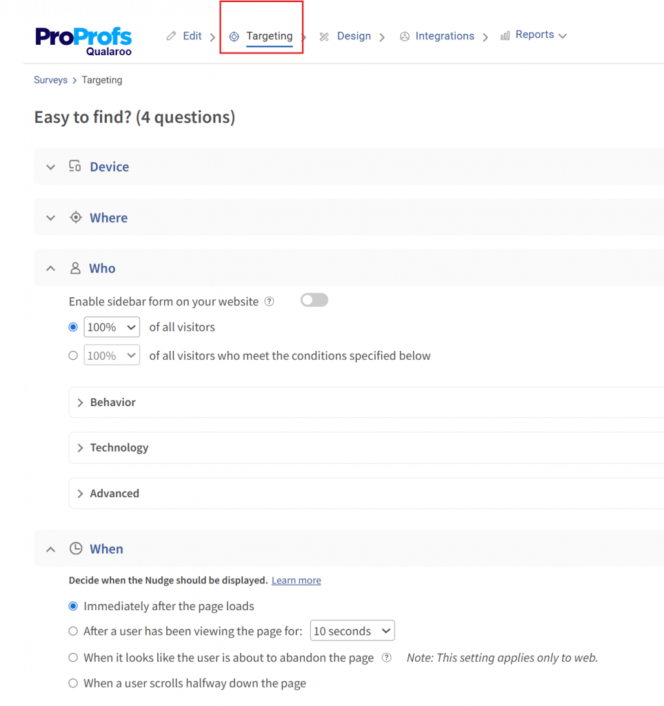
- Specific pages or URL patterns
- User behaviors (e.g., time on page, scroll depth)
- Triggers (e.g., exit-intent, after X seconds, on button click)
- Device types, visitor frequency, or segments
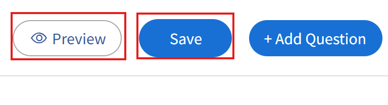
- Review everything one last time in preview mode.
- Activate/publish the survey to start collecting live feedback.
Your on-site feedback form is now live! Monitor responses in the dashboard, analyze patterns in UX pain points or delights, and iterate on your website design accordingly.
This approach keeps surveys short, contextual, and non-intrusive—key to high response rates and actionable UX insights. Start simple with 1–3 questions, then expand based on what you learn.
Which Type of UX Survey Should You Use?
Once you know what you want to learn, choosing the right type of UX survey becomes straightforward. You do not need to use every survey type out there. In most cases, one well-chosen survey will tell you more than three generic ones running at the same time.
Below are the most common UX survey types, explained in plain language, along with when each one actually makes sense.
1. Customer Satisfaction Surveys (CSAT)
Use this survey when you want a quick read on how users feel about a recent interaction or experience.
When This Works Best:
- After a support interaction
- After a purchase or upgrade
- After a user completes a key action
What This Survey Tells You: It shows whether users walked away satisfied or frustrated, and it gives you a chance to learn why.
Simple Example Questions:
- How satisfied are you with your experience today?
- What worked well during this interaction?
- What could we improve to make this experience better?
- Did anything feel frustrating or confusing?
- How well did this experience meet your expectations?
Here’s a quick CSAT survey template you can tweak and use:
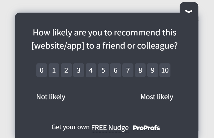
2. Net Promoter Score Surveys (NPS)
Use this survey when users have spent enough time with your product to form an opinion.
When This Works Best:
- For active users
- After repeated usage
- When measuring long-term sentiment
What This Survey Tells You: It helps you understand loyalty at a high level, while follow-up questions reveal what drives that score.
Simple Example Question:
- How likely are you to recommend this product to a colleague?
- What is one thing we could do to improve your experience?
- What do you find most valuable about this product?
- What almost stopped you from recommending us?
Here’s an NPS survey template for you:
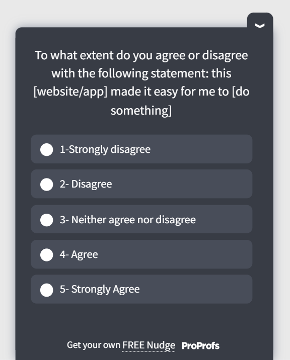
3. Task and Effort Surveys (UES)
Use this survey when you want to understand how easy or difficult something felt for users.
When This Works Best:
- After completing a task
- After a failed attempt
- During onboarding flows
What This Survey Tells You: It highlights friction in specific flows and helps you spot where users struggle.
Simple Example Questions:
- How easy was it to complete this task?
- What slowed you down, if anything?
- Was there a step that felt unclear or unnecessary?
- Did you need help to finish this task?
- What would have made this task easier?
Here’s a quick user experience survey template for you:
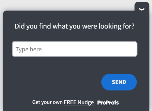
4. Exit-Intent Surveys
Use this survey when users are about to leave without taking the action you expected.
When This Works Best:
- Pricing pages
- Checkout pages
- High-bounce content pages
What This Survey Tells You: It shows what information users were missing or what made them hesitate.
Simple Example Questions:
- Did you find what you were looking for today?
- What stopped you from moving forward?
- Was there any information missing on this page?
- What questions do you still have right now?
- What would have helped you continue?
Here’s a useful exit-intent survey template you can leverage:
5. Onboarding Surveys
Use this survey to understand how first-time users experience your product.
When This Works Best:
- During the first session
- After completing the initial setup
- After the first key action
What This Survey Tells You: It reveals confusion early, before users quietly drop off.
Simple Example Questions:
- What were you trying to do when you first signed up?
- How clear did the next steps feel to you?
- Was anything confusing during setup?
- Did you feel confident using the product right away?
- What would have made getting started easier?
Here’s a survey template you can use to onboard your users well:
6. Prototype & Design Feedback Surveys
Use this survey when you want feedback on designs before they go live.
When This Works Best:
- During usability testing
- While reviewing prototypes or mockups
- Before shipping major changes
What This Survey Tells You: It helps you validate whether users understand the design as intended.
Simple Example Questions:
- What do you think this screen is meant to do?
- What would you click on first?
- Is anything on this screen unclear or distracting?
- Does this layout feel simple or overwhelming?
- What would you change to make this easier to use?
UX Survey Best Practices: How to Get More Responses From Your UX Surveys
At this point, you know what kind of survey to run and what questions to ask. This section is about execution. Small choices here make a big difference in whether users respond thoughtfully or ignore the survey altogether.
Ask While the Experience Is Still Fresh
Timing matters more than most people realize. Feedback collected days later is often vague because users barely remember what happened.
Good moments to ask include:
- Right after a task is completed or abandoned
- During onboarding, once users have taken a few real actions
- When someone is about to leave an important page
- Immediately after a meaningful interaction, such as a purchase or support chat
When surveys appear in the moment, users do not have to guess or generalize. They can respond based on what they just experienced, which makes the feedback far more useful. Here’s a video for you to learn more about creating in-context surveys:
Respect the User’s Time
Long surveys feel like work, and users treat them that way. Short surveys feel like a quick check-in.
A few practical rules that consistently work:
- Keep most UX surveys between two and five questions
- Focus on one experience or action at a time
- Include at least one open-text question, but not more than two
When users see a short survey, they are more likely to finish it and give thoughtful answers instead of rushing through.
Write Questions That Sound Human
Users respond better when questions sound like something a real person would ask. Overly formal or technical language creates distance and confusion.
Here are simple ways to keep questions human:
- Ask how something felt instead of whether it met predefined criteria
- Ask what got in the way instead of why the user failed
- Ask what would have helped instead of what they disliked
Clear, conversational questions reduce friction and make users more comfortable sharing honest feedback.
Make It Easy to Skip or Opt Out
Not every question applies to every user, and that is fine. Giving users the option to skip a question shows respect and keeps them engaged, rather than forcing them to answer questions that do not reflect their experience.
When users feel in control, they are more likely to complete the survey rather than abandon it halfway through.
Make the Survey Feel Like Part of Your Product
A survey that looks and feels disconnected from your product can break trust. Users are more likely to respond when the survey matches the design, tone, and flow of the experience they are already in.
Consistency in visuals and language helps the survey feel like a natural extension of the product instead of an interruption.
Avoid Asking the Same Users Too Often
Even well-designed surveys can become annoying if users see them repeatedly. Spacing surveys out and targeting them carefully prevents fatigue and keeps response quality high.
If users feel like you only ask when it truly matters, they are more willing to help.
FREE. All Features. FOREVER!
Try our Forever FREE account with all premium features!
How to Turn UX Survey Responses Into Product Decisions
If responses sit in a dashboard, they don’t create value. The goal is to turn them into a short list of decisions your team can actually execute.
The 30-Minute Response Triage
- Pull responses from the last 7 to 14 days into one view; don’t review feedback in fragments.
- Read the first 20 responses quickly without analyzing. You’re scanning for repetition.
- Drop each response into one of three buckets: Blocking, Annoying, or Nice-to-Have.
- Count how many responses land in each theme. The largest theme is your first focus.
- Pick one theme to act on this week. Write down the smallest change you can make to reduce it.
Blocking: Users cannot complete what they came to do.
Annoying: Users can complete the task, but it feels harder than it should.
Nice-to-Have: Users have preferences, but nothing is broken.
Fix blocking first. It unlocks growth faster than anything else.
The Signal Checklist
Feedback is a signal worth acting on if:
- It appears repeatedly across different users
- It’s tied to a high-value flow: signup, onboarding, checkout, or activation
- It names a specific moment, step, screen, or expectation
- It matches behavior data you already see, such as drop-offs, repeated attempts, or support volume
If it’s vague and isolated, it’s noise. If it’s repeated and specific, it’s worth acting on.
Turn Feedback Into a One-Page Action Note
What We Heard: The theme in one sentence.
Where It Happened: The page, flow, or step.
What It’s Costing Us: Plain language, such as “Users are abandoning checkout” or “New users can’t finish setup.”
What We’ll Change Next: One small fix you can ship.
How We’ll Know It Worked: One measurable outcome, such as fewer exits, fewer complaints, or higher completion.
Example:
What We Heard: Users can’t tell what’s included in each pricing plan.
Where It Happened: Pricing page.
What It’s Costing Us: Visitors leave without starting a trial.
What We’ll Change Next: Add a feature comparison row and clarify the plan names.
How We’ll Know It Worked: More visitors reach the signup page; fewer exit-intent responses mention missing information.
Make Feedback Hard to Ignore
Don’t open internal reviews with a chart. Open with three user quotes that all say the same thing in different words, then show the pattern count. People argue with opinions. They don’t argue with repetition.
Close the Loop
A short in-product note, a release callout, or a targeted follow-up to affected users is enough. The point is to show users that feedback leads to change; that’s how you earn better response rates over time.
UX Survey Mistakes That Corrupt Your Data (and How to Fix Them)
Most UX survey mistakes are not dramatic. They are small, well-intentioned decisions that quietly reduce the quality of feedback, and they happen even in teams that genuinely care about user experience.
| Mistake | What Happens | Quick Fix |
|---|---|---|
| Treating UX Surveys Like a Form, Not a Conversation | Users rush, skip, or give bland answers because it feels like homework. | Write questions like you would ask a real user in a real conversation, and keep the intro minimal. |
| Asking Questions Without a Clear Use | You collect “interesting” data that does not lead to any decision. | Add only questions that will change what you do next, and cut anything that is only nice to know. |
| Using Vague or Leading Questions | You get biased feedback or responses that are too broad to act on. | Ask specific, neutral questions tied to a task, screen, or moment. |
| Using Overlapping Answer Options | Data becomes messy because users do not fit cleanly into one choice. | Make ranges mutually exclusive and exhaustive so every user fits one option clearly. |
| Relying Only on Scores | You get numbers without the “why,” so it is hard to know what to fix. | Pair every rating question with a short open-text follow-up asking for the reason. |
| Ignoring Feedback That Is Inconvenient | Trust drops internally and externally, and the same issues keep repeating. | Track top themes, pick one fix to ship, and communicate changes back to users when possible. |
| Letting Feedback Sit in a Dashboard | Insights never turn into action, and surveys become busywork. | Convert themes into owners, next steps, and a success metric, then review weekly. |
| Surveying the Same Users Too Often | Users feel annoyed and stop responding altogether. | Space surveys out and limit frequency per user so surveys stay welcome. |
Final Thoughts: How to Start Your First UX Survey Today
If you take away just one thing from this guide, let it be this: UX surveys work best when they are simple, timely, and tied to action. You do not need a perfect setup or a long list of questions to get started. You just need to be clear about what you want to learn and be willing to listen to the answers.
The real value of UX surveys shows up when feedback leads to change. Fix one thing. Improve one flow. Make one decision easier for users. Over time, these small improvements add up to a noticeably better experience and fewer surprises in your metrics.
You do not need to overthink this. Start small, stay curious, and treat every survey as a conversation with the people using your product. With the right questions and the right timing, tools like Qualaroo make it easy to start and learn from the conversation.
Frequently Asked Questions
What is the difference between CSAT, NPS, and CES surveys?
CSAT measures satisfaction after a specific interaction. NPS measures long-term loyalty and likelihood to recommend. CES measures how much effort a user had to exert to complete a task. Use CSAT after support or purchase moments, NPS after repeated product usage, and CES after key flows like onboarding or checkout.
When is the best time to send a UX survey?
The best time is immediately after the experience you want feedback on, while it is still in the user's working memory. Surveys triggered in-session or within minutes of task completion produce more accurate and specific responses than surveys sent 24 to 48 hours later.
How do you write unbiased UX survey questions?
Avoid leading language like "How much did you enjoy..." and replace it with neutral phrasing like "How did this feel?" or "How easy was this to complete?" Ask about specific moments rather than general impressions, and always offer an opt-out or "not applicable" option so users aren't forced into answers that don't reflect their experience.
What should I do when UX survey responses contradict each other?
Contradictory responses often reflect different user segments experiencing the same flow differently. Before acting, filter responses by user type, entry point, or behavior. Look for the response pattern that aligns with a measurable behavior signal, such as a drop-off rate or support ticket volume, and prioritize that one.
How do I get more users to complete my feedback survey?
Keep the survey to three questions or fewer for in-session placements. Match the visual design to your product so it feels native rather than intrusive. Trigger it after a completed action, not during one. Giving users the ability to skip individual questions also increases overall completion rates.
What is a good NPS follow-up question to ask detractors?
The most effective follow-up for detractors (scores 0 to 6) is: "What is the primary reason for your score?" followed by "What is the one thing we could change that would most improve your experience?" Avoid asking detractors the same questions you ask promoters; their friction is specific and different in nature.
How do I analyze open-ended UX survey responses?
Read the first 20 responses without categorizing to identify natural patterns. Then sort all responses into three buckets: Blocking (user could not complete the task), Annoying (user completed it but with unnecessary friction), and Nice-to-Have (a preference with no real friction attached). Fix blocking issues first, as they have the highest impact on conversion and retention.
How do I present UX survey findings to stakeholders?
Lead with two or three direct user quotes that illustrate the same problem, then show how many responses reflect that pattern. Stakeholders are more likely to act on repeated user language than on charts alone. Follow with a one-page action note that names the problem, the cost, the fix, and the success metric.
How often should you survey your users?
There is no single rule, but most users should not encounter a survey more than once every 30 days. Frequency should be governed by the user's journey stage, not by your internal reporting cadence. Surveying too often is one of the fastest ways to suppress response quality and generate fatigue.
FREE. All Features. FOREVER!
Try our Forever FREE account with all premium features!
 We'd love your feedback!
What did you like & how can we make it even better?
 Thanks for your feedback!
 Ask Your Question
Have a question? Get expert help to make your decision easier.
