Ever since brick-and-mortar businesses took the back seat in the digital age, the online experience has ruled the customer realm.
Today, your first interaction with prospects isn’t in a conference room or your favorite Chili’s [Guilty of The Office reference], but on your website.
Can you guess where we’re headed? (Hint: To prioritize improving website user experience)
Most of the time, people use the internet to search for products and services. It means your business’ first impression depends on how the prospects interact with your website and the kind of experience they have.
Ipso facto, you have to be on top of your game and constantly improve your website user experience.
A good customer experience results in endless benefits, from boosting positive word of mouth to reducing churn rate.
But the biggest question is – HOW?
Well, here’s how; leverage these kickass 20+ best practices to ace your website UX.
What Is Website User Experience?
In simple words, website user experience is defined as the quality of interaction people (call them prospects, customers, etc.) have with your business through your website. It’s about offering hiccup-free navigation and a seamless experience while browsing.
But you may wonder – “what defines a good website user experience?”
A few indicators are:
- Customers staying on your website and landing pages without bouncing off
- Visitors navigating through multiple pages
- Prospects interacting with the page CTAs and adding products to the cart
- Customers completing the checkout, and more
Why Is Improving the Website User Experience so Important?
Let’s start this with some solid statistics:
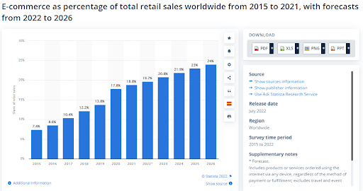
- By 2026, the e-Commerce share in retail sales globally increased to 24% from ~19.7% in 2022.
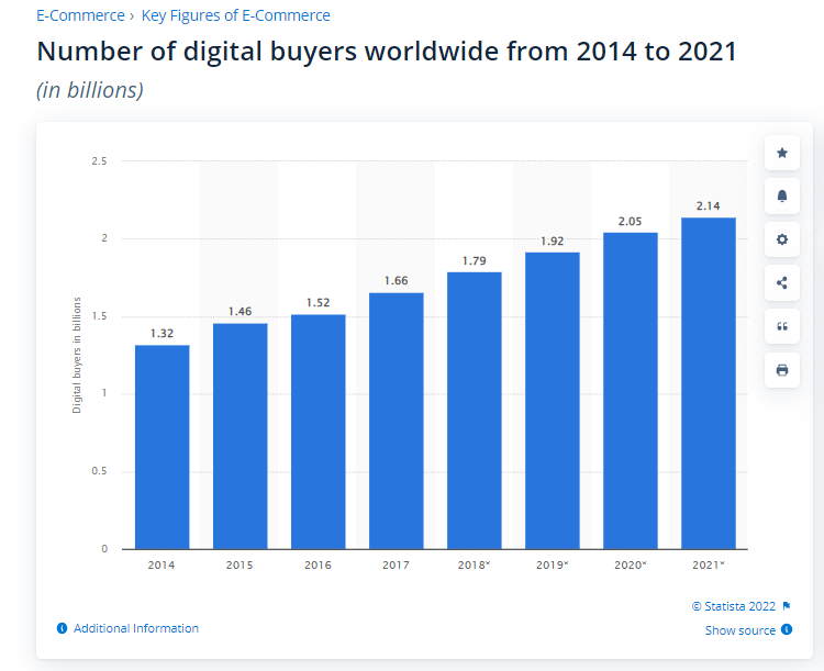
- In 2021, the global digital buyers count reached 2.14 billion, which increased in 2022.
Do you see where all these statistics point at?
Designing a robust and unparalleled website experience is becoming a norm, with no room for exceptions.
A website is a powerful tool for any business in today’s digital marketing landscape. It is a salesman that works round the clock, ensuring clients can find your services/products anytime, anywhere in the world.
To ensure your website converts visitors and brings in sales, you must deliver an impeccable user experience.
Improving your website user experience makes it better to navigate, making it easy for users to find their way around your online store. A good user experience also influences the purchasing process by guiding visitors through their journey and helping them make informed choices.
A good user experience means your website loads fast enough, pages are easy to find, and the checkout process is effortless.
To improve the website user experience, you first need to know the visitors’ pain points whenever they visit the website and then work to resolve these issues to deliver the best UX.
20+ Best Practices for Improving Website User Experience
Now that we know why great website user experience matters let’s jump right into how to nail it with these best practices:
1. Perform User Research to Listen to Customers
For a successful business venture you need to hold the clients’ opinions in high regard. Ignoring what the customers say sets you up for failure since you cannot tell their pain points. Listening to your clients can provide insights into improving your products and services and your website’s user experience.
You can use different types of surveys depending on your purpose. For example, you can use customer satisfaction surveys to gauge the satisfaction level of customers or use NPS to find your loyal customers.
In the survey, you can include a rating button. Below the button, you can include questions such as:
- What should we do to enhance your experience?
- Which features would you be interested in seeing in the future?
- Have we met your expectations?
These questions enable the visitors to tell you what they want so you can improve their website user experience. For example, if most visitors say they had difficulty finding pages or items, it’s time to add a search button to improve the website user experience, or better yet, use the Breadcrumbs scheme to the website for seamless navigation.
CASE STUDY: UDEMY
As you may already know, Udemy is an industry leader in the e-learning domain, offering free and paid courses worldwide.
Since the company has users from across the globe, it was time for them to introduce the auto-captioning feature and make the courses accessible to people from different countries.

Of course, they couldn’t leave it at that and launched surveys using Qualaroo to get feedback on this new feature. As a result, Udemy improved the feature to offer a flawless learning experience.
2. A/B Test Using the Feedback
No website is perfect in the first go. And since it is meant to be for customers, who better tell you how it should be?
So, if you have a website prototype or a fully functional website, a top-tier combination of A/B testing and customer feedback can give you powerful insights.
You can test multiple variations, collect feedback on the changed variables, and compare the results to build the best version of the website.
For example, if you want to A/B test your homepage CTAs due to high bounce rate, you can experiment around with the CTA button and place it at different places with different designs to see where it works the best.
More so, you can also leverage heat maps tools in your A/B testing to identify the most interactive areas on your website and start with placing your CTAs there.
Click on this A/B testing detailed guide to explore how you can extract the best out of your testing endeavors.
CASE STUDY: KINGSPOINT
KingsPoint agency helps its clients increase their conversions through bespoke solutions. The company uses Qualaroo’s surveys to assess its clients’ unique needs, customers’ experiences, and feedback to improve conversions.
But that’s not it. Kingspoint used a combination of surveys for feedback and split testing into multiple high-value pages to boost the conversion rate.
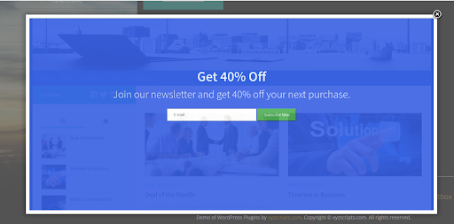
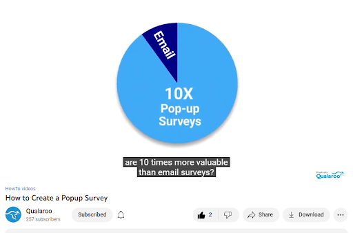
3. Use Pop-Ups Smartly
Pop-ups are undoubtedly a great tool to grab visitors’ attention on the website and let them interact with critical CTAs. But too many pop-ups can hinder the user experience on the website. They surely become an obstacle to a smooth and improved website user experience.
How?
Because if new visitors are bombarded with pop-ups as soon as they land on your website, they may get annoyed and bounce off immediately.
Some visitors may be using pop-up blockers, but the rest don’t. To create a flawless website UX, you have to collect the required visitor information using pop-ups without overwhelming them.
Here are a few things you need to keep in mind:
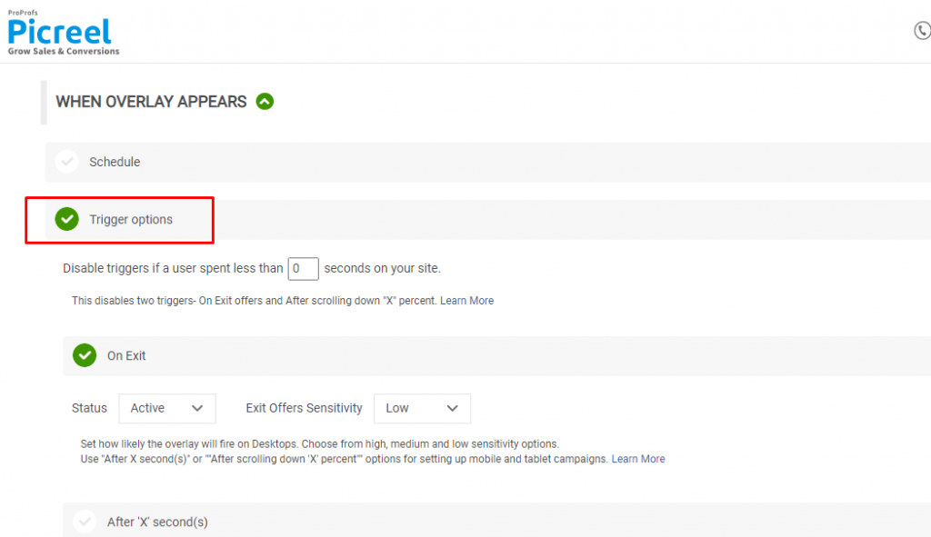
- Consider the placement, design, frequency, and timings of pop-ups when launching them on your website. You can use tools like Picreel to create intuitive and customized pop-ups and manage the triggers that control all the factors mentioned above.
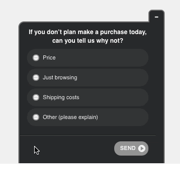
- You can also create exit-intent surveys Nudges with tools like Qualaroo to understand user experience without disturbing their website experience.
- Avoid showing multiple pop-ups at once.
- Don’t create pop-ups that cover the entire screen and hinder the UX.
Related Read: 11 Best Exit-Intent Popup Tools to Increase conversion In 2026
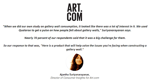
CASE STUDY: ART.COM
ART.com is an online platform using AR technology to help customers buy art online. Since the website is a state-of-the-art product, they wanted to know how it’s doing with customers and the kind of customer pain points they face.
According to the Director of Consumer Insights, Ajantha Suriyanarayanan —
4. Treat Content as Primary With Design
Not just in marketing, but content plays a huge role in improving the website design user experience that leads to conversions.
Content helps customers understand your product offerings, learn about your brand, and explore the use cases. So, without actionable content, you will only have an aesthetic website with nothing real to add context and credibility for visitors. And without design, you will have a website that’s not compelling.
So, to improve user experience on the website, it’s best to use both to find an equilibrium that works for you.
For example, if you offer complex products/features, you must design a content strategy to educate your prospects. But if your offerings are straightforward, then simple and elaborative product pages will do.
💁♀️Pro Tip:
Use behavior analysis tools like heatmaps to find the most attractive areas on your website and place the most relevant and influential content there.
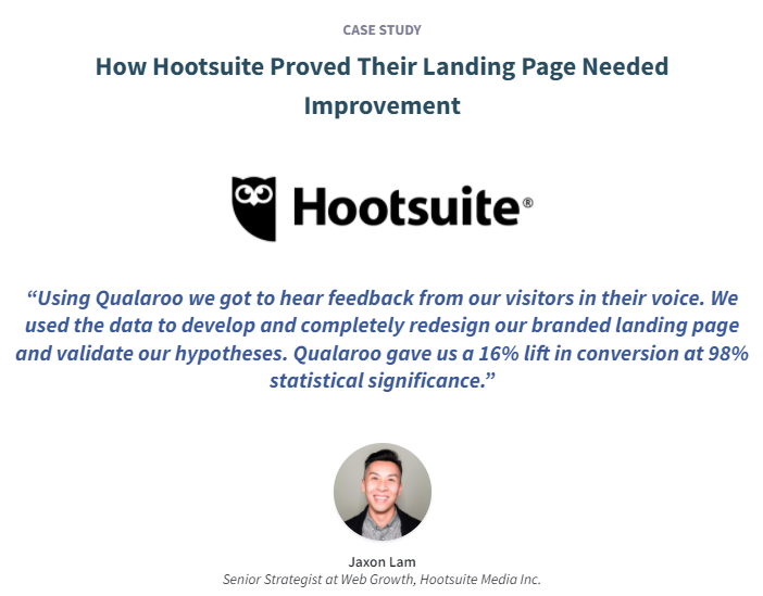
CASE STUDY: HOOTSUITE
Hootsuite helps manage its users with multiple social media accounts in one place. The platform faced a high bounce rate on its product homepage.
To get to the bottom of this behavior, they add Qualaroo surveys to the page. They figured out that they had focused on the intricate features of the tool and didn’t explain the principal features and how the tool works.
With such insights, Hootsuite was able to redesign its content strategy as well as the website design to be more lead-friendly.
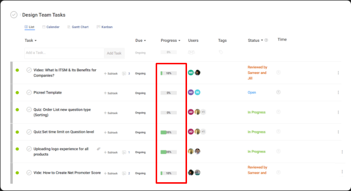
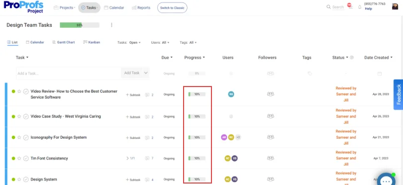
5. Motivate Customers by Showing Task Progress
A Russian psychologist, Bluma Zeigarnik, found that remembering unfinished tasks compared to completed ones. So, when they complete the task, they get maximum satisfaction.
While designing your website, you can use this phenomenon and employ the ‘goal-gradient effect.’ This way, visitors are more likely to return to complete an action and not churn away.
For example, the project management tool, ProProfs Project, shows the progress made on each project to keep them fueled with motivation to complete the project.
6. Making It Easier to Get Help
If you think hiding the customer support options under layers of steps in the case of return/exchange will reduce your support tickets, think again.
It’s a horrendous website user experience if customers have to find a way to connect with your brand representatives.
And it’s also important to provide customer support as soon as possible to maintain certain customer satisfaction metrics. Because if you do, users are 2.4X more likely to continue with you.
So, how can you offer optimal assistance at every step of the customer journey to provide an outstanding user experience?
Enter self-help tools.
Software such as automatic chatbots and ProProfs Knowledge Base allows your users to independently find answers to small questions and queries without waiting for customer service.
Besides this, you can also set up live chat, a dedicated Contact Us page, and detailed FAQs section to offer multiple ways to get information and help.
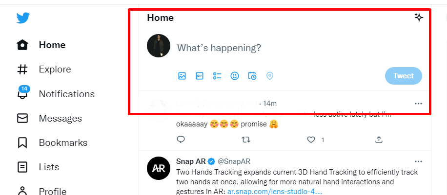
7. Make the Elements Accessible
How you place action items decides how functional they will be for customers. For instance, if your CTA buttons are too small or placed without a strategy, the click-through rate will be lower than you’d like.
For example, see how Twitter places its new tweet CTA right in the center to draw users’ attention immediately.
A few things to keep in mind while designing your website are:
- Keep the design convenient
- Make it interesting but not confusing
- Prioritize visual hierarchy
- Keep the design consistent throughout
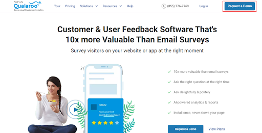
8. To Highlight Elements, Isolate Them
One of the website design standards is to isolate things to make them stand out from other page elements. Like how Qualaroo does, place your CTAs and other important elements in isolation, so they easily grab users’ attention.
9. Maintain Consistency and Familiarity in Design Elements
As per Jakob Nielsen’s Law of Consistency in “Usability Heuristics for User Interface Design,” users expect your website to perform similarly to other websites and have the same patterns.
For example, an element that looks like a button should be clickable, and a camera icon should open up a camera and not do something entirely unrelated. These two are examples of external consistency.
In internal consistency, you should keep the functionality of similar elements and components consistent throughout your website.
But why is maintaining consistency so crucial for an impeccable website UX?
If you employ elements unfamiliar to the users, they will bounce off the website and abandon your business altogether.
For example, the UI elements on the Evernote mobile app and website work similarly, offering a consistent and improved user experience.

10. Design Aesthetic Website to Appeal to Customers’ Senses
The first thing a website visitor notices on your website is the aesthetics of the UI design. Such designs are more attractive, intuitive, and easy to use for prospects.
So, you must focus on the aesthetics of your website and keep the design uncluttered for smooth navigation.
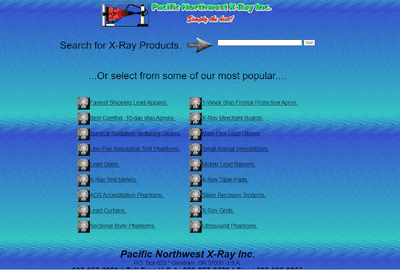
For example, here’s a website with just functionality and no design:
Now, look at the website of Boosted USA and see how they’ve used a perfect amount of dynamic elements with a clean UI and clear CTAs.
To ensure your website has the aesthetic touch, you can follow the color psychology and build a color pallet that resonates with your company’s messaging.
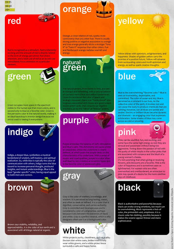
Image Source
Another example of an aesthetically pleasing and dynamic website is the ProProfs Training Maker:
11. Balance Aesthetics and Functionality
Sure, aesthetics are crucial for an unforgettable website user experience and customer engagement, but not at the expense of functionality. Your website should be easy to navigate, and customers can quickly find what they are looking for.
For example, simply focusing on aesthetics like this website confuses visitors. So, it’s better to find the right balance and create an interesting website to look at and get the job done.

12. Avoid Offering Too Many Choices at Once
Offering too many choices increases the cognitive load on the visitors, delaying their decision-making. So, despite your good intentions, try to keep the choices to a minimum.
You can categorize your products, break down complicated tasks into steps, and keep the navigation crisp and uncluttered. All this will surely improve your website user experience and boost conversions.
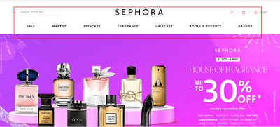
For example, here’s how Sephora makes it easy for customers to navigate and choose the products:
13. Leverage Empathy Mapping to Create a User-Friendly Website
Using human psychology is a great way to optimize your website and make it exactly what the users need. One way to leverage psychology is through empathy mapping.
It lets you dive into customers’ minds and understand their overall experience, how they perceive the design, and make purchase decisions to enhance your website experience.
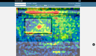
You can also use tools that help uncover users’ behavior, along with empathy mapping. You can use heat mapping tools to perform behavioral analysis and discover their thoughts, habits, and what attracts them.
For example, you can use SessionCam and Qualaroo integration to collect contextual feedback for behavior and website user experience monitoring.
You can target underperforming pages and sections on your websites with contextual surveys and use their feedback to visualize users’ attitudes and behaviors in an empathy map.
Gathering accurate feedback data and using it properly in empathy mapping can reveal gaps in your existing user data.
Here are a few examples of how empathy mapping can help you in UX designing:
- Capture user persona
- Creates a shared understanding of user needs
- Helps with user research, etc.
14. Improve Your Load Speed
According to Jacob Neilson, users’ attention span is only about 10 seconds. That means if your page load time is more than this limit, users are likely to become frustrated and bounce off from YOUR website to your COMPETITORS’.
Another study states that the average load time for a website should be 10.3 seconds.
The question is, ‘What can you do?’
Well, to improve user experience on the website, you can utilize a tool named PageSpeed Insights by Google to analyze the load speed of your website pages.
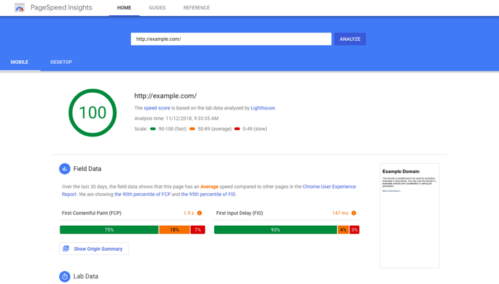
Image Source
It brings the UI elements that increase the load speed to the limelight. You can simultaneously perform user experience website testing (A/B testing) to see what works best.
A few tips on how to improve your page load speed are:
- Use CDN to load the images,
- Optimizing the image sizes
- Declutter the HTML and Javascript on the page
- Choosing a fast e-commerce hosting provider to ensure fast speeds and uptime
- Reducing number of unnecessary widgets on the pages to avoid extra loading elements
15. Go Beyond the Personalization Threshold
Personalization is ubiquitous. From Alexa to e-Commerce websites, every business is competing to offer the best personalization among the competitors.
And so, you need to go beyond the basics of personalization and dive deep into your users’ behavior.
So, how can you improve on the personalization front?
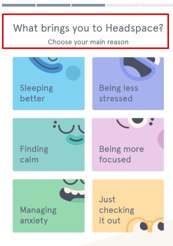
You can use customer usage data through analytics and feedback to introduce personalization in your processes. For example, Spotify releases “Spotify Wrapped” at the end of each year to let users know their listening habits and preferences.

You can collect crucial customer insights to tailor your services and solutions at the onboarding stage. For example, Headspace asks a bunch of questions at the onboarding stage to suggest appropriate media for them.
However, if you can’t go into an elaborate onboarding process, you can use pop-up surveys to get the job done. For example, you can ask behavioral questions to personalize your recommendations:
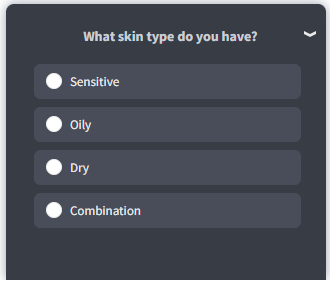
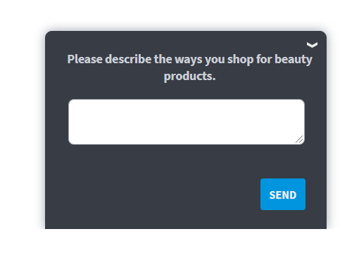
You can follow-up on the above question by asking their preferences and what changes they would like to see.
16. Optimizing the ‘Limbo’ Stages
Customer journey mapping is not just about getting your leads from consideration to conversion; it’s also about making the transitions between each touchpoint seamless and smooth.
So, you must optimize the ‘limbo’ stages between touchpoints to give an overall flawless website UX.
Let’s understand this better with an example.
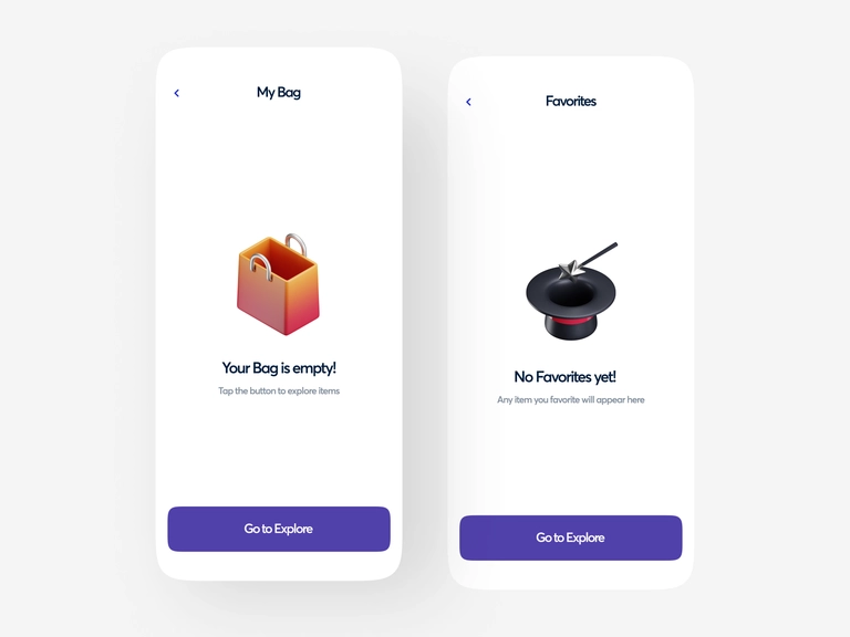
Suppose you have an e-Commerce website, and you’ve planned everything from the home page, product page, and checkout page. But what about the limbo stage: when the customer hasn’t added any product to the cart?
We get it; sometimes, it’s not easy to identify these limbo stages during designing. But it’s okay. Designing a website is an iterative process; you can always improve it to suit your users’ needs.
For that, you can brainstorm these questions with your teams to identify the transition stages besides looking for gaps in the customer journeys:
- What will the website visitors see once they complete an action?
- What will they see while transitioning from one screen to the other?
- What will the visitors see when a task is in progress?
- What will the website visitors see when the internet connection is abruptly lost?
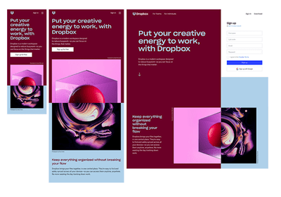
17. Ensure Mobile-Friendliness & Responsive Design
Around 60% of all internet users search for products and services using mobile phones. Ipso facto, you need a responsive website on mobile devices to ensure you don’t miss out on this incoming traffic.
When designing your website, ensure it is optimized for mobile devices and that the pages can load properly.
Having a website that is not mobile-friendly can seriously affect your search engine rankings.
Here are some common ways to make your mobile-friendly:
- Providing the information you’d find on a desktop optimized for mobile devices.
- Place buttons at the screen’s bottom, so they are nearer to the thumb.
- Ensuring users can interact with your pages with a single touch.
You can also access this on-page SEO checklist to optimize your website for search engines.
Dropbox has done an excellent job ensuring its website is responsive across all devices. They use an arrow to help users scroll through the site, while the same arrow is absent in mobile devices since users will naturally scroll using touchscreen capabilities.
18. Use Whitespace Generously & Wisely
While white spaces can be used for advertisement for more revenue, they are critical to the website’s design and functionality. They make it easier for the visitors to focus on the elements around the text and ensure the content is legible.
White space around titles and text can increase the user’s attention. They also make a website feel and look more open, uncluttered, and modern. It helps to communicate your brand’s ideas to the users.
Like everything else, white spaces also have their drawbacks. They take up space that could otherwise be used for valuable information on your website.
The key to using white space effectively is finding a balance between communicating what’s important and the page’s aesthetics.
Sara Does SEO by Sara Dunn is a good example of how best to use white spaces. The white spaces draw attention to the important content of the page, i.e., the product offering and the website is soothing to the eyes.
Formatting your website text can make it more user-friendly and easier to read, improving customer experience.
Some of the ways you can format text on your website include:
- Using Sans-serif fonts like Arial, Helvetica, etc., that are easier to read on digital screens than fonts like Georgia, Times New Roman, etc.
- Using appropriate headings to make it easier for the reader to find what they need.
- Using short paragraphs instead of long blocks of text to make them more scannable.
- Adding bullet lists to make key information more visible.
- Highlighting key terms to make it easy for people to scan through your content.
19. Offer Seamless Navigation
The navigation elements on your website pages guide your visitors to popular pages and the most viewed products. To make the most of this feature, your website should have clear navigation written in simple navigation heading language.
Remember that visitors have an idea of where they would want the navigation to go, and if yours is outside the norm, it may increase the bounce rate since it makes it hard for them to find what they want.
An intuitive website layout will allow visitors to access all key features at a glance, making the website more accessible.
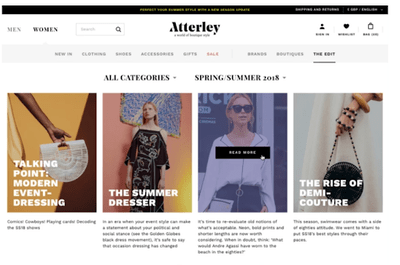
Atterley is a great example of a company that uses its product navigation to direct users’ attention to its product.
You can also use usability testing to improve your website navigation. For example, you can use a survey tool like Qualaroo to create five-second tests to get visitors’ first impression of your website and how you can improve it.
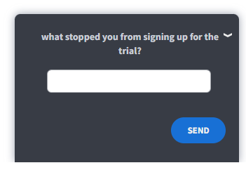
20. Avoid Misleading CTAs
You should be careful of the CTAs you use on the website. Misleading CTAs may bring the visitors to the desired page but won’t help convert them. People would simply bounce off the page leading to a poor user experience (UX).
For example, if you see a CTA saying, “Try our free trial,” you expect it to collect your information and get you started for free. But if the CTA redirects you to the payment page, that’s misleading and may lead you to abandon the website altogether.
So, always double-check the CTAs you place on the website.
You can use tools like heatmaps to see the most engaging CTAs and whether customers stick to the redirect page or abandon it.
You can also perform A/B testing and collect customer feedback using surveys on your CTAs. All this will help you create and place CTAs that work for you and the website visitors.
21. Use Proper Page Redirects
Most people are familiar with the 404 redirect that notifies a browser when a URL is no longer in existence. But there are plenty of other redirect codes used in websites, such as:
- 301, signals a permanent relocation of a page to another URL
- 303, another redirect that moves you to a new URL
- 307 temporary redirect that tells the page you want has temporarily moved to a new location
Websites require redirects for different reasons, including:
- To direct traffic to a similar item if the old one is removed
- Redirecting traffic to your homepage after removing a special landing page
- After consolidating different product pages into one leaving you with multiple outdated URLs
- After changing the store’s URL structure
The right redirect on a page ensures visitors do not see the ‘404 error’ or a purged page. It would unnecessarily complicate their journey to the end of the sales funnel and may lead to the visitor abandoning the website altogether.
The Best Website User Experience Is Just a Few Tips Away
Now you know what it takes and how to improve your website user experience. So, let us tie a neat bow and sum it up for you with this website user experience checklist:
- Listen to the voice of your customers using surveys and behavior analytics to create the website design user experience they want.
- Create a solid content strategy along with the design to align the users’ needs and preferences with the product messaging.
- Balance the aesthetics with functionality to engage the visitors without overwhelming them.
- Think of the transition states to provide a seamless user experience across every device.
- Don’t forget about personalization.
So, that’s it. As long as you follow these website user experience design best practices and keep track of your user’s behavior, you’re covered.
FREE. All Features. FOREVER!
Try our Forever FREE account with all premium features!
 We'd love your feedback!
What did you like & how can we make it even better?
 Thanks for your feedback!
 Ask Your Question
Have a question? Get expert help to make your decision easier.