If a landing page is like a sales pitch, landing page testing helps you deliver the perfect pitch and earn new customers.
But how much effect can experimentation bring in?
- A simple color change for the CTA can increas opt-ins by 86% on the landing page.
- Switching from light to dark background without changing anything else can land 10% more conversions.
This is just the tip of the iceberg. You can come up with other simple ideas that can profoundly affect your landing page conversions.
But these ideas don’t just fall out of the sky.
It’s the result of a very targeted planned approach. Yes! Landing page testing and optimization.
It is a meticulous strategy to redefine your landing pages for the target audience, one element at a time.
That’s why we’ve compiled this blog. By the time you’re done reading it you’d start building a landing page test strategy for your business right away.
What do we have in this blog for you?
- Ideas on what to test on your landing page.
- Case studies of big and small businesses that successfully implemented landing page tests to achieve great results.
Let’s start with the basics first.
What is Landing Page Testing?
Landing page testing is a part of the page optimization process that focuses on optimizing different page elements to maximize conversions or signups.
It is a multi-step structured approach for continuously improving the landing page optimization by changing small elements without redesigning the entire page in one go.
Here’s what a typical landing page testing process looks like:
- Using customer and analytics data to identify which elements need to be improved on the landing page.
- Building a clear hypothesis to showcase what needs to be changed in the elements like color, text, position, etc.
- Creating an altered landing page version called variation with the proposed changes in the elements.
- Setting up clear goals to measure the performance of variation and original page.
- Running the landing page test.
- Segmenting and analyzing the data to declare the winner of the test.
- Deploying the solution.
Even if the tests fail to yield a successful result, the data is used to extract insights for successive testings.
Types of Landing Page Testing
There are three experimentation techniques used to test landing pages. Each technique offers different testing opportunities and methods. Let’s quickly go through each of them:
1. A/B Testing or Split Testing
A/B testing lets you test one page element at a time. You can create multiple variations of the same element. Each variation slightly differs from the original page in terms of color, text, size, orientation, etc.
The original page is called control, and the altered version is called variation.
A/B testing or landing page split testing is one of the most used landing page optimization methods and is relatively simpler to set up than other methods.
2. Multivariate Landing Page Testing
Unlike A/B testing, multivariate testing lets you test multiple elements simultaneously in a single test. It also accurately measures the impact of each element on the conversions.
You can see which changes produced a positive effect and which ones did not impact the test results. Since it is more complicated than A/B testing, the setup and execution require more time and effort.
3. Split URL Testing or Redirection Testing
Every variation and control is hosted on individual URLs in Split URL testing. The traffic is also split between URLs during the test to measure the set goals.
It differs from A/B testing, where both pages use the same URL. Another difference between the two methods is the level of changes you can make in split URL testing.
This method measures only the overall change in each page’s conversion rate without considering the impact of each element.
It means you can overhaul the entire page design as long as the set goals are the same for each page.
How Important Is It to Test Your Landing Page?
Test, test, test, till you succeed!
Alright, we may have changed the phrase, but it’s still true. To create a landing page that converts, you need to build a targeted experimentation strategy.
It takes the guesswork out of the equation and makes it possible to attract the right audience to the page.
1. Helps to Locate Unknown Issues
No matter how vigilant you are, issues can creep up at any point.
You might not be aware of them, but your customers are.
These issues can prevent visitors from completing their desired actions or frustrate them, resulting in an underwhelming experience.
For example:
- Your CTA link may not be working, causing visitors willing to convert to bounce off the page.
- The page might be taking too long to load due to unoptimized images or other technical issues. It can impact the page’s SEO, bounce rate, and conversions.
Regular landing page testing can help you pinpoint and weed out these issues.
You can also combine data from surveys or feedback forms to locate such issues in time and resolve them.

2. Aligns Your Page’s Messaging With the Target Audience
Each landing page is designed for a specific audience and purpose. So, it’s necessary that your unique selling point (USP) and product offering reflect what customers want to see on the page.
The question is, how would you ensure it?
Suppose you notice your landing page’s conversion to traffic ratio is relatively low.
One of the reasons can be that people cannot find what they are looking for. Another reason can be that the page source does not match the landing page offering or content.
Landing page testing helps you experiment with different content copies, product messaging, and CTA headlines to find the right one that makes your visitors move towards conversion.
Want to see how?
Hootsuite, a leading social media management platform, achieved an incredible 16% lift in conversions on their page with landing page testing.
The team observed that lead to conversion ratio was brutally off for Hootsuite’s branded landing page. So they implemented feedback software Qualaroo’s surveys to find the reason behind those numbers.
Here are the insights from the survey campaign:
- 65% of the visitors stated they needed more information before making the purchase decision.
- The landing page didn’t communicate Hootsuite’s core value proposition to the visitors.
- There were no images of Hootsuite’s dashboard to help people understand how the tool worked.
The team started to work on the insights and revamped the page:
- They emphasized communicating Hootsuite’s solution more clearly to people landing on the page.
- Hootsuite’s dashboard image was added to the page.
- The pricing structure was also added to the landing page to show different Hootsuite plans.
- They added a new testimonial section to show how the tool had helped real customers.
Then, the new page was tested against the original design.
The results?
The new page showed a 16% lift in conversions at a 98% statistical significance.
3. Lets You Optimize the Page Without Overhauling It
There are more than eight elements that make up your landing page. (More on that in the next section)
This begs the question- Which elements can improve the landing page conversions and visitor engagement?’
Landing page testing can help you choose and experiment with individual elements and make changes without overhauling the entire page.
The same approach allowed TruckersReport to increase the conversions on their landing page by 79% through six successive landing page tests:
- First Test – Switched to a shorter lead form to increase conversions by 13.56%.
- Second Test – Optimized the page heading to improve the conversion rate by 21.7%%
- Third Test – Removed a redundant step from the registration process to earn 21.7% more opt-ins.
The last three tests aimed to optimize the headline further and change the page design. The new landing page performed 79.2% better than the original page.
4. Improves Conversion Rate
The goal of testing landing pages is to bring in more prospects and earn more customers. Testing makes the page better to optimize the customer experience. It also helps remove the extra or redundant steps preventing them from converting.
This seamless transition between clicking on the page source, browsing the information on the page, and clicking on the CTA promotes better conversions.
11 Elements to Choose for Landing Page Testing
Here are some elements you can test to optimize the landing page. You can change these elements’ color, orientation, messaging, and design to check what increases page goals like conversions.
1. Headline & Sub-Headline
The headline is the first thing people read when they land on your page. It tells the visitor what the page is about.
For example, can you tell what the following landing page is about?
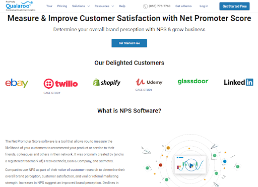
Yes. It’s Qualaroo’s page on NPS surveys.
That’s what the main heading tells the visitors.
It also quickly tells you the importance of the NPS survey- ‘Measuring customer satisfaction.’
In the same way, the subheading leads the visitors deeper into the rabbit hole and gives more information about the page’s context and content.
So, it’s good to include a plan to optimize the headline in your landing page testing strategy.
There are different headline formats you can test depending on the landing page type:
- You can use the ‘How to’ headline to state the page’s purpose and benefit.
- Make people aware of the problem to prompt them to look closer at the page with page headings like ‘tired of low response rates on your surveys?’
- Try adding your unique selling proposition to the headline.
- Highlight the special offers for the prospects or visitors, as Amazon Prime’s landing page does.

2. Value Proposition & Unique Selling Proposition (USP)
What is a USP? It’s what sets you apart from the competition. It can be a fact like the number of active customers, a prestigious award, or a unique facet of your product.
The interesting thing is you can have a different USP for each page depending on the following factors:
- Who your target audience is?
- Which customers’ needs, preferences, concerns, and problems are you trying to address on the landing page?
- Which features make your company unique, and what are your strengths?
- What are the product benefits, and what value can these benefits offer customers?
Once you have the answers to these questions, you can design simple and concise USPs that match the page’s intent.
Take a look at Canva’s homepage USP – ‘Canva. Design for everyone.’

What makes this USP effective is the thought behind developing the tool. Canva was specifically designed to let people create professional design templates without requiring expertise.
With Canva’s drag-&-drop builder, anyone can create beautiful designs without coding. The simplicity of use separates it from the other tools like Photoshop and Illustrator.
CASE STUDY – Scandiweb increased the CTR by 35% by testing the value proposition on its home page.
The Scandiweb’s Growth team observed that the homepage’s bounce rate was high. Also, the CTR of the value proposition block was quite low even after receiving substantial traffic. So, the team decided to optimize the value proposition and add a USP block to increase engagement.
They replace the looped video (previous value proposition block) with a static image of USP and distinct CTA.
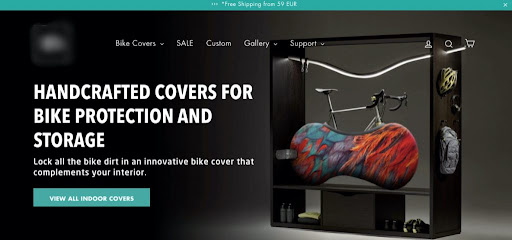
New product categories and ‘how to’ blocks were also added to engage customers.
Here are the test results:
- The new value proposition block showed a 35% increase in the CTR.
- The conversion rate on the page was 89% higher than the original page.

3. Images, Videos & Other Media Elements
Visual elements play an essential role in attracting users’ attention and increasing customer engagement.
Adding images can help people visualize your product’s interface and reinforce your USP.
Remember Hootsuite?
One of the main reasons people weren’t converting on its page was the lack of product images, making it hard to communicate the product’s usage to visitors. So, the company added product dashboard images to show how the solution worked.
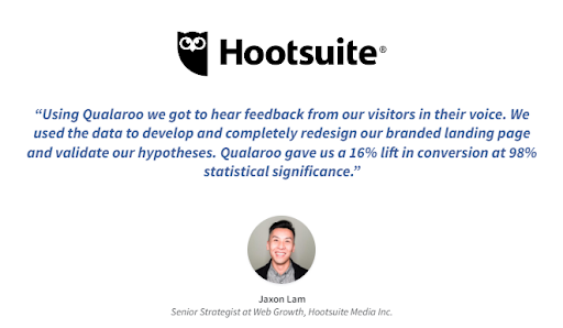
We saw it worked like a charm to increase the page’s conversion rate by 16%.
But what about videos?
Over 75% of customers are more likely to purchase a product if they can watch a tutorial video beforehand.
Embedded videos on the landing page, such as tutorials or ‘How-to’ videos, give an operational perspective about your product. It leaves a positive impression on visitors’ minds and helps push them across the conversion funnel.
You can design some simple landing page tests to improve your page’s aesthetics and visitor engagement.
4. Website Copy (Long Form vs. Short Form)
Content matters for a lot of reasons, namely:
- Customer engagement
- SEO
- Showcasing product offerings to the visitors
- Displaying your product’s unique features
The more content you have on the page, the better. Right?
Not necessarily!
There’s always a debate about long-form vs. short-form content on the landing page.
One size does not fit all. Sometimes long-from landing page works, and other times it’s the short-form page’s day.
And that’s where landing page testing becomes useful.
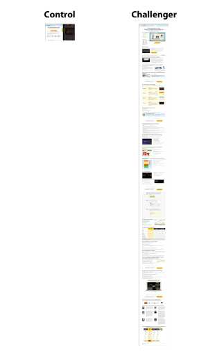
Some brands like CrazyEgg increased the landing conversion rate by 363% by switching from short-form to long-form page content.
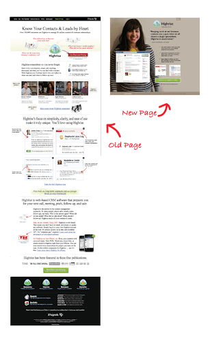
On the other hand, Highrise, a CRM app for companies that track tasks, contacts, and notes, A/B tested with a more minimal landing page.
They compared their original landing page with a shorter one that included the crucial information from the longer version but without most of the graphics. The shorter version increased paid signups by 102.5%.
Experiment with your page content to see what works for your audience.
5. Credibility Markers
Credibility markers instill trust and confidence in the visitors’ minds. Building trust is necessary, especially if your landing page form asks for sensitive information like contact details or demographic data.
According to a study, trust seals like McAfee, Norton, VeriSign, etc., are essential for building trust in a website or page.
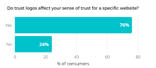
People feel safer sharing their data when you have trust seals on your pages.
In fact, Blue Fountain Media increased the conversions by 42% by simply adding the VeriSign seal on their lead form.
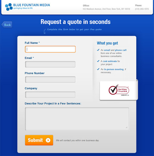
It worked because it ensured the visitors that their data was safe with the company.
Other trust-building elements include customer reviews and testimonials.
- 79% of people believe that online reviews help build positive brand perception, and about 89% of customers read online reviews before making a purchase.
Reviews tell the story of real customers’ experiences with the product and brand. By reading these, new potential prospects can start to trust your product offerings and brand value.
Here’s how to use trust markers:
- Add reviews on your landing page to showcase real-life customer experiences.
- Mention the brands you have worked with as the product/service provider.
- You can add trust seals to your lead forms and checkout page.
- Assure customers that their card details are secure with you.
- Create a separate testimonial and customer success stories page.
6. Click-To-Actions (CTAs)
CTAs are arguably the most crucial element on your page. These are the doorway to the next step in the conversion process.
And if it is not adequately optimized, many potential customers will turn back from your landing page even if you have the perfect page.
Here are some ways to experiment with the CTA during the landing page testing:
- CTA Placement – You can add it to the top of the page, in-between critical headings, and in other places.
- CTA headline – If the CTA heading is not actionable, people might not get interested in clicking on it. Also, make sure your CTA heading aligns with the page intent.
In a study, MOZ increased the monthly leads on its client’s website by 148% by changing the CTA copy.

- CTA color – Make sure that the CTA visually stands out from the rest of the page. You can use contrasting colors for the page and CTA to make it easily visible.
- Size and Shape – Landing page testing can help you optimize the CTA’s design and size to make it easily visible to visitors. But ensure that it does not become intrusive or interfere with the other page elements.
7. Offers and Incentives
Do you have a special offer for new visitors? Are there added benefits for first-time subscribers?
- Is your offer appealing to people?
- Which benefits convince more people to sign up on the page?
- Is there a perfect time to display the offer?
- What is the correct place to put the discount banner?
By split-testing the landing pages, you can get answers to these questions to create the best offers to attract visitors and increase conversions.
8. Lead Forms (Single-Step vs. Multi-Step)
If you are experiencing high visitor drop-offs on the lead form page, it’s time to test and optimzie it.
There can be several reasons for lead form abandonment:
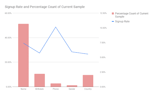
- Asking for personal details like gender and birthday can decrease the response rate on a form.
- Making all the fields mandatory
- Non-responsive form
- Too many form fields or questions in the form
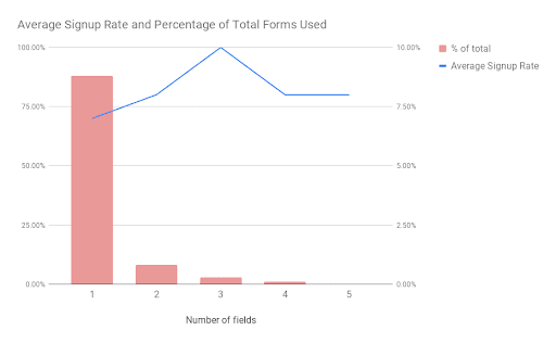
In the above graphs, one thing to note is that there is no gradual increase/decrease in response rates for both field types and the number of fields.
You can run regular tests to find the optimal form length for your landing page. Introduce offers and discounts to justify the depth of data you want to collect from the visitors to improve the response rate.
9. Pricing Structure
Pricing can impact customers’ purchasing decisions. If your pricing plans are expensive, it can alienate a big chunk of customer segments, who may have turned into loyal customers.
Again, if people feel the set price outweighs the provided product benefits, they may hesitate to purchase the plans.
So, if your landing page has a pricing plan section, you can run a pricing analysis and test the pricing structure to attract viable prospects.
10. Responsive Design
In 2022, mobile website traffic share reached about 58% compared to desktop. This indicates that a significant amount of traffic on your landing page may be coming from mobile browsers.
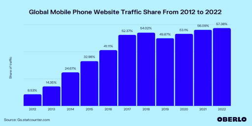
It begs the question – ‘Is your landing page optimized for mobile devices?’
How will you test it?
The best part is you don’t need to set up a separate landing page testing environment to check mobile responsiveness. You can use Google’s mobile-friendly.
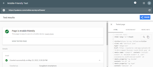
It takes only a few minutes, so you can do it regularly when you deploy any changes on the page.
11. Page Load Time
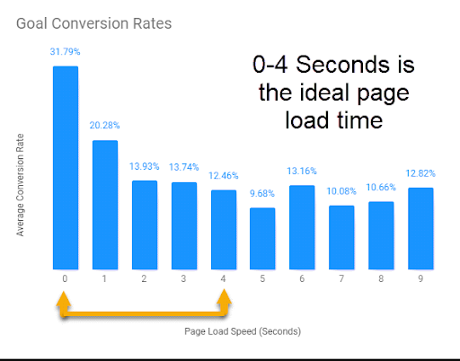
Another critical landing page aspect for testing is the page load speed because a slower page speed can hinder user experience and negatively impact SEO.
Slower load times also impact conversions, as we can see in the image below:
What’s the solution, and how much does it cost?
You can run a page load speed test using Google’s PageSpeed insights tool. And it’s free.
The tools show the load time results for both mobile and desktop.
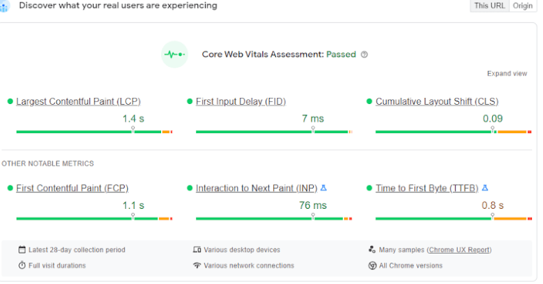
It also provides detailed diagnostic tips for each issue so you can improve page speed. We advise taking the help of your developers as the test results are pretty technical.
FREE. All Features. FOREVER!
Try our Forever FREE account with all premium features!
8 Simple Steps to Run a Successful Landing Page Test
With the what and why out of the way, let’s set up the landing page test. Here is the step-by-step approach to landing page testing:
Step 1: Collect First-Hand & Second-Hand Data to Set a Baseline
It all starts with the data.
Before split testing the landing pages, you need to have a clear vision of what needs to be done, and data can help you with that.
It includes data from the website, analytics tools, social media, and other outlets.
But what kind of data are we looking for?
We are trying to find:
- Queries
- Feedback related to the landing page
- Bug reports
- Traffic data
- Behavioral insights
- Reported issues
Now, let’s talk about the ways to collect it:
a. Surveys
Surveys pose an exciting opportunity to collect in-context feedback from the desired audience. These also let you gather insights from people you are trying to target with the landing page.
For example:
- If you have a landing age for the people in the middle of the funnel, you can target repeat visitors to find out why they are not converting.
- In the same way, if you see a high drop off from the page, you can target visitors leaving the website with exit-intent surveys to get a sense of this behavior.
- You can even survey visitors who click on the CTA link on the landing page to find out what convinced them to do so.
Another challenge is managing the sheer amount of incoming responses. It can be a real problem for web pages that experience a high influx of visitors.
Advanced survey tools come to your rescue in this station. Survey feedback tools like Qualaroo caries advanced analysis and management tools like sentiment analysis engine and text analytics capabilities to reduce your manual work. (More on analysis later)
b. Feedback forms
These work just like surveys and help to collect unsolicited feedback from visitors. People can click on the feedback sidebar or widget while browsing the page to submit the feedback.
These forms let visitors speak their minds and help you uncover unknown issues or collect suggestions.
c. Behavioral Tools
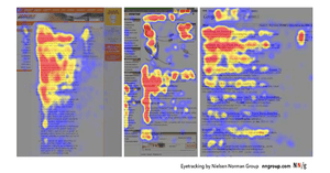
Behavioral tools analyze how people are interacting with your landing page in real-time. These techniques include heatmaps, session recording, click-stream data, and eye-tracking.
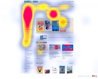
The importance of using such tools is that they can help you:
- Locate the most interacted parts of the page.
- Analyze how people scan the page so you can align the content accordingly.
- Uncover any issues like slow page speed and broken links.
d. Support Tickets
If you add a simple ticket link, you can also entertain queries from visitors. These are more potent than feedback forms and surveys.
It means people asking queries are interested in the product offering and seeking more information before making a decision, such as:
- Inquiring about custom plans
- Exploring product features
- Reading on additional requirements to use the product
- Available integrations
You can use the data from the helpdesk system and support tickets. It can help to optimize the page for conversions.
Step 2: Build Your Hypothesis
he data is in your hand. Let’s dig through the rubble to find what we need.
Collate the data under one screen. This includes data from surveys, feedback forms, support tickets, social media, and more.
Once you have the data in one place, look for patterns pointing towards specific visit behavior.
Suppose the heatmaps show that people are not scrolling down the page entirely and leave when they reach half the length of the page.
There are three possibilities here:
- Either the page length is much longer than it needs to be.
- People find all the required information in the first half of the page.
- The first half of the page isn’t engaging the visitors.
Now what?
Look for clues in other data sets. Let’s assume that your survey data reveals that people would like to know about the features.
Here is a working hypothesis for this situation:
You can add a features section in the second fold of the page and put an engaging CTA just below it.
Step 3: Choose a Proper Testing Tool
The next step is to choose a landing page testing software to set up an experiment to test your hypothesis. Here are a few tips for choosing the right tool:
- There should be no flicker effect.
- It should automatically manage the traffic allocation during the test to maximize conversions.
- It should be able to set custom goals and track them over time during the test.
- It should build the variations within the tool.
- It should support a good integration stack to manage the dataflows.
Looking for landing page testing tools that fulfill your needs?
We have the perfect guide for you
List of Best A/B Testing Tools
Step 4: Design & Run Your Experiment
Put the hypothesis to work. Start creating variations to run the landing page test. Most testing tools have an inbuilt builder to design your variations.
Step 5: Collect Data During the Test
It usually takes 2-4 weeks to reach the required statistical significance to conclude the test. You can leverage this time to collect valuable data for the next iteration and optimization process.
Deploy the surveys to your pages and collect feedback from the visitors to find out what is and isn’t working for them.
Note: Make sure that the surveys on both pages are identical and use the same targeting conditions to keep the same testing conditions. Using different surveys might change the users’ experience, causing the results to be unreliable.
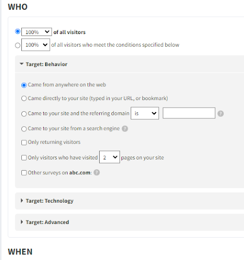
Here are some survey questions you can use during landing page A/B testing:
- Did you find the information you were looking for?
- Is something preventing you from signing up on the page?
- What can we do to change your mind about registering for an account?
- Is our pricing structure clear?
- On this page, it seems like I should be able to…
- What’s the one thing that nearly stopped you from starting a trial?
Step 7: Let the Test Run for the Required Duration
One of the people’s biggest mistakes during landing page testing is concluding the test early. It can be a risky decision.
Suppose you see a spike in the conversion on your variation initially, or it may return inconclusive results during the initial run.
There can be several reasons for initial results like novelty effect, recency, or pure coincidence.
If you decide to stop the test at this point, you cannot be sure whether the results are reliable or not.
These variations tend to flatten out with time as the sample size increases. So, the higher the statistical significance, the more reliable the results.
Step 8: Analyze the Results & Iterate
Once the landing page testing is complete, there are three possibilities:
- Your variation may outperform the control
- Your control may outperform the variation
- The test may be inconclusive.
If the landing page test is successful, deploy the winner on the page.
If the control wins the test, you can use the data to run another iteration by changing the same element.
You can also design a new landing page test by considering a new element to experiment with.
8 Landing Page Testing Tips to Maximize Returns on Your Tests
Here are some do’s and don’ts that can sometimes become a deciding factor between a successful landing page test and an unreliable puddle of incoherent data:
1. Start With Your Ad or Page Source, Then Move to the Landing Page
Before making changes and testing the landing page, ensure the source of the incoming traffic is fully optimized.
Sometimes the page is fine, but the source attracts the wrong audience. It can be the heading of the online ad, the meta-data of the landing page on the SERPs, or the content of the email linked to the page.
It can impact your page’s bounce rate, conversions, and SEO.
If the source is an ad, it means wasting your campaign budget and increasing acquisition costs.
So, it is better to start by analyzing your page source before making changes to the page.
2. Reach the Required Statistical Significance
In landing page testing, statistical significance or confidence level defines the probability of the test results being correct rather than a chance/random occurrence.
In simpler words, the confidence level sets the reliability of the test results. A higher statistical significance reduces the chances of a false positive or negative.
For example, a 99% confidence level means a 1 in a 100 chance that the results are false.
That’s why it is essential to let the test run for the required duration to reach the set confidence level.
In general, 95% is the accepted confidence level, but you can change it as per your needs. It is important to note that your sample size, i.e., the amount of visits per page needed to declare a winner, also increases with the confidence level.
For example:
- The required sample size to reach a confidence level of 95% is 24000 per variation.
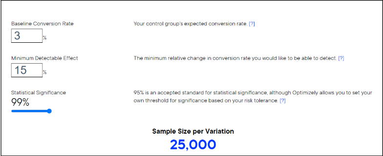
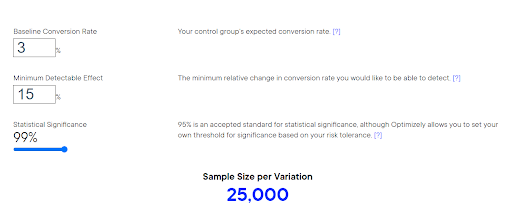
- When you change it to 99%, the sample size increase by 1000.
3. Account for External Factors to Avoid Data Pollution
For the landing page experiment to be fruitful, the testing conditions should remain the same for the entire test duration. It ensures that any sudden changes or external elements do not sway the test results in a particular direction.
For example, the test results would differ dramatically during a festive season compared to a regular test window.
If your competitor is running a promotion on their website while you are testing the landing page, you may experience a different traffic flow on your landing page than usual.
There would be changes in the flow of traffic, page interactions, conversions, and even customer segments that land on your page.
These sudden changes can pollute your landing page test data and give you false results. You can avoid it by calculating the sample size and running the test for the required duration.
Also, try to monitor the competition to check whether they are running any discounts or sales during the test.
In the same way, monitor internal factors like page load speed, 404 errors, and downtime to ensure the accuracy of your test results.
4. Monitor Flicker Effect
The flicker effect or Flash of Original Content (FOOC) is when the variation takes a moment to load, and the visitors see the original page before seeing the variation.
Flickering during landing page testing can occur due to issues with page load speed and incorrect script installation. Sometimes improper tool integration can also cause pages to flicker.
Flickering can skew your test results. It hinders the users’ experience and can lead to page abandonment.
Most modern testing tools take care of the flicker effect automatically, but here are a few ways to fix it:
- Improve page loading speed with optimized images, CDNs (content delivery networks), page caches, and other means.
- Place the testing tool’s solution code in the header tag of the source code.
- Reduce the size of the solution code in your page header by removing tags of inactive tests.
5. Collect Feedback After the Landing Page Test
We know:
- Collecting feedback before the landing page testing is crucial to building a test hypothesis.
- Feedback during the test is vital to collect data for the next iteration.
Likewise, post-deployment feedback can help you design the next experiment. It also provides valuable data on the visitors’ consensus about the new changes.
With a survey tool like Qualaroo, you can create targeted survey Nudges™ and deploy them on the landing page to capture insights.
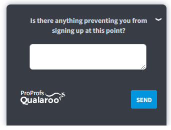
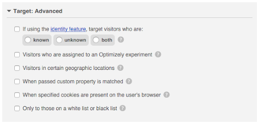
To make it more contextual, you can target specific visitor behavior and actions to trigger the survey at the right time.
6. Track the Performance Metrics After Deploying the Solution
It’s better to be sure than sorry. So even after you select the winner of your landing page testing, keep monitoring the performance of your page to make sure that the test results were correct.
Suppose you changed the CTA button color and deployed the test winner on the page. After a month, you observe that the conversions have dropped on the page and are back to the original rate before the landing page test.
Why did this happen?
You forgot to account for the Novelty effect, which means that the users were attracted to the CTA more because of the new color.
They were clicking on it out of curiosity and not because it was better than the original color.
The effects flattened with time to bring the conversions back to the previous state.
Again, if you have added or optimized media elements such as images or videos for landing page testing, keep tracking the page’s performance to spot any technical issues like image or video loading and page speed.
Tracking the page’s vitals like conversions, traffic, bounce rate, and clicks can help you spot any surges or drop in any metric.
You can also deploy surveys or feedback forms to collect insights about the changes made on the page.
7. Don’t Test Too Many Changes at the Same Time
Slow and steady wins the race.
Unless you are running multivariate landing page testing, it’s better to test one change at a time.
Landing page A/B testing or split testing can only measure the correlation between a single element and set goals.
For example, you can change the headling of your CTA and measure the uplift in click-through rate.
But if you try to test too many elements simultaneously, the test will bear unreliable results.
You cannot know the contribution of each change to the test result.
It means there is a possibility that;
- Some elements didn’t contribute to the change at all.
- Some elements might be causing a negative change, but you cannot track it accurately.
Testing so many changes makes it hard to track the elements driving the net results.
8. Remove Any Barriers to Conversion (Remove Conversion Friction)
Suppose you have the ideal landing page attracting the right audience and getting them interested into converting.
Now what?
It’s time to make the road to becoming a paying customer as smooth as possible, i.e., removing conversion friction.
It means simplifying the process toward the conversion, like eliminating unnecessary fields in the lead forms, putting CTA at the ideal place on the page, and optimizing the steps in the checkout process.
You can go one step further by eliminating unnecessary choices from the landing page. These include outgoing links to other pages. It helps to remove distractions and streamline the decision-making process.
5 Best Landing Page Testing Software & Tools
Landing page test software comes in all shapes and sizes. Some help you design and run the tests, while others can help you build your hypothesis.
Here are some of the best testing tools we have come across in the market:
1. Qualaroo
One of the most advanced feedback tools, Qualaroo can work as an excellent landing page testing software that can help you capture user insights to build your test hypothesis. You can use targeted surveys on your landing page to collect data before, during, and after the test. The tool also provides advanced targeting options to show the survey to the right visitors based on their actions and behavior on the page.
And you can leverage its AI-based sentiment analysis engine to dig through the responses in real-time and channel the insights into your landing page test hypothesis.
2. Hotjar
Hotjar is a behavioral analysis tool that uses heatmaps and session replays to analyze visitors’ behavior on your landing page. You can see which elements attract the most attention and which parts of the page are suitable for adding the CTAs. You can also pinpoint any issues with the page and lead forms using the session recordings to optimize them.
3. Google Analytics
Google Analytics is an integral part of your landing page testing process. The tool gives you real-time insights into the page’s performance. You can use it to track and compare bounce rates, conversions, time on page, traffic, and other metrics before and after deploying the test winner.
4. Optimizely
Optimizely lets you design and run successful A/B and split tests into your landing pages. The tool offers a visual builder to create variations in minutes, and its AI-based engine automatically allocates the traffic to the winning variation to maximize conversions during the test. You can also use the in-depth dashboard to segment the test data based on customer segments, devices, and other parameters.
5. Unbounce
Unbounce is another dedicated A/B testing tool to optimize your landing page. It comes with a drag-&-drop builder to design test variations without any coding. You can design the entire landing page testing campaign without any help from the developer. The tool also offers experience personalization options like Sticky bars, Dynamic Text Replacement (DTR), and pop-ups to elicit visitor action on your pages.
Start Planning Your Next Landing Page Test Today!
It’s normal to feel overwhelmed by the number of variables and steps needed to set up landing page testing for your website.
And it is valid to some extent that your first test would require extensive effort and resources to bear fruitful results.
But as you build a continuous landing page testing loop, successive testing becomes more flexible and easier to run.
You will also have in-depth data and experience from previous tests to use in the subsequent iterations.
And the effort is worth the returns when the returns are higher acquisitions and conversion rates.
So, start implementing these tips today and create the perfect landing page your users want.
FREE. All Features. FOREVER!
Try our Forever FREE account with all premium features!

 We'd love your feedback!
 Thanks for your feedback!


