Whether it’s your homepage, a link from an advertisement, or the result of a popular search term, a landing page or LP is highly likely to be the very first ‘real’ interaction between a visitor and you. At first glance, your visitors get an indelible impression that makes or breaks a sale.
That’s why your landing page needs to hold the visitor’s attention, wow them, convey purpose, and prove that you can offer a credible solution to their problem.
Although each landing page should ideally be customized to the customer’s needs, there are some steps you can take to make your landing pages effective, like mobile optimization (friendliness).
This guide will show you how to make effective landing pages that will increase your conversion rate.
What Is a Landing Page?
A Landing Page is usually a specifically developed web page for guiding the people brought in by your marketing or advertising campaign to the perfect place for converting them through a call to action (CTA). It is where you want the visitor to “land” once they click the link in your email, your ads on social media platforms like Facebook, Instagram, Twitter, or your promotions through Google, Bing, YouTube, etc. The CTA (or CTAs) in your LP try to turn the visitor into a customer.
Creating effective landing pages for great conversion rate optimization (CRO) is no walk in the park. Landing pages that convert the most number of customers take time and effort to build.
So how do you speed up the process – or at the very least, make it more effective?
The first thing to clarify is that while your landing pages should look good, that is only one of the many factors contributing to high converting landing pages. Good LPs will net you lots of new customers by convincing the visitors that what you offer benefits them in the way they want.
Second, it takes multiple tweaks to create landing pages that convert more and more customers over time. How often you implement the changes you make should be guided by precise customer feedback.
This process, termed landing page optimization, is an ongoing process due to its very purpose. What was trending yesterday and bringing in customers might already be forgotten, and what works today may be obsolete for tomorrow’s customers – so stay sharp and in touch with them!
Benefits of Effective Landing Pages
Good landing pages create value for your business in multiple ways. Major among them are:
- Increase conversion rate
- Better prospects targeting
- Accurate metric tracking
- Co-branding opportunities
- Focused design & copy
- Better SEO & SERP rank
Now that you are acquainted with what an LP does (and its many benefits for business), let’s move on to how it differs from web pages, its various types, and how to test it for best results.
3 Key Differences: Landing Page vs. Webpage
|
Landing Page |
Web Page |
|
Persuasive: Guides visitors towards a specific action: They complete the purchase |
Informative: Tells visitors about your product or service: They know the benefits |
|
Is usually brief, to the point, and concise |
Is usually descriptive, elaborate, and long |
|
Generally brings the sales process to an end |
Generally starts customer on the sales path |
FREE. All Features. FOREVER!
Try our Forever FREE account with all premium features!
Types of Landing Pages
Depending on where your visitor enters the sales funnel (at the top, middle, or bottom), your perfect landing page should help them move to the next step. In addition to this type of high conversion LP, a few other landing page types are required now and then for dealing with specific scenarios, such as Page Not Found errors and Unsubscribe / Goodbye messages.
Some common types of landing pages are:
- Lead Capture Page: Asking landing page visitors for information is quite tricky these days. Almost every consumer is aware of data privacy and security-related thefts. That is why your lead generation or capture landing page needs to allay such customers’ fears.
You could link to your data privacy policy to achieve this effect, especially if you are in an industry that places a high value on data protection – the Software as a Service (SaaS) industry, for example.
- Sales Page: Good sales pages persuade visitors to buy your product to fulfill their needs and help them overcome challenges. Depending upon the intricacy of your product or service, these sales pages can either be informative, full of benefits and pain points, or delightful nudges that make people want to buy.
Usually, sales landing pages are targeted at the bottom of the funnel, guiding customers towards completing their purchase decision. Do not forget to add landing page testimonials to encourage decision-making.
- Splash Page: Splash pages are great for announcements that are likely to convert customers, like special offers and discounts. Using them on yearly occasions to fit the trending topics (like Halloween or Independence Day) increases their interactivity and convinces visitors to explore more of your offerings, whether they are goods or services.
- Squeeze Page: These very brief landing pages are constructed for quite specific purposes (e.g., collecting an email address upon visitor showing exit intent). By keeping them light, fast, and to the point, you stand a higher chance of getting the info you need.
- 404 Page: The dreaded “Page Not Found” error message needs to carry a positive message so that the visitor who lands up at such a link on your website does not exit straight away.
You can do this with funny messaging, or using memes and GIFs, or even calling back to famous pop-culture moments, along with an option to visit the homepage.
- Referral Page: Your referrals landing page can be targeted at those customers who respond with a 7 or above (passives and promoters) to your Net Promoter Score survey.
If you are running referral bonuses, promotions, offers, sales, discounts, etc., then referral landing pages can be a great place to increase existing customers’ lifetime value as well as encourage them to draw in more customers from their own networks.
- Unsubscribe Page: Instead of considering this unsubscribe landing page as one that means you were at fault, treat it as one that shows you where you can improve your customer experience.
If you think that the person who is unsubscribing is past the point of no return, you might be wrong! The unsubscribe page gives you the last chance to win back potentially lost customers – or get their valuable opinions. Explore ways to win back their trust, but at the very least, ask them why they are leaving.
- Thank You Page: These pages are great for gathering and nurturing leads. After a customer fills out a form, answers a survey, submits a query for clarification, or makes a purchase, show them a thank you page to appreciate their time and effort.
You might show them related blogs here. If your marketing budget allows, offer them an incentive to leave a review, revisit your page, recommend you to others, or purchase more.
RELATED: Check out this webinar to see some awesome ways in which companies drove conversions!
Essential Landing Page Elements
Depending on the type of landing page, there are elements that go into making the best version.
Here is a list of elements that must be given due consideration to meet the intent of your LP in the best way possible, whether it is to convert more customers or identify exit intent, or others:
1. Catchy & Punchy Headline
- Why it’s important: The beginning of your landing page needs an attention-holding headline to attract and hold the attention of website visitors. It should ideally tell anyone who reads it what your product or service is all about. Since it needs to project your product’s essence in an impactful way, it should not be too long – SEO guru Neil Patel suggests keeping its length below ten words.
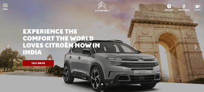
- A good example: Consider the landing page that carmaker Citroen created for their launch in a new market. The headline: “Experience the comfort the world loves.” It clearly marries their global presence with their USP: comfort
2. Explanatory Subheaders
- Why it’s important: These encapsulate the best parts or main motives of what you offer customers. Highlight features that set your offering a notch above your competition and unique characteristics that only your product can give them.
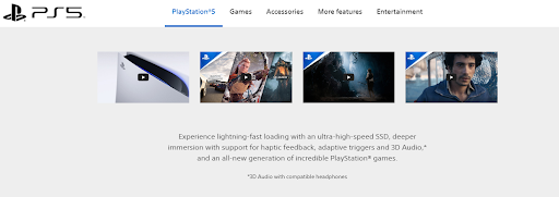
- A good example: When Sony put the word out about its next-gen gaming console, its landing page shared what gamers could expect from the PS5.
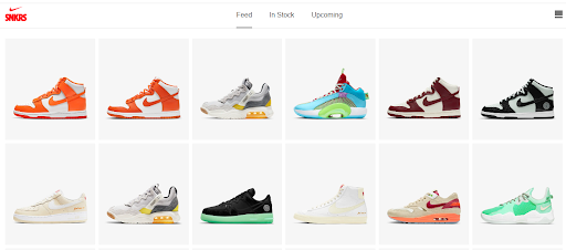
3. Images & Multimedia
- Why it’s important: Visual elements on your landing page that reinforce what you sell – whether it’s goods or services – go a long way in persuading potential customers to make that crucial purchase decision. Think about it yourself – are you more likely to buy from a nice-looking website or a drab, lifeless one?
- A good example: Nike has a range called SNKRS. Its landing page has just that – sneakers. Bright colors and designs stand out against a plain white background.
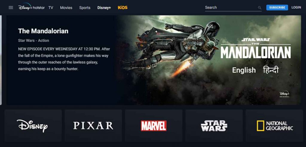
4. Informative Content (copy)
- Why it’s important: Descriptive explanations about your offering educate prospective customers about your company’s best offerings- the benefits they will get if they buy from you and not others. Describe the perks they might enjoy if they become loyal patrons (among other things you want to explain in detail).
- A good example: Disney Plus, a relatively new streaming service, built a landing page that tells visitors that they will get to watch exclusively created content.
5. Benefits & Pain-Points
- Why it’s important: How your offering will benefit them or help them overcome their challenges plays a crucial role in convincing potential customers. If you can show them how their lives will become better through your product or service with a landing page that encapsulates the best benefits, conversion rates will rise.
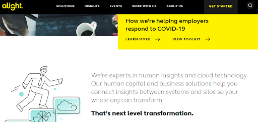
- A good example: Alight, a cloud-based human resources company, put up a banner saying “How we’re helping employers respond to COVID-19” on their LP.
6. Interactive Live Chat
- Why it’s important: On-the-spot support (whether through automated chatbots or with live agents) for LP visitors gives them an opportunity to contact you directly in case they can’t find what they’re looking for or need help with an issue.
- A good example: There is a unique example of using a chatbot on the company’s flagship product’s landing page to involve, educate, and convert customers. An Artful Science designs websites (and landing pages, so you might want to look it up) and starts the process with a witty conversational AI chatbot!
7. Credentials & Promises
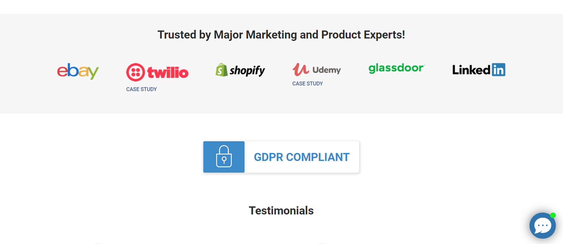
- Why it’s important: Testimonials, social proof, guarantees – these are the kind of things that reassure fence-sitters and doubters about the quality and relevance of your product or service. This factor is all the more important if your industry relies a lot on customer reviews – for example, the hospitality or food service industry.
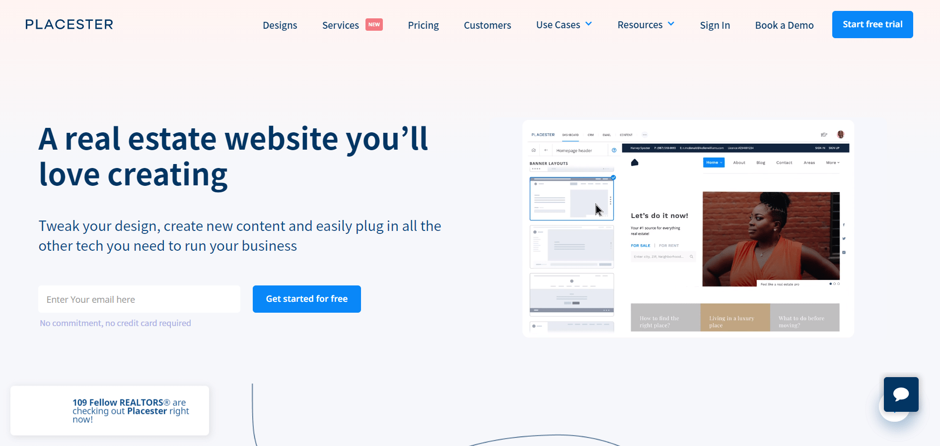
- A good example: Each and every section of Placester’s main page is appended with a real estate agent who used their landing page building feature and services, and includes their linked case study or testimonial. Check it out!
8. One/Many Call(s) To Action
- Why it’s important: Last but definitely not least, the button(s) that take customers to checkout/signup/subscription/lead generation forms should stand out. Use color schemes, innovative text, or out-of-the-box ideas to bedazzle LP visitors into buying your product/service or signing up for your lead database!
An additional tip about CTAs, considering their importance: Due to their small sizes, calls to action need to convey a lot in a very few words. The best CTAs communicate a sense of urgency, should be zero-obligation statements, and last but not least, entice prospective clickers with how they stand to benefit. - A good example: Why make do with one good example when you can have 21? Check out this blog post on the aforementioned SEO guru Neil Patel’s Crazy Egg!
Of course, you can never be sure with a one-size-fits-all approach when it comes to landing pages. This is especially applicable if you serve a variety of customer segments because each segment has its own way of responding to your marketing efforts. Hence, you need to test the elements of your landing pages to make sure that each customer sees the most suited variant.
How to Create High Conversion Landing Pages
As said above, there is no template to guarantee high conversions on landing pages. Effective landing pages are rarely created in one go. It takes several iterations to get the recipe of elements right (like the benefit or feature you are highlighting, the CTA you are using, the color, etc.) – and even then, it needs regular testing and tweaks to keep conversion rates high.
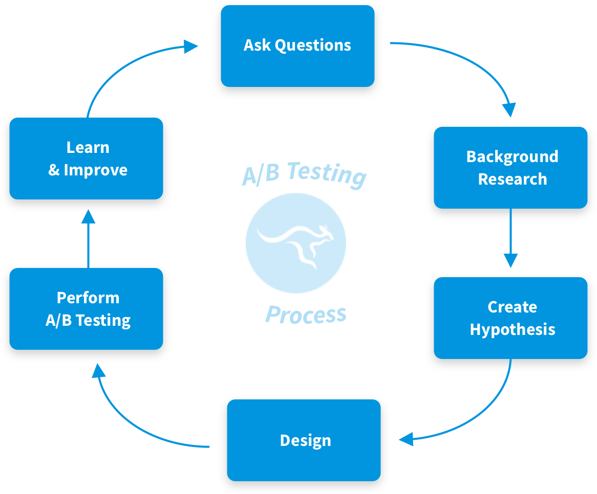
Using A/B Testing To Land on the Best Page LP Elements
While figuring out how to build a landing page, it makes sense to have multiple variations of the elements so that the most effective one can be made live for visitors to see. A/B testing tells you which version of your LP is better at doing the job it is meant to do: converting customers.
Bonus read: Best A/B Testing tools
For example, you may wish to determine which CTA on your newly created landing page results in more people clicking to go to the next intended page or step in your sales conversion funnel.
No worries: simply set up an A/B test with two different variations of the button to determine this. In this hypothetical example, the “A” variant of the button might say “Learn More” while the “B” variant of the button might say “See How”. Go with whichever version converts more test users.
In an A/B test, both variants of the button run at the same time to a set percentage of website visitors. In the simplest case, 50% of visitors see variant “A” and 50% see variant “B”. Using an A/B testing software, you get to see actual numbers of the click-throughs for both variants.
Suppose the results of the A/B test are:
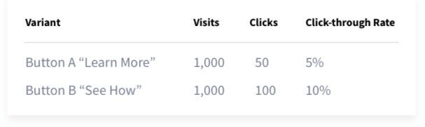
The numbers prove that the button variant B, “See How”, performs twice as well as variant A, “Learn More”. Thus, variant B of your CTA button is called the “winning variant” or “winner” and should be the one used to create a landing page that converts the most visitors into customers.
Carry out similar tests for all elements that make up your LP so that you create an awesome LP, like the ones we have curated for you to get inspiration, new ideas, and hence, more business!
Read this blog for strategies to Increase Shopping Cart Completions with User Feedback
How to Write Effective Landing Page Content
Content should drive landing page visitors to click on your call to action. To increase the chances of them doing so, here are a few tips to write convincing, persuasive LP copy.
- Make your CTA exciting. The usual CTAs like Sign Up Today, Start Your Trial, etc. have become so commonplace that customers might even reconsider their decision to purchase. Instead, use action words that entice them to Enjoy A Demo, Boost Revenue, Ramp Up Conversions, etc.
- Do A/B testing. As we have said before, testing different versions of CTAs and LP elements is a great way to ensure higher conversion rates. The same applies to content and body copy, too. Also, it helps you reinforce your messaging and keep it consistent throughout the landing page.
- Keep up with trends. Remember – it’s not just landing page visitors who are evaluating your content, but Google and other search engine algorithms are constantly being updated as well. To ensure that your landing page ranks higher than your competition, update your content and CTAs. Keep a sharp eye on what your competitors/industry leaders are doing and emulate it.
FREE. All Features. FOREVER!
Try our Forever FREE account with all premium features!
Examples of Awesome Landing Pages
Take a moment to observe this LP for celebrity chef Gordon Ramsey’s Private Dining and Events Page.
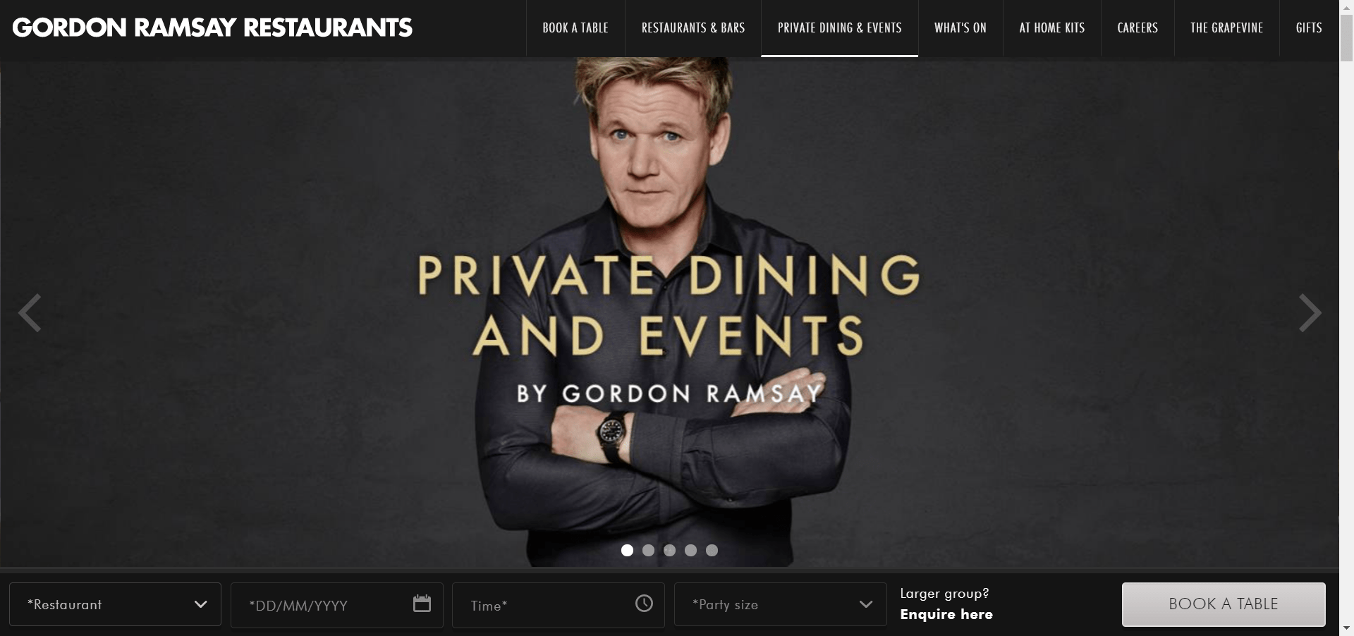
Do you see that the main feature is clearly highlighted (due to the stark black/gold contrast)?
Furthermore, the CTA button has a clear action: “Book A Table”
Finally, there is a top-level dropdown menus bar if people reach this page from search engine results pages for recipes, reservations, or even careers – as well as masterclasses from a famous chef.
Now, let’s have a look at a SaaS product that has lots of features but there’s no focus on its benefits in this LP:
We hate to sound too critical, but there is just too much going on on this landing page. Granted, it is informative – but that is the job of a dedicated web page.
So we suggest: keep your LP minimal.
The company with the landing page shown above went through a rebranding. The result:

We think this is a lot better than the overloaded dense landing page they had earlier. Do you?
Bonus Read: SaaS Marketing Strategies : Techniques to Grow Your Business
Steps to Build a Landing Page That Converts
Step 1. Decide the Goals of Your Landing Page
It is important to have a good sense of your main objectives to figure out how to build a landing page that converts lots of customers before deep diving into writing the content. Go through these questions before you start to create a landing page, and keep your answers in mind:
- What is the primary goal of the page?
- Are you trying to generate more free signups?
- More leads?
- Rank high for a certain keyword?
- Who are the other stakeholders on this page?
- Will it affect the sales team?
- The support team?
- Current customers?
- Do you have related pages that you should link to, from this page?
- Should other pages link to this page?
- What is the proper order for users to funnel through these pages?
- Do you have any design constraints? Will this page be in the same layout as another page, or are you free to be creative?
- Is this page brand new, or will you test it against an existing webpage?
Step 2. Write the Content With the Goals in Mind
You will want to write content before you start designing to ensure that you are capturing all of the relevant information. Standard (read: most) landing pages are built on these types of content:
- A hero that captures the reader’s attention
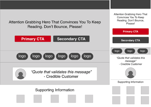
- A social proof section that immediately establishes credibility
- A primary CTA that entices the visitor
- Supporting information that demonstrates value/benefits
- A customer quote or client testimonials that instill faith
Step 3. Design Your Landing Page for Your Target Customer
You can start wire-framing the page with tools like Balsamiq or Canva and then use more advanced tools like Sketch or Photoshop to create detailed designs. Be sure to do your research so that you can find the best landing page builder for your needs. Your landing page should keep the same look and feel as the rest of your website content to maintain brand consistency.
If you don’t have a style guide and are looking for inspiration, look at websites of companies that have similar ideas as yours but are not your direct competition.
Keep Important Content Above the Fold. When you start designing the layout of the webpage, you want to keep in mind what content will be “above the fold” and which content will be “below the fold.” Any content above the fold is content that your viewer will be able to see without scrolling. You want to make sure that the most important content is above the fold, so the user will be sure to see it right away.
Maintain A Strong Visual Hierarchy. The F-shape pattern is a technique of keeping visitors interested not just in landing pages but web pages in general. It lays out a visual hierarchy that makes the visitor continue focusing on relevant information, presented in the following way:
- A bold headline with or without a relevant image at the top
- Lists or bullets down the left side for subheadings
- CTAs placed strategically (to attract attention) at multiple places on the page
- A good balance between the font, its size, and the quantity of text used to highlight USPs.
Tip: Check to make sure that your landing page will look good across different breakpoints. This is especially important for showcasing social proof like reviews, ratings, customer testimonials, significant awards, and statistics that elevate your landing page. Using heat maps or session recorders to see where visitors to pause and where they scroll through the breakpoints can help.
Be Responsive For All Device Types. It is important to keep in mind that users will come to your website through different devices with different screen sizes from the one you are designing your page on. The fold will be different for each user based on their screen size – and the layout may have to be completely different for mobile users.
Tip: To see which devices your users are visiting your website from, go to Google Analytics → Audience → Mobile → Overview → Secondary Dimension = “Screen Resolution”.
This should give you a good idea of the screen size.
Step 4. Enhance Your Landing Page With Sharp Coding & Plugins
There are many ways to bring your design to life – with or without code.
If you can code or you have a developer on hand – great! Just make sure you optimize all of the important SEO elements (the major ones being your landing page title, primary and secondary keywords, meta description, links/backlinks, headings, social media integrations, etc.) to ensure that your page ranks well in Google, Bing, or any other search engines.
Tip: You may consider running your landing page through seorch.eu to ensure that you are fully optimizing your page.
Hate coding? Don’t worry!
There are plenty of tools to help you get your page up and running with minimal code, such as:
- Shopify
- Squarespace
- WordPress
Any of these tools will be mobile responsive right off the bat, and they come with the ability to add plugins to enhance your website as you go.
Step 5. Test Your Landing Page To Improve Conversion Rates
Just because your web page is live does not mean it’s done!
Continue to test, iterate, and improve as users interact with your website. There are great tools available on the internet for running A/B tests (as described above) and split URL tests.
When you run an experiment, think about…
- What is the hypothesis? How will you measure success for your test?
Common goals are:
- Signups
- Lead Submissions
- Clicks
- What are the risks? Is there anything that could happen that would be bad? Make sure you can measure potential risks too.
- When will the test end? Choose a date to review the test results. It is all too easy to “set it and forget it,” but you want to make sure you eventually choose a winner and send all of your traffic to this page.
A/B testing makes many decisions clear-cut by basing them on data rather than only intuition. Some examples of things that can – and should – be A/B tested are:
- Color palette & schemes
- CTA text, designs & placements
- Number & relevance of form fields
- Visual design (text, white spaces, etc.)
- Number of links and reason for their placement
- Header & footer navigation
- Social proof & testimonial inclusion
- Copy optimization: size & volume
Testing these factors to decide the optimum landing page features will work well in the long run!
For example, check out this scenario.
You see many visitors land up on your product page and browse the site, but despite providing a free trial and mentioning a clear CTA that says “Start Your Free Trial Today!”, you don’t get as many clicks from them on it.
As part of your A/B testing, you can place quick surveys that can try to uncover visitor intent:
“What did you come to this site to do today?”
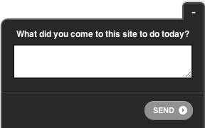
Or ask something like: “What’s preventing you from starting a trial?”
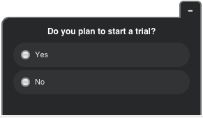
This can give you a direct idea of what they need. Or you may ask this question:
“What’s preventing you from starting a trial?”
And discover that they can’t even locate the CTA button that easily even if they wanted to sign up!
Want to understand more scenarios like this one for A/B testing? Check out this survey question library.
Step 6. Pay Close Attention To Insights & Analytics
As your visitors interact with the page, you might miss some information that is not captured just by clicks. In this case, it helps to simply ask your visitors what they are thinking! An A/B testing feedback tool can help you gain real-time insights into your customer’s decisions. Your customers make hundreds of decisions about you; Qualaroo is there to find out why they made them.
Bonus Read: 30 Best Website Feedback Tools
Step 7. Iterate And Repeat Your Landing Page Conversion Rates!
As you continue to learn what works – and what does not work – you can add your findings back into your page to improve your conversion rate.
Then as your visitors interact with your landing page, you may realize some information, visual factors, or customer behaviors that were not considered earlier during LP design. In such cases, it helps to ask your visitors questions at the moment with an unobtrusive feedback widget, like the Qualaroo NudgeTM!
Qualaroo Nudges ™ can help you gain contextual insights into your customer’s decisions. Your customers make hundreds of decisions that impact your business. Qualaroo tells you ‘why’.
Here’s how:
FREE. All Features. FOREVER!
Try our Forever FREE account with all premium features!
 We'd love your feedback!
What did you like & how can we make it even better?
 Thanks for your feedback!
 Ask Your Question
Have a question? Get expert help to make your decision easier.