Do you want valuable feedback from your website visitors while ensuring seamless navigation?
If so, you should consider adding feedback tabs and buttons to your website.
Website feedback tabs are smart tools that allow you to collect high-quality feedback in a user-friendly way.
They blend in with your website’s design and steer clear of interfering with the browsing experience.
In this blog post, you’ll learn everything you need to know about website feedback tabs and buttons, including how to use them effectively to enhance customer experience and boost conversions.
Ready to get started?
What Are Website Feedback Tabs & How Do They Work?
A feedback button, also known as a feedback tab and sidebar form, is a type of website feedback tool that allows you to collect feedback from your website visitors in a non-intrusive and user-friendly way.
A feedback button works by displaying a small icon and text on the side of your website that prompts your visitors to click on it and open a feedback form.
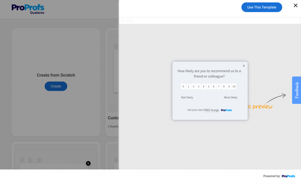
The feedback form can be customized to ask different types of questions, such as rating scales, multiple-choice, open-ended, Likert scale, and NPS (Net Promoter Score).
The feedback button can be triggered by certain events or behaviors on your website, such as page load, scroll, exit intent, or time spent. This way, you can target the right visitors at the right time and increase your feedback surveys’ response rate.
You can also integrate feedback buttons with other tools, such as analytics, CRM, or email marketing, to enrich your data and segment your audience based on their feedback.
7 Powerful Use Cases of Website Feedback Tabs
Let’s discover the power of website feedback tabs by exploring the various use cases they bring to your online presence. Common uses of feedback buttons include:
1. Website Feedback
Engage visitors by asking for general feedback about your website, including overall satisfaction, ease of use, design, and content quality. You can also gather feedback on specific pages or elements such as landing pages, forms, or calls-to-action (CTAs).
Here’s a quick video on how to collect website feedback:
Website feedback enables you to evaluate the strengths and weaknesses of your website, including its usability, design, content quality, functionality, and speed.
With feedback tabs, you can learn about visitors’ pain points and frustrations, such as navigation issues, errors, or bugs. Working to address these concerns, you can optimize your website to perform better, leading to higher conversion rates.
2. Product Feedback
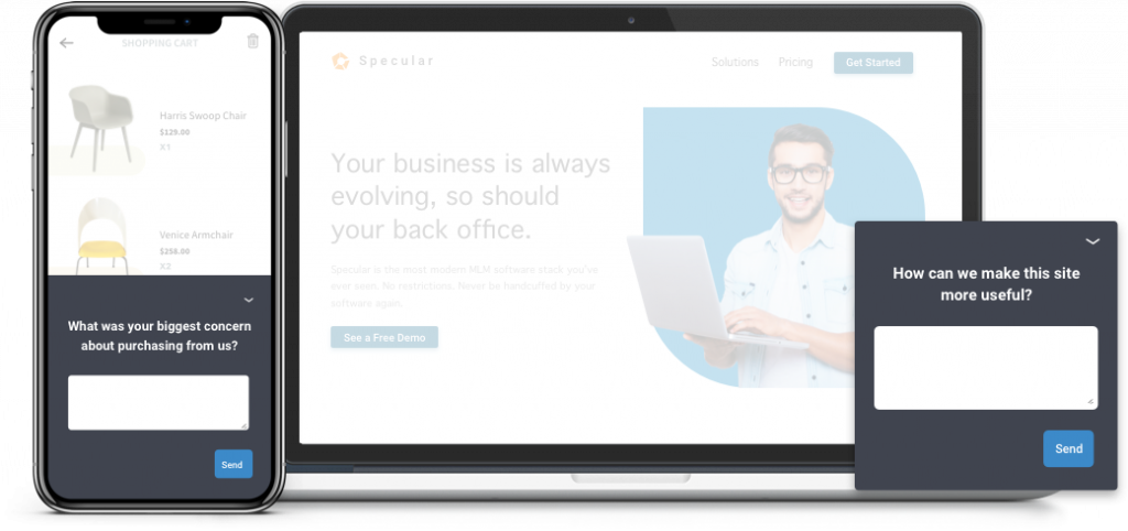
Feedback buttons can help you get visitors’ input on your products, including features, functionality, pricing, and quality. You can also receive feedback on new or upcoming products, such as beta testing, feature requests, or product validation.
Feedback can provide creative ideas and suggestions for how to enhance your products. Implementing these insights and ideas can provide more value to your visitors, differentiating you from your competitors.
3. Service Feedback
You can gather visitors’ feedback on your services, including the quality of delivery, customer support, or overall satisfaction.
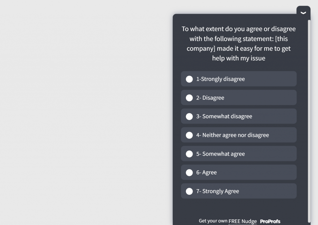
Additionally, feedback buttons can assist you in measuring service quality or customer loyalty using metrics like Net Promoter Score (NPS), Customer Satisfaction (CSAT), or Customer Effort Score (CES).
Here’s a CES survey template that you can use:
4. Customer Satisfaction, Loyalty & Advocacy
By encouraging feedback from your visitors, you show them that you value their opinions and desires, which ultimately nurtures a stronger relationship with them.
Through their feedback, you can gain valuable insights that guide the improvement of your product or services. As a result, visitors are more likely to become loyal customers and refer your brand to others.
Including a feedback button on your website also shows your transparency and open-mindedness. By actively responding to and encouraging feedback, you can build trust and credibility with visitors, leading to stronger relationships.
5. Marketing Insights
You can employ feedback buttons to gather valuable marketing insights from your customers via testimonials, reviews, or ratings. Additionally, you can gather feedback from prospects for lead generation, qualification, or nurturing.
By listening to feedback, you gain a deeper understanding of visitors’ preferences, expectations, motivations, and behaviors so that you can tailor your marketing efforts accordingly.
6. Customer Segmentation
A feedback button can help you segment your users based on their feedback, such as their needs, preferences, behaviors, and demographics. You can use customer segmentation to tailor your website content, design, and offers to different user groups, increasing their engagement and loyalty.
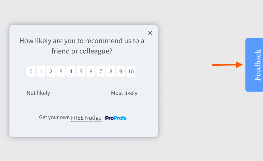
7. Unsolicited Feedback
A feedback button enables you to collect feedback from your users that you didn’t explicitly ask for, such as their spontaneous thoughts, feelings, and opinions about your website.
Unsolicited feedback is valuable as it provides genuine and honest insights that you might not get from solicited feedback. It can help you discover new opportunities, uncover hidden problems, and understand user preferences and expectations better.
Types of Website Feedback Tabs & Buttons
With various types of website feedback buttons available, it’s important to choose the most relevant one and align your feedback button design with your site. Let’s look at some effective feedback button survey types:
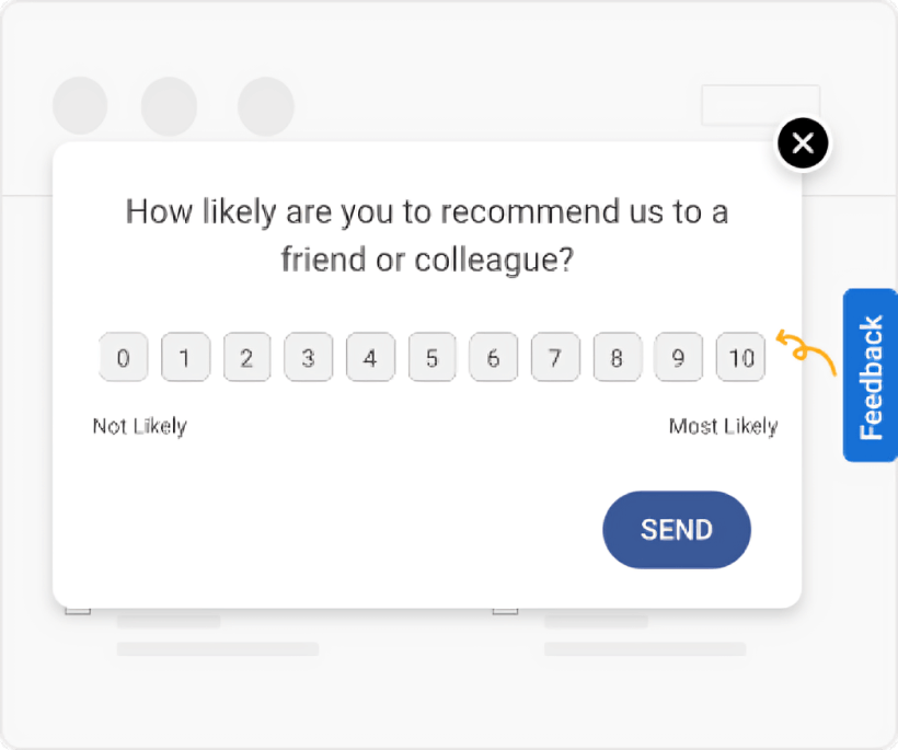
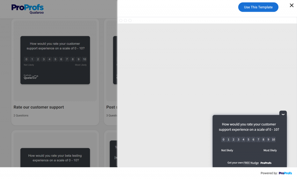
- NPS (Net Promoter Score): An NPS feedback button on a website gauges how loyal your customers are toward your product/service by asking them this simple question:
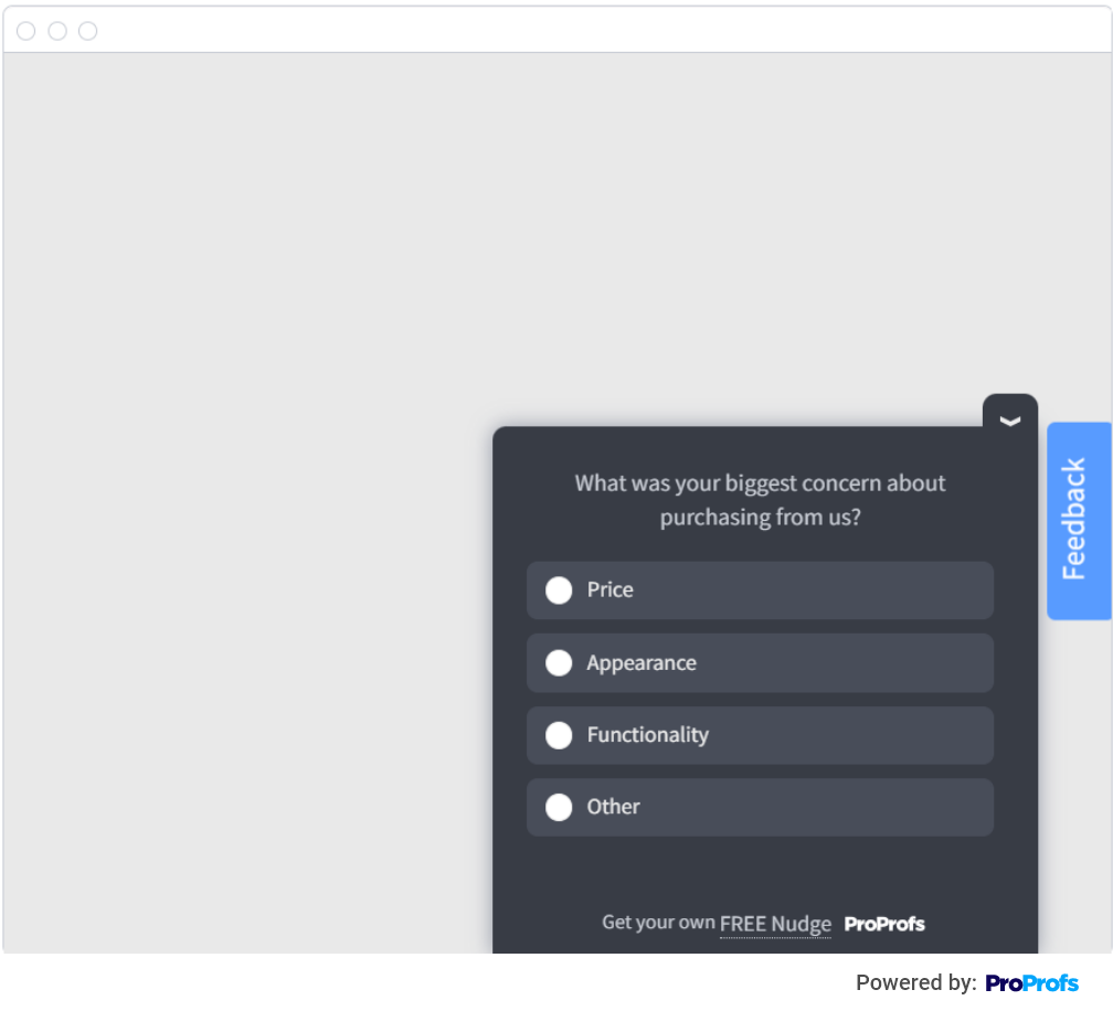
- Multi-choice: Engage your users with a feedback button that opens a short survey with predetermined options, enabling them to share structured feedback.
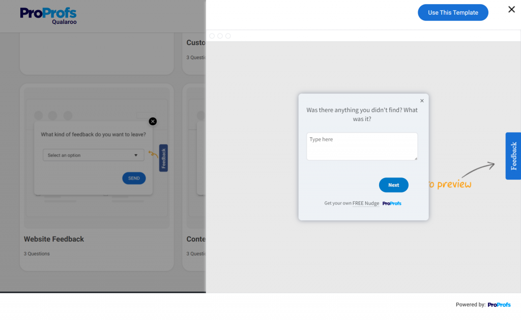
- Open Text Box: This classic feedback button allows users to provide detailed feedback by typing their comments directly into a text box.
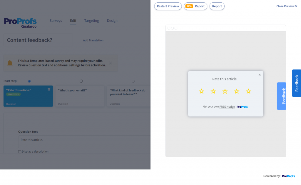
- Star Ratings: Popular on review sites and e-commerce platforms, star ratings provide a straightforward and visual way for customers to rate your products, services, or content.
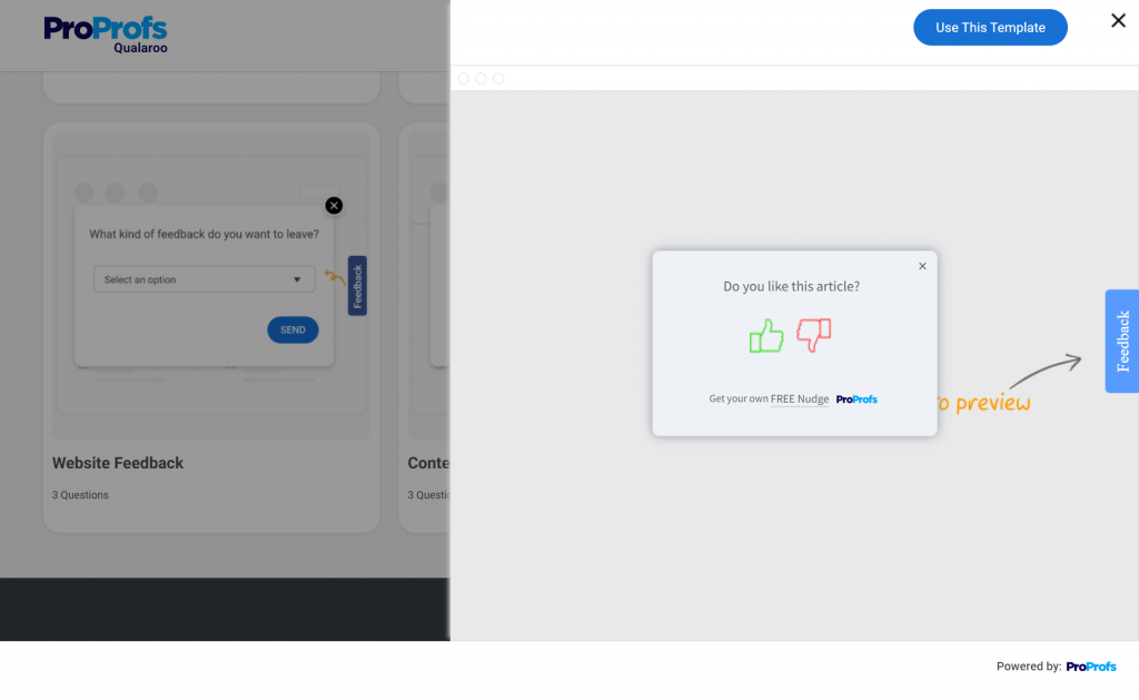
- Thumbs Up/Thumbs Down: Simple yet effective, these buttons for websites let users express their positive and negative feedback using two polar visual options.
- Emoji Rating: Incorporating emojis in your website feedback tab allows users to quickly express their feelings toward your website, product, or service in an engaging way.

- Feedback Category Selector: This button prompts users to select the type of feedback they want to provide, such as bug reports, feature requests, or general comments.
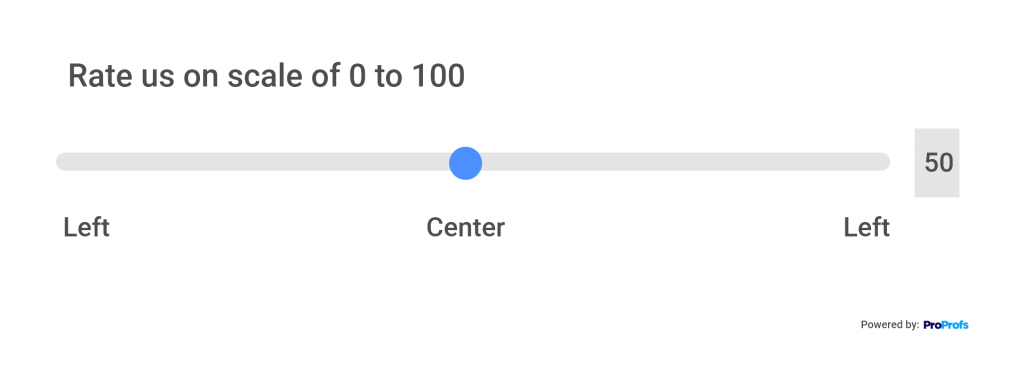
- Slider Feedback: Users can express their satisfaction or agreement on a sliding scale, making it easy for them to provide nuanced feedback.
- Screenshot or Screen Recording Buttons: This website feedback tab enables users to suggest improvements using screenshots, screen recordings, or interactive highlighting.
When selecting a feedback tab or button for your website, prioritize user experience and align it with your specific goals. Ensure it is user-friendly, visible, and seamlessly integrated into your website’s design.
Where to Place a Feedback Button
When it comes to collecting feedback from your website visitors, you want to make it as easy as possible for them to provide their input. Here are some key locations where you can place a feedback button:
1. Homepage
The homepage is often the first page visitors see, and it receives a lot of traffic. Consider placing a feedback button prominently on this page, making it easy for visitors to share their thoughts about your website.
There are some exceptions, however. For example, a single-product website won’t benefit from a feedback button on homepage but on product pages to collect feedback on its product. This leads us to our next place.
2. Product Page
Product pages are crucial for e-commerce and product-based websites. Visitors come here to learn more about your offerings. Placing a feedback button here allows visitors to provide insights into your products’ attractiveness, usefulness, and competitiveness.
3. Checkout Page
The checkout process is a critical moment when visitors are about to become customers. A feedback button on the checkout page gives them an opportunity to report any issues or concerns they may have encountered during the process.
4. Thank You Page
After a successful purchase or sign-up, users are directed to a thank you page. Seize this opportunity to show appreciation and offer additional value. Placing a website feedback tab here allows users to share their satisfaction levels and provide suggestions for improvement.
Pro Tip:
Pro Tip: Besides a feedback tab, you can also add a live chat button to your product or home page. A live chat button opens a live chat or contact form, allowing users to reach out to your support team or provide feedback via a direct line of communication. You can use Qualaroo’s targeting (URL rules, time on page, user attributes) to keep surveys relevant and respectful—show less, learn more.
Here’s a quick comparison table for you to choose better:
| Method | Best For | UX Feel | Strengths | Watch-outs | Ideal Placement/Trigger | Primary KPI Lift |
|---|---|---|---|---|---|---|
| Sidebar Feedback Tab (Qualaroo Sidebar Form Nudge™) | Ongoing, lightweight input across the site | Non-intrusive, self-serve | Contextual insights without blocking | Can be overlooked if too subtle | Persist on home, product, pricing, docs; visible on mobile | Response rate, qualitative depth, UX issues discovered |
| Micro-NPS in App | Loyalty pulse at key milestones | One-question, ultra-fast | Trendable over time; high completion | Ask fatigue if overused | After purchase, feature adoption, or time-on-page | NPS, repeat intent |
| Exit-Intent Prompt/Tab | Understanding abandonment | Timed to “about to leave” | Captures “why I’m leaving” in the moment | Avoid aggressive overlays | Exit on product, cart, pricing | Bounce reduction insights, recovery ideas |
| Thank-You Page Micro-Survey | First-impression post-purchase | Opt-in, feels natural | Fresh memory; high relevance | Keep it under 30 seconds | Order confirmation / sign-up success | CSAT, repeat purchase intent |
| Inline “Was this helpful?” | Content quality & IA | Embedded, contextual | Pinpoints pages to fix fast | Can skew to extremes; add open text | Blogs, help center, docs | Content helpfulness, self-serve deflection |
| Email NPS/CSAT | Reaching dormant or long-cycle users | Asynchronous | Broad reach across accounts | Lower response vs in-context; recall bias | Time-boxed campaigns | Longitudinal loyalty tracking |
FREE. All Features. FOREVER!
Try our Forever FREE account with all premium features!
Top Questions to Ask With a Website Feedback Button
Here’s a look at the top questions you can use in a feedback tab on a website, along with the right place to ask them.
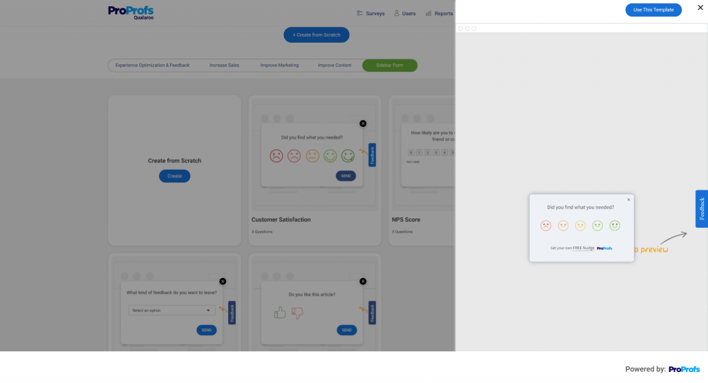
- How easy was it to find what you were looking for on the website?
- Purpose: To evaluate the website’s navigation and content structure
- Location: Landing page, product pages
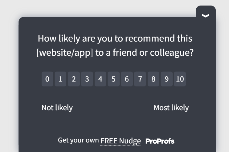
- How likely are you to recommend our website to others on a scale of 0 to 10?
- Purpose: To calculate the Net Promoter Score and customer advocacy
- Location: At key customer touch points, such as after a purchase, feature update, customer service interaction, or spending some time on a content page (article or blog)
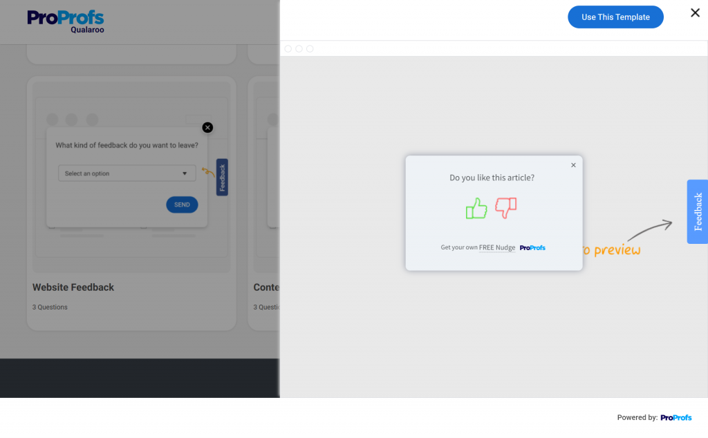
- How helpful was this article?
- Purpose: To collect feedback on the website’s content quality and relevance
- Location: Resource pages like blogs and help articles
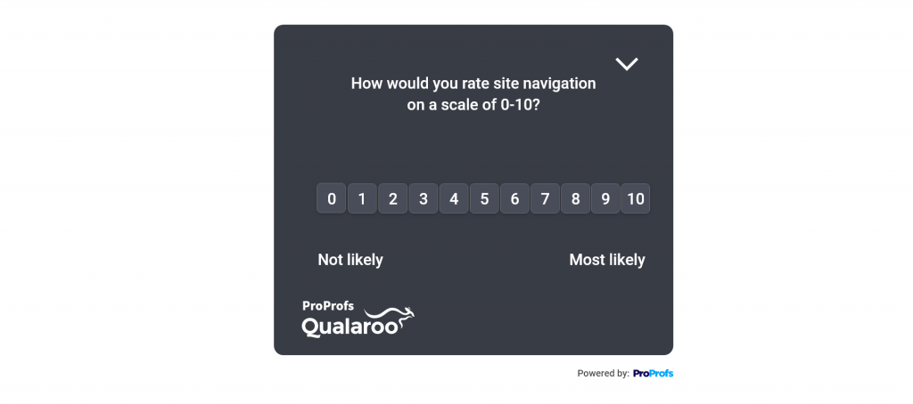
- How do you rate your experience navigating the website?
- Purpose: To measure website navigation experience
- Location: Any webpage
- How do you rate the website’s design and appearance?
- Purpose: To get feedback on the website’s visual appeal and layout
- Location: Homepage or product pages
- How happy are you with your recent purchase experience?
- Purpose: To gauge the effectiveness of your checkout process and trust in the buying process
- Location: Post-purchase screen

- How was your interaction with our customer service team?
- Purpose: To monitor the customer service performance and feedback
- Location: In post-interaction surveys sent right after a customer contacts the service or support team
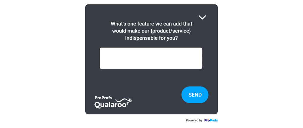
- What are some features or improvements you’d like to see on the website?
- Purpose: To solicit customer suggestions and ideas for enhancement with open-ended questions
- Location: In exit-intent feedback when the customer is exiting the website
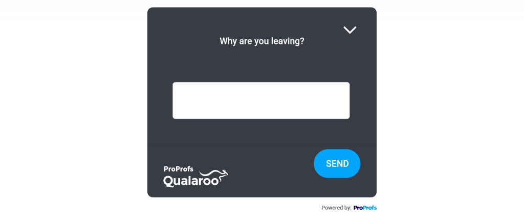
- What made you decide to leave the website?
- Purpose: To understand the customer’s reasons for abandoning the website
- Location: When a customer shows exit-intent on any webpage
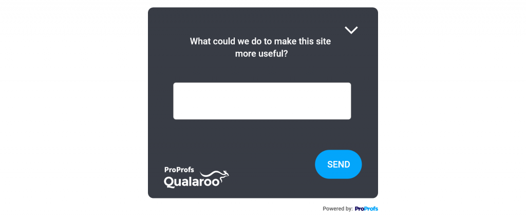
- What can we do to make this website more useful?
- Purpose: To assess the website’s user retention and engagement
- Location: When the customer is leaving the website
- How likely are you to return to our website in the future?
- Purpose: To assess the website’s user retention and engagement
- Location: When a customer shows exit-intent
Watch: How to Create a Website Exit Survey
The Real Impact of Feedback Tabs (Backed by Results)
Want proof this isn’t just a UX nice-to-have? Here’s what teams see when they add a persistent, well-targeted website feedback tab:
- Higher participation, right when intent is hottest. On-page tabs catch users in the moment, so you hear from people who would never answer an email survey. Expect a visible lift in response rate and richer, contextual comments you can actually act on.
- NPS/CSAT moves—not just comments. Capturing in-journey friction (navigation issues, copy confusion, trust blockers) turns into quick fixes that raise NPS/CSAT and reduce churn.
- Faster triage from open-text. With Qualaroo’s sentiment analysis, word clouds, and tagging, teams cut down on manual reading time and surface trends automatically—so product and CX can prioritize faster.
- One tab, continuous discovery. Because it’s always on, you don’t have to “launch a study” to learn. You’re constantly collecting signal across pages and devices.
Quick Win: Start with an always-on sidebar tab for ongoing insights, then layer one moment-based micro-survey (post-purchase or feature adoption) to capture milestone sentiment. Qualaroo makes both dead simple.
Inspiring Website Feedback Button Examples
Here are some examples of excellent implementations of feedback tabs on a website:
Mailchimp
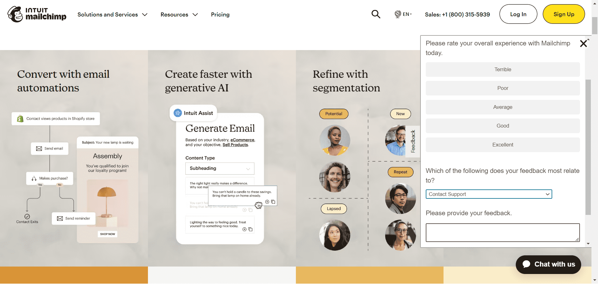
Mailchimp has a simple but effective website feedback tab on its homepage, presented as a sidebar form.
When users click the send feedback button, they’re presented with a short survey. They’re asked to rate their experience with Mailchimp and mention what their feedback is about by choosing from a drop-down.
Additionally, users can articulate their thoughts by entering a text response, allowing for detailed explanations or additional feedback.
Alibaba
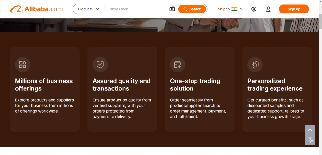
Alibaba presents its website feedback button in a highly non-intrusive and subtle way. You’ll spot a small square on the bottom right – it’s their feedback button. It’s neat, sitting there with a navigation button.
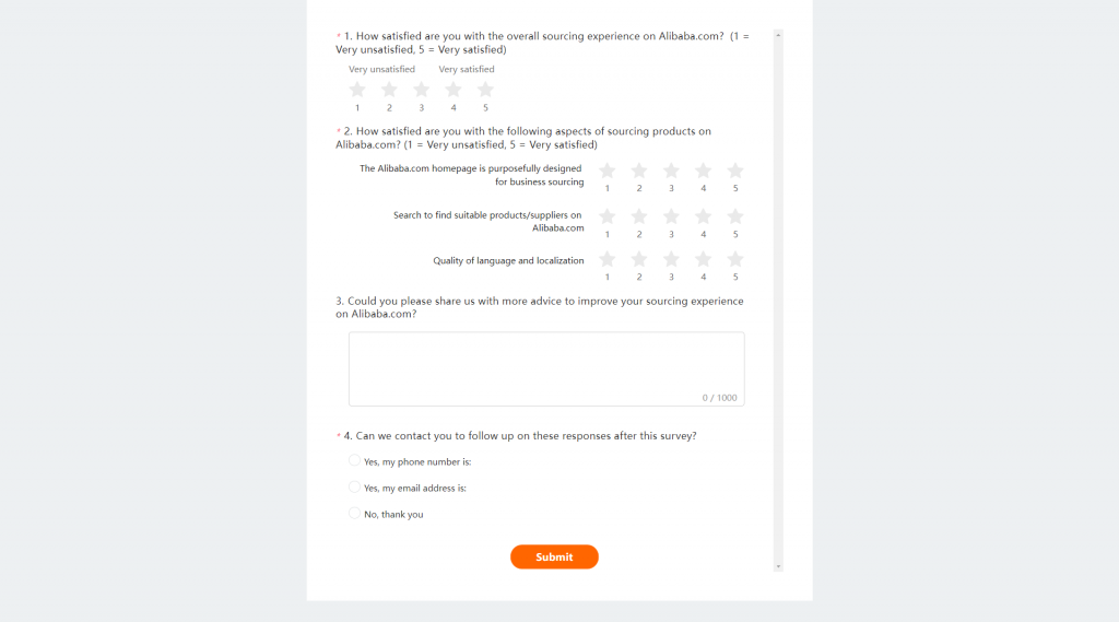
When you hover over it, it expands into a “Leave Feedback” call-to-action highlighted in bright orange.

Click on it, and you’re taken to a new page in a new tab. There, you answer 4 straightforward questions to quickly share your thoughts about their website.
Picreel
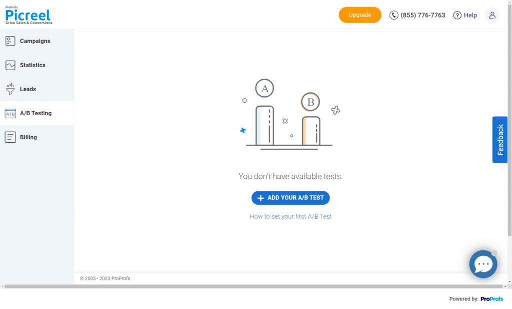
Picreel presents a sidebar feedback button powered by Qualaroo to the logged-in users on the dashboard. On clicking the feedback button, a popup appears at the center of the screen containing a Net Promoter Score (NPS) survey question.
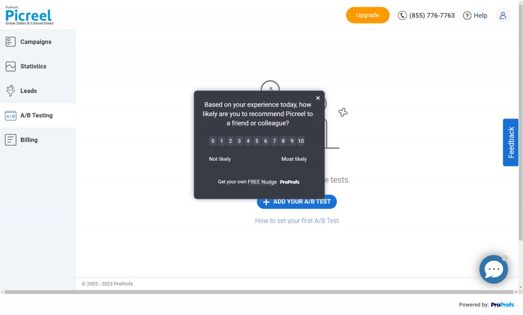
After users pick a rating, they’re asked 3 quick follow-up questions aimed at understanding the reason for their rating.
Picreel’s feedback button lets them gain contextual insights into customer experience and satisfaction, boosting retention and advocacy.
Related Read: How to Measure Customer Satisfaction in Context
How to Create & Add a Feedback Tab to a Website
Now that you know all about website feedback tabs, why don’t we move on to creating one? Let’s look at the step-by-step process, taking Qualaroo as an example.
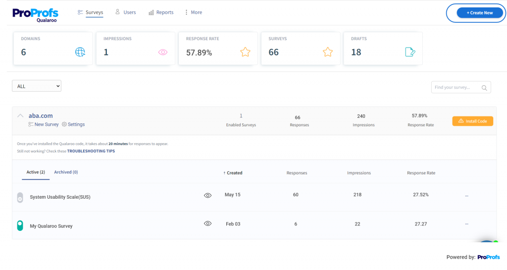
Step 1: Click “Create New” on the top-right corner of the dashboard.
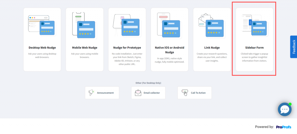
Step 2: Hover over the Sidebar Form NudgeTM type and click “Choose Template.”
If you want to create a website feedback tab from scratch, choose “New from scratch.”
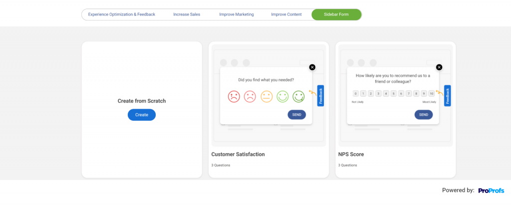
Step 3: Select any survey template you want from a wide selection of surveys by clicking “Use This Template.” You can also preview the template before going ahead with it.
Step 4: Now, you can customize, edit, and add questions like radio buttons, Likert Scale, multiple-choice, dichotomous, open-text, etc.
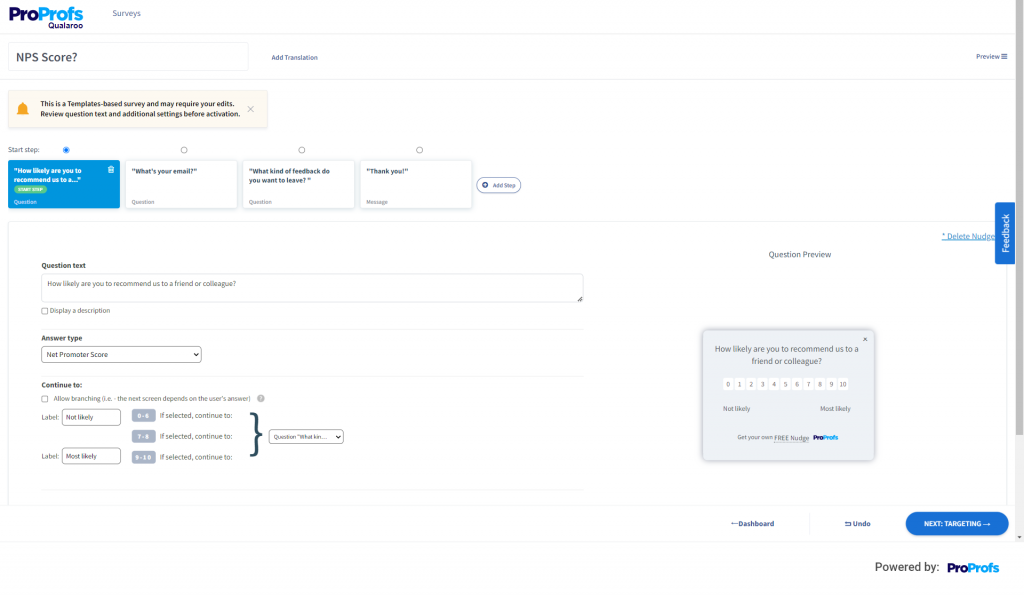
Step 5: Click next to move to the “Targeting” menu.
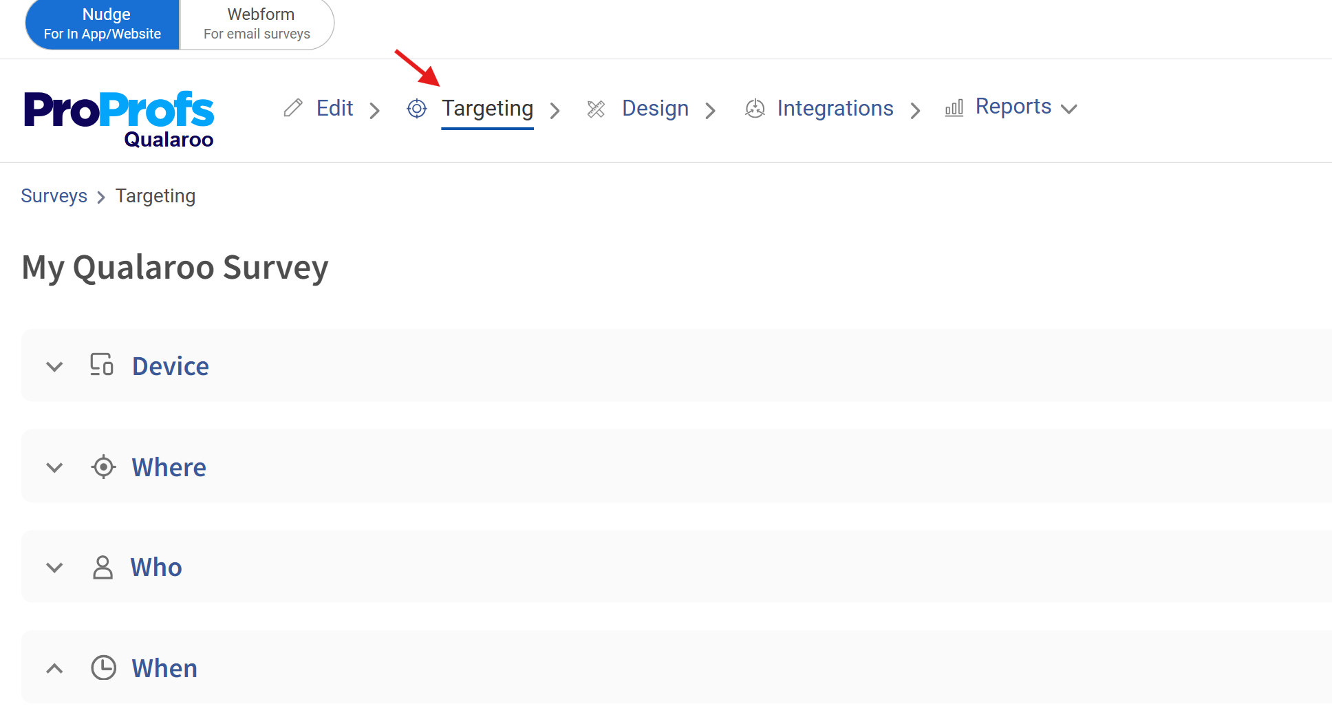
Use advanced targeting options to reach your desired audience and demographics for your surveys.
Choose “Use a simple URL” and input the website URL where you intend to launch your survey. If you wish to target a specific page, select “Use an advanced URL.“
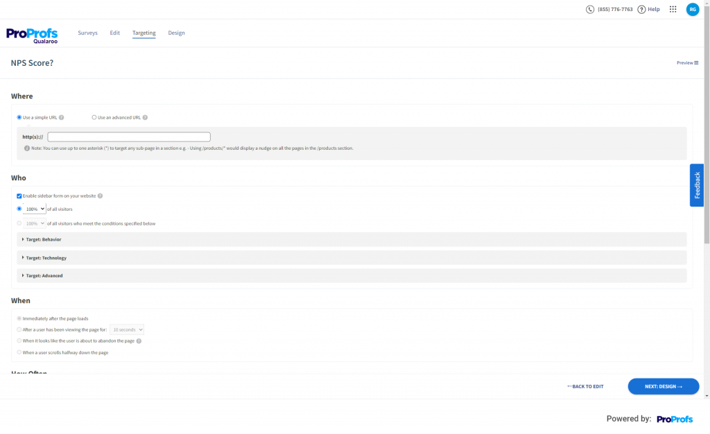
Step 6: Once done with targeting, click “NEXT: DESIGN.”
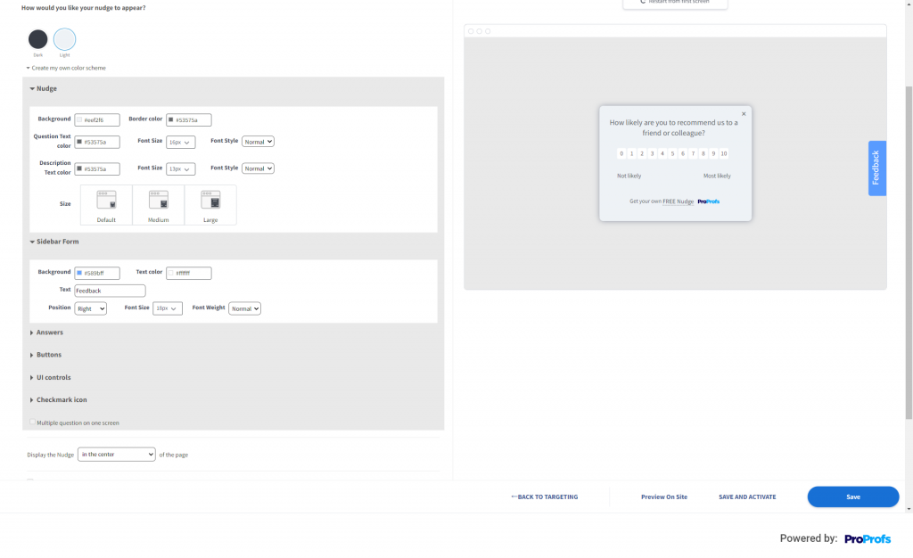
You can personalize your website feedback button to align with your branding.
Step 7: Once done, click “Save” to save your website feedback tab and take it live whenever you want.
And that’s it! That’s all you need to do to create a feedback tab or button for a website.
FREE. All Features. FOREVER!
Try our Forever FREE account with all premium features!
Capture Feedback the Non-Intrusive Way
Feedback buttons are a great way to collect feedback from your website visitors and customers and use it to improve your website and customer experience. They are also easy to create, customize, and launch using a feedback tool or software, such as Qualaroo.
Qualaroo is a leading feedback platform that helps you create feedback buttons and contextual surveys that suit your needs and goals. With Qualaroo, you can:
- Ask the right questions at the right time and place to get the most relevant and actionable feedback from your users.
- Analyze and understand your feedback data and insights using advanced features, such as sentiment analysis, word cloud, NPS, etc.
If you want to start using feedback buttons on your website and see how they can help you grow your business, sign up for a free trial or request a demo of Qualaroo today.
FREE. All Features. FOREVER!
Try our Forever FREE account with all premium features!

 We'd love your feedback!
 Thanks for your feedback!


