Do you know what ‘Bad UX’ looks like?
If not, a simple search on Twitter will get you loads of tweets from frustrated customers, begging for a resolution for their bad experience.
For example, the user below shares their flawed UX with a tool named Opensea, a leading NFT marketplace.
There’s too much back and forth in a simple process of searching for traits or special properties of the items listed in it, making it unnecessarily tedious for users to browse the list.
So, what went wrong?
The designers could have paid more attention to the UX rules which would have taken care of this issue in the first place. For instance, one principle from the heuristic approach “Use control and freedom” would allow users to exit filters to search for desired results freely.
Steve Jobs, Co-founder of Apple, once remarked, "Some people think design means how it looks. But of course, if you dig deeper, it’s really how it works."
Jobs highlighted that true design extends beyond mere aesthetics to encompass functionality and usability.
Designing your user experience keeping the UX rules at the center will build a strong foundation for converting new leads into loyal customers.
So, to create UX that converts, you can refer to this UX design guide for beginners and experienced designers. It covers top 15 UX laws and rules and UX design best practices in depth to build exceptional customer experiences.
What Are UX Rules?
UX design rules and laws are the best practices and design principles that UX designers consider while creating the user experience for any product or project.
For example, if you are into the SaaS space, you should follow the UX rule of iterative process where you keep rolling out new features or updates based on the customer feedback loop. Don’t fret, we’ll cover this in detail later.
So, now let’s explore the UX design basics for beginners and seasoned designers: UX rules.
So, to create UX that converts, you can refer to this UX design guide for beginners and experienced designers. It covers top 15 UX laws and rules and UX design best practices in depth to build exceptional customer experiences.
15 UX Rules Every UX Designer Should Follow (With Bonus)
Now that you know what UX rules and laws are, let’s discuss them in detail to understand how each UX principle and law helps designers create seamless experiences for users through and through.
- Jakob’s Law of Consistency and Familiarity
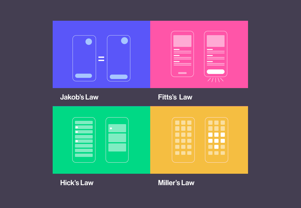
Image Source
Introduced by Jakob Nielsen in “Usability Heuristics for User Interface Design,” this is one of the 10 heuristic principles that focuses on consistency and familiarity when using websites. It is also known as the UX rule of familiarity.
They like seeing similar patterns and expect your website or product to perform similarly to other websites/products of the exact nature. These are called internal and external consistencies.
For example, an external consistency is when a camera icon is clickable and allows users to click a picture instead of performing a completely unrelated action.
Similarly, an element that resembles a button should be clickable.
Internal consistency means keeping the use of icons, symbols, emojis, images, etc., consistent throughout your website/product.
If you design your product/website entirely different than what users are used to, they may get confused and simply leave.
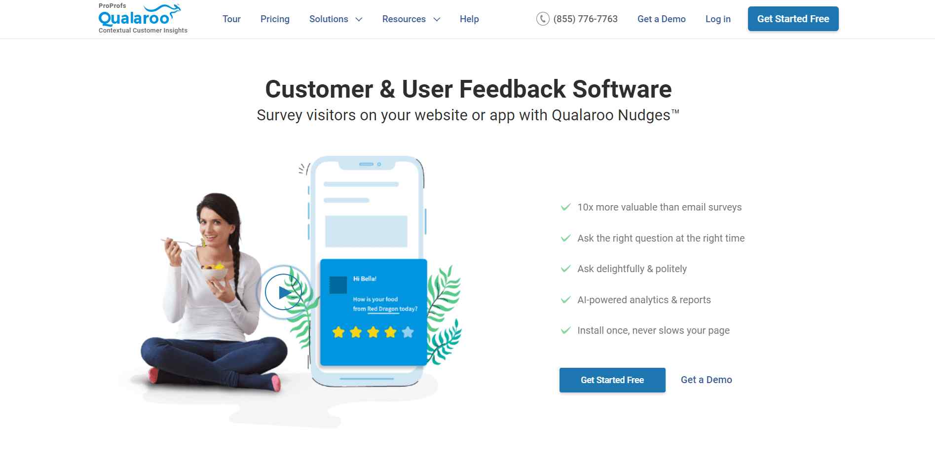
For example, the UI of Qualaroo’s surveys, a customer feedback tool, is consistent across different channels and devices.
The other nine heuristic principles are:
- Show system/activity progress: Show users the progress of their actions.
- Follow real-world conventions: Design keeping real-life elements in mind that are familiar to users.
- Provide user control and freedom of activity: Allow users to navigate freely.
- Error prevention: Avoid errors by helping users do things the right way.
- Let users recognize errors and help recover: Show errors in an understandable way with their solutions.
- Prioritize recognition over recall memory: Create designs that focus on recognition.
- Allow flexibility of use: This allows users to navigate how they want to.
- Follow minimalist but esthetic design: Keep the design simple yet intuitive and exciting.
- Offer plenty of help and documentation: Guide users with issues and the best practices to perform an action.
Key Takeaway:
- As much as you might want to create unique designs for your website/product, completely reinventing the wheel may backfire. Since users like to use websites/products that work similarly, you should keep the elements simple and similar to others, so it’s not challenging for them to use.
- Implement the principle of least astonishment in your product/website design so users are not overwhelmed.
- Refer to the 80/20 Rule
Popularly known as the Pareto principle, the 80-20 rule states that 20% of your effort can get you 80% results.
In UX design language, it translates into the fact that 20% of design changes can give you 80% of the results.
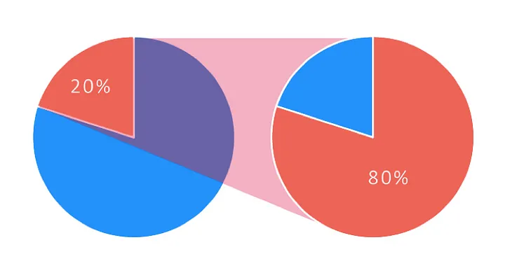
Image Source
Key Takeaway:
- Don’t try to fix every minor problem individually. Identify the ones you think have a more significant impact on your user experience, web design, and UX. This way, you fix 20% of the issues causing 80% of your problems. It’ll allow you to work efficiently.
- Appeal to Customers’ Senses with Aesthetic Design
Known as the Aesthetic Usability Effect, this rule of UX states that people find aesthetically pleasing designs more attractive, intuitive, and easy to use than cluttered and unpleasant designs.
It’s the same when you apply this rule to digital products like websites, mobile apps, and software.
Aesthetics are the first thing prospects notice in your products. For example, look at the website of Sennep, a digital product studio. It has a clean and simple UI that’s not cluttered or confusing.
You can leverage color psychology and interactive elements to design an aesthetically pleasing website. You can choose the colors that represent a positive impact and resonate with your brand image.
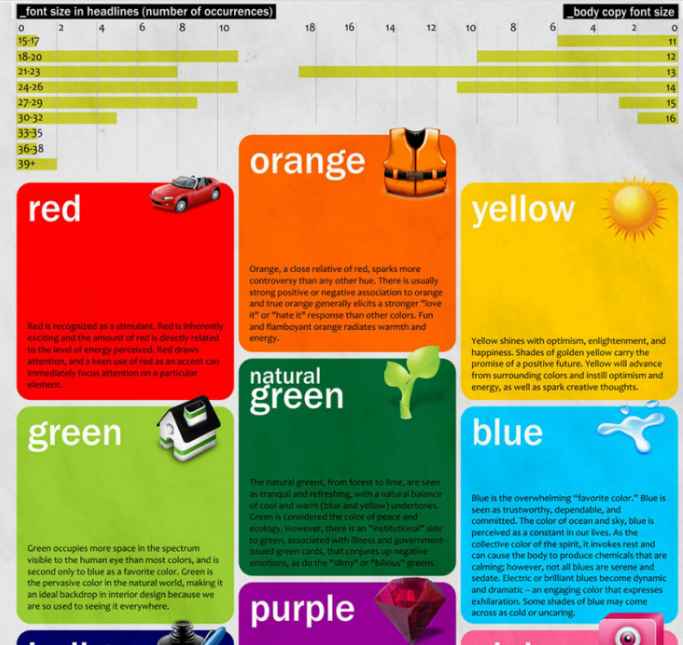
Image Source
Adding interactive and dynamic elements also helps enhance the UI of your products, making them more engaging.
Here’s an example from ProProfs Training Maker:
Key Takeaway:
- Usability alone doesn’t guarantee impeccable user experience; you must also consider your product’s and website’s aesthetics. Adding interactive and dynamic elements and leveraging color psychology help you design engaging products.
- You shouldn’t favor one over the other. Try to find an equilibrium between usability and aesthetics to create a flawless UX design.
- Too Many Choices = Analysis Paralysis
Have you ever stood in front of a cereal aisle and couldn’t decide which brand or flavor to buy?
Yes, that sums up Hick’s law of choice overload.
According to this phenomenon, the more choices a person has, the longer it takes them to choose and sometimes even leads to analysis paralysis where no choice is made.
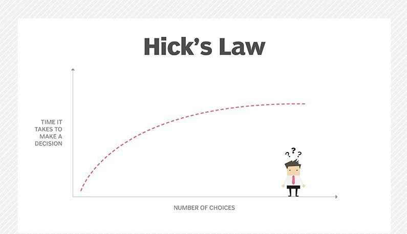
Image Source
So, the more features you offer to the customers, the more time it takes to decide, and the complexity increases. And eventually, it leads to a decrease in performance and usability.
This law was introduced by psychologists Ray Hyman and William Edmund Hick. They studied the correlation between the number of stimuli and individuals’ reaction time.
So, even if you have good intentions in offering multiple choices to your customers, it will only increase their cognitive burden.
You must be incredibly attentive to this law when designing for E-Commerce since too many choices will risk analysis paralysis and cost you conversions. So, keep the choices to a few and relevant to increase your conversion rate.
Key Takeaway:
- Keep the choices to a minimum but relevant.
- Simplify complex tasks by breaking them down into small steps.
- Reduce the navigation options to keep the menu simple and uncluttered.
For example, here the brand has categorized its products into a few but relevant categories to help customers choose.
- Zeigarnik Effect to Kick in the Goal-Gradient Effect
The Zeigarnik effect, another rule of UX, claims that people remember incomplete or interrupted tasks better than completed tasks. If a task is incomplete, they would think about it during other tasks and will only achieve satisfaction once they complete it.
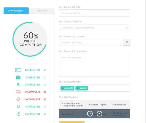
Image Source
This phenomenon was first noticed by a Russian psychologist Bluma Zeigarnik. He observed that a waiter in a restaurant remembered unpaid orders more clearly than the paid ones.
As soon as the orders were paid, he couldn’t recall the details of the orders as he did before when they were unpaid.
As a UX designer, you can use this effect in designing to motivate users to complete tasks on your website or product.
This UX design law ties in nicely with the goal-gradient effect, which states that people feel highly motivated when they are about to achieve a goal.
For example, this is how ProProfs Project shows progress to users for each task.
Due to this, they are more likely to complete a task faster and not abandon it in the middle.
Users focus more on how close they are to their goal than how far they have come. That’s why it’s a great idea to add a progress bar to show users how much they have yet to accomplish to reach their goal.
For example, YouTube shows how much a video has been played, so if users leave it in the middle, they can continue watching it later.
Key Takeaway:
- You can use gamification to use Zeigarnik and the goal-gradient effect while designing the UI and add elements like a progress bar or a progress circle so users can see their progress.
- If you use the two UX laws together, the users will remember the incomplete tasks and feel motivated to complete them.
- Ikea Effect to Increase Your Product’s Perceived Value
Most of us have taken on the adventure of Do-It-Yourself and went to Ikea to assemble the products.
As much effort as it might be to make that table stand on its leg, it’s nothing compared to the satisfaction you get from the fruit of your labor – That wobbly table created by YOUR hands.
For you now, it’s not a product you just bought but something you contributed to creating, so it holds more value.
That’s what the IKEA effect is.
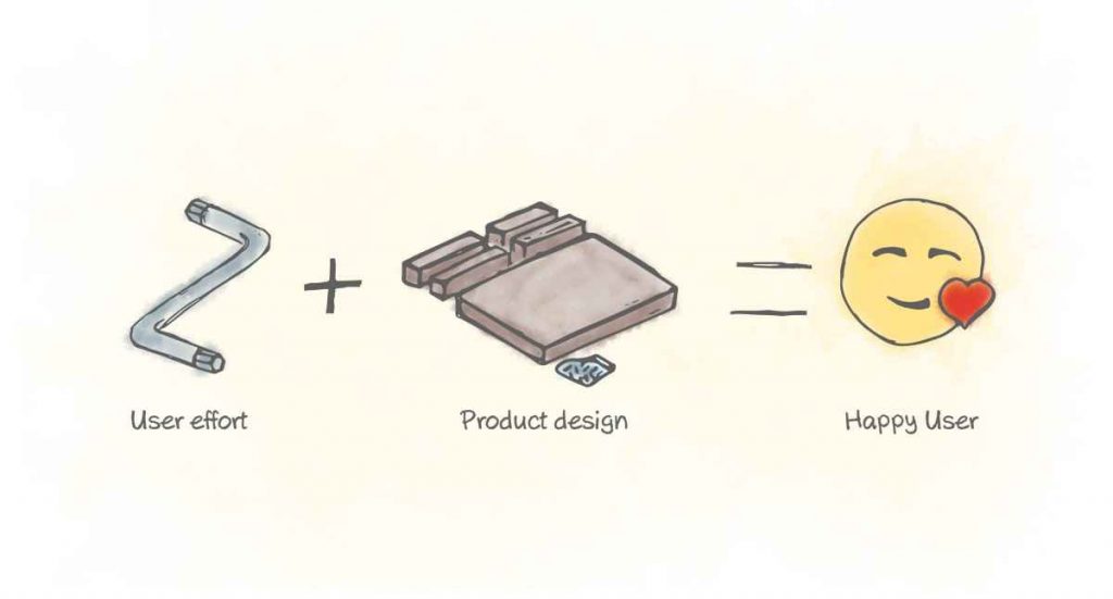
When you allow users to put just a little effort into achieving something with your website/product, customize the product, and make them feel they are in control, they instantly perceive it as more valuable.
For example, when you lead users while they complete their profile or any small task that requires little effort but offers a high perceived contribution.
Key Takeaway:
- Allowing customers to execute simple tasks such as creating a profile, sending an email, etc., will allow them to engage with your product and see it as more valuable.
- Preach KISS Principle
One of the most popular UI/UX design principles and rules is KISS; Keep it simple stupid.
This UX law states that it’s best to keep any product or website’s UI and UX design simple so users can easily use it and complete their goals.
Apart from being user-friendly, simple designs are faster and cheaper to build and are easy to maintain.
For example, Slack offers an excellent UX, from its simple onboarding process to its fun UX elements. For example, the app sends affirmations such as “great day at work” while loading. Such small details add to the personality of the tool.
Key Takeaway:
- Don’t complicate your products’ UX journey and UI; offer a seamless experience.
- Prioritize Recognition over Recall
Did you also score good marks in MCQ type exams compared to written ones?
That’s because our brain has a stronger recognition power than recalling.
When you see answer options in MCQ style, you can immediately recognize the correct answer. On the other hand, you need to recall information to answer in exams where you need to write a lot.
As a UX designer, you can use this phenomenon to create designs that help users instantly recognize how to use a feature or perform a task than to make them recall everything.
You can use pictures, images, and other rich media since it helps users recognize things faster.
A great example of recognition over recall is search engines’ past searches. When you type something in the search bar you had searched in the past, it will come in the suggestions.
It’s something that eCommerce websites also use in their interface. If you search for something on Amazon’s search bar, it will show your previous searches so you can continue shopping for the items you checked out.
Key Takeaway:
- Go beyond the limitations of human memory and make it easier for users to continue a task they left or help them recognize how to use features easily using this phenomenon.
- Doherty Threshold: Computer Response Time
Be honest – how long do you wait for your computer to respond after clicking something on your computer? Probably like a second, right?
If it’s more than that, you blame the computer for being slow. That’s what happened with websites too.
In 1982, the experts at IBM, Walter J. Doherty and Arvind J. Thadani, conducted research to find out users’ threshold for computer response time.
They figured that the response time shouldn’t be longer than 400 milliseconds.
So, according to this UX principle, you need to keep the response time at least under 10 seconds while designing the UX of your website. According to research by Jakob Neilson, it’s the limit for users to keep attention on any task.
Key Takeaway:
- If your process is time-consuming, add a loading widget so that users know the task is in progress and nothing is wrong.
- Consider Fitts’ Law
Fitts’ law suggests that the smaller the target and the bigger the distance, the longer it will take to get to it.
For example, if a button is too small on a mobile screen and the distance is longer from where users generally grab their phone, it will take longer for users to perform a task.
Another example of this UX design rule for web design is Twitter. It placed its new tweet button right at the bottom of the screen, so it’s very easily accessible to the users.
All the E-Commerce brands place the CTA buttons at the bottom of the screen because it’s the closest to users’ thumbs.
It lets the users press the button quickly and with more ease than, say, a button on the upper left corner of the screen.
Key Takeaway:
- Analyze your product or website to understand how users will access it. If you are designing for a mobile application, place buttons where they are easily accessible and at a size that’s easy to click. If you are designing for a website, then place the buttons where users can notice them.
- Miller’s Law of 7 (±2)
George A. Miller, a cognitive psychologist, introduced the term “The Magical Number Seven, Plus or Minus Two.” This law states that humans can only retain 7 items (±2) at any time in their short-term memory.
It means that the human brain has a limited capacity to retain short-term memory or process data.
So, what’s the lesson for UX designers?
Keeping this UX design principle in mind, designers can create UI with only essential information and not add chunks that will distract customers.
Key Takeaway:
- Present content on the website in small groups, so it’s easily scannable and doesn’t require much time and attention from the visitors.
- Peak-End Rule of Experience
We generally look at the user experience as a holistic experience. But this peak-end UX principle puts a microscopic view on the UX.
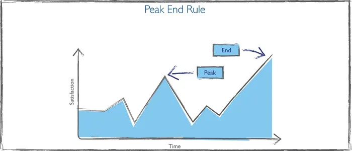
Image Source
This term was coined by the Nobel Prize-winning economist and psychologist Daniel Kahneman and his colleagues. It focuses on how customers feel at the peak and end of their experience.
Every experience has a peak and end, irrespective of its nature (good or bad experience).
Key Takeaway:
- Try to offer an excellent experience at high-impact points in the customer journey and ensure that the experience ends positively. These points can be customers’ first visit on your website, first purchase, onboarding, etc.
[Also read: The Ultimate Guide to Customer Journey Map Guide (With Examples & Templates)]
- Design with Serial Position Effect
Ever noticed that you somehow remember the first and the last thing you read on a page, and the rest just blurs?
It’s known as the serial position effect or primary and recency bias. It states that users only recall the primary and recent things from a list of data.
This effect also comes into play when you are conducting surveys, which we have covered in detail in our article about the types of survey errors you might be making and how to avoid them.
For example, respondents are prone to choose the last option they see in a survey due to the recency bias. You can shuffle the options as you show the survey to different participants to avoid this error.
Similarly with websites, customers may forget or ignore crucial information and touchpoints such as CTAs as they scroll down the landing pages.
For this, companies add the crucial elements at the button of the screen which are static so they are always in the focus of customers.
Key Takeaway:
- Keeping these biases in mind, you should take a page from the book of companies and add elements like home button and profile buttons in the left and right corners and boost visitor retention.
For example Instagram has placed crucial elements at the bottom with the home and profile buttons in the corners.
- Weber’s Law: The Difference Threshold
Weber’s law of just noticeable differences states that the stimulus intensity can be changed even with minimum changes to enhance the user experience.
In UX design, it means that users tend to dislike drastic changes to the design and UI.
It has become one of the user experience basics for designers. You don’t need to overhaul your product/website design to bring positive changes; small noticeable changes that enhance the customer experience are enough.
Users may feel overwhelmed if you make drastic changes, so it’s better to stick with small but significant updates.
Key Takeaway:
- Do not redesign a product/website until it’s necessary to do so. Start with small changes and see if they work.
- Von Restorff Effect: Isolate Elements to Highlight
Another rudimentary aspect of UX design is the Von Restorff effect introduced by German psychiatrist and pediatrician Hedwig von Restorff in 1933.
In one of her studies, she found that participants only remembered the item that was different from other same products in the group.
The isolation of the product from other similar products made it memorable for the participants.
So, in essence, consider this effect as one of the UX design standards and create elements that stand out from their surroundings.
Key Takeaway:
- Make your CTAs stand out on the website page. The same goes for specific product features that you want to highlight.
UX Design Pro Tip:
With the UX rules and laws out of the way, here are a few best practices designers swear by to design intuitive user interfaces that render exceptional user experience.
Listen to Your Users
If you are an experienced designer or an otherwise avid web user, you may be an expert at the technical stuff but prone to think you know the best way to design a product or experience. But odds are, you’re mistaken.
Why?
Because you are not the user and can’t anticipate their beliefs. This is known as the False-consensus effect.
Your users are the best bet to understand about the experiences built for them.
Even if you are a consumer of the product or service you’re designing for, you can’t possibly recognize all of the use cases or the hurdles within your design.
So, user research is the way to go. One simple and effective way to conduct the research is by launching pop-up surveys on your website, mobile app, and product.
You can ask customers questions about their user experience like “Did you find what you were looking for on this page?” and take notes of what needs improvement.
[Also read: A guide on UX research for beginners]
However, there is a limit to how much you should listen to the voice of your customers and when.
You need their opinion on how they find your UX design and if there are any challenges. But at the same time, you don’t want them to tell you how to fix it (something we will cover in detail in the next point).
Key Takeaway:
- Ensure that the response sample size is relevant to the target audience and large enough to establish statistical confidence and avoid false interpretations.
- Conduct usability testing with real users post-release to complete the feedback loop and gather early feedback. It will help you make real-time changes to optimize newly added features or product updates.
[Also read: How to Use Customer Feedback for Product Growth]
CASE STUDY: UDEMY
Udemy is an online learning platform that offers paid courses to people worldwide. The company uses an auto-captioning feature to make its courses accessible to people with different native languages.
To understand users’ experience with the feature, Udemy launched pop-up surveys on its courses and asked customers about their experience. This helped the company improve its features and offer a flawless learning experience.
Combine Creativity with UX Rules and Feedback
All the UX rules we discussed above are guidelines for UX beginners to follow and create seamless user experiences.
As a computer software, you should never forget to show your creativity in the process because it’s the individual characteristics of a company that make its UX stand out.
So, the best way is to merge these UX design rules and laws with your creative inputs to design products, websites, and UX that brings positive results.
Even then, your UX will not be effective if you don’t know who you are creating the products, websites, and experiences for. That’s where you need a customer feedback tool like Qualaroo that’ll help you understand your customers and design specifically for them.
FREE. All Features. FOREVER!
Try our Forever FREE account with all premium features!

 We'd love your feedback!
 Thanks for your feedback!


