
Prototype testing has always been one of the most common and reliable ways of validating designs through real-world users before starting off with the development stage.
Developers work relentlessly on creating new and better products and brushing off any prototyping mistakes in the initial stages of development.
But before the designs become a reality, a lot of feedback is needed from the users to ensure that no imperfections seep into the design.
There’s real flexibility in how you approach prototype testing, and every designer brings their own style and standards to it.
That said, flexibility isn’t the same as anything goes. Poor task design, biased moderation, sloppy recruiting, or unclear objectives can quietly compromise your findings, no matter how fluid or rigid your overall approach is.
The nine mistakes below are the parts worth getting right regardless of your personal testing style.
Every designer approaches the development in a different way and has their own set of standards and expectations for the final mock-up of the prototypes. They can be as fluid and explorative or as rigid as the designer wants.
It’s surely important how you test prototype, but more importantly, how you validate your designs, fix existing mistakes and perfect them round after round.
A prototype may be a little rough around the edges, but your final product should always deliver on the expectation and drop any liabilities.
To help you with this, we have carefully compiled a list of 9 mistakes in prototype testing and how to avoid them.
Let’s begin with the most basic one that could derail things right at the beginning.
Mistake #1: Not Setting Intentional Goals
If there’s nothing else that you take away from this article, be sure to avoid this #1 prototyping mistake. Testing without goals is like embarking on a treasure hunt without a map.
What are you working towards?
How can you make sure you get to that golden pot of user insights?
Setting goals will give your user tests a purpose instead of just being a standard procedure. Without intentional goals, you may be ticking off the testing box on your to-do list, but you won’t be able to tell if what you’re doing has any value or solves user needs.
What to do instead: Decide what your goal/research question is
We’re fans of the reliable SMART goals framework. SMART goals are Specific, Measurable, Achievable, Relevant, and Time-sensitive.
Let’s walk through a more concrete example of what this can look like with prototype testing by looking at a possible goal.
Goal: I want to uncover whether or not users can find the feature that they are looking for within the prototype.
You are specifically trying to understand the usability and navigation of your SaaS tool.
It’s measurable because, in the end, the user either did or didn’t find it.
- You can ask questions to measure your prototype’s performance, such as:
- How difficult was it for you to find feature x?
- What was difficult about finding this feature?
- What was easy about finding this feature?
- Did it take you more or less time than you expected to complete this task?
- From your experience with other tools, would you normally spend this amount of time on doing this?
- Ask questions about any other metrics you’re interested in tracking. Remember that these can be qualitative, not just quantitative.
The goal is achievable because it has clear and realistic outcomes.
You aren’t saying – I want every user to be able to find the feature. That would be setting yourself up for failure. Instead, you’re trying to learn what’s working and where you can improve the user experience.
Is it relevant? Well, if you just finished redesigning your flow, then yes, this goal is totally relevant.
But let’s say you just redesigned the landing page…product navigation might be a secondary goal to concept validation and figuring out whether or not the landing page is easy for visitors to quickly understand what your company does.
Make sure you have enough time to do user testing on this question.
- Is there room within your research scope and budget to allocate time for this?
- Do you have extra time for additional goals?
This way goal setting can help you avoid a number of prototyping mistakes.
Mistake #2: Testing a Prototype That’s Unfinished or Too Polished
As a general rule of thumb, testing prototypes at a lower fidelity stage is a smart move. Your mockups don’t need to be perfect in order for you to understand how users will react to the product.
However, there’s a balance to strike. You don’t want something that’s so lo-fi it doesn’t resemble the final product closely enough. If it’s too hi-fi, you may be wasting time on perfecting one version instead of getting feedback as soon as possible.
If it looks too polished, they might be more concerned about how direct their feedback can be if it appears someone has spent a lot of time on it.
What to do instead: Test a few versions at the right fidelity
Put together a few rough versions at the same fidelity, not too low and not too high. Having only one prototype might make people less likely to give you more open and critical feedback that you need to actually push the product forward.
Having a few versions can allow you to see which version best helps users to achieve their goals. If you don’t have time to let users test different versions, consider doing a side-by-side comparison of the different options you’re exploring to see which they find most intuitive.
Mistake #3: Being Underprepared
If users don’t have clear instructions that they can review before the test, they might feel lost before they’ve even begun interacting with your product.
Instructions should include context on the prototype. Outline any upfront limitations that they might experience with this current iteration so that hiccups in the prototype feel expected and not distracting.
Most importantly, though, your instructions should include a list of tasks that you want users to perform during testing.
What to do instead: Provide simple instructions.
Writing instructions doesn’t have to be some kind of long and tedious task. In fact, the shorter and more straightforward your instructions are, the better.
In Steve Krug’s book Don’t Make Me Think, one of the guiding principles is to “omit needless words”. He actually uses instructions as an example for when to do so. “When instructions are absolutely necessary, cut them back to the bare minimum.”
Since you need some signposting and guidelines for user testing, this is a case where they are absolutely necessary but don’t have to drag on.
All you need to say is something like:
- Please read the scenarios below and complete the related tasks.
- Answer the questions that follow. This will take you about x minutes.
- We appreciate your help to improve our product.
Again, if need be, mention any details here about the prototype’s fidelity that the user should be aware of.
Mistake #4: Assigning Bad Tasks
As someone who interacts with the product on a daily basis, you’re probably used to all the acronyms and jargon and unique features that come with your product.
However, your users are not.
Assigning bad tasks that ask users to try out specific features is like asking someone to taste ingredients from a recipe instead of making an actual meal.
When straightforward tasks are provided that tell a user exactly what to do, you aren’t going to capture what it would be like for your user to interact with the product in their own day-to-day life. And what you really want is for the testing to feel as seamless and organic as possible.
Similarly, avoid guiding your testers through specific user journeys or site flows that you have in mind. Sending your users down one journey might result in confirmation bias where the assumptions you’ve made about user flow can’t actually be challenged.
What to do instead: Create task scenarios
Again, users are motivated by actual goals. You should be too. No matter what your company does, you have to step outside of the research box and imagine real-world scenarios where a user or customer will actually be looking for a product like yours.
For example, in our work with Belron (read case study here), Customer Journey Improvement Manager Stephen Payne explained what he calls grudge purchases. Belron sells windshields under the U.S. brand Safelite.
Payne shared that most people don’t necessarily wake up thinking about a new windshield. You make grudge purchases only “if you have damage and need it fixed immediately.” So let’s adapt this for the context of prototype testing.
Poor task:
Find information about our glass recycling program.
Their information on glass recycling is interesting and differentiates them as industry leaders, but not realistic to what a potential site visitor would do when first arriving on the site.
Okay task:
Book an appointment to have your windshield replaced.
Telling users just to book an appointment is giving them too many clues and not allowing users to have a bit of roaming room.
Best way: Task scenario
While you were driving to work this morning, you drove by a golf course
and a stray ball flew at your window, leaving a big crack.
Find a way to get your windshield replaced.
This scenario feels realistic and actually might include more than one task.
Testers might read about other services offered, explore locations near them or even read reviews before scheduling the end appointment. In this way, scenarios allow you to learn more than simple tasks would, and creating the right ones can help you avoid many prototyping mistakes.
One related note: if you prepare a moderator guide that maps the expected flow through the prototype, keep it for your own reference during the session. It’s a tool for noticing when a tester goes off the expected path, not a script to walk them through it. Sharing that path with users directly would undercut the realistic, unguided scenario you just built.
FREE. All Features. FOREVER!
Try our Forever FREE account with all premium features!
Mistake #5: Asking the Wrong Questions
This all goes back to goal setting and tasks.
Let’s go back to the treasure hunt comparison for prototype testing. If having a map is like having a goal and user insights are the treasure chest, then questions are your directions.
Asking the right questions can guide you to the right information and user feedback that will be most constructive towards making better design decisions.
What to do instead: Write questions that will give you results.
The solution here is simple: ask yourself if the questions you’re asking will give you more insight into your end research goal or if they can tell you more about how users were able to complete tasks.
Mistake #6: Asking Too Many Questions
Okay, we know we just got on a soapbox about how questions are basically the rainbow that leads you to a pot of gold. But all good things in moderation, right?
If you ask too many questions, you run the risk of annoying your users and causing survey fatigue and this is one of the most common prototyping mistakes committed by many.
Annoying your users can negatively bias their feedback against your mockup. Meanwhile, survey fatigue or tiredness that comes with answering too many survey questions will result in lower quality data towards the end of testing.
What to do instead: Choose your questions carefully
Try 1-2 follow-up questions after each task with 3 questions at the end of the test. If you’re looking for concrete examples of what you can ask, review Step 4 of our guide to testing prototypes here.
If you come up with a list of questions and find yourself with too many, just ask yourself if the question will provide you with an answer that serves your ultimate research question and goal. If it doesn’t, eliminate it.
Mistake #7: Recruiting Too Strictly!
Another major prototyping mistake is made while choosing who to research with.
One of the most common reasons people skip over user research during the early phase is that they feel they need to gain insights only from their target persona.
On the other end of the spectrum, some teams feel that they need to test a statistically significant number of users for their results to count.
Whether you’re going too narrow or aiming for too large a group of testers, you’re missing one of the key points of user testing. Get your product in the hands of real people for an outside perspective.
What to do instead: ‘Recruit Loosely and Grade on a Curve’
UX thought leader and author Steve Krug writes that conducting user research with just about anybody can be very useful. As he puts it, we should all “recruit loosely and grade on a curve” when it comes to choosing user research participants.
Krug’s point is that you can identify usability issues with pretty much any user research testers, not just those who may fit the profile of your ideal customer to a T.
Unless your tool is intended for such a niche group that only a very specific subset of people can use or understand it, you really don’t need to obsess over recruiting only folks who fit neatly into your target audience.
On that note, don’t fret too much over having a large number of user research participants either because you can still get very valuable insights from just a few participants.
Also, qualitative user research doesn’t confine you due to the need for a representative sample. In fact, if you’re interested in user testing, Jakob Nielsen argues that “the best results come from testing no more than 5 users and running as many small tests as you can afford.”
Worth noting this guidance applies to qualitative usability testing aimed at finding problems, not to research where you need statistically reliable numbers, like comparing conversion rates between two design variants.
For that kind of quantitative comparison, five users won’t give you a reliable answer, and you’d want a larger sample or an A/B test instead.
When the statistical barriers that come with quantitative research are removed, you can conduct user research more frequently and also stretch your research budget further.
Mistake #8: Not Having a System to Collect Feedback
Whether your test is moderated, unmoderated, remote, or in-person, you need to have the tools that will help you collect feedback ready to go on the day of testing. Without a system for gathering feedback, the valuable time you just spent on testing sessions will go wasted.
If your feedback is disorganized, it will take longer to sort. If it’s not accurately captured and instead relies on the moderator’s memory in some way, it will be prone to so many errors as to become unusable.
What to do instead: Pick the method that works for you.
The way you collect feedback will mostly depend on the type of prototype you’re using.
If you’re testing with paper prototypes, then a paper survey might be the best route. Remember that paper surveys will require extra time later for manual data entry and response coding.
If you’re testing with digital prototypes, you may consider a usability testing tool like lookback.io or in-app testing tools like Qualaroo, which let you collect responses right within mockups to help you avoid making prototyping mistakes.
FREE. All Features. FOREVER!
Try our Forever FREE account with all premium features!
Mistake #9: Forgetting Best Practices on the Day of Testing
There are several prototyping mistakes that you need to avoid making on the day the testing takes place. Here are some of the most common ones:
Testing without consent to collect information
If you plan to collect any type of personal information and use testers’ responses or record sessions for further analysis, you should be getting written and signed consent first. If there’s any possibility that your testers are located in the EU, you’ll have to be mindful of GDPR. In California, there’s the CCPA to take note of.
Not using neutral language with participants
The language you use to describe your prototype needs to be neutral when you’re describing it. But if we’re being honest, you probably shouldn’t be describing it at all. It’s the old show-don’t tell rule. Let them discover the product themselves rather than tell them about every feature.
Additionally, if you’re a designer and you’re participating in the research process, don’t let users know that you made the prototype, even if you did. The goal is to eliminate as much room as possible for bias, especially since you may be testing with a smaller size of respondents.
What to Do With Your Findings After Testing Wraps
Collecting feedback well, per Mistake #8, only pays off if what happens next is just as structured. A few steps worth building into your process:
Code your observations. Go through your notes and recordings and tag each observation with a short label, “couldn’t find X,” “misread the icon for Y,” “expected a confirmation step.” This turns a pile of session notes into something you can actually count and compare.
Group into themes. Once coded, cluster similar observations together. If three out of five testers struggled with the same step, that’s a theme worth acting on. A single tester’s one-off comment is worth noting but shouldn’t carry the same weight.
Separate usability issues from preferences. “I couldn’t complete the task” is a usability issue. “I’d prefer a different color” is a preference. Both are useful, but they call for different responses, a preference is a data point to weigh, a usability issue is often something to fix before launch regardless of how few testers hit it, especially if it blocks task completion.
Assign severity. Not every finding deserves the same urgency. A quick framework: does this issue block the task entirely, slow it down significantly, or just create minor friction or confusion? Prioritize fixes in that order, weighted by how many testers hit each one and how central that flow is to your product.
Skipping this step is how teams end up with a stack of session recordings and sticky notes that never turns into an actual design decision.
Metrics Worth Tracking Beyond Simple Task Success
Mistake #1 touched on measuring whether a user found a feature or not, but a binary success/failure read leaves useful detail on the table. A few additional metrics worth capturing during testing:
- Task Success Rate: Did the user complete the task, partially complete it, or fail outright? A three-way split is more useful than pass/fail alone.
- Time on Task: How long did it take, compared to what you’d expect? A task completed successfully but slowly can still point to friction worth fixing.
- Error Rate: How many wrong turns, misclicks, or backtracks happened before completion, even if the user eventually succeeded?
- Confidence Rating: Ask users to rate how confident they were that they completed the task correctly. A low-confidence success often points to unclear feedback in the interface.
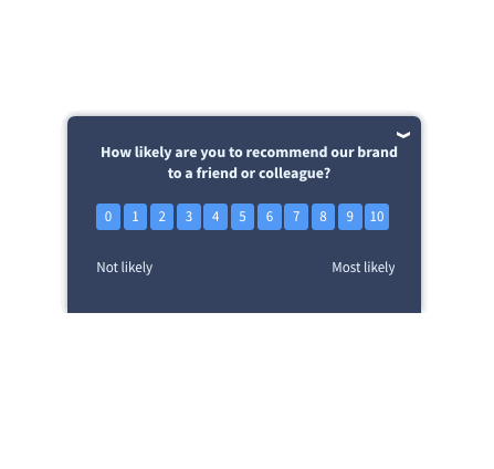
- Post-Task Difficulty Rating: A quick Single Ease Question (SEQ), “How difficult or easy was that task?” on a 1-7 scale, gives you a fast, comparable number across tasks and testing rounds.
- SUS (System Usability Scale): For a broader read on perceived usability across the whole prototype rather than a single task, a short standardized questionnaire like SUS is useful, particularly for comparing fidelity versions against each other.
You don’t need all of these for every test. For a quick five-user round, task success plus an SEQ rating after each task is often enough. Save the fuller metric set for higher-stakes rounds where you’re comparing multiple design directions.
Quick Tips to Avoid Prototyping Mistakes
If you’ve been with us to this point, you’d be very well aware of what prototype testing is and what are the most common prototype testing mistakes that you would come across while doing so.
Now, let’s quickly go through some of the tips that you can easily implement to avoid mistakes during prototyping.
- Know exactly why you’re testing your prototypes before jumping in.
- Explore multiple different design possibilities to avoid prematurely settling in one design direction.
- Consider paper or low-fidelity prototypes for early, high-level concept validation, but the right fidelity depends on your research question, how much the interaction relies on things paper can’t simulate (like gestures or dynamic feedback), how far along the product is, and what you’re actually trying to validate. A checkout flow with meaningful interaction complexity, for instance, often needs a clickable digital prototype even at an early stage to produce useful findings.
- Make your prototype as interactive as possible for the best results.
- Schedule frequent design reviews to brush off any imperfections before you go too far in the design process.
- Test your prototypes with your friends or non-design colleagues before testing them externally.
- Always be agile in your testing and recruit relevant users as quickly as possible.
- Create a moderator guide that outlines the expected flow and likely click paths, for your own reference during the session, not as instructions you give to users. This helps you notice when a tester deviates from the expected path (often the most valuable finding) without steering them there yourself.
Test Prototypes With Confidence
Prototype testing is all about freedom: freedom to be creative, make prototyping mistakes and eventually create something amazing.
There are plenty of pitfalls throughout the prototype testing process, but most of them are avoidable once you’re deliberate about goals, tasks, recruiting, and consent going in, and just as deliberate about coding, theming, and prioritizing what you find once testing wraps.
Thankfully, we are fortunate enough to have plenty of tools like Qualaroo to help us avoid such prototyping mistakes altogether and create promising designs by leveraging contextual feedback.
Also, if you are new to prototype testing, you can have a look at our detailed guide: A Step by Step Guide: Testing Your Prototype.
The floor is now yours, so go out there and create amazing prototypes.
FREE. All Features. FOREVER!
Try our Forever FREE account with all premium features!
 We'd love your feedback!
What did you like & how can we make it even better?
 Thanks for your feedback!
 Ask Your Question
Have a question? Get expert help to make your decision easier.