If you’ve ever used an online dating service, you know how nerve-wracking the process can be. As it turns out, that old adage your parents ingrained in you long ago is very true — you don’t get a second chance to make a first impression.
In the fast-paced world of digital commerce, viewing your customer base as an endless series of blind dates can provide much-needed direction towards ultimately finding success. All that time and effort spent designing an effective advertising campaign does you little good if it doesn’t ultimately lead to the ROI and conversions you crave in the first place. Page impressions, as hard earned as they might be, don’t mean much without corresponding sales.
A landing page is a standalone page from a website that is focused on conversion. It should be a critical component of your overall marketing strategy, providing a familiar, streamlined and effective segue between customer engagement along the sales funnel.
Effective landing page design requires unique insights into the complexities of consumer behavior and preference. When properly constructed, landing pages can make sure those metaphorical, endless first dates with your customer base will always make first impressions that lasting success can be built upon.
With landing pages, you should absolutely sweat the details
The most efficient and effective landing pages are those that intensify the initial customer engagement, strengthen brand identity, and increase familiarity with your product or service.
As several recent studies have shown, those small emotional responses that often occur within a fraction of a second can be the difference between conversions to sales and an endless stream of aimless, fruitless browsing and empty page impressions. Landing pages should be designed in a deliberate, well-organized manner that is specific to the message and tone of your overall strategy.
They should always highlight emphatic calls-to-action, be constructed to optimize readability and absorption, and breed that crucial sense of familiarity that inherently lends itself to higher conversion rates.
Even a peripheral review of different landing page examples will provide clear evidence of pages with effective designs and those that add nothing to the customer experience.
Marketo used YouTube display ads in a recent campaign to engage potential customers by offering a free report:

The accompanying landing page successfully matched the overall design and message by reiterating the offer and again emphasizing the free report:
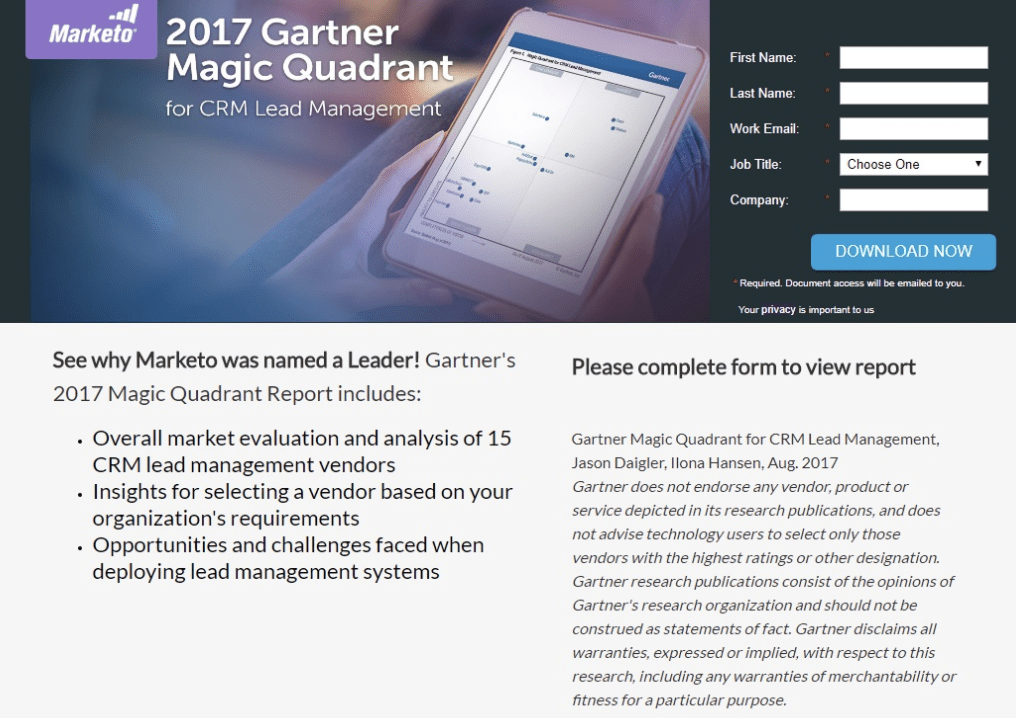
This consistency develops a familiarity within the user that makes them much more likely to follow through and download the report.
Take a streamlined approach
Ideally, a landing page should enhance the overall user experience. Its message should be simple and direct, focusing its efforts on advancing the customer further into the sales funnel and intensifying the impact of your page impressions. Distinct, individual landing pages should be used for each specific offer with no distractions to dilute the user’s attention. In other words, landing pages are one instance where one size should never fit all and less is always more.
Furthermore, users should never have the ability to click on links that lead in any other direction than the call-to-action. Don’t treat your landing pages like random links embedded within your company’s main site. Remove any semblance of header and footer navigation along with links to your homepage, product page or even contact page.
All branding, including corporate logos, images and copy, should be concise, blend with the page design, and void of any hyperlinks routing the user elsewhere. Eliminating all such distractions helps create a necessary focus on the conversion process and validates the page impressions in the first place.
Design with purpose
Instapage always constructs landing pages with an underlying mind towards ease-of-use and natural human tendencies. Research into those tendencies has revealed particular site designs as being especially effective in maximizing content and message absorption by the user.
Using heatmaps to track eye-movement while reading site copy, such research has shown that content formatted in both F-Patterns and Z-Patterns are more persuasive in getting visitors to navigate your page the way you want them to, avoiding the aimless browsing that lacks purpose and intent.
This heatmap image illustrates eye-movement tracking on three separate pages:
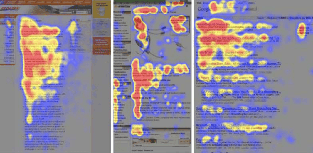
F-Patterns are those where users scan across the top headlines of copy and then skim downwards along the left side of the page to view numerals and bullet points. The pattern is completed when the user scans across the page again to read bolded text or subheadlines. An F-Pattern emphasizes strong, persuasive headlines as well as evocative subheaders and bold keywords to convey information, often within dense or lengthy copy to facilitate skimming.
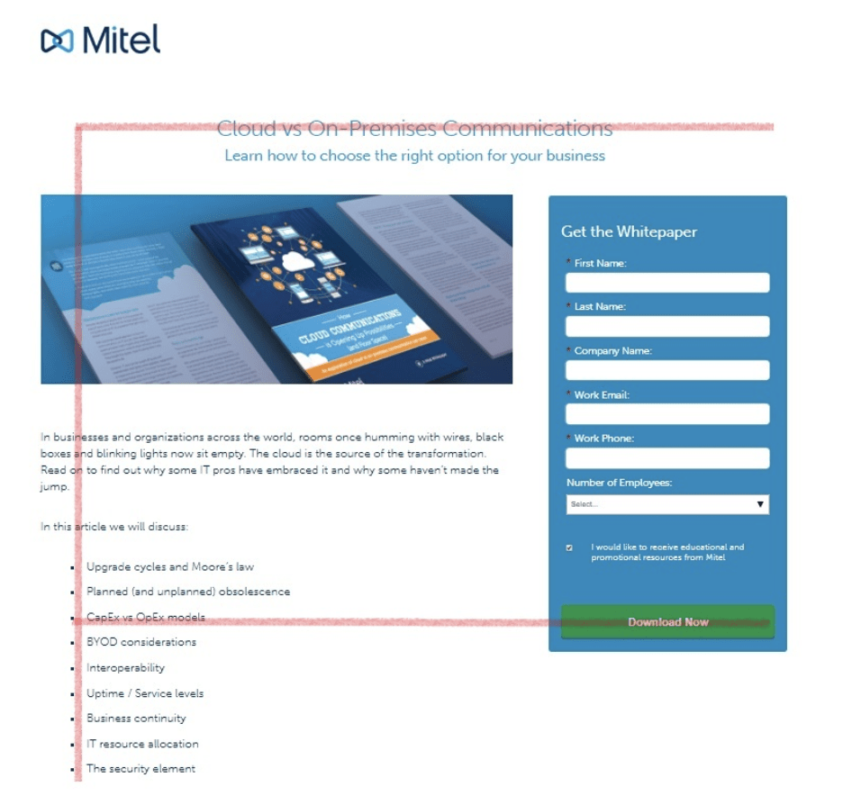
In this example, Mitel uses an F-Pattern to emphasize the headline and call-to-action along horizontal lines as well as informative bullet points on the left margin:
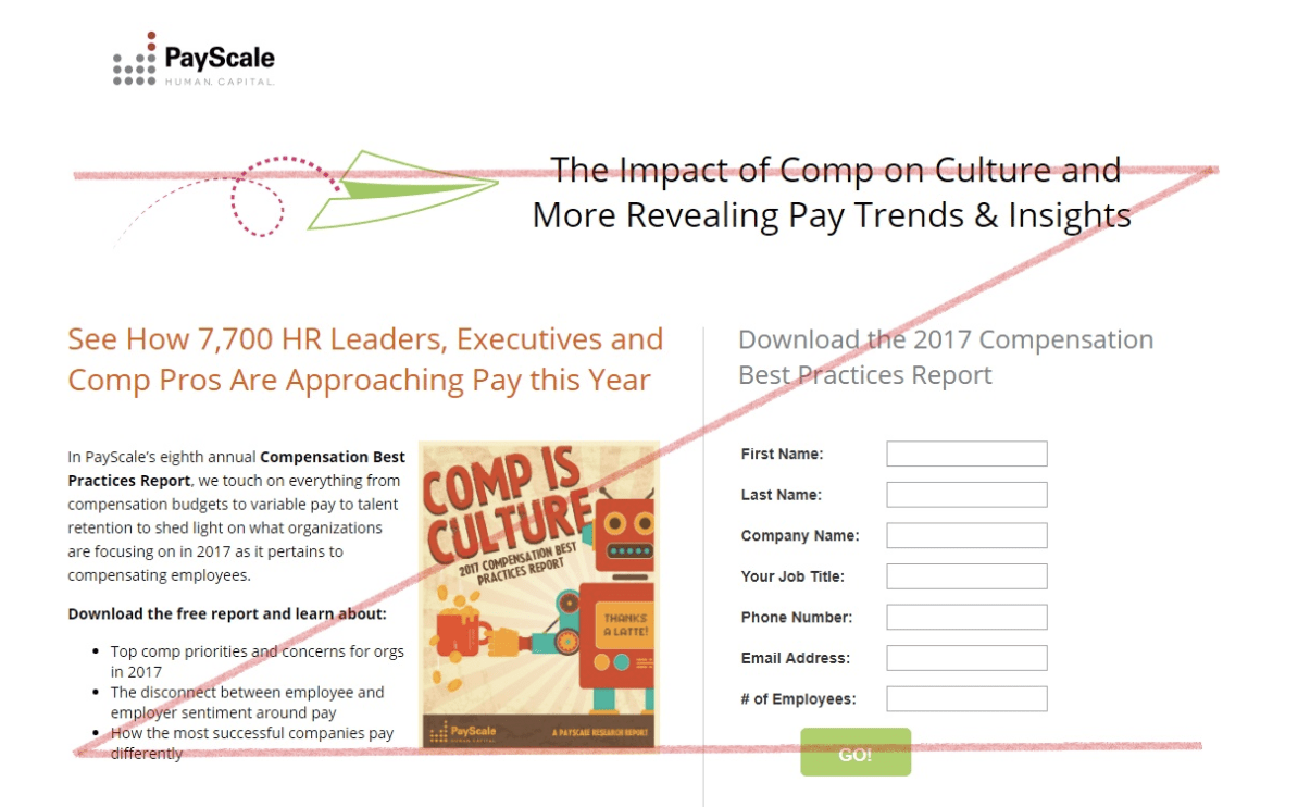
Similarly, Z-Patterns also feature strong opening statements but then rely on a skimming eye-movement. This sequence moves from the top-left corner of the screen to the top-right, then diagonally down the page, and finally over to the bottom-right, once again re-engaging with the copy’s closing statements. Whether relying on F-Patterns or Z-Patterns, however, landing page content should be designed to adhere to these types of instinctual reading patterns to maximize engagement and focus attention on a persuasive call-to-action.
PayScale utilizes a Z-Pattern on their landing page, placing emphasis on the headline, image and information, as well as the call-to-action to form a distinctive Z:
FREE. All Features. FOREVER!
Try our Forever FREE account with all premium features!
Include the right elements
Aside from the overall design, the more granular elements of a landing page are also important components to maximizing ROI and conversions. An appealing and effective headline serves as the anchor point for the design and foundation to which the other elements attach.
Your landing page headlines must be compelling enough to convince the user to stick around long enough to understand and consider the product or service that you’re offering. It should be clear and concise, leaving absolutely no room for ambiguity.
Headlines
Likewise, a headline needs to be relevant and consistent with the originating message, no matter if the user lands on the page from social media, YouTube, an embedded email link or any other source. A headline should also be empathetic to the visitor’s problem and be solution-oriented in its wording.
Clearly spelling out your unique value proposition (UVP) in the headline presents your solution in a way that distinguishes it from those of the competition and allows your brand and product to set itself apart.
Images
Images are another useful way to convey purpose and meaning to your customer base as visual branding is what leaves memorable mark. However, any images embedded into a landing page should be used in an extremely deliberate manner or they risk detracting from the customer experience, diluting your message and focusing attention away from the sales process.
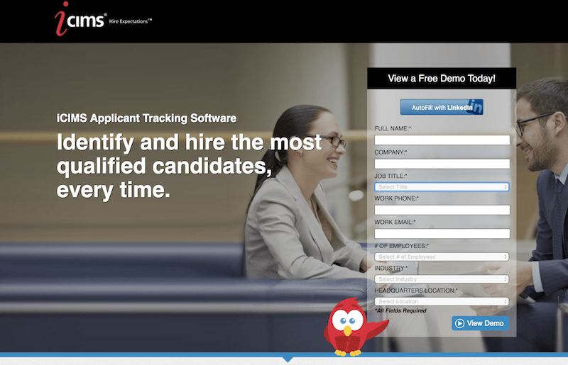
The deictic gaze is a psychology concept that is important to keep in mind when choosing particular images to use within a landing page. The concept states that a user’s attention will automatically be drawn to whatever direction another person is gazing towards or directional cue points to, irrespective of other content prompts. Look at how iCIMS strategically places their form in-line with their eyesight:
Since the entire point of a landing page and your page impressions is to focus on a call-to-action and deepen the sales process, images should naturally pull the user’s attention to the call-to-action and never distract the eye elsewhere.
Copy
Landing page copy should be concise and persuasive. It should use highly readable words and phrasing to convey information and further engage the user without unnecessary language that serves no useful point.
Blocks of uninterrupted text should be avoided at all costs since they tend to intimidate the typical user and dissuade them from remaining on the page. Keywords and phrases that encapsulate important concepts and components of your message can be in bold typeface to capture attention and strengthen impact.
White space
Landing page design should also be cognizant of white space, sometimes referred to as negative space, within the overall look and feel of the page. This space relies on the absence of clutter and distractions that would draw attention away from the overarching theme and message. The absence of such clutter prompts the user’s eye to follow your intended path that leads to your call-to-action and advancing the user along the sales funnel.
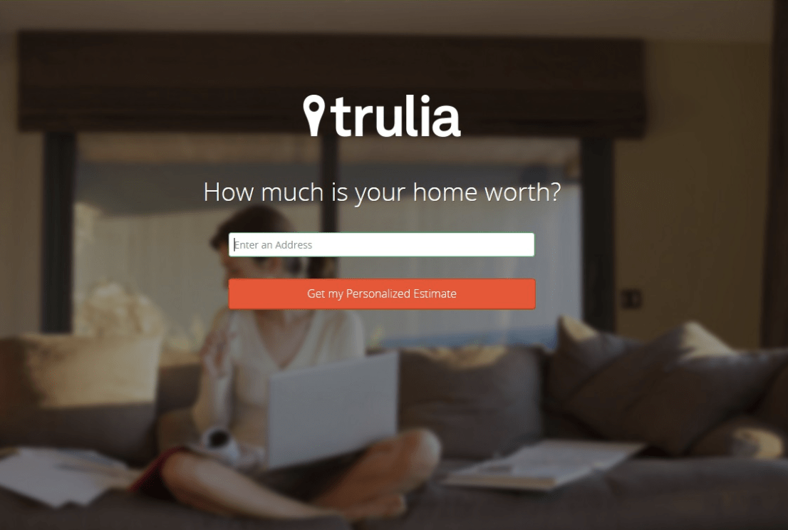
Truvia uses white space to draw attention to the call-to-action on its landing page. The background image breeds familiarity but is blurred to not distract from the primary focus of the page. The sparse negative space emphasizes the important elements of the design:
Call-to-action
Your CTA should be distinct to make it a focal point within the page that cannot be overlooked by the user. It should be located in a place where attention is naturally drawn, like the bottom of the design framework if employing a Z-Pattern for instance, and use colors, shapes and verbiage that make it stand out from the other elements within the site design.
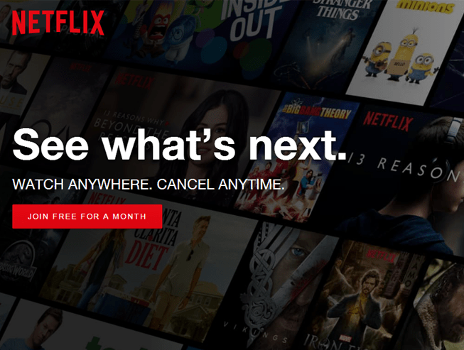
Netflix uses a distinctive CTA button in its landing page. It is well-positioned and in a contrasting color to make it obvious to the user. Just as important, however, the CTA button copy is customized to fit well with the overall message. It emphasizes the free trial and is placed directly underneath copy that assures the user they can cancel at anytime:
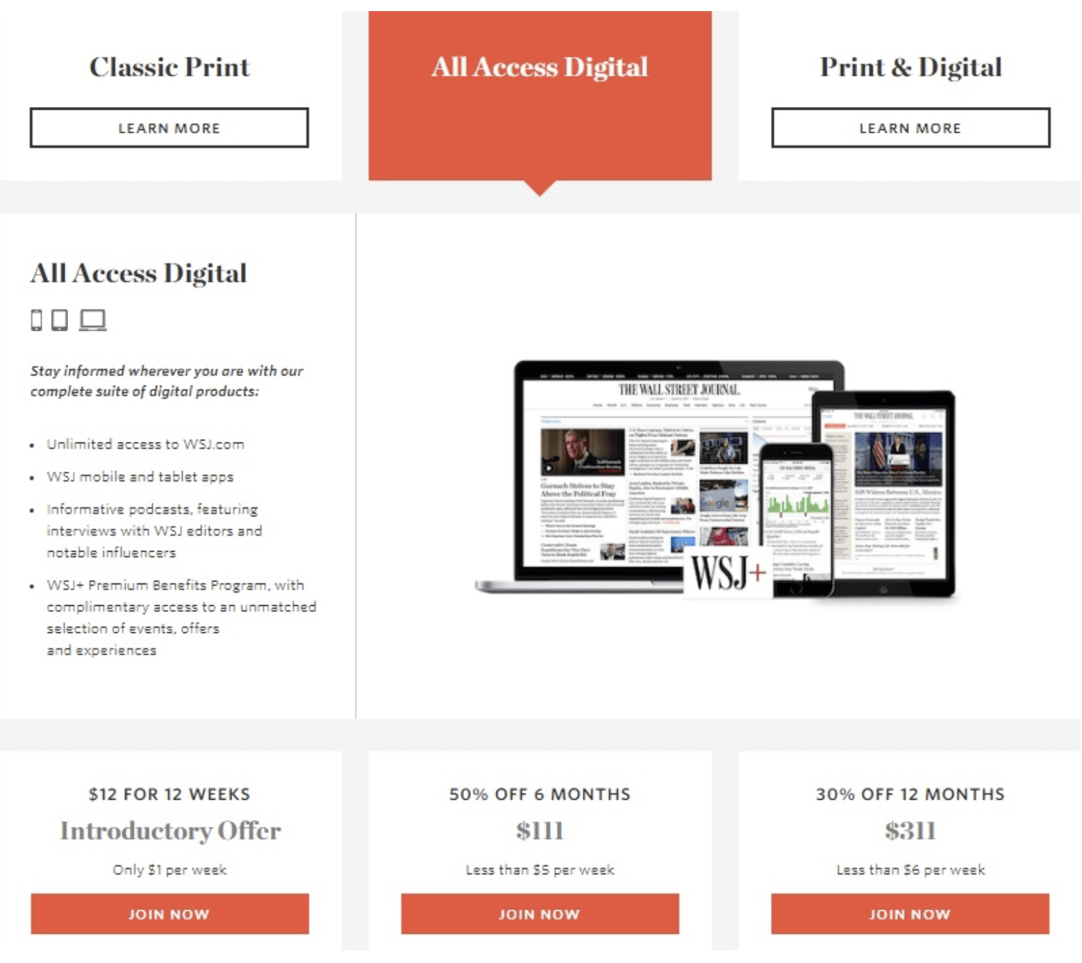
Psychology adds another useful concept when using multiple CTAs for different price points on the landing page. This concept, called the decoy effect, relies on asymmetries between varying offers to entice a user to choose your preferred option.
For example, if your company is offering two different models for your product or service, a basic model at a low price point and a deluxe model at a higher one, users would typically choose the basic model strictly out of cost efficiency.
However, if you include a third offer, one with a price point even higher than that of the deluxe model, users are much more prone to choose that middle deluxe model since it now looks like a great deal in comparison. This decoy effect is based on a user’s natural cognitive biases and irrational decision-making process when presented with asymmetrical choices.
The following subscription offer from the Wall Street Journal perfectly illustrates the decoy effect. By presenting an asymmetric offer for the 12 month subscription at a price point far higher than the other two deals, the paper is using the decoy effect to entice the user to purchase the 6 month, All Access Digital package:
Forms
Your landing page form must be designed in a way that doesn’t dilute attention from the CTA. It should also be user-friendly to add to, not distract from, the overall customer experience.
Make sure the number of form fields is appropriate to the specific stage of the sales funnel. If you are targeting initial user experiences with your company and service, brevity will likely capture more leads. For customers lower in the funnel, a longer form will probably lend itself to better profiling and higher quality leads for your sales team.
Trust badges and social proof
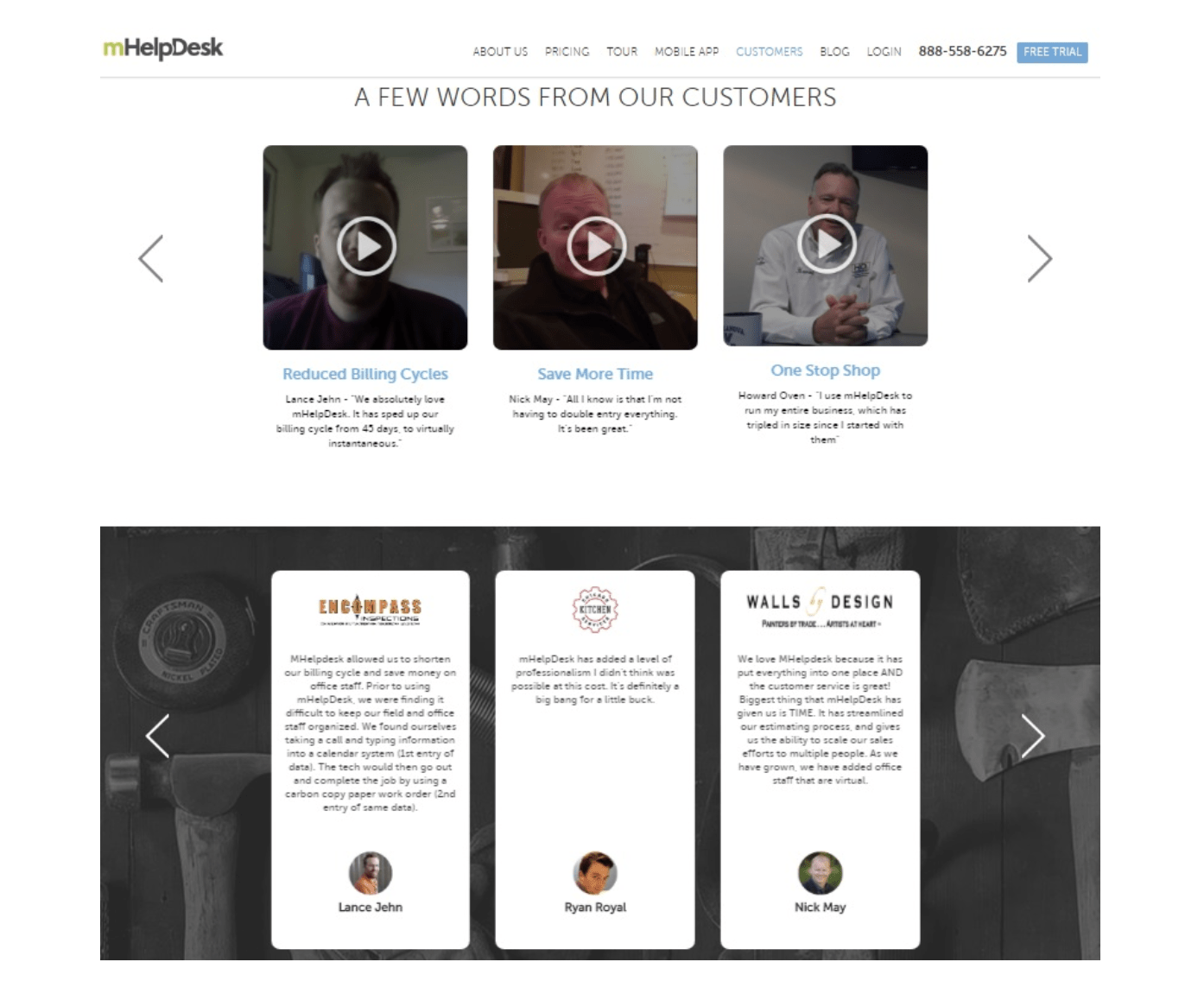
To bolster a sense of comfort and security for your product or service, social proof in the form of customer testimonials, awards your company has won, number of downloads, or even social media likes can have a similar effect, establishing trust between your brand and the user as well as enhancing the potential impact of your page impressions on the bottom line.
mHelpDesk uses both video and written testimonials to create a sense of trust between the user and brand. Allowing the user to see the faces of the testimonials further enhances trust and impact for the page:
FREE. All Features. FOREVER!
Try our Forever FREE account with all premium features!
Increase page impressions using landing pages
Landing pages are much more than a simple extension of your initial customer engagement. They serve as a conduit between an advertising campaign and the sales they strive for, maintaining and building upon the voice, tone and story you meticulously developed for your overall marketing strategy.
Speak the vocabulary, understand the concepts and insights — even use a marketing dictionary if necessary — and take a well-informed look at your landing pages to make sure they’re performing for you. In the end, it’s about creating first impressions that lead to successful and lasting relationships.
About the author
Brandon Weaver is the Director of Content at Instapage, the world’s most customizable and designer-friendly landing page solution. He writes about landing pages, marketing, and has a healthy obsession with the Golden State Warriors. Say hey: @bkweav
FREE. All Features. FOREVER!
Try our Forever FREE account with all premium features!
 We'd love your feedback!
What did you like & how can we make it even better?
 Thanks for your feedback!
 Ask Your Question
Have a question? Get expert help to make your decision easier.