

Most product teams know UX matters. Fewer know which numbers to actually watch.
There are dozens of UX metrics out there, and most advice on the topic either lists them all without telling you how to measure them or skips the measurement entirely. Neither is useful when you have a drop-off to diagnose or a redesign to justify.
This guide covers the metrics that move the needle for SaaS and product teams:
- What each metric tells you and when to use it
- How to measure it without a large research team
- How to turn the data into faster, smarter product decisions
- Where in-context feedback tools like Qualaroo fit into the picture
Let’s check these metrics out.
What Are the Key UX Metrics You Need to Track?
UX metrics are the data points that tell you how people experience your product: how fast they complete tasks, where they drop off, how often they make errors, and how satisfied they feel along the way. They split into two main categories: behavioral (what users actually do) and attitudinal (how they think and feel about the experience).
Here is the shortlist. For each one: what it tells you, and exactly how to measure it:
What Does Task Success Rate Tell You?
Task success rate is the percentage of users who complete a defined task: submitting a form, finding a setting, finishing checkout, or completing onboarding.
It is the most direct measure of whether your product actually does what it promises.
How to Measure the UX Metric:
- Define a specific task with a clear pass/fail outcome
- Observe users (moderated or unmoderated) attempting the task
- Divide completions by total attempts and multiply by 100
- Track it across releases to catch regressions
If 100 users attempt a task and 70 finish it, your task success rate is 70%.
A 2011 research by J. Sauro (MeasuringU) benchmarks from usability studies consistently show that well-designed digital products average 78-85% on primary tasks.
Anything below 70% on a core flow needs immediate attention.
A Task Completion Template You Can Use:
How Do You Use Time-on-Task to Spot Friction?
Time-on-task measures how long it takes a user to complete a specific action. Shorter is not automatically better.
The useful question is: how does today compare to your baseline, and did something you shipped recently move it?
How to Measure the UX Metric:
- Set a baseline during initial usability testing
- Record start and end times per task in usability sessions
- Track session analytics for time-to-action on key flows (feature activation, checkout, form submission)
- Flag any increase above 20% after a release
Track this alongside the task success rate. A user who completes a task but takes three times longer than expected is not having a good experience, even if the success rate stays high.
What Does User Error Rate Reveal About Your Product?
User error rate counts how often users make mistakes: wrong inputs, failed submissions, misclicks, and backtracking. A high error rate on a specific step almost always points to a UI clarity problem, a missing affordance, or confusing copy.
How to Measure the UX Metric:
- Count errors per task attempt during usability testing
- Use session recordings to identify backtracking, rage clicks, and repeated attempts
- Monitor form validation errors and submission failures in your analytics
- Segment by new versus returning users
If errors cluster around new users, that is an onboarding problem. If returning users make the same errors, the issue is structural.
How Does System Usability Scale (SUS) Work?
SUS is a ten-question standardized questionnaire that produces a usability score from 0 to 100. It was developed by John Brooke in 2013 and has been validated across hundreds of usability studies.
Because it is standardized, you can compare your score against industry norms and track it across product versions.
How to Measure the UX Metric:
- Administer the ten SUS questions immediately after a usability session or key interaction
- Alternate positive and negative statements to reduce response bias
- Calculate: (sum of odd-item scores minus 5) + (25 minus sum of even-item scores), then multiply by 2.5
What the scores mean in practice:
| SUS Score | Grade | Interpretation |
|---|---|---|
| 90 and above | A | Excellent. Extremely intuitive. |
| 80 to 89 | B | Good. Above average usability. |
| 70 to 79 | C | Acceptable. Marginal. |
| 68 | D | Below average. Industry floor. |
| Below 68 | F | Poor. Significant issues exist. |
A 2013 study by J. Sauro (PhD.) stated that 68 is the average industry SUS score. Sitting below that is not a minor concern. It usually means structural usability problems, not cosmetic ones.
SUS tells you that users rate your product poorly. It does not tell you why. Pair it with open-ended questions or session recordings to find the cause.
A SUS Template You Can Use:
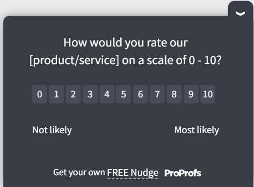
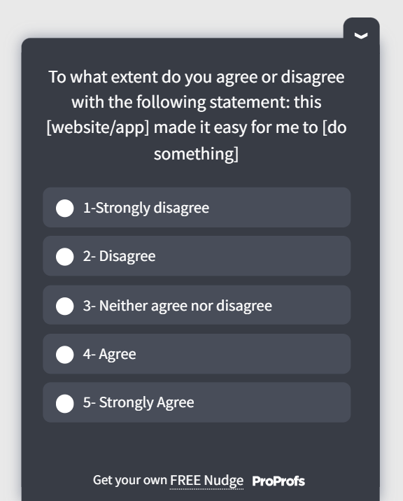
What Is NPS and When Should You Use It?
Net Promoter Score asks one question: “How likely are you to recommend this to a friend or colleague?” on a 0 to 10 scale. Promoters (9-10) minus Detractors (0-6) gives your NPS.
How to Measure the UX Metric:
- Send NPS surveys at consistent intervals (monthly or quarterly) to your active user base
- Trigger an NPS survey after users reach a meaningful milestone, such as 30 days of active use
- Always follow up with an open-ended “why” question to get the reasoning behind the score
- Track NPS by user cohort, not just as a company-wide average
Bain & Company, in the year 2022, noted that while any score above 0 is technically “good,” a score over 50 is excellent, and 70+ is considered “world-class.”
One Important Caveat: NPS is a loyalty metric, not a usability metric. A high NPS with poor retention is a contradiction that usually means users like your product but are not getting enough value from it day to day.
For internal or enterprise tools where users have no choice, Customer Effort Score (CES) is a better fit because it measures ease of use rather than likelihood to recommend.
An NPS Template You Can Use:

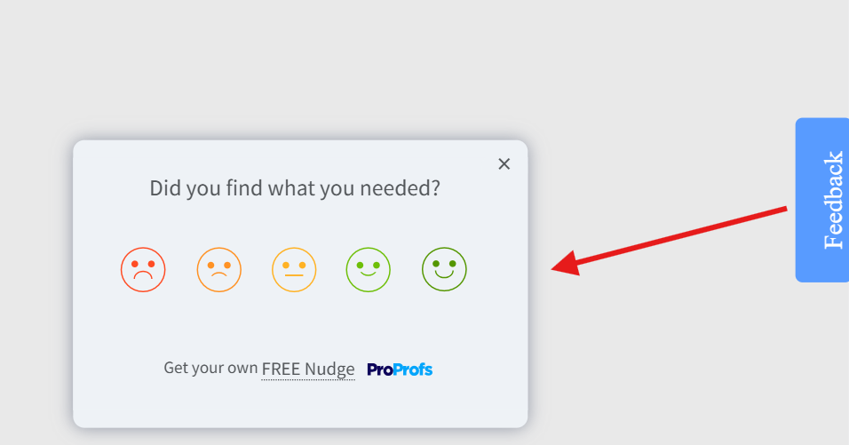
How Does CSAT Measure Satisfaction at Specific Moments?
Customer Satisfaction Score (CSAT) measures how satisfied a user was with a specific interaction. You ask, “How satisfied were you with your experience today?” right after a defined event: completing onboarding, resolving a support ticket, or using a new feature.
How to Measure the UX Metric:
- Trigger a CSAT survey immediately after a key action while the experience is fresh
- Use a 1-5 or 1-10 scale, then report the percentage of satisfied respondents (4s and 5s on a 5-point scale)
- Segment CSAT by flow, feature, or user type to pinpoint where satisfaction is lowest
- Track it over time to catch deterioration after releases
A Salesforce study indicates that a CSAT score above 70% is generally considered strong. A reading below 50% is a clear signal that the specific interaction is creating friction worth fixing.
Use CSAT for point-in-time feedback after a defined event. Use NPS to track overall relationship sentiment over time. They answer different questions and should not be treated as interchangeable.
A CSAT Template You Can Use:
How Do You Actually Collect UX Metrics Data at the Right Moment?
Knowing the UX metrics is one thing. Getting clean, actionable data from them is another. Traditional UX surveys sent by email 48 hours after an interaction miss everything that matters: the exact moment of friction, the context, the emotion. You get vague responses that are hard to act on.
That is the core problem Qualaroo solves.
Instead of interrupting users with a generic pop-up or chasing them down after the fact, it lets you place targeted micro-surveys called Nudges at specific moments in the user journey, triggered by real behavior.
The user who just tried and failed to complete a key task sees a question right there, in context, while the experience is still fresh. That is a fundamentally different quality of data.
Here is how to set one up:
Step 1: Name Your Nudge
Inside the dashboard, every survey is called a Nudge. Name it clearly so your team can find and track it, something like “Onboarding Drop-Off” or “Feature Adoption Check.”

Step 2: Write Your Question and Pick Your Format
One to three questions is all you need. Choose the format that fits your goal: a quick rating, yes/no, emoji reaction, or a free-text box for the full story. Keep it tight. The shorter the ask, the higher the response rate.

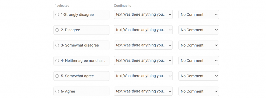
Step 3: Turn on Branching Logic
This is where it gets genuinely useful. The survey adapts based on how someone answers. A frustrated user gets asked what went wrong. A happy user gets asked what they loved.
Same survey, two completely different conversations, both relevant to where that person actually is.
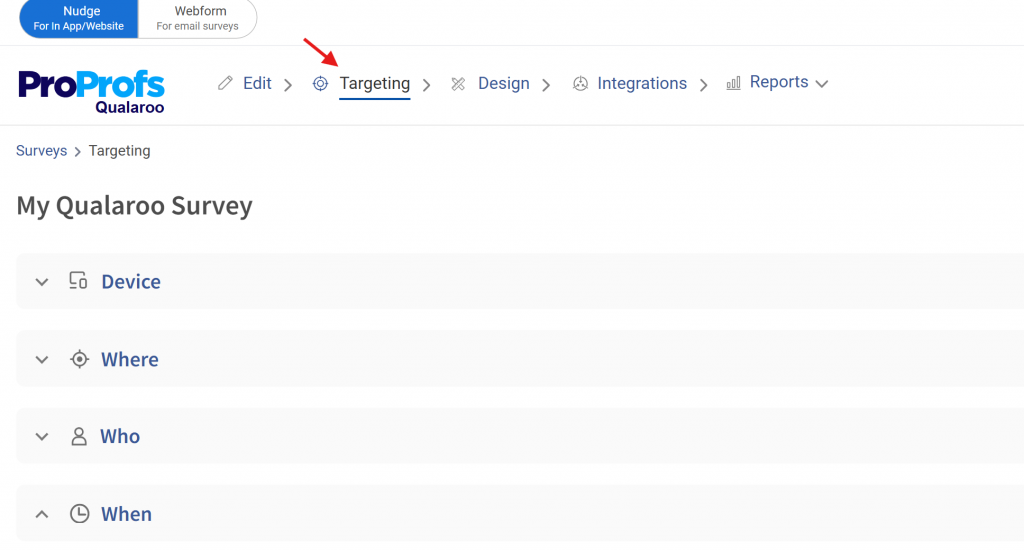
Step 4: Set Your Targeting
You are not placing a survey on a page and hoping the right person sees it. You can target by URL, by user behavior, by what someone just did, or by how many times they have visited a specific page.
The user who has been to your pricing page three times but never signed up sees a completely different question than someone who just completed their first purchase.
Someone heading for the exit sees an exit-intent Nudge before they disappear.
Step 5: Tie Every Response to a Moment
Each answer comes with behavioral context: where the user was, what they just did, and how far into their journey they are.
That context is what makes this data actionable. Traditional survey feedback arrives stripped of all of it. Furthermore, you get to see customer sentiments in real time.
How Do Qualitative and Quantitative UX Metrics Work Together?
Quantitative data tells you what is happening. Qualitative tells you why. You need both, or you will keep shipping fixes that address the symptom and miss the cause.
Here is the pattern that catches teams off guard: you can have a perfectly average SUS score while users are quietly working around a broken flow they have trained themselves to tolerate.
That never shows up in a number. It only surfaces when you watch someone use the product or read what they wrote in an open-ended field.
A practical triangulation setup for a SaaS product:
- Use session recordings to identify where users hesitate or backtrack
- Deploy a CSAT micro-survey immediately after the friction point
- Run a SUS survey post-onboarding to benchmark usability
- Compare results quarterly to track whether changes are working
Expert perspective: A recurring pattern among UX practitioners is the gap between what standardized metrics report and what behavior shows. A high NPS alongside poor retention does not mean users love your product.
It means they have positive feelings about it, but are not getting enough value to stay. The fix is to triangulate multiple scoring measures rather than relying on a single KPI in isolation.
One score in isolation is an ink-blot test. Leadership reads into it whatever they already believe. Three corroborating signals start to look like evidence.
What Does the UX Landscape Mean for How You Measure Experience?
Nielsen Norman Group’s State of UX 2026 report lands on one uncomfortable conclusion: surface-level design is no longer a competitive differentiator. And if you are only measuring surface-level things, your metrics are telling you the wrong story.
Two forces are driving this shift.
UI is cheaper to produce. Design systems, component libraries, and standardization mean anyone can assemble a decent-looking interface quickly. AI tools are accelerating this further. The visual layer of your product is no longer where you win or lose.
What AI cannot replicate is research-informed judgment, contextual understanding, and the decision-making that comes from actually knowing your users.
More interactions are mediated by AI. Users in many products now spend less time navigating the interface and more time delegating to an AI layer sitting on top of it. The interface is receding.
The experience is increasingly defined by the system’s behavior, its logic, and its content, not by what it looks like on screen.
Here is what this means for how you measure UX:
- Tracking visual polish or UI aesthetics is low-leverage and getting lower
- The question that matters is whether users can reliably achieve their goals, not whether they find the product attractive
- Research is no longer just a design input. It informs how AI models are trained and customized for real user contexts
- If your team is measuring output (features shipped, screens designed, surveys sent) instead of outcomes (did the user solve their problem?), you are measuring the wrong thing
NN/G also points out that the practitioners who will thrive are the ones treating UX as strategic problem-solving rather than deliverable production.
The measurement implication is the same. Track outcomes. Everything else is noise.
FREE. All Features. FOREVER!
Try our Forever FREE account with all premium features!
Start Measuring the UX Metrics That Actually Move the Needle
Most teams already have enough data to make better product decisions. The gap is not information. It is a repeatable process: collect the right signals at the right moments, connect them to specific problems, and close the loop with a fix.
Set your baselines now. Run a SUS benchmark this quarter. Deploy one in-context survey on your highest-drop-off flow this week. The data will tell you what to fix next.
If you want to start capturing feedback at the moments that actually matter, Qualaroo’s Nudge feature lets you deploy targeted surveys across web, mobile, and in-product flows without needing engineering support every time.
Frequently Asked Questions
What is a good SUS score?
The industry average SUS score is 68. A score above 68 is above average. Above 80 is rated good. Above 90 is excellent. If your score sits below 68, you have structural usability problems that likely affect task completion and retention.
How often should you measure UX?
Always-on behavioral analytics should run continuously. CSAT and in-context surveys should trigger after key events. Run SUS benchmark tests quarterly and after major releases. Monthly lightweight usability testing on one priority flow keeps you from missing regressions between releases.
Is NPS a reliable UX metric?
NPS measures loyalty, not usability. It is useful when paired with other metrics but misleading in isolation. A high NPS with poor retention signals a loyalty gap, not a UX win. According to CustomerGauge's 2021 B2B Benchmarks Report, the median NPS for computer software companies is 36, and for IT services is 40. For internal or enterprise software, Customer Effort Score (CES) is a better fit because it measures ease of use rather than likelihood to recommend.
What is the difference between CSAT and NPS?
CSAT measures satisfaction with a specific interaction, captured immediately after the event. NPS measures overall relationship sentiment over time. Use CSAT for post-event feedback. Use NPS to track relationship health across your user base. They answer different questions.
How do you measure UX without a large research team?
Use in-context micro-surveys triggered at specific journey points to capture attitudinal data without manual effort. Combine with session recording tools to see behavioral patterns. Five users in an unmoderated usability test will surface most major usability problems in a given flow.
unmoderated usability test will surface most major usability problems in a given flow. What sample size do you need for usability testing?
For exploratory testing (finding problems), five to eight users will surface the majority of major issues. For benchmark testing (comparing releases), 15 to 20 users give you a reliable comparison. For statistically reliable quantitative testing, aim for 40 to 60 participants.
FREE. All Features. FOREVER!
Try our Forever FREE account with all premium features!
 We'd love your feedback!
What did you like & how can we make it even better?
 Thanks for your feedback!
 Ask Your Question
Have a question? Get expert help to make your decision easier.