Like any field, web design comes with its own set of best practices that have become central tenets. While these “laws” are meant to improve web usability and experience, they’re certainly not immutable.
One web usability idea that seems to persist is the three-click rule: or the idea that it should take no more than three clicks for a visitor to reach their desired piece of content.
This idea is credited to UX thought leader – Jakob Nielson.
Today we’re going to debunk the 3-click rule and demonstrate why this rule needs a refresh. We will also cover some best practices you can adopt instead of the three-click rule to improve a website’s usability and user experience.
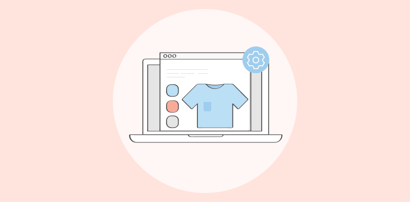
What Is the 3-Click Rule?
As mentioned above, the 3-click rule is an established belief or suggestion that aims to make the data more accessible.
It states that any desired information should be accessible in not more than three clicks. The hypothesis behind the idea is that users are more likely to get frustrated if they cannot reach the webpage or settings in three clicks.
When you think about it, the rule tends to make sense at first. After all, optimizing the UX and usability aims to let people reach their goals as fast as possible. One of the ways to do this is to reduce the number of clicks or steps in a process.
But, statistics and studies show that the 3-click rule does not apply to all websites.
In fact, sticking rigidly to the rule can make the user experience more frustrating in some cases, as we’ll see in the next sections.
Origin of 3-Click Rule
One of the earliest references to the 3-click rule can be found in the book by American entrepreneur and web designer Jeffrey Zeldman – Taking Your Talent to the Web.
The book itself does not provide empirical evidence to support the claim, rather it lists it as a suggestion rather than an ironclad rule.
The suggestion is based on the way people used the internet at that time.
So, to understand the concept behind the 3-click rule and the perceived acceptance, let’s travel back to 2001 and see the state of the worldwide web or internet.
For example, this is what Apple’s website looked like back in the day:
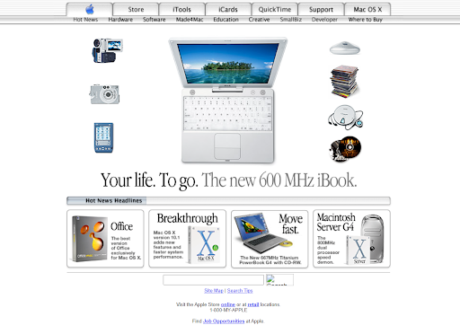
The same was true for the other 29 million websites at that time.
What’s more, only 8% of the world’s population had internet access. The internet was a new medium, and limitations in broadband bandwidth and architectural languages restricted the UX designers to a minimalistic website design.
If we add slower load times to the mix, this rule starts to make sense.
Plus, there was primarily a linear route for visitors to get to a desired web page.
Type a specific company name or term >>> click on the link >>> wait for the page to load >>> browse through the website and click on the desired link.
The internet and website design were also expensive.
So, it’s fair to believe that people would get frustrated if they took a lot of time to reach a specific page. That’s why the number of clicks on a website triumphed over aesthetics.
And for companies, it was cost-effective to keep things simple, which didn’t require excessive coding.
But even in those early days, studies proved that number of clicks & usability were only related when they provided a better user experience.
In 2026, there are as many paths to a website as there are pages on it. Using the three-click rule would lead to a lot of backtracking and overstuffed design elements.
Let’s understand this by an example.
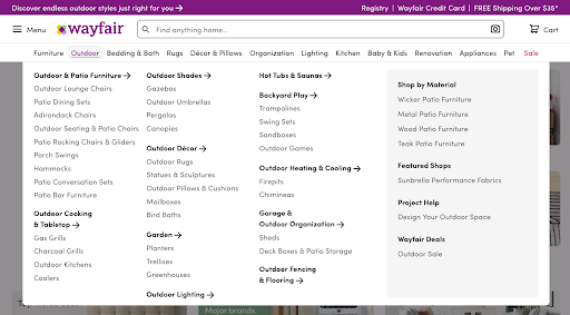
3-Click Rule Can Create Unoptimized Website Navigation UIs
One of the major challenges following the 3-click rule is designing a navigation menu.
Websites’ hierarchical architecture(IA) has expanded exponentially in the last few years.
Each business website has categories, sub-categories, independent landing pages, blog posts, FAQs, help center sections, and other such elements to drive and target different traffic types to the targeted page.
Imagine what would happen if all these headings and pages were crammed into a single mega menu on the website header to make everything accessible within the 3-click distance.
It would be hard to follow, less legible, confusing for the visitors, and may lead to visitors bouncing off the website.
You made the experience worse by trying to make it better with an unproven suggestion.
It directly conflicts with providing a seamless user experience which is the central core of website design.
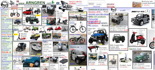
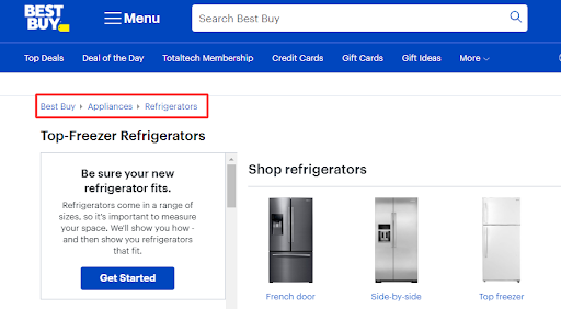
Here is an example of a densely populated IA that will surely make you nauseous:
And this is the navigation menu for the New York Times website:
You can see that each item corresponds to a major news category.
When you click on an element, it takes you to a new page with subcategories and related news articles.
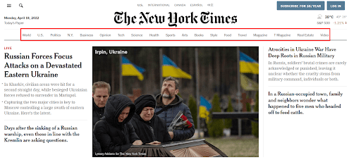
Now, think of the chaos that would ensue if the news outlet decided to jam all that information into their header to make the items accessible in three clicks.
That’s why website IA should be tackled on an individual basis.
So what should you do?
Sit and design the first iteration of your website navigation menu, run some usability tests like card sorting, and repeat the process to optimize it further.
Make the most out of usability testing with Qualaroo insights.
Studies That Challenge the 3-Click Rule
Usability does not equate to a specific number of clicks, taps, pinches, and swipes
– John Morkes
Let’s move from logical explanation to real-life case studies that solidify the fact that the 3-click rule is a myth:
1. Joshua Porter’s Research
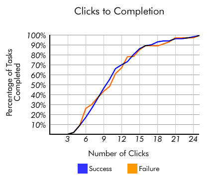
In 2003, Joshua Porter took it upon himself to find out how many clicks are too many on a website.
The study results knocked the 3-click rule straight out of the park.
The team analyzed over 8,000 clicks and found that people visited as many as 25 pages before completing their task.
The average number of clicks ranged from 3 to 25, and the users kept on clicking.
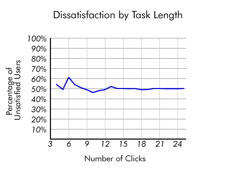
What’s more, the study found very slight variation in the dissatisfaction among users based on the number of clicks.
The data drew a relatively flat graph:
This study also points out that users usually don’t quit because of the number of clicks.
Visitors bounce off a website when they fail to find what they desire. If users have to click the back button continuously, they are more likely to give up.
But if the users feel they are headed in the right direction, they keep moving forward.
2. Jakob Nielsen’s Usability Tests
Jakob Neilsen’s book Prioritizing Usability describes that in a series of usability tests, their team found that the ease of finding information increased by 600% after switching to a design that placed the product page 4 clicks away from the homepage instead of 3 clicks.
So, they essentially increased the number of clicks to purchase and still got better results.
Here again, we can see that the focus is on user experience. By making the information more easily accessible, people were not bothered by the number of clicks.
FREE. All Features. FOREVER!
Try our Forever FREE account with all premium features!
Should You Ignore the Number of Clicks Altogether?
We’re not saying that you should completely ignore the number of clicks it takes to accomplish a task or unnecessarily inflate that number.
Instead, maintain better metrics to focus on, i.e., user confidence and satisfaction.
If people know they can get what they need and have a sense of progress toward that goal, they will click however many times necessary.
We saw this tendency in Joshua Porter’s study.
In fact, sometimes, it’s better to have more clicks to segment a task or set of content so as not to overwhelm your audience. In other cases, you can do better with a single click.
We have two practical examples from the extreme ends of this ‘number of clicks’ spectrum to illustrate our point:
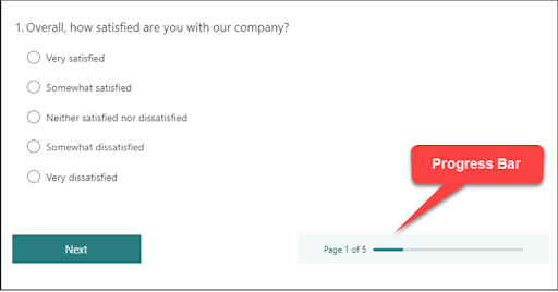
1. Multi-Step Forms (When You Should Do Away With 3-Click Rule)
Different studies show that multi-step forms perform better than single-step forms. This is especially true when you have an extensive form:
- Conversionfanatics website tested out single-step and multi-step form processes on its landing page to discover that the multi-step form outperformed the former by 12%. It also produced higher leads.
- Geek Powered Studios switched from a single form to a 4-step lead generation form and improved the conversion rate on their client’s website by 5.51%.

The reason behind these results is simple.
Large survey or lead forms can be intimidating to some users and may be harder to understand. The situation can worsen if you want to collect different types of information.
For example, your form may contain fields for personal information, professional information, follow-up questions about behavior or preferences, and other such fields.
If you try to add all this on a single page, you would have to create sub-sections, making the form look bloated. It is better to separate the form into multiple pages.
The same goes for survey forms – nobody likes filling in long forms!
Take, for example, feedback software like Qualaroo that divides its survey Nudges™ into multiple screens.
The multi-step design makes it easier for respondents to focus on the question at hand as opposed to getting overwhelmed by a long page full of questions.
Even though users have to click many times, they are confident that they are getting closer to their goal.
You can also add a progress bar (either visually or numerically) to instill confidence in users and help them understand where they are in their process.
At the end of the day, user confidence needs to be at the heart of design ideas.
Watch: How to Create a User Research Survey
There are other scenarios where more clicks can be a good thing.
For example, when you’re making a purchase on a new site, you’d probably feel more confident if you had a review screen to confirm your order details and payment information.
If an additional screen or confirmation page can prevent a user from making an error, it may be for the best.
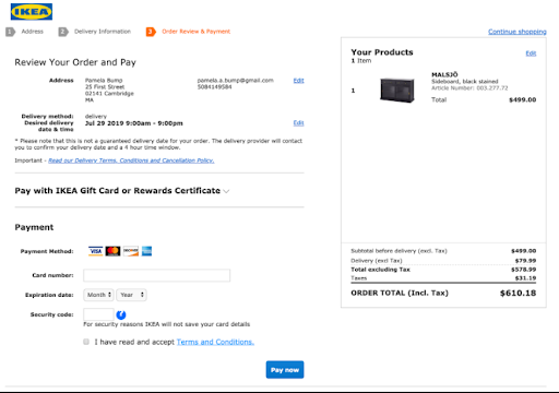
More clicks aren’t always bad, especially when they inspire trust.
2. One-click Checkout (When Fewer Clicks Are Better)
In some scenarios, fewer clicks are better. Specifically, additional clicks that add no value to your user’s experience or are particularly repetitive should be avoided.
One example we love where fewer clicks make a lot of sense is Amazon’s 1-click checkout.
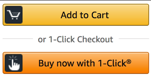
This simple feature streamlines your purchasing process by auto-saving your payment and shipping information and allowing you to purchase in…one click.
1-click works because it eliminates the need for users to enter the same information repeatedly.
It’s great for user experience, as frequent shoppers don’t necessarily get anything from repeating the same process for each order.
It’s also good for Amazon as it reduces barriers to purchasing and lowers the chances of cart abandonment.
5 Tips Better Than 3-Click Rule to Improve Website Usability
By now, you can see that strict adherence to the three-click rule is an absolute no-go in the website and UX design.
This begs you to ask a simple question – Are there better ways to optimize the customer journey based on a data-backed approach?
There are, and we have listed some of them below:
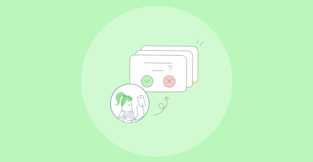
1. Run Usability Tests
The simplest way to assess a website’s usability is through usability tests. It can help you find the points of improvement for different website elements before and during development.
Some of the true and tried means of optimizing your prototype are card sorting, reverse card sorting, and tree testing.
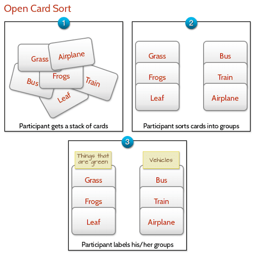
These methods are great to gauge if people can easily navigate through your menus and IA to reach the desired page or settings without much effort.
You can test your prototypes and product designs before committing anything to development.
The best part is that you can run these remotely using advanced usability tools like Usabilla, eliminating the need for personal interview sessions.
So if you are planning to launch a new product or a major update, test it out to check for yourself if the 3-click rule works for you or not.
Getting started on usability testing?
Check out our step-by-step guide to design your first usability test
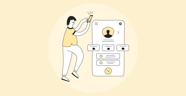
2. Collect Customer Feedback Regularly
Testing during development is an excellent strategy to refine your initial design, but participants’ experience under controlled testing conditions may differ vastly from the actual visitors.
So, how will you gauge its usability once your website goes live?
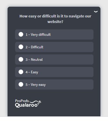
Simple. Ask the following question directly to the visitors – “Did you find what you were looking for?”
Collecting regular feedback can help you run post-release optimization using the experience insights from the users.
You can use an effective customer feedback tool to design targeted surveys and gauge how easy it was for the visitors to reach the desired page.
Here’s how:
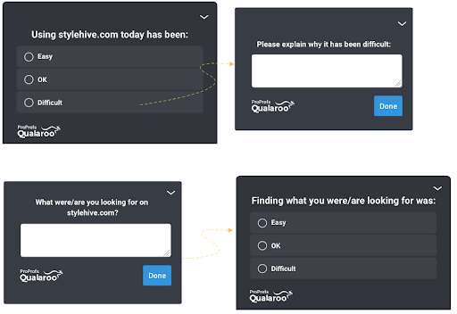
- Add these surveys to your homepage, checkout page, knowledge base section, and other interaction points that include multiple steps or subsections.
- For example, if you have placed a survey Nudge on your 4-step checkout process, you can see if people find any step redundant, time-consuming, or confusing.
- Ask how their shopping experience went and what they would change in the checkout process.
- Once you have data, you can optimize the checkout to improve the user experience.
- Then, run another survey after the update to find out if your efforts worked or not.
The best part is that advanced usability tools like Qualaroo let you analyze the feedback data in real-time so you can run continuous optimization.
You can leverage the inbuilt AI-based sentiment analysis engine and detailed reporting section to dig through the feedback in real-time and extract actionable insights.
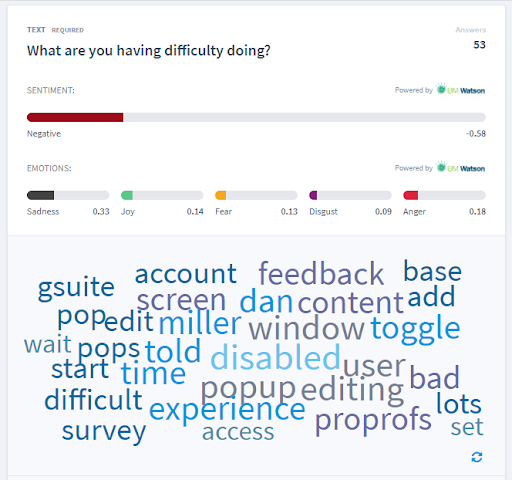
Case Study: How Marketade Improved UX Using Contextual Feedback
Marketade’s client, a healthcare services provider, wanted to improve their website. Using a feedback software like Qualaroo they piloted some surveys to measure UX, especially from exiting visitors.
With an ease-of-use survey and a task survey, they found that accessing records on the website, searching & querying, and accessing contact info & appointments were difficult for the visitors, adding to their frustration while browsing the website.
With quantitative and qualitative data in place gathered from these surveys, they were able to improve the website flow in motion.
Read more about how they did it here.
Avoid Large Hierarchical Drop-downs
As the name implies, a multi-level hierarchical menu lists the categories, sub-categories, and items in a hierarchical manner on the website navigation.
So, the customers can browse the item they are looking for by opening each sub-category as they move along the navigation menu.
Seems logical and simple, right?
The problem starts when the number of categories and items increases.
In such cases, over-the-top simplifications can backfire and make the website difficult to navigate.
Take an eCommerce website like Amazon. The sheer amount of product categories and subcategories would require extensive nesting, which can become overwhelming for visitors. They would need to click on precise subcategories to move to the next level.
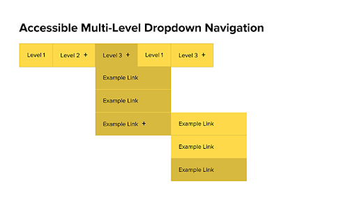
An easy alternative is using a mega menu.
The mega menu is also a dropdown navigation menu. This navigation technique places all the options of a particular category in one menu instead of a narrow dropdown, as seen in the image below:
How does it work in improving navigation and legibility?
- With mega-menu, you can display the first or second-level categories on the menu navigation.
- Provides a cleaner look than nested items.
- The person is directed to a new page to browse through the third-level and other subsequent categories.
- Gives you more space to add illustrations or images to the categories to make them more descriptive.
- It takes less space than a full-fledged hierarchical menu.
- Reduces backtracking if the person hits the wrong subcategory.
You can always add a survey to the main page to collect feedback on the mega menu and refine it further.
4. Leverage Serial Position Effect
The serial position effect is defined as a tendency of people to remember the first and last items of a series better than the middle ones.
How does this fit into website usability?
Every page on your website is designed to prompt the visitor to take a specific action.
For example:
- The product page is designed to make the visitors click on the buy now button.
- The discounts and deals pages are built to take the people to the right product.
Using the serial position effect, you can direct visitors’ attention to the targeted elements on the page and prompt them to take action.
Here’s how:
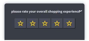
- Put important items at the beginning, like the navigation menu, CTA button, star ratings, etc.
- Add the CTA at the page’s beginning and end to make it easily accessible as the visitor scans the page.
- Adding high interacting items at the same place on the different pages to ensure consistency. For example, an e-commerce website can place the return & exchange policy at the same point on the page. It makes the information easily scannable as people switch pages.
- Use consistent icons across the website to jog the visitors’ memory.
These simple steps make the website more accessible and easy to navigate.
When people can easily recognize the actions they need to take to move to the next step in the conversion funnel, it increases the chance of taking the intended actions, even if they have to click multiple times.
This is better than putting all your eggs in the 3-click rule basket.
5. Add Breadcrumbs
Breadcrumbs are text-based navigational schemes that help visitors locate their position on the website.
Adding breadcrumbs can have a two-pronged effect on website usability and user experience:
- Makes navigation easier – People landing on any page through organic search can quickly know where they are on the website. They can just click any category in the breadcrumb instead of the back button and move to the last category.
- Improves SEO and indexing – Breadcrumbs help Google figure out how your website is structured. They also appear on the top of your page links in the SERPS.
Even if a visitor doesn’t find relevant information on a page, they have a sense of direction about where they can find it. It means they can go higher than 3-clicks to reach the destination.
Build for User Experience, Not Clicks
You kept scrolling down to the end of this post because you found valuable information in this blog. It works the same for the number of clicks. If the users see the shore in the distance, they will keep paddling to reach it.
The 3-click rule does not bind this sense of achievement. The user experience should take precedence here.
Every example and case study in this blog also supports the notion of making it easy for users to reach their goals without obstructing their journey. If three clicks or fewer get it done for your audience, go ahead with it.
And if it doesn’t, find the best solution that motivates them to keep on clicking without getting frustrated or annoyed.
FREE. All Features. FOREVER!
Try our Forever FREE account with all premium features!
 We'd love your feedback!
What did you like & how can we make it even better?
 Thanks for your feedback!
 Ask Your Question
Have a question? Get expert help to make your decision easier.