About
Marketade is a nimble 9-person user research company with deep expertise in collaboration and design thinking. We share a passion for turning user insights into better experiences and business results. We’ve been a remote team for 10 years. While we love to collaborate with our clients in person, we are also experts at remote research and virtual workshops with all types of teams.
From one-time usability testing to innovation workshops to weekly UX research cycles, we help companies turn user insights into business results. We work with organizations across the U.S., from the Fortune 500 to fast-growing startups. We're based in the Washington DC area and have consultants in or near Philadelphia, New York City, Portland, Houston, Raleigh, Minneapolis and Vermont.
Problem:
One of our clients, a university web services team, had decided to migrate their current website from one backend platform to a better one and were keen on taking that opportunity to enhance its usability. Our team carried out exploratory research to pinpoint the problems in usability for website visitors, mainly for these most common scenarios:
- Primary care doctor selection
- Primary care appointment booking system
- Family member visit for patients in the hospital
- Mammogram scheduling
- Child food allergies research
Solution:
Step #1: Pilot, Iterate & Launch
We piloted a few surveys to serve both purposes of the research: measuring user experience (UX) and collecting information from visitors showing exit intent.
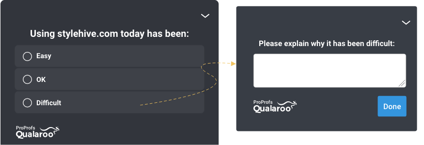
Ease-of-Use Survey
The first survey began with a simple, multiple-choice ease-of-use question. The visitors who selected “Difficult” were asked “why” as an open-ended follow-up question.
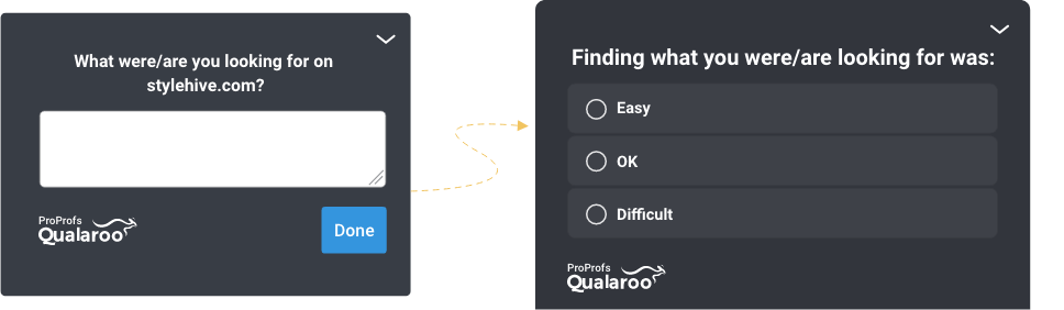
Task Survey
The second type of survey was the opposite: it began with an open-ended task question, followed by a multiple-choice question. This was an exit-intent survey.
According to the team, these were the advantages of using short surveys:
- gather both quantitative and qualitative data
- maximize the response rate and reduce the annoyance of the users
- get a good picture of common tasks and top reasons for frustration, and the relationship between the two
Step #2: Analyze
After we received 600 responses, both surveys were taken off the site. The received responses were thoroughly analyzed, with the research team taking these steps:
- Gathering all survey responses in a single spreadsheet
- Calculating some ease-of-use metrics
- Filtering the list to responses with likely task failure or frustration
- Manually categorizing the task failure and frustration reasons
- Counting the responses within each of those categories
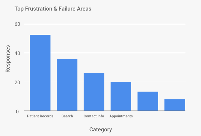
The key task areas causing failure/frustration findings were (in decreasing order of frequency):
Accessing Medical Records
We received responses like, “Total waste of time”, “Can’t get on [records section]”, “Hard getting the activation code”, and “almost impossible to get into.”
Searching & Querying
The responses stated the following: “got dead-end links” and “could not search for a doctor and view feedback from their patients.”
Accessing Contact Info & Appointments
The respondents stated the following -“where is the email for [name]?”, “Can I make an appointment online?”, “Patients should be able to communicate with Doctors through email”.
Step #3: Share
We shared these survey findings and the top failure areas at a stakeholder workshop, just after the health system’s marketing team had watched 5 of the moderated usability sessions for putting the findings in the context of usability.
Result:
The qualitative testing with the surveys gave actionable insights for improving the usability of the website, and the quantitative data from the surveys allowed the team to:
- Understand and form their benchmark usability score
- Validate/invalidate/quantify their qualitative findings
- Identify new UX issues that did not show up in moderated testing
A major issue we uncovered with the surveys was that the patient records section of the website was not properly accessible. With the direct insights received from the surveys, we were able to put a project to improve this website flow in motion.