Cart abandonment is the revenue leak everyone has, but no one admits. You celebrate new features and traffic spikes, but behind the scenes, people load up their cart, walk to checkout, and vanish like nothing happened.
Most founders treat this like bad weather. I promise, it isn’t. It’s a series of small moments where your shopper loses trust, patience, or clarity.
If you’ve ever watched a session recording where someone adds to the cart, moves toward checkout, hesitates for one beat, then closes the tab, you know exactly what I mean.
The good news is that these moments are predictable and fixable. Once you patch them, your revenue starts acting like it should.
This guide is the version I’d give a friend if they came to me saying, “People add stuff to the cart, but they just disappear.” By the end, you’ll know exactly why they’re leaving and exactly how to reduce cart abandonment.
What Is Shopping Cart Abandonment?
Shopping or eCommerce cart abandonment is exactly what it sounds like. Someone adds an item to their cart, walks toward checkout, then leaves before paying. No mystery to it.
It happens because something along the way didn’t feel right. Too slow, too expensive, too confusing, or just too much effort for the moment they’re in.
How to Calculate Your Cart Abandonment Rate:
Use this quick formula:
1 – (Completed Purchases / Carts Created)
If 200 out of 500 carts convert, your abandonment rate is 60 percent.
Do the math once. It gives you a baseline number, so every fix you make later helps reduce cart abandonment rate.
Why Shoppers Really Abandon Carts?
Before you fix anything, you need to know what you’re actually fixing. Abandonment isn’t random. It always traces back to one of six moments where your shopper loses trust, patience, or clarity.
1. Unexpected Costs & Pricing Surprises
Nothing kills momentum faster than a total that jumps at the last second. Hidden shipping fees, surprise taxes, unclear duties. The moment a shopper feels tricked, they bail.
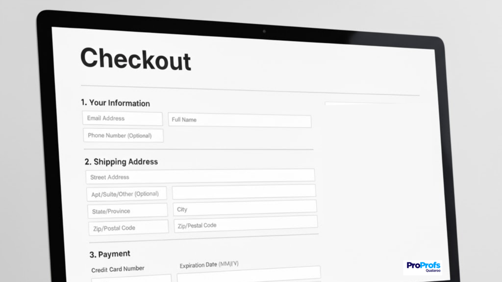
2. Check-out Friction & Form Fatigue
Long forms, too many fields, passwords they never remember, captchas, or forced account creation. If checkout feels like paperwork, people quit.
3. Mobile UX Struggles
Phones are the main shopping device now, but most checkouts still behave like they’re on a desktop from 2012. Tiny buttons, endless typing, wrong keyboard types, slow-loading forms. Thumbs get tired, and tired thumbs close tabs.
4. Trust, Privacy & Payment Anxiety
Shoppers pause when something feels even slightly off. A payment field that looks outdated, a missing lock icon, a confusing return policy, or a checkout page that asks for information that feels unnecessary.
5. Shipping, Returns & International Uncertainty
Vague delivery timelines, unclear return rules, no idea if duties are included, and prices shifting between currencies. International shoppers abandon the fastest because the risk feels highest.
6. Not Ready To Buy
Sometimes the shopper simply isn’t ready. They’re browsing, comparing, saving for later, or waiting for payday. This is normal. It just means you need a recovery strategy, not a rescue mission.
The Complete Step-by-Step Playbook to Reduce Cart Abandonment
This is the part that most guides rush through, often with long lists and generic tips. You’re not getting that. You’re getting the exact steps to reduce cart abandonment you’d use if you sat down today and said, “I want fewer abandoners and more buyers by next week.”
Think of these cart abandonment solutions as your wrench-and-screwdriver kit. Follow the steps in order. Don’t skip around unless you already know where your leak is.
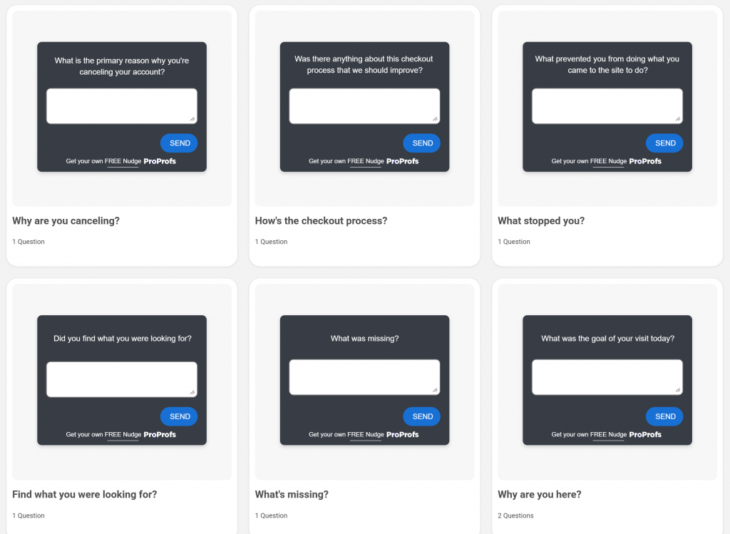
Step 1: Capture Exit Intent To Learn Why People Leave
You can’t fix a problem you can’t see. And most checkout issues hide in places analytics alone won’t catch. That’s why the smartest thing you can do is ask people why they’re leaving at the exact moment they decide to leave.
A tiny exit-intent question on your cart or checkout tells you more than any heatmap ever will.
Use simple questions like:
- “What stopped you from completing your purchase today?”
- “Was anything confusing or missing here?”
- “What were you expecting that you didn’t see?”
A single question is enough. The goal isn’t a full survey. The goal is catching the truth before the tab closes.Here are a few exit intent survey templates you can check out and try to capture users while they are leaving:
Here’s what you look for: If you hear the same reason three times in the same week, that’s your highest-impact fix. Everything else comes second.
Once you have this signal, the rest of the playbook becomes obvious. That’s why we start here. Here’s a quick video for you to learn how to create website exit surveys:
Step 2: Make Pricing Radically Transparent
Now that you know what people are saying, fix the biggest trust breaker: surprise costs. Shoppers don’t abandon because of price, but because the price changed.
Make things predictable by:
- Showing shipping costs early, ideally on the product page
- Listing taxes in the cart summary
- Displaying duties upfront for international orders
- Showing a running total throughout checkout
- Adding a “You’re $12 away from free shipping” progress bar
If you want a quick pulse check, ask leavers:
“Was the total what you expected?”
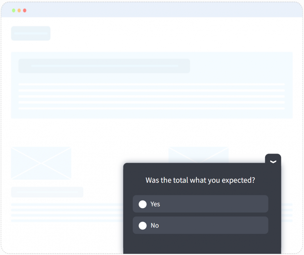
If they say no, this step is where you start tightening bolts.
Step 3: Simplify Checkout To The Fewest Possible Steps
A long checkout is a conversion graveyard. Every extra field is another excuse to leave.
Clean it up by:
- Keeping only 7 or 8 essential fields
- Turning first and last name into one line
- Making guest checkout the default path
- Auto-applying available coupons so shoppers don’t go hunting
- Protecting people from form resets when they make a mistake
If you’re unsure which field annoys people most, place a quick “What slowed you down here” prompt for hesitators. It always reveals the same three offenders.
Step 4: Design Checkout For Mobile Thumbs First
Most of your shoppers are on their phones. The problem is that most checkouts still behave like laptops.
- Enabling autofill for names, addresses, and emails
- Using address suggestions so users barely type
- Triggering the right keyboard for each field
- Keeping the main button sticky at the bottom of the screen
- Using tap targets large enough for real thumbs
- Adding Apple Pay and Google Pay so checkout becomes a single tap
If you want a brutal but honest test, try checking out on your own site using only your thumb. Anything that felt annoying to you feels twice as bad to a shopper.
Step 5: Build Trust At The Point Of Payment
By the time someone reaches payment, they’re ready to buy. They just need to feel safe doing it.
Improve trust fast by:
- Placing security badges near the payment fields
- Adding a one-line return promise in plain language
- Writing a simple privacy line like “We don’t store your card details”
- Pulling in one or two short review quotes next to high-value items
Here’s an example:
Think of this step as reassurance, not decoration. People buy when they feel safe enough to commit.
Step 6: Clarify Shipping, Returns, And International Rules Upfront
Ambiguity kills conversions. Clear expectations convert.
Make things obvious by:
- Showing real delivery timelines, not ranges that span a week
- Writing return rules in simple language
- Auto-detecting currency or giving a clean switcher
- Showing duties and taxes before checkout, not after
International shoppers move fast when they trust the final number. The more global your audience, the stronger this step becomes.
Step 7: Make The Cart Easy To Edit
Shoppers abandon carts all the time simply because editing them feels like work.
Make your cart flexible with:
- Clear plus and minus buttons for quantity
- A simple “Remove” link, not a tiny icon
- A “Save for later” option that doesn’t feel hidden
- Quick item thumbnails so people always know what’s in the bag
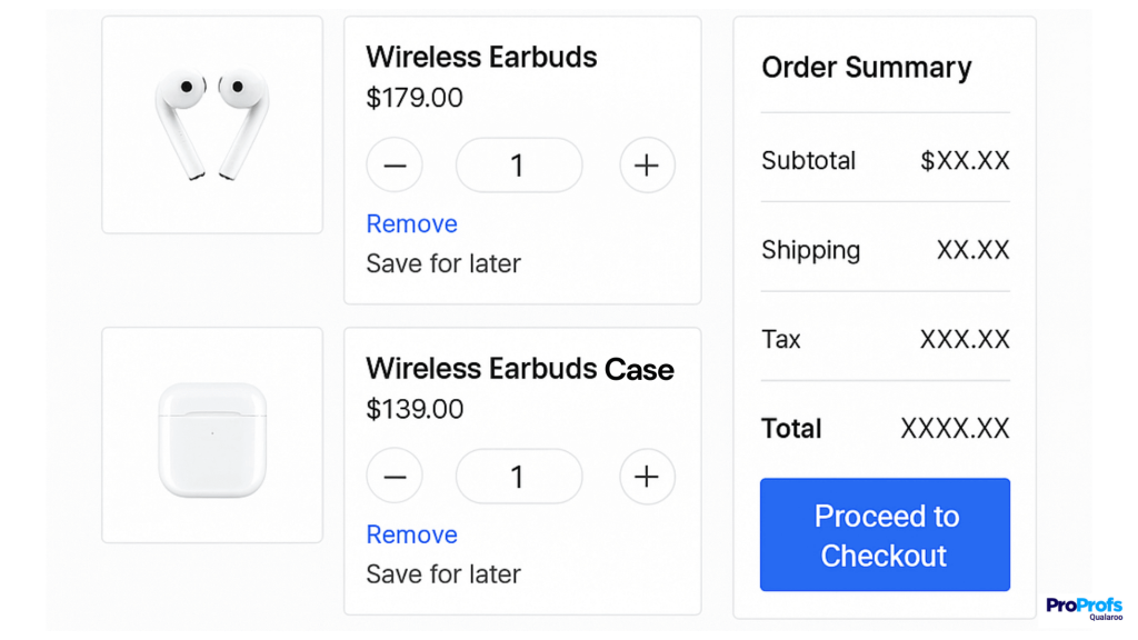
A cart should feel like a workspace, not a locked box.
Step 8: Build A Friendly Recovery Engine
Not every abandonment is a failure. Some shoppers just weren’t ready. That’s where recovery earns its keep.
Email Recovery: Email recovery is the quiet workhorse of abandoned-cart fixes. Most people don’t leave because of a fatal flaw. They leave because life interrupted them, or they needed one more piece of clarity, or they simply forgot. A good recovery sequence doesn’t beg. It doesn’t push. It just gets the shopper back into the headspace they were in when they first added the item to their cart.
Email 1: The Simple Reminder (30–60 Minutes After Abandonment)
Subject: You left something behind
Hi there,
You were close to checking out, so I saved your cart for you. No pressure.
If you want to finish later, here’s your shortcut:
[Restore My Cart]
If something didn’t feel right, hit reply and tell me. You’ll get a real response, not a bot.
Talk soon.
Email 2: Add Clarity Or Social Proof (24 Hours Later)
Subject: Quick help before you decide
Hey,
Noticed you didn’t complete your order yesterday. That happens.
If you’re still thinking it over, here’s what usually helps people decide:
1. Clear delivery timelines: most orders arrive in X to X days
2. Easy returns: no forms, no jargon, no guilt
3. Tried and loved: “This was even better than I expected” — real customer review
Your cart is still waiting for you here:
[Take Me Back]
If something felt confusing or missing, reply and tell me. It helps us improve fast.
Email 3: A Gentle Nudge With A Small Incentive (48–72 Hours Later)
Subject: Last call on your saved items
Hi,
Your cart has been sitting for a bit. If you still want what’s inside, here’s a small boost to make the decision easier:
Use code: FINISH10 for 10% off (valid for the next 24 hours)
If you already bought somewhere else, no hard feelings.
And if something held you back, I’d love to know what it was.
Here’s your updated cart:
[Resume Checkout]
Thanks for giving us a look.
SMS Recovery: SMS is the channel you use when someone clearly wanted to buy but something tiny pulled them away. They were on their phone. They tapped through half the checkout. They hesitated for a moment, then life intervened. SMS catches them while their intent is still warm.
The key is to keep it human. SMS is personal space. You don’t enter it with hype or pressure. You enter it like a store associate who noticed someone left their items at the counter. Examples:
- “Still thinking it over I saved your cart for you.”
- “Your cart is ready whenever you are. Here’s the quick link.”
- “Want to finish your order? No rush. Just saved it for you.”
Retargeting: Retargeting is great when it’s done like a gentle nudge. It’s terrible when it feels like surveillance with a marketing budget. You’ve probably seen the bad version. You browse a product once, and suddenly it follows you across every site like a lost puppy with ad spend. That’s the fastest way to make a warm shopper cold.
Here’s how to keep retargeting effectively without crossing the line:
- Cap your frequency. No one needs to see the same ad twelve times in two days.
- Rotate messages. Use variety. Show the product, display a review, highlight the benefit, and illustrate a use case.
- Exclude buyers immediately. Nothing breaks trust like being sold something you already bought.
- Avoid desperation framing. No “We noticed you…” or “You forgot…” messaging. It’s creepy.
- Use a clean creative. People scroll fast. Give them clarity, not chaos.
Implementation Roadmap: What To Fix First, Fastest
You don’t reduce cart abandonment by tackling everything at once. That creates chaos. You fix it by handling the highest-impact items in the order that gives you the fastest wins. Start at the top and work your way down. No guesswork. No “where do I begin.” Just a clean execution plan.
Quick Wins (24 Hours)
These are the changes you can roll out in a day. They won’t require a new sprint or a team debate. They just work.
| What to Do | Why It Matters | How to Execute (Straightforward & Fast) |
|---|---|---|
| Add a Simple Exit-Intent Question on Your Cart or Checkout | You stop guessing and start hearing real reasons for drop-offs | Ask one question: “What stopped you from completing your purchase today” Keep it tiny and unobtrusive |
| Turn on Guest Checkout | Removes the biggest conversion blocker instantly | Make “Continue as Guest” the default button and stop forcing account creation |
| Add Trust Cues Next to Payment Fields | Reduces hesitation at the most sensitive moment | Add a lock icon, “Secure Checkout,” and one short privacy line beside the card field |
| Show Shipping Costs Earlier | Prevents surprise-fee abandonment | Add a simple shipping estimate box on product pages or in the cart |
| Make All Cart Edits Obvious | Stops users from quitting due to frustrating controls | Use large quantity buttons, clear “Remove,” and item thumbnails so nothing feels hidden |
These alone plug a surprising amount of revenue leak.
High-Impact Fixes (7 Days)
These are changes you can complete in a week with light design or dev help. They move the numbers. Most teams feel the difference by the next Monday.
| What to Do | Why It Matters | How to Execute |
|---|---|---|
| Cut Your Checkout Fields Down to the Essentials | A shorter checkout lifts conversions immediately | Keep only the fields required to fulfill the order. Combine first and last name. Remove company fields unless truly needed |
| Add Autofill and Address Suggestions | Cuts mobile typing by half and speeds up checkout | Enable browser autofill. Add address autocomplete. Test it yourself on mobile to confirm it feels fast |
| Rewrite Your Mobile CTAs and Test Sticky Buttons | Makes checkout doable with one thumb, not two hands | Keep the main button fixed to the bottom of the screen. Use clear action language like “Continue” or “Review Order” |
| Add Currency Auto-Detection or a Simple Switcher | Prevents confusion and drop-off for international shoppers | Auto-detect location or add a one-tap currency selector in the header or cart summary |
| Launch Your Three-Email Recovery Sequence | Recovers users who weren’t ready, distracted, or unsure | Use the three email templates. Schedule sends for 1 hour, 1 day, and 2–3 days after abandonment |
You’ll start seeing cart recovery happen in real time.
Advanced Improvements (30–60 Days)
These are foundational improvements that create long-term, compounding results. They take a little longer, but they permanently clean up your funnel, and surely reduce cart abandonment.
| What To Do | Why It Matters | How To Execute |
|---|---|---|
| Build a Localization-Ready Checkout | Global users convert only when the experience feels local | Add local currencies and familiar payment methods. Show duties upfront. Translate key UI |
| Overhaul Your Mobile Checkout Experience | Mobile is usually your biggest conversion leak | Reduce typing, enlarge tap targets, simplify layout, speed up load times, test with your own thumb |
| Tune Your Retargeting So It Feels Respectful | Keeps your brand from feeling stalky | Cap frequency, rotate creatives, exclude recent purchasers, avoid “We noticed you…” messaging |
| Integrate User Feedback With Behavior Data | Shows the real reasons behind abandonment | Pair exit-intent responses with session recordings to see what shoppers struggled with |
| Run A/B Tests on the Biggest Friction Points | Highest ROI because you fix what shoppers actually complain about | Test only the top two issues mentioned. Keep variations simple. Ignore the noise until these move |
These are the moves that turn your checkout into a predictable revenue stream, rather than a gamble.
FREE. All Features. FOREVER!
Try our Forever FREE account with all premium features!
The Straightforward Path to Reducing Cart Abandonment
To reduce cart abandonment, you don’t need to redesign your whole store. It’s more about fixing the exact moments where shoppers lose confidence or patience. Once you see those moments, the fixes become obvious.
You now have a clear path. Capture exit intent so you hear the real reason people leave. Smooth out the friction points. Make mobile effortless. Build trust right at payment. Recover the shoppers who just needed a little more clarity or a nudge.
Teams that improve the fastest all have one thing in common. They listen while the shopper is still on the page. A small, well-placed pulse in the cart or checkout gives you clarity you can act on immediately.
Start with what shoppers tell you. Fix that first, then move down the roadmap. Do it in order and your checkout stops leaking. It starts converting.
Frequently Asked Questions

How to stop abandoned checkouts?
Remove the friction that causes them. Show full costs early, keep checkout short, make mobile effortless, build trust at payment, and use exit-intent to catch blockers in real time. Fix the issues you hear most often first.
Why do users leave even when the page looks fine?
Because “fine” is not the same as “effortless.” Your ICP data shows that users drop off the moment something feels hard, confusing, or slow. They don’t report the issue. They just leave mid-flow and often buy somewhere else.
What’s the fastest way to find out why users abandon checkout?
Ask at the exact moment they’re leaving. A small exit-intent question captures the real blocker while the frustration is still fresh. Your ICP teams rely on this because it exposes specific issues analytics alone can’t reveal.
FREE. All Features. FOREVER!
Try our Forever FREE account with all premium features!
 We'd love your feedback!
What did you like & how can we make it even better?
 Thanks for your feedback!
 Ask Your Question
Have a question? Get expert help to make your decision easier.