I’ve built enough products to know this: your users will never send you a polite email saying, “Hey, your checkout button confused me, so I’m out.” They just vanish. Poof. No drama, no goodbye, just gone forever with their wallet still closed.
Bad UX isn’t about the pretty colors or the fancy animations. It’s the tiny frustrations that make people bounce: slow pages, confusing steps, missing info. Each one kills sales without you ever knowing why.
The good news? People don’t bail randomly. They trip over the same dumb hurdles again and again, like clockwork.
I have gathered over 35 real 2026 statistics that show precisely where users are struggling today: on mobile, desktop, product pages, checkout, and even AI features.
Steal these numbers to win arguments with your team, light a fire under your designer, justify that redesign budget, or just stop guessing and start fixing the stuff that’s quietly bleeding your revenue.
Let’s make your product feel easy and keep people around.
General UX & ROI Statistics
If the core experience drags, everything else drags with it. These numbers are the early warning signals. They tell you why fixing UX before it breaks is cheaper than repairing trust after users churn.
- 32% of customers leave a brand they previously loved after just one bad experience [PwC].
- 90% of users have stopped using an app because of poor performance [Toptal].
- 88% of online consumers say they are less likely to return to a site after a bad experience [Toptal].
- Only one out of nine vendors earned an above-par score in mobile accessibility testing, revealing how far the industry still is from mobile-first UX maturity [Forrester].
- Low platform adoption remains a major UX barrier for accessibility tools, according to customer feedback, because teams struggle with unclear insights and steep learning curves [Forrester].
- 47% of organizations report improved customer satisfaction from using AI. [McKinsey].
- 64% of companies assess the success of UX work by measuring changes in user satisfaction [Userlytics].
- 57% of customers say obvious errors are the biggest deal-breaker in a digital experience [Bain Generative AI Usage Survey].
- 42% of customers would pay more for a friendly, welcoming experience. (PwC)
E-Commerce & Checkout UX Statistics
Checkout is the moment of truth. If the flow drags or demands too much, users vanish without explanation. These numbers show why you need real-time feedback at the exact point of hesitation.
- 18% of consumers have abandoned a purchase because the checkout process felt too long or too complicated [Baymard Institute].
- 41% of customers are willing to pay more for a convenient experience, which includes fast, low-friction checkout flows [PwC].
- The average large e-commerce site can bump its conversion rate by 35.26% by redesigning its checkout process [Baymard Institute].
- Most sites can reduce their default form fields by 20% to 60% without losing necessary data, which directly reduces drop-offs [Baymard Institute].
- 64% of companies measure UX impact by tracking changes in user satisfaction, a sign that checkout satisfaction matters more than checkout speed alone [Userlytics].
Mobile UX & Site Performance Statistics
Mobile traffic is the new default. If your experience breaks on a small screen, your funnel collapses. These numbers show why mobile issues surface only when you ask users in the moment they struggle.
- By 2028, 20% of people will have an immersive experience with persistently anchored, geoposed content once a week, up from less than 1% in 2023 [Gartner]
- Over half of global web traffic comes from mobile devices [Smart Insights].
- There are 310 million smartphone users in the U.S., so any friction on mobile instantly affects a massive share of your audience [Statista].
- Organizations are advised to design mobile-first when optimizing navigation and performance, since mobile users now dominate most experience funnels [CSG].
- In Forrester’s accessibility evaluations, customers chose vendors with clear and actionable communication of accessibility issues, leadership-friendly reporting, and low barriers to entry for product teams, all of which map directly to better mobile UX adoption [Forrester].
- The spatial computing market is projected to grow from $110 billion in 2023 to $1.7 trillion by 2033, which means mobile UX will collide with augmented, location-anchored content sooner than most teams expect [Gartner].
Homepage & Product Page UX Statistics
Your homepage sets the tone. Your product page answers the last unanswered questions. If either one feels unclear, inaccurate, or generic, users leave without saying a word. These numbers show how much information quality and trust shape the decision to move forward.
- 71% of online shoppers were unaware they had used generative AI during their shopping experience, which means new AI features on homepages and product pages often go unnoticed unless the output is incorrect [Bain].
- 57% of customers say that obvious errors have the biggest negative impact on user experience, and these errors usually appear first on visible surfaces, such as homepages and product pages [Bain].
- 56% of customers say inaccurate product information has a very or extremely negative impact on their experience, making product-page clarity non-negotiable [Bain].
- 41% of customers feel comfortable using a generative AI tool only if they trust the brand, which means AI-driven recommendations or summaries on product pages can backfire without strong UX safeguards [Bain].
- Targeted offers that use real-time recommendations and personalized timing consistently outperform blanket promotions in both customer experience and conversion impact. [McKinsey].
FREE. All Features. FOREVER!
Try our Forever FREE account with all premium features!
Customer Experience & Personalization Statistics
Personalization is not about being clever, it is about being useful. When users feel understood, they move forward. When they do not, they bounce. These numbers show how much relevance drives trust and conversion.
- AI algorithms that tailor navigation, content, and recommendations increase engagement by matching experiences to actual user behavior, not assumptions [CSG].
- Roughly half of customers see significant or transformative potential in generative AI, which raises the bar for relevance across every touchpoint [Bain].
- Modern LLMs can be factually incorrect anywhere from 1% to 30% of the time, which means personalization only works when the underlying information is accurate [NN/g].
- 74% of consumers prefer chatbots over human agents for simple questions, because speed now beats human interaction when the task is low stakes [Outgrow].
- 57% of businesses say chatbots deliver significant ROI with minimal investment, which is why many teams now use them as the front line of personalized support [Outgrow].
AI in UX Research & Design Statistics
AI is slipping into the UX toolkit faster than it is being documented. Teams are using it for speed, exploration, and automation, but they are also hitting accuracy limits that shape how much they trust it. These numbers show how AI is reshaping the UX workflow in 2026.
- 56% of organizations now use AI to help produce or uncover UX research insights, which means AI is already embedded in early discovery work [Userlytics].
- UX professionals say AI has either “some value” (47%) or “is not impressive” (20%), which shows how uneven the impact feels inside real-world design teams [UXPA].
- Modern LLMs can be factually incorrect anywhere from 1% to 30% of the time, so every AI-assisted UX workflow now has a built-in accuracy risk [NN/g].
- 24% of companies have already deployed AI organization-wide, which means UX now has to account for AI-driven behaviors across entire product ecosystems [Microsoft].
- Digital experience management now relies on monitoring load time, stability, responsiveness, navigation clarity, and engagement, because UX failures rarely start on the surface [CSG].
- AI adoption skyrocketed 24 points YoY among UX teams, showing a rapid shift in how prototypes, copy, and flows are generated [Userlytics].
- AI-powered conversations elicit deeper insights from more than 40% of B2B clients, which shapes UX for support, onboarding, and research flows [Bain].
The UX Research Mindset: Methods First, Tools Second
If you’ve built anything before, you already know this: tools don’t save bad research. A new platform, a new dashboard, and a new AI widget, none of them matter if you don’t actually understand what your users are trying to do.
The teams that consistently ship good UX aren’t tool collectors. They’re methodical people.
- They run quick interviews.
- They watch a handful of users struggle.
- They test before they commit.
- They keep the loop small and fast.
Everything else is just support.
You can run great research with the simplest setup in the world. A call. A screen share. A notepad. What tools can do is make that loop easier to keep going. They reduce friction around the work by tagging insights, tracking patterns, and pulling signals out of noise.
That’s where things like sentiment analysis or ready-made UX survey templates help. Not because they “improve UX” on their own, but because they make it easier for you to stay consistent. They take the admin work out of research so you can focus on the part that actually matters: understanding people.
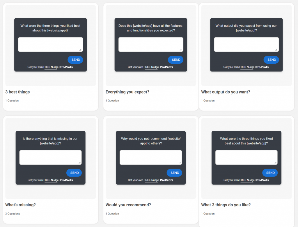
In fact, here are a few quick & easy UX survey templates for you to understand your users better:
Most teams don’t fail at UX because they chose the wrong software. They fail because they do research once, fix a few things, and then stop. Meanwhile, the product changes. The users change. The expectations change. And the team is still operating on last quarter’s assumptions.
A solid UX mindset is just rhythm.
- Small tests. Often.
- Simple questions. Asked at the right moments.
- Clean insights. Put into action quickly.
If you get the method right, any tool you add on top becomes a multiplier instead of a distraction.
How to Use Real-Time Feedback to Fix UX Before It Breaks
Honestly, most UX problems don’t show up in your analytics until they’ve already burned a hole in your revenue. By the time you see a spike in exits or a drop in conversions, the moment has passed. The user got stuck, got annoyed, and left.
Real-time feedback fixes this by catching the problem as it happens, not after.
Let me show you exactly how to set this up so it actually works.
Step 1: Pick the One Place Where Users Struggle Most
Start small. Don’t try to “fix UX.” Fix a screen.
Choose one:
- Your product page
- Pricing page
- Sign-up form
- Checkout
- Mobile homepage
Pick the place where hesitation hurts the most. If you don’t know where people struggle, look at:
- The page with the highest drop-off
- The longest time on page with no action
- The most confused support questions
Start there.
Step 2: Add a Tiny Question Right at the Friction Point
You don’t need a full survey. One question is enough, if it’s the right question.
Examples that work:
- “What’s missing on this page?”
- “What’s stopping you from checking out?”
- “Is anything confusing right now?”
- “Did you find what you needed?”
- “What made you hesitate here?”
These aren’t fancy questions. They’re the honest ones that get real answers.
Most UX teams use micro-surveys for this: small in-page popups that trigger at the right moment, not instantly. Think “show after 8 seconds” or “show when the user moves to exit.”
Step 3: Listen for the Pattern, Not the Volume
You don’t need 500 responses. You need 10 people saying the same thing.
- If 3 users report that the product page is missing comparison information, that’s your fix.
- If people say the checkout feels long, shorten the process.
- If people say mobile is cramped, fix spacing first, not visuals.
Good UX isn’t about chasing big numbers, but noticing small signals early.
A quick usability check can confirm what you are seeing. If your in-app questions reveal a pattern and you are not sure why it is happening, run a short usability test with three to five people.
Watch them move through the same screen where users gave negative feedback. You will see the hesitation almost instantly. Sentiment analysis can help here it sorts feedback into “positive, negative, neutral” so you can see where frustration actually clusters without reading every message.
Step 4: Make Small, Fast Fixes — Not Giant Redesigns
The point of real-time feedback is speed.
- If users say “I can’t find shipping info,” you add a shipping block.
- If they say “I’m not sure what this plan includes,” you rewrite three lines of copy.
- If they say “This button is too small on mobile,” you fix the tap target.
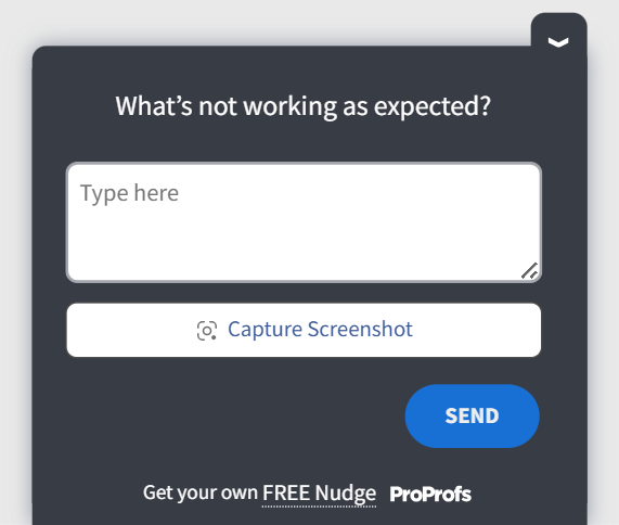
In fact, you can ask your users to capture screenshots of what they’re facing and resolve their issues quickly. Here’s a screenshot capture template to gauge user experience:
These are 5–30 minute fixes that move metrics more than full redesigns.
One small fix a week beats a massive redesign every six months.
Step 5: Keep the Loop Running All the Time
Here’s the real advantage of real-time feedback: It never stops.
You’re not guessing what to improve next because users will tell you in the moment they feel stuck. This turns UX into a living system. It grows, adjusts, and self-corrects just like your product.
Why This Works
Real-time feedback gives you two things analytics never will:
- The exact moment a user felt friction
- Their reason for hesitating
Once you have those two, UX stops being a matter of guesswork.
You’re no longer reacting, just steering.
FREE. All Features. FOREVER!
Try our Forever FREE account with all premium features!
Social Listening & In-Product Feedback Working Together
Users talk about your product in two very different places. In public spaces like Reddit and Quora, or software review websites like G2 and Capterra, they speak freely about frustrations and expectations. Inside your product, they react in real time to the designs you ship. When you connect these two signals, you get a complete picture of what people want and what they struggle with.
Below is a simple way to build this loop so it actually supports your decisions.
Step 1: Use Social Listening to Understand What People Care About
Start by paying attention to the complaints and questions that show up in public communities. This is often the earliest sign of a pattern.
Look for recurring themes. People often voice the same problems across posts and threads. You can treat these moments as early warnings. They show you expectations before users arrive on your site.
You are not validating anything here. You are exploring the landscape.
Step 2: Bring Those Themes Into Your Product
Once you see a pattern in public conversations, check whether your own users feel the same way. The simplest method is a small, well-placed question inside the experience.
- If people keep saying product pages do not answer key questions, ask your own visitors what information they still need.
- If users talk about broken trust with AI features, ask whether your suggestions felt helpful.
- If you notice mobile complaints, ask mobile visitors whether the layout feels easy to use.
This step tells you whether the outside conversation is also happening inside your product.
Step 3: Compare the Signals to Find the Most Important Work
Some issues appear both outside and inside your experience. These are the ones worth tackling first. They affect your reputation and your conversions at the same time.
- Some issues appear only in public spaces. These may be trends you can watch rather than act on.
- Some issues appear only inside your product. These are often the silent blockers that analytics cannot explain.
A straightforward comparison helps you choose work that moves real outcomes.
Bringing It All Together
UX is not a one-time project. It is a system you keep tuning as your product grows and your users evolve. The stats in this guide are not abstract trends. They point to the everyday moments where people get confused, hesitate, or walk away. When you pay attention to those moments, your product becomes easier to use and easier to trust.
You do not need a heavy research program to get there. You need a steady rhythm of listening, like a few in-the-moment questions inside your product, a short usability test when something feels off, or a quick scan of what users are saying in the wild.
Tools that let you ask targeted, in-context questions, like Qualaroo’s micro surveys, make this easier to keep running without adding process overhead.
UX gets better the moment you stop guessing and start asking. Keep the loop open and your product will keep improving, often in ways users notice long before the metrics catch up.
Frequently Asked Questions

Are 88% of users less likely to return after a bad user experience?
Yes. Multiple studies confirm that a single rough interaction can push users away from a product for good. This is why in product feedback and small, continuous UX fixes tend to outperform large, infrequent redesigns.
What is the 1-10-100 rule in UX?
The rule explains the cost of ignoring UX issues. Solving a problem early costs one unit of effort. Fixing it later in development costs ten. Fixing it after release costs one hundred. Real-time feedback tools help you catch issues in the one unit phase instead of discovering them when the fix is already expensive.
What does UX stand for in stats?
In the context of statistics, UX refers to the measurable parts of the user experience, such as drop-off rates, time to complete tasks, satisfaction scores, and friction points. These numbers help teams understand what users do, but they still need qualitative feedback to understand why they do it.
Why do UX teams say methods matter more than tools?
This comes from years of practitioner insight. Communities like Reddit regularly point out that strong UX results come from simple methods like usability tests, interviews, and in-context questions. Tools help you move faster, but the clarity comes from watching real users struggle, listening to their hesitation, and asking direct questions at the right moment.
FREE. All Features. FOREVER!
Try our Forever FREE account with all premium features!
 We'd love your feedback!
What did you like & how can we make it even better?
 Thanks for your feedback!
 Ask Your Question
Have a question? Get expert help to make your decision easier.