This is the second post in our series on our recent webinar “Conversion Optimization Techniques that Actually Work,” with Qualaroo CEO Sean Ellis and Unbounce Co-Founder Oli Gardner. If you didn’t have time to catch it (or if you did and would like to see it again), you can watch the whole thing here. Previously, we talked about designing smart conversion optimization tests based on insights collected from on-site surveys. Today, we’re looking at a handful of landing page best practices that Sean and Oli have picked up over the years. So what makes or breaks a good landing page?
Conversion Rate Depends on Your Attention Ratio
Oli cautions: When it comes to conversion, stay away from peacocks and toothpaste.

Let’s explain: If your landing page is the above photo, and your visitor’s goal is to find the peacock, they’re going to have a hard time with so many “eyes” competing for their attention.

Removing those unnecessary eyes makes the goal much more obvious—the peacock is easier to spot, and easily-distracted visitors are instantly more focused on the goal.
Toothpaste shopping also illustrates what it’s like for visitors on your page: they come with a mission (buy toothpaste).
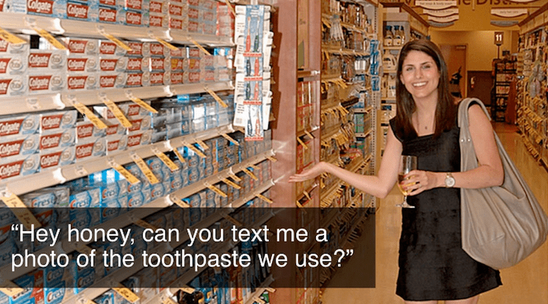
At the store, however, they’re so overwhelmed that they forget what kind of toothpaste they even use (Crest, Colgate?). Distraction makes is almost impossible to complete their mission.
This kind of confusion occurs when someone lands on a website with a high attention ratio—which Oli defines as the ratio of interactive elements (things you can click) to the number of campaign conversion goals (always one).
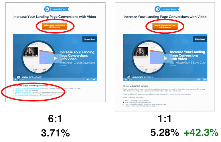
Unbounce tested a webinar recording page where people could a register (see below). In addition to the campaign’s CTA, they provided additional interesting and helpful content. The page had an attention ratio of 6:1—6 potential actions to 1 goal. When Unbounce tested this page against a page without the links, resulting in a 1:1 ratio, they saw conversions increase over 40% just from removing those helpful distractions.
Oli stresses that this doesn’t mean you shouldn’t be generous with excellent, free content, but there’s a time and place, and it isn’t when you’re trying to get visitors to perform a specific action. In some instances, like in the middle of a campaign, it can hurt more than help.
Context of Use Ups Conversion Rates
When it comes to driving conversion rates on your landing pages, context is everything. By providing visuals that help people quickly determine the context of your offer you can help them make decisions to move forward, improving your conversion rate.
For example, Unbounce wanted to figure out what users were thinking when visiting their high-traffic, under-performing templates page, so they implemented a Qualaroo survey to ask visitors to the page, “What do you think of our templates?”
Out of over 1000 responses the most common were:
- “How much are they?”
- “Where can I download them?”
- “Can I use them in WordPress?”
It was clear from the questions that the context of use just wasn’t communicated clearly—the templates are exclusive to Unbounce. So instead, Unbounce focused on showing the template library inside the Unbounce page editor, providing better context of use, which resulted in a 45% lift in new trial starts (Unbounce’s main KPI). Over the course of a year, providing context of use added up to an additional $1,016,640.
You might be surprised how lost people are when they’re on your site, but providing visual demonstration of how your product or service will be used by the customer can help. As cheesy as shamwow and slapchop commercials are, they do a great job getting the point across. Buyers know what to expect because they’ve seen the product in action.
Context Matching is the Holy Grail of Conversion Optimization
Though failed tests are not uncommon, the following technique has never failed Oli—as in, every single test based on context matching has been a winner. This means matching the style and content of the conversation through which a visitor first encounters you (usually an ad, blog post, or email) to the landing page where that visitor ends up.
Bryan Eisenberg calls this ‘maintaining the scent’ of the visitor from one page to the next. Context matching includes matching the design of your ad to the design on your landing page, as well as making the headline of your ad the same as the headline on your landing page.
Look at your marketing outreach and at your landing page. Is the transition from ad to landing page a natural, seamless experience, or is it disjointed and jarring? It should be less like entering a different territory and more like an expanded experience from one step to the next. After all, whatever got them to click on the ad in the first place will compel them to keep moving through the funnel.
Respect the Click
The way organic and paid visitors interact with your website is fundamentally different. Your homepage is for organic traffic—people who want to wander and explore, to click around and get to know you. But people click on a paid ad for a reason. They don’t want to explore and connect the dots, so why disrespect the click by sending them to a page designed to facilitate that experience?
This is what landing pages are for. The attention ratio is 1:1, meaning they don’t have to search. Message and design match between ads and landing pages means that they have a pleasant, cohesive experience. Plus, as your bounce rate decreases and your relevance increases (thanks to messaging that matches), your cost per click will go down and your ad position will rise.
FREE. All Features. FOREVER!
Try our Forever FREE account with all premium features!
Shoot for a Post-Conversion Conversion
Just as your work doesn’t stop with that initial click, it doesn’t stop once visitors convert. You can and should leverage the opportunity to ask fresh leads for a second conversion. After someone makes a purchase, downloads a whitepaper, or registers for a webinar, ask them to share on Facebook or Twitter or subscribe to your newsletter.
Unbounce has been wildly successful using this technique. In one instance, out of 2500 webinar registrants, Unbounce was able to get 1100 new blog subscribers. These visitors are already engaged—getting them to take just one more step is much easier than getting unengaged visitors to do anything. While you have their attention, make the most of it.
This concludes our wrap up of “Conversion Rate Tips that Actually Work.” We hope you found something that will make CRO work for you. And if you’ve yet to try Qualaroo or Unbounce, give it a shot now. Get 50% off of Unbounce for three months or try Qualaroo free for 14 days.
FREE. All Features. FOREVER!
Try our Forever FREE account with all premium features!
 We'd love your feedback!
What did you like & how can we make it even better?
 Thanks for your feedback!
 Ask Your Question
Have a question? Get expert help to make your decision easier.