A first impression is everything. That’s why most products’ landing pages aim to communicate their product’s mission at a glance.
If a landing page doesn’t prompt a lead to become a customer, it often means something got lost along the way—a customer reached the page expecting one thing, but they got something else. So when you figure out why leads’ expectations aren’t being met, you’ll get those conversion numbers up.
Hootsuite, the most widely used social media management platform, was able to get to the bottom of this problem with one on-site survey question. Here’s how.
How Hootsuite Proved Their Landing Page Needed Improvement
Hootsuite’s branded landing page was originally designed with the assumption that everyone who searched “Hootsuite” must understand how the product works. They loaded their branded landing page with graphics and illustrations showcasing the product’s higher-level functions.
Hootsuite’s growth team took a hard look at what was happening when people reached that branded landing page, by analyzing the landing page and measuring the CTR to the pricing page. As Senior Growth Strategist Jaxon Lam told us, “Based on different data points and heuristic landing page analysis that we had completed, we hypothesized that this branded SEM traffic still required more information about our core value prop and functionality.” As a result, people who needed Hootsuite were bouncing.
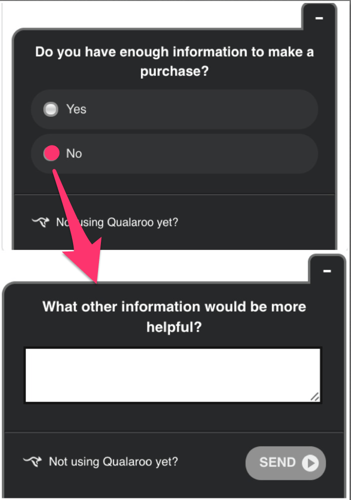
So Hootsuite put that hypothesis to the test. They implemented a short on-site survey on their branded landing page and asked whether there was enough information to make a decision.

The results validated that hypothesis. Out of a sample size in the mid to high hundreds, around 65% of the traffic said they needed more information before they could make a decision.
Even though their branded traffic knew the name “Hootsuite” enough to search for it, they didn’t understand what Hootsuite actually does—and that was because the landing page didn’t communicate Hootsuite’s core value proposition.
If people don’t understand what your product does, it doesn’t matter how many descriptions you include about its advanced features. If your landing page doesn’t make the core function exceedingly clear, you won’t get those conversions.
How Hootsuite Used Survey Responses To Redesign Their Landing Page
Armed with their survey results, Hootsuite had a clear path to take action and revamp their landing page. They discovered that the following qualities limited the impact of their core value proposition:
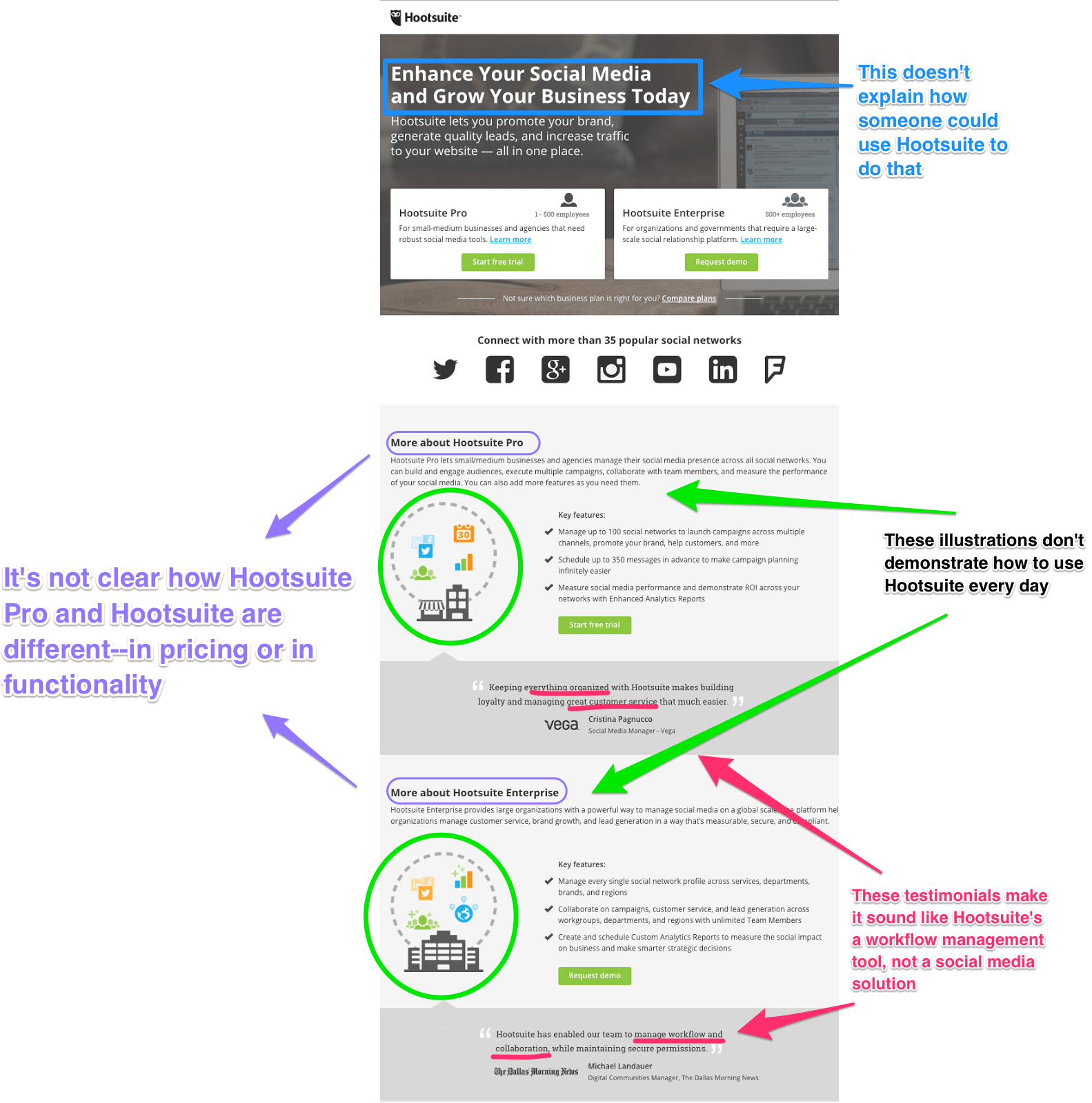
- Hootsuite’s original site stated that their product puts your social media in one place, but the landing page didn’t communicate how one might use Hootsuite to do that.
- The landing page had illustrations of how Hootsuite worked with other tools at a higher level, but that was too abstract without a picture of the dashboard.
- The difference between Hootsuite Pro and Hootsuite Enterprise wasn’t clear in terms of functionality and pricing.
- The site’s testimonials preached Hootsuite as a workflow management tool, but not as one that specifically worked with social media.
As it stood, it made sense to Hootsuite that none of these were triggering an Aha! moment for their leads.
Here’s what it looked like before the changes:

When Hootsuite changed their landing page, they clarified their product’s core functions.
- They used specific language on all of the new landing pages to communicate Hootsuite’s everyday solution.
- They put pictures of the dashboard front and center to show how that solution worked.
- They clearly distinguished the different paid Hootsuite plans.
- They added new testimonials highlighting how Hootsuite’s core functions have helped their customers.
Here’s how it looked after:

When the Hootsuite team A/B tested the original and new pages, their results showed a 16% lift in conversion at a 98% statistical significance. Even though the new page had a decreased CTR to their billing page, the quality of the page view was much better and led to an exponentially higher conversion rate.
Using surveys to direct CRO efforts can help companies reach people who need their product most, and help them understand the solution it provides. If leads say they don’t have enough info about pricing, companies know to provide it. If leads need visuals, companies will add it. Surveys are the key to unlocking the friction that stops individuals from converting—and eliminating it.
Surveys Give You A Direction
As Hootsuite saw, surveys can be more than NPS or customer temperature tools. Using them to direct your CRO efforts can show you what’s working, and what needs to be improved. Because your survey results show you what to do next, your surveys become a mechanism for your company’s growth.
FREE. All Features. FOREVER!
Try our Forever FREE account with all premium features!

 We'd love your feedback!
 Thanks for your feedback!


