Most customer engagement dashboards look busy and still miss the point. You see traffic, clicks, and sessions climbing, but you cannot answer the only question that matters: are users getting value and coming back?
That’s usually because your data is split across tools, channels fight over credit, and your team tracks whatever is easiest to report. I’ve been there. You end up measuring motion, not momentum.
Here’s how I frame it: engagement is not attention; it is repeat value. Users hit value fast, adopt the right features, return on their own, and stick around long enough to renew or expand.
In this guide, I’ll give you the 10 customer engagement metrics that actually predict growth, the benchmark ranges that make the numbers readable, and simple examples so you know what to fix next.
Quick Summary (Read This First)
- Customer engagement metrics measure how deeply users interact with your brand across the journey.
- Track one primary metric that reflects repeat value.
- Add three drivers (activation speed, adoption depth, and churn).
- Use benchmarks as context, but let segments + trends make the call.
Let’s first start with what customer engagement metrics are.
What Are Customer Engagement Metrics?
Customer engagement metrics are the numbers that show how users interact with your brand, product, and experiences over time, not just whether they noticed you, but whether they stuck, moved forward, and came back.
Think of them as answers to a few high-stakes questions:
- Are people finding value… or just browsing?
- Are they progressing (click → sign-up → activation → purchase)?
- Are they returning often enough to form a habit?
- Are they happy enough to stay (and recommend you)?
This matters because engagement can look “fine” on the surface while the business quietly erodes.
- Lots of traffic, but zero intent
- Great CSAT, but users still churn
- Strong social engagement, but no pipeline
- Solid conversions, but no repeat usage
The point isn’t to decorate a dashboard. It’s to pinpoint where momentum breaks, so you fix the experience, not debate the report.
How to Measure Customer Engagement
Measuring customer engagement is not about collecting more metrics. It is about building a system that produces numbers you can trust, interpret quickly, and act on, even if you have a small team.
1. Pick One North Star Metric and Three Supporting Metrics
Most engagement reporting fails because teams track too much and prioritize nothing.
Start with:
- One North Star metric that reflects value for your business (retention, repeat purchase rate, weekly active teams)
- Three supporting metrics that explain why the North Star moves (time to first value, feature adoption, churn)
This keeps you focused when you do not have dedicated analytics expertise.
2. Standardize Tracking and Definitions Across Tools
If marketing, product, and support use different definitions, your numbers will conflict, and every meeting becomes a debate.
Example: In GA4, an engaged session is a session that lasts longer than 10 seconds, has a key event, or has 2 or more screen or page views.
Do the same standardization for feedback metrics, too:
- Use consistent CSAT and CES scales
- Ask at consistent moments (after onboarding, after support, after a key feature use)
- Keep the same reporting window so trends are comparable
3. Map Metrics to the Customer Journey
Use the customer journey as your organizing logic:
- Awareness: Are we attracting the right audience?
- Consideration and activation: Are users reaching value quickly?
- Retention: Are they returning and building a habit?
- Advocacy: Are they satisfied enough to recommend us?
This is the fastest way to spot tracking gaps, implementation issues, and mismatched intent between channels.
4. Choose Metrics Based on Your Niche
Most teams do not need all 10 on day one. Start with three based on your business model.
For B2B SaaS
- Time to first value
- Core feature adoption rate
- Churn rate
For E-commerce
- Conversion rate
- Visitor recency
- Customer effort score
For Content or Community Products
- Visitor recency
- Stickiness (DAU/MAU)
- Net promoter score
5. Add Real-Time Feedback and Periodic Pulse Checks
Analytics tells you what happened. Feedback tells you why.
Use two complementary approaches:
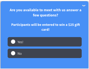
- In-the-moment feedback inside the experience, where friction happens (onboarding steps, feature use, exit intent, checkout hesitation). This is where an on-site or in-app nudge approach fits naturally. Here’s a video on how you can create website microsurveys to gauge your audience:
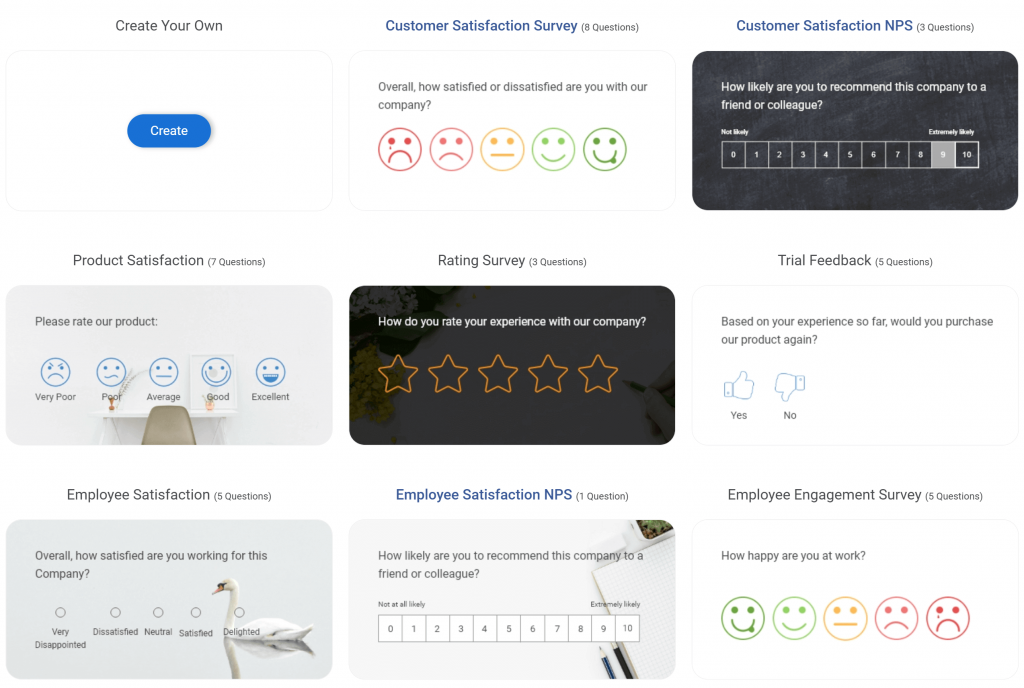
- Periodic pulse surveys for broader sentiment and deeper context (quarterly relationship NPS, post-launch sentiment, customer research). This is where a longer-form survey workflow is often more appropriate. Here are a few pulse survey templates you can use:
Used together, you get both speed and depth without turning engagement measurement into a heavy analytics project.
Customer Engagement Metrics You Actually Need to Track
These 10 metrics keep you focused on what actually predicts retention and revenue. Each one includes a benchmark range, plus examples and fixes that account for real-world constraints.
Here’s a table for you to quickly skim through. You can learn more about each metric below:
| Metric | Stage | What It Tells You |
|---|---|---|
| Customer Engagement Score | Consideration, Retention | A single health score that combines usage, depth, and loyalty signals |
| Active Users (DAU, WAU, MAU) | Retention | How many users actually come back in a period |
| Stickiness (DAU/MAU) | Retention | Whether you are building a habit or a one-time visit |
| Feature Adoption and Depth | Activation, Retention | Whether users reach value and how much of the product they truly use |
| Visitor Recency (Days Since Last Visit) | Retention | How recently users returned, a strong habituation signal |
| Time to First Value (TTFV) | Activation | How quickly users experience the first meaningful win |
| Conversion Rate | Decision | Whether engaged traffic turns into signups, leads, purchases, or upgrades |
| Churn Rate | Retention | Whether customers are leaving faster than you can grow |
| Customer Effort Score (CES) | Retention, Advocacy | How hard it is to get help or complete key tasks |
| Net Promoter Score (NPS) | Advocacy | Loyalty and likelihood to recommend |
1. Customer Engagement Score
A single score that summarizes how engaged a user or account is, based on your highest-value actions.
Benchmark Range: Use internal percentiles, not universal targets: bottom 25% is at risk, middle 50% is stable, top 25% is power users and expansion-ready.
Why It Matters: It forces marketing, product, and support to agree on what “engaged” means.
How to Improve: Pick 3 to 5 value actions, weigh them, and keep the formula stable for a quarter.
Watch Outs: Equal weights, vanity events, and no segmentation by persona or plan.
2. Active Users (DAU, WAU, MAU)
Counts of unique users active in a day, week, or month, based on a meaningful action.
Benchmark Range: Compare by segment, lifecycle stage, and acquisition channel.
Why It Matters: Active users reveal whether engagement is recurring or just launch-week curiosity. They also expose identity gaps when users switch devices, and you cannot stitch journeys.
How to Improve: Define “active” as a value action, not a login. Track returning vs new. When DAU drops, ask a one-question intercept on the step users abandon, then follow up with a deeper survey if needed.
Furthermore, you can focus on optimizing content and anchors around long-tail keywords and ensure that meta tags, headings, and alt texts are optimized.
Watch Outs: Blended totals that hide a collapsing cohort.
3. Stickiness (DAU/MAU)
DAU divided by MAU, shown as a percent. It is a quick habit proxy.
Benchmark Range: A commonly cited SaaS average is about 13%, and an across-industry average is about 37%.
Why It Matters: It cuts through “vanity growth.” You can buy MAU, but you cannot fake repeated use for long.
How to Improve: Tighten the core loop so users reach value fast, then have a clear next step. Reduce friction in setup and cross-channel handoffs.
Watch Outs: Comparing unlike products. Some workflows are naturally weekly.
4. Core Feature Adoption Rate
The share of active users who use your core feature at least once in a period.
Benchmark Range: Across sectors, average core feature adoption has been reported at around 24.5%.
Why It Matters: This is where “satisfied but churning” shows up. If users never adopt the feature that creates value, retention becomes fragile.
How to Improve: Define one core feature per persona. Instrument events consistently across tools.
Watch Outs: Counting clicks as adoption instead of repeated, successful use.
5. Visitor Recency
How recently a user returned, often tracked as days since last visit or last meaningful action.
Benchmark Range: Start with internal targets by product type. “Days since last visit” is a standard way to measure the time between visits.
Why It Matters: Recency is a strong habituation signal and stays useful even when attribution gets messy across channels.
How to Improve: Set recency thresholds by segment, then trigger lightweight prompts when users cross them. Use the response to route fixes, missing info, friction, or misfit expectations.
Watch Outs: Ignoring cross-device identity and calling it “churn.”
6. Time to First Value
Time from signup to the first moment the user gets the core value.
Benchmark Range: An average SaaS time-to-value of about 1 day and 12 hours.
Why It Matters: It is a leading indicator of retention, especially for small teams that cannot analyze everything. If users do not reach value quickly, the rest of the funnel is noise.
How to Improve: Define the first value as a single outcome, then remove steps before it. Use contextual questions at drop-off points, and align support content to the exact blockers.
Watch Outs: Defining the first value as “account created.”
7. Conversion Rate
Percent of users who complete a desired action like signup, demo request, checkout, or upgrade.
Benchmark Range: For e-commerce, IRP reported an average conversion rate of 1.99% in December 2025.
Why It Matters: Conversion is where cross-channel conflict shows up. Paid and SEO can drive clicks, but product friction kills outcomes.
How to Improve: Track micro-conversions, then diagnose the step with the biggest drop. Use an exit or on-page question to capture friction context immediately.
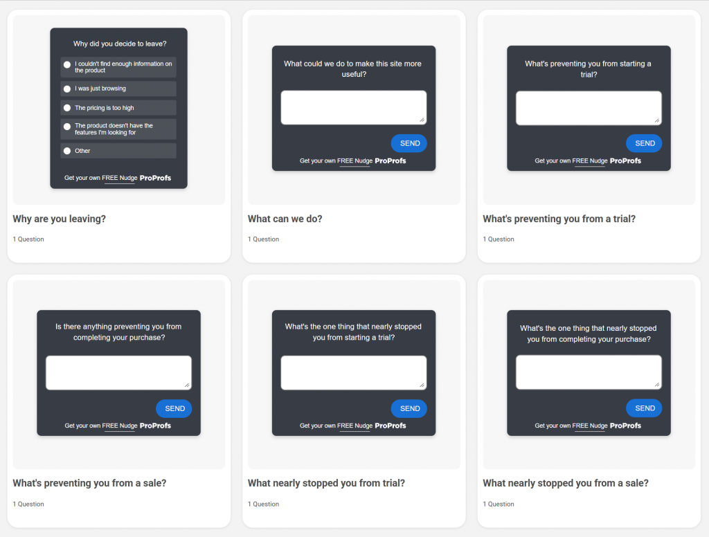
Here are a few exit intent survey templates you can use:
Watch Outs: Optimizing for CTR instead of intent-aligned conversions.
8. Churn Rate
Percent of customers who cancel or stop using your product in a period.
Benchmark Range: Recurly lists overall churn at 3.27%, with 2.41% voluntary and 0.86% involuntary.
Why It Matters: Churn is the scoreboard. It also highlights operational issues like billing failures that “feel” like product problems.
How to Improve: Split voluntary vs involuntary, then tie churn back to engagement cohorts. Capture cancellation reasons in the moment, and tag themes so teams stop arguing and start fixing.
Watch Outs: One blended churn number with no cohort breakdown.
9. Customer Effort Score
A measure of how easy it was to complete an interaction, usually right after support, onboarding, or checkout.
Benchmark Range: One guide suggests a “good” CES is typically 4.0 to 5.0 on a 1 to 5 scale, or 5.5 to 7.0 on a 1 to 7 scale.
Why It Matters: Effort exposes the real cost of handoffs. Customers feel the seams between tools and teams.
How to Improve: Ask CES immediately after key moments, then add one open-text follow-up. Use the verbatims to prioritize fixes that reduce steps and confusion.
Watch Outs: Measuring too late and losing context.
10. Net Promoter Score
Loyalty metric based on how likely customers are to recommend you.
Benchmark Range: Industry medians vary widely, for example, software around 30 in one benchmark set, so compare within your industry and track the trend.
Why It Matters: NPS becomes powerful when paired with behavior. A stable score with rising churn often means you are surveying the wrong segment or missing product friction.
How to Improve: Always ask “why,” tag themes, and close the loop with detractors. Use targeted prompts, then periodic surveys for relationship-level tracking. You can use this survey template for NPS:

Watch Outs: Treating NPS as a vanity score instead of an action system.
Here’s a quick video for you to learn more about NPS:
What to Do Before You Benchmark Anything
Benchmarks only help when your numbers mean the same thing every time. If they don’t, treat benchmarks as directional, not definitive.
- Lock your definitions. Decide what “active,” “engaged,” “conversion,” and “churn” mean in your business, then keep them stable.
- Benchmark by segment, not averages. Split results by new vs returning, channel/source, device, plan/persona, and lifecycle stage.
- Compare like with like. Measure the same period, same cohort type, and same product surface (web vs app) each time.
- Use trends as the truth. Watch movement week-over-week/month-over-month before you overreact to a single number.
- Sanity-check outliers. If something spikes or drops hard, verify it’s real before you ship conclusions.
FREE. All Features. FOREVER!
Try our Forever FREE account with all premium features!
Website & Product Instrumentation Checklist
Before you optimize anything, make sure you can answer two questions with confidence: who did what and what happened next. This checklist is the fastest way to spot missing events, messy naming, and gaps between web → product → revenue, without turning analytics into a full-time job.
1. Define your active and value events
- Choose 1 to 3 actions that clearly represent value for your product.
- Define what counts as an active user using those actions, not logins.
- Lock these definitions for at least a quarter so trends stay comparable.
2. Standardize event naming and ownership
- Use one naming convention across web and product events.
- Create a simple event dictionary: event name, definition, where it fires, and who owns it.
- Confirm the same action is not tracked differently across tools.
3. Capture drop-off points
- Track the steps where users commonly stall, such as signing up to the first action and onboarding steps.
- Track core feature setup, checkout or upgrade flows, and support contact to resolution.
4. Set up identity and segmentation basics
- Decide how you will stitch sessions to users across devices where possible.
- Tag events with key properties like source, device, plan, persona, and lifecycle stage.
- Separate new vs returning users everywhere.
Run a monthly tracking audit
- Spot-check top funnels to ensure events still fire after releases.
- Watch for missing data, duplicate events, or sudden definition changes.
- Document changes so metric shifts are not misread as performance shifts.
Common Measurement Challenges and How to Fix Them
Even solid metrics fall apart when teams measure different things, journeys go dark between tools, or tracking quietly breaks after a release. These are the three failure modes that create fake confidence, and the fastest fixes that bring your dashboard back to reality.
| Challenge | What you see | Fix fast |
|---|---|---|
| Data Silos | Numbers do not match across tools | Align IDs, standardize definitions, report in one view |
| Cross-Channel Tracking Gaps | Attribution breaks, journeys disappear | Track micro-conversions, use cohorts, group channels |
| Tracking Breaks After Releases | Spikes and dips with no explanation | Monthly audit, event-drop alerts, and log tracking changes |
Put Customer Engagement Metrics to Work
Metrics don’t retain customers; the decisions you make from them do. Pick a primary signal that represents repeat value, back it with a few drivers (activation speed, adoption, and churn), and review them the same way every week.
When something dips, don’t guess. Go straight to the step that changed (onboarding, a core workflow, pricing, checkout, support), capture the reason in the moment, and ship one fix that removes friction. That’s how engagement becomes a compounding system, and not a dashboard you glance at and ignore.
A lightweight nudge layer like Qualaroo can help you capture the “why” right where friction happens, so your next move is based on context, not guesswork.
Frequently Asked Questions
What are the four P’s of customer engagement?
Purpose is the job you help customers get done, stated in plain language. Personalization is tailoring the experience based on what you already know, like whether someone is new, returning, stuck, or power-using a feature. Proactivity is intervening before frustration becomes churn by guiding next steps at the right moment. Proof is showing progress and outcomes, so customers feel the value compounding over time and trust the relationship more.
What are good engagement metrics?
Good engagement metrics track repeat value, not busywork. Focus on active users and stickiness to see habit formation, adoption depth to confirm customers are using the value-driving parts of the product, visitor recency to catch drop-offs early, conversion rate to verify intent is turning into outcomes, and churn to keep a hard check on retention. If you add sentiment, make it serve decisions by tying it back to behavior and cohorts.
How do you unify engagement insights across tools and teams?
Start by agreeing on a shared set of definitions for “active,” “engaged,” “conversion,” and “churn,” then map every source to those definitions. Use a single identity layer or consistent IDs so web behavior, product usage, and outcomes can be connected. Route the resulting signals into one reporting view and push the few that require action into the systems teams already live in, like your CRM or support platform. Finally, review results on a fixed cadence by the same segments each time.
FREE. All Features. FOREVER!
Try our Forever FREE account with all premium features!
 We'd love your feedback!
What did you like & how can we make it even better?
 Thanks for your feedback!
 Ask Your Question
Have a question? Get expert help to make your decision easier.