User experience and funnel optimization
When we talk about user experience (UX), we're referring to the totality of visitors’ experience with your site—more than just how it looks, UX includes how easy your site is to use, how fast it is and how little friction there is when visitors try to complete whatever action it is they’re there to complete.
As it applies to funnel optimization, the importance of UX cannot be overstated. By carefully crafting your user experience, you can ensure the user stays on task and keeps moving through the funnel, having been given just enough information and options at each step.
In your funnel optimization efforts, you’ll be focusing primarily on two aspects of UX:
- Reducing friction in the form of wasted clicks, excess pages, false starts, going to the wrong page, slow page loads and other friction points that cause users to give up.
- Reducing cognitive overhead—another version of friction—that puts doubt and indecision into the mind of the user, causing them to waver over whether to convert.
Projects usually begin with design briefs, branding standards, high-level project goals, as well as feature and functionality requirements. While certainly important, these documents amount to little more than the technical specifications, leaving exactly how the website will fulfill the multiple user objectives (UX) wide open.
By contrast, if you begin by looking at the objectives of the user and the business, you can sketch out the various flows that need to be designed in order to achieve both parties’ goals. The user might be looking to find a fact, order a product, learn a skill, download a document, and so on. Business objectives could be anything from getting a lead, a like, a subscriber, a buyer, and so on. Ideally, you’ll design your flow in a way that meets both user and business objectives.
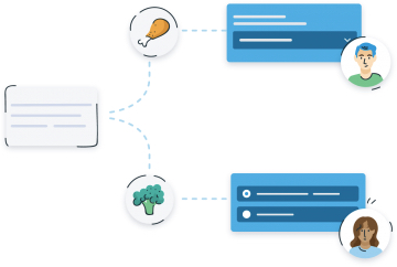
In addition to an awareness of user objectives,it’s important to account for the different traffic sources and levels of knowledge and engagement in your user base. You must map those in-bound user flows to conversion funnels that provide value to the user (without neglecting those business objectives.)
When mapping out your user flows, start at the top—the point at which users first exposed to your site. You’ll probably want to address the flows that impact the most users first.
Here are a few examples of typical user flows:
- A user clicks into your site from a banner or Google AdWord ad (Paid Advertising)
- A user finds your site via a friend’s post on a social network (Social Media)
- A user clicks into your site from a deep link that was surfaced by a search (Organic Search)
- A user sees you mentioned in the news or a blog post and visits your site (Press or News Item)
In each of these cases, the user comes with his or her own needs, expectations and level of knowledge; and they need to be treated accordingly.
For example…
Assume like many websites, one of your major sources of traffic is paid advertising. Let’s follow the user flow from a paid channel from first exposure to conversion.
It all starts with the banner or search ad copy, which needs to achieve one precious goal: get a click from the right person.
When designing ads that represent the topmost point of your user flow, ask yourself the following:
- What type of user am I targeting?
- Are they actively seeking a solution to a problem, or are they casually browsing?
- What problem are they trying to solve?
- How can I best capture the user’s attention?
- How do I relate to the user?
- Is there a message that will resonate with the user?
- Is there a pain point that my product or website alleviates for the user?
- How can I articulate this solution clearly and quickly?
- What compelling calls to action will get our target user to click?
Look to the data you’ve compiled via analytics, user surveys and user testing to ensure your your ads speak to your users’ motivations and be sure to include a great hook.
So you’ve designed an ad that fulfilled its main objective, getting the user to the landing page. This is when the user flow work really begins. In this case, the user is coming from a low-information source—for example, your ad doesn’t communicate as much as a press or news item. Because of this you must cater your flow to fills in the gaps of information, providing the the data visitors need to feel comfortable giving you their email address (or whatever your desired conversion is). The key here is twofold: provide a reason to keep moving through the flow, down the funnel and get rid to any reasons to stop and click out of the funnel.[1]
In the next chapter we’ll thoroughly cover the art of crafting a killer landing page but below are a few methods of keeping the user moving through the funnel:
- Articulate benefits and support them with simple proof points
- Organize your content and design to support—rather than distract from—your call to action
- Remove friction at every step by asking as little as possible from the user—the minimum amount of information and load time, the fewest number of fields and clicks
- Use a compelling headline or hook that creates a sense of anticipation in the user, propelling them through the last registration step.
While some sites use tricks (also known as “dark or anti-patterns”) to drive conversion, the resulting growth is inauthentic.[2] Because they trick people, their reputation is ultimately damaged and their word of mouth referrals are hurt.
It’s important to understand that converting every visitor isn’t optimal. Rather, focus on designing your user flow in a way that nudges the right visitor toward the must-have experience. Further, once that visitor converts, the UX should make it easy for them to tell their friends about their great experience via social media and other sharing, driving new users into the funnel.
Landing page optimization
Chances are, if there’s an under-optimized page on your site, your landing page is it. Yet many users’ first impressions are based predominantly on this page. When you first start reading up on CRO, you’ll find tons of “rules” about what makes a great landing page.
As we’ve already discussed, however, what worked wonders for someone else might not produce the same results for you.
In addition, much of the landing page advice you’ll find online relates specifically to pages that are created for the purpose of landing pages–pages tied to a paid advertising campaign to maximize conversion. Don’t forget, however, that people land on many different pages of your site.
With Google responsible for 25% of the traffic delivered to websites in the US [1], visitors are landing on product pages, contact us pages, blog posts and knowledge bases. When thinking about landing page optimization, it’s up to you to look at the top landing pages for your business and build a plan to optimize those pages for conversion.
The bottom line…
While it’s great to find inspiration from successful tests that others have run, don’t count on them to produce the same results with your audience. Create your own hypotheses and tests to find the winners for your business.
Landing Page Elements
If you scan several successful landing pages, you’ll probably notice they several key elements in common—and for good reason, as these elements communicate critical information to users. For this reason they are excellent candidates for testing and optimization. Use KISSMetrics “Blueprint for a Perfectly Testable Landing Page,”[2] cited below, as a jumping-off point for constructing your own winning landing page.
- The headline— like on a newspaper, the goal of the headline is simply to get the visitor to read the next line and so on. A great headline is a great hook that grabs the attention of the visitor.
- Hero Image— this is the primary image or creative element on the landing page. It should work with the headline, reinforce your value proposition and draw people further in, toward the call to action or benefits.
- Proof points— these are benefits or other copy that “pays off” the promise laid out in the headline. If the headline is the hook, these articulate the promise.
- Form or Call to Action— depending on the type of landing page you have, you may have either a form to collect data, a call to action (like a button to download your app), or both.
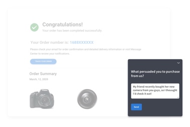
- Social Proof— testimonials and other elements validate your brand or product. Our psychology is such that in the absence of perfect information, we will make similar decisions as others that we perceive to be like us.
- Third-party endorsement— to create trust and confidence, you can leverage existing brands that are recognizable by your target audience. Has your business been featured in a known news publication or used by a prominent client? You can confer some of the trust associated by their brand by using their logo on your page (with their permission of course).
A Mnemonic for Landing Pages
In “How to Make a Landing Page that C.O.N.V.E.R.T.S.”, Beth Morgan offers a mnemonic for the landing page elements that lead to conversion. It is as follows:
How to Make a Landing Page that CONVERTS
- C = Clear Call to Action
- O = Offer
- N = Narrow Focus
- V = VIA: Very Important Attributes
- E = Effective Headline
- R = Resolution-Savvy Layout
- T = Tidy Visuals
- S = Social Proof
You’ll notice that Morgan’s mnemonic and the blueprint that comes before it have a lot in common and rightly so—these landing page elements work because they satisfy distinct and universal user needs and desires.
Long-form vs. Short-form Landing Pages
Let’s discuss a bit of dogma regarding landing pages—something you’ve almost certainly read again and again—the debate over whether landing pages should be short and minimal, or long and rich.
In the minimalist camp you’ll often hear that “long form” landing pages don’t sell. This is a myth. Long form pages can be very effective. In the long form camp you’ll often hear the opposite–that minimal landing pages don’t give visitors enough information to make a decision, and therefore are poor performers. This is also a myth.
As a general rule, we’ve found that longer-form landing pages work for products that are more complicated in nature or that are newer to the market and need to build trust with the visitor. Shorter-form landing pages work for products that are very easy to understand or have strong existing brand awareness and trust with visitors.
Below, you’ll find a few more guidelines for optimizing your landing page.
Let’s start with landing page copy…
- Make whatever text you do have on your landing page as streamlined as possible through editing, refining and condensing. Your visitor will give you about 5 seconds before deciding to leave or stay. Your copy must be clear concise and attention getting.
- But whether it’s five sentences or five pages, your landing page should engage users.[3]
- Don’t jump the gun. It’s better to delay your “pitch” until visitors are fully engaged than present the call to action before they’re ready for it. In other words,capture your visitors’ attention before asking them to take action. This might mean presenting a quick product tour that shows them how they can’t live without your service before asking them to sign up for it.[4]
- Consider that you might be neglecting to highlight the must-have experience. Why do your most dedicated users come back again and again?
- Do you have resources—like promotions or testimonials from well-known clients—that are under-utilized? Make sure they’re prominently displayed.
Now for the other elements of your landing page…
- Whatever behavior you’ve designated as a conversion, users shouldn’t have to search for it. Make the conversion visually obvious. A button, a phone number, a form. Whatever the element, it must stand out. Deemphasize, relocate, or remove other less important but visually distracting elements.
- Don’t overwhelm visitors with too many choices. Provide a single call to action. If you have more than one choice, you haven’t narrowed your landing page down to meet the intent of the visitor.
- Some people prefer audiovisual content, while others find text preferable. Make sure to test what works best for your audience.
- Understand why people are coming to your site in the first place. Examine your best-converting or largest traffic sources and make sure your landing page and associated ads and keywords accurately represent your value proposition. You might learn that your bounce rate is high because visitors are under the assumption that, based on your ads, you offer something you actually don’t.
- The best landing pages quickly build trust. Let your users know they can trust you by using elements such as safe shopping seals and trusted third party endorsements including: Verisign logo for e-commerce, logos of recognizable clients, publications you’ve been featured in, testimonials, etc.
If this chapter could be summed up in three words, they’d be: only the essentials. Think back to the basic definition of conversion rate optimization from Chapter 1—finding why visitors aren’t converting and fixing it. Keep this definition in mind when optimizing your landing page. You’re simply figuring out why visitors aren’t converting (call to action is impossible to find? they aren’t convinced of your trustworthiness? they’re distracted by unnecessary images and links?) and fixing it.
Case Study: Highrisehq Landing Page Optimization
In May of 2011, the folks at 37signals decided to run some A/B testing on their landing page design for Highrisehq.com.[5] Jamie of 37signals explains their reasoning, “Signups were going well, but we were worried that customers still couldn’t get the gist of what Highrise did and why they needed the product.” The used their original landing page as their baseline during testing.
Be sure to check out Signal vs. Noise for the fully story (part 1, part 2, part 3).
First, they drafted a long form version of their landing page and ran it through an A/B split test—presenting either the original or the long form version to over 42,000 visitors. The Long Form page had a 37.5% increase in net signups. Awesome! But they didn’t stop there.
Despite the success of the Long Form design over the original, they implemented yet another A/B split test—this time a far shorter Person Page, which had a 47% increase in paid signups over the Long Form design.
Next they added more information to the bottom of the Person Page. The resulting Long Form Person Design did in 22% worse than the original—despite the original user preference Long Form design!
Since the Person Page was the clear winner, they decided to swap out the featured person to see how different faces affected conversion rates. Testing indicated that a specific person wasn’t as important as a big photo of a smiling customer. Jamie points out, however, that they are still “tweaking and measuring behind the scenes.” Just because the Person Page is the winner for now, that doesn’t mean they won’t eventually come up with a design that’s even better.
The 37Signals Test Implementation
Noah describes their testing implementation as, “two services and some home grown glue.” It looks like this:
- They use Optimizely to set up the test.
- In conjunction with the Optimizely setup,they use a Javascript snippet inserted on all pages (experimental and original) to identify the test and variation to Clicky.
- They also added to Optimizely another piece of Javascript to rewrite all the URLs on the marketing pages to “tag” each visitor that’s part of an experiment with the experimental group. When a visitor completes signup, Queenbee—37Signals’ admin and billing system—stores that tag in a database so they can track plan mix, retention, etc. across experimental groups.
- Finally, they set up click and conversion goals in Optimizely to serve as validation for the results from Clicky.
After the testing begins, their Campfire bot ‘tally’ takes center stage to help evaluate the test. They’ve set up tally to respond to a phrase like “tally abtest highrise landing page round 5” with the “conversion funnel” for each variation–what portion of visitors reached the plan selection page, reached the signup form, and completed signup.
Tally also provides the profile of each variation’s “cohort” that has completed signup, including the portion of signups for paying plans, the average price of those plans, and the net monthly value of any visitor to any landing page.
Anyone at 37signals can check on the results of any test that’s going on or recently finished anytime in just a few seconds via Campfire.
This is the anatomy of a great test—one bold change at a time,meticulous documentation,and full understanding of the cyclical nature of optimization.
Reducing Bounce and Exit Rates
Your site is up and your product is out there for the world to see. Before you know it, you have visitors trickling in to see what you have to offer.
Despite the depths of the Internet and the billions of pages offered, users are arriving at your website and then without any explanation—they’re leaving.
They come and then they go, maybe after a minute, maybe even less. After all of the hours you’ve put in, the majority of your visitors aren’t staying around long enough to get past your landing page. Many of them visit once and never return.
Do not immediately move through the five steps of grief; in this chapter we’re going to go over some ways to change this trend for the better.
In Chapter 1, we touched briefly on your Bounce and Exit Rates. In this chapter we’ll look at these numbers in much more detail.
First, let’s review those key terms.
Exit Rate
An Exit Rate is specific to each page; it’s the percentage of people who leave after viewing the page. Your exit rate lets you know the last page that users view before they move on. A very high exit rate on a specific page can be a red flag.
For example, if your product tour page that details the benefits of what you sell has one of the highest exit rates, you are likely not connecting the true value of your product with your visitors.
Bounce Rate
Your Bounce Rate is the number of visitors who leave your website after visiting a single page. Each page has its own bounce rate, but initially you probably want to address look at the bounce rates for three pages:
- Landing pages that you’re sending paid traffic to through ads
- Pages where you are attempting to make conversions happen
- High traffic pages–pages that most of your visitors see
The higher your bounce rate, the lower your percentage of engaged users. Your bounce rate can be affected by your page but also by the quality of the traffic coming to your site.
All of the following ways of leaving your site constitute a bounce:
- Hit the back button
- Type a different URL
- Close the window or tab
- Click on an external link
- Timeout [1]
But how do you find your bounce rate?
This is where your analytics come in. We touched briefly on analytics in Chapters 1 and 4, and we’ll discuss them in much more detail in Chapter 9, but for the sake of our discussion of bounce rates, we’re going to mention them again. They are that important.
A basic analytics report will give you an overall bounce rate, with options to dig deeper and find out the bounce rates for individual pages. In Google Analytics, you’ll find this by going to Behavior > Site Content > All Pages.
Once you have a grasp of what your bounce rate is, it’s time to figure out why visitors aren’t sticking around in the first place.
Your toolbox for determining what’s causing your high bounce rate contains many of same tools we discussed in Chapter 4. Again, we’ll discuss these at length in Chapter 9, but the basics are as follows.
- Analytics – Figure out bounce rate and traffic sources for your most popular pages. Your website’s overall bounce rate is too vague a number. A detailed page-level report will help you identify your highest traffic pages and your worst offenders when it comes to bounce rates. Analytics also delivers insights regarding where this traffic is coming from.
- User Testing – Figure out what users are doing on your site. The ability to observe how users interact with your site is invaluable in determining the cause of high bounce rates. Using a CrazyEgg heatmap might reveal that only 30% of visitors see your call to action.
- User Surveys – Ask users what they are looking for and whether they can find it. Analytics and testing will only tell you so much. Some stuff you can only figure out by asking visitors directly.
Here are some of the most common culprits:
- Your website is visually unappealing. Sometimes the fix is obvious. A visitor has stumbled across your site and they are unimpressed by your cheesy stock images and choice of Comic Sans as a font. Never underestimate the power of an attractive, easy-on-the-eyes website compared to a cluttered eye-sore. Great design creates credibility.
- Your website is difficult to use. Maybe your site copy makes perfect sense to you but visitors are left confused or even worse, offended. It could also be that users are not visiting more pages because they can’t find them. Either because of poor layout, poor information architecture, technical errors or malfunctioning buttons and page errors, users are left stranded.
- Your website doesn’t meet user expectations. Unlike in the previous scenario, in which the user can’t easily leave the landing page, in this situation someone visits your website based on a promise that isn’t kept. If you do offer what they’re looking for it might not be easily located from the page they landed on. Users lack the motivation or time to scour every page you have, so it is crucial to remove the obstacles that cause them to give up and look elsewhere.
- The people coming to your website aren’t the right people. The type of person viewing the page is just as important–if not more so–than the page itself. If people are bouncing it may be because they arrived based on a false promise. This is traffic you can’t really optimize, because they are going to bounce regardless. To avoid this, be sure your ads accurately represent your product and keywords align with your site’s mission.
- There is no Call to Action. This issue is quite comparable to to the “lack of usability/navigation” issue, though likely even more detrimental to your bounce rate. Users arrive to your site one way or another and simply don’t know where to go next—the shopping cart is nowhere to be found, it’s not clear how to subscribe to your blog, etc. Whatever the activity you’ve designated as conversion, if the user has no idea what you want them to do, there is a huge problem.
For example…
You own a sporting goods store that’s having an awesome sale on fishing reels. You advertise in the newspaper, put banners on the storefront, and send out a mass email. The turnout is great! A thousand customers show up, but only ten customers are able to locate the reels on your cluttered, disorganized sales floor.
The remainder is left alone at sea, struggling (mind the pun), and more often than not, this struggle is all it takes to make your customer head for your competitor across the street (whose fishing reels are prominently displayed in the front window). This is how e-commerce works, except it’s far easier to make a few clicks over to the competitor compared to crossing the street. If you’re making it hard for your users to take advantage of what you’re offering them, you’re essentially sending that competitor business.
- Too Many Calls to Action (the flip-side of the “No Call to Action” coin). After reading about the last issue, it may seem impossible to offer too many calls to action but this is quite often the case. On a site with too many calls to action, the user is overwhelmed by the possibilities—buttons and links are everywhere and the user has no idea which one will deliver whatever it is he or she is looking for. Before you know it, they are seeking the comfort of a simpler, less cluttered site.[2]
Do not get bogged down by all of the negative though. For each potential reason for a user to bounce, there are a number of fixes to help guarantee future users stick around.
When attempting to lower your bounce rate, keep your conversion goals in mind—what exactly is it you want users to do? You aren’t lowering bounce rates because bounce rate are inherently bad. You’re lowering bounce rates so people stick around long enough to subscribe to your email newsletter, download a document, make a purchase and so on.
Now, lets take another look at the above issues:
Your Website is Unattractive
When a user arrives at your website, is he or she greeted with a simple, easy-to-navigate site? Or is the user bogged down with pop-up ads, dated graphics and a disorganized layout? Your goal is to provide exactly what they are looking for. If any visual element of your site stands in the way of this, you are creating friction and friction kills conversion.
Your Website is Unusable or Lacks Navigation
The easiest fix here is to actually put yourself in your users’ shoes and explore your site.
- Does every link work?
- Do you run into any technical errors?
- How is the load time?
- Can you easily follow your own navigation to your desired goal?
To take it a step further, consider asking a few close friends to try out your site and complete a task. Watch them and document their experience—specifically any problems they have. For the best possible representation, use friends from all over the spectrum, those inside your field and those who have no idea what you do or sell. Tweet this!
Your Website doesn't Meet User Expectation
First, ask yourself these questions:
- What search terms did visitors use to get here?
- What website or ad did your visitors come from?
If the answers to these questions are readily available, you can make some assumptions about what visitors are looking for and expecting to get from your site. Again, this will come from analytics. To find this out in Google Analytics, you’ll use the All Traffic, Referrals, and Search Engines reports under Traffic Sources.
Many users will arrive via search engines, so it is important to know the their intent and make sure your site matches those expectations. For example, if you are sell marketing automation software but have a large percentage of visitors showing up looking up performance-based marketing agencies, you have a percentage of visitors who will never buy from you, no matter how optimized your landing pages are.
In addition to analytics, you should ask visitors what they’re looking for when they arrive on your site. This lets you determine visitor intent, going beyond keywords to the actual reasons a person is on your site.
For example, if you have a mobile photography iOS app and a visitor arrives on your site from searching “iPhone mobile photos” you don’t know if they’re looking for a photo taking app, photo editing app, how to backup their photos, or how to take better pictures with their phone. You can only get that information by asking.
There is no Call-To-Action
If a user is lost, the best tip is for the site to be a guide. You need to guide the users towards your goal. The users shouldn’t have too think too much or look too hard when arriving at your site. Make certain that your Call to Action is prominently placed on your landing page. Also consider these tips to help guide your users to your CTA:
- Situate a “search function” in clear view for users
- Match keywords in ads you run to your CTA, this way the users naturally spot what they expected to find
Too Many Calls to Action
With too many distractions comes the potential for the user to get anxious and hit the back button. There are many tools you can use to figure out exactly where you users scroll on the page,which will be covered in Chapter 9. But know for now that the most sure way to guide your user to your CTA is to give them little other choice. There should be a clear path upon the user arriving on the page to fulfilling the goal you set out.
Back to the fishing store example…
Upon advertising the awesome sale of fishing equipment, you would have every reason to prominently place all of that merchandise, so as soon as customers opened the door to the store they saw what they expected to find. There is no reason for anything else to block this pathway. No other merchandise. No other announcements for later sales cluttering the customer’s view. Nothing between the fishing reels and your customers.
These are of course just some examples. Your bounce rates are contingent on your website’s unique challenges and user base. Still, when attempting to lower your bounce keep the above tips in mind. The important thing is this—in order for visitors to convert into users, they have to stick around. In its most basic form, lowering your bounce rate is simply figuring out why people are leaving and fixing it.