
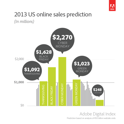
The two biggest days in e-commerce are right around the corner. Have you optimized your site to take advantage of them? If so, what about your mobile site? Adobe reports that in 2012, Cyber Monday sales were worth $1.98 billion, an increase of 17% over the previous year. Not only that, this year’s Cyber Monday is projected to increase by another 14%.
But even more impressive is the growth in mobile shopping.
In 2012, 22% of Cyber Monday sales were completed via mobile devices like smartphones and tablets—that’s almost a quarter of sales on the busiest online shopping day of the year. The Black Friday numbers tell the same story—nearly one out of every four dollars spent came from a mobile user. And mobile shopping is expected to spike on Thanksgiving—as stuffed shoppers splurge on online deals from their tablets and smartphones from the comfort of their couches.
Although it’s already November, you still have time to optimize your mobile site to make sure your visitors are able to find and buy what they’re looking for with ease. If you’ve already optimized your checkout experience for desktop, you’re ahead of the game. But those optimizations won’t necessarily make things easier for mobile users.
The key difference between the two is that mobile users—unlike their desktop counterparts—are rarely browsers. Instead, they’re most likely looking to accomplish a specific task as quickly as possible. This is true of Black Friday, Cyber Monday, and every other day of the year.
When you’re optimizing your mobile site, make changes and optimizations that align with mobile users’ task-oriented mindset. They have no time to waste. Slow, cumbersome experiences will make them vanish in a flash.
Find Out What’s Getting in the Way
Your mobile audience has their own unique needs and expectations. One of the best ways to understand what’s keeping your mobile visitors from converting is to ask them. Using Qualaroo for Mobile Web, you can find out what’s getting in the way of your mobile shoppers and focus your efforts on removing those roadblocks from the user experience.
With a simple question, you can identify the best opportunities for quick optimization just in time for Cyber Week. Best of all, you can try Qualaroo for Mobile Web, free for 14 days, and get insights right now, to help shape your last minute tweaks to your mobile shopping experience.
In addition to using Qualaroo, consider the following simple and effective tips for optimizing your mobile site for holiday shoppers.
Mobile Sites Are About Simplicity
Whether you’re using a stand-alone mobile site, or responsive design, it’s important that that your mobile site maps to the experiences on the desktop so that multi-device shoppers (an increasing demographic) can find what they’re looking for when switching from one device to another.
This doesn’t mean every last component of your desktop site should be reproduced and crammed into a mobile site. You have to prioritize key activities and navigation elements to help the mobile user accomplish what they’ve set out to achieve quickly and seamlessly.
For Cyber Monday, make sure that your shopping experience is front and center, and that sales, promotions, and other purchase-driven calls to action are immediately available and easily accessible.
Speed Kills, Make Your Mobile Site Fast
Next to simplicity, site speed is another element that either makes or breaks the mobile experience. Be sure to check your site speed with Google’s Page Speed test to make sure it’s up to par. Slow load times can cripple a mobile experience and drive your users elsewhere.
If you have a slow loading mobile site, talk to your developer teams about what can be done in the short term to improve performance. Optimizing images, javascript, and other code elements can generate quick wins in site speed.
Streamline Your Checkout Process
Even if your site loads quickly, poorly designed cart processes can still result in high abandonment rates. Streamline your checkout process by making product pages easy to read on mobile, providing multiple images, and making it easy to access information such as sizing charts, return policies, and shipping information.
Remember that people browsing with fingers on mobile screens need bigger buttons and controls. Pinch and zoom shouldn’t be required, and make sure that there aren’t any modal or pop-up windows required to get to key information. Pop ups on mobile are a user experience no-no.
Make it Easy to Get Help
If you’re not able to deliver the perfect user experience in time for this holiday season, at least make sure mobile shoppers can get help quickly and easily. Make customer service contact information prominent and easy to contact. Eliminate long contact forms or multiple steps and connect mobile shoppers direct to customer service agents who can help.
A click-to-call and click-to-email will give you more opportunities to save sales from shoppers who are about to give up on their mobile shopping cart.
Guest Checkout
We could probably just file this one under “ask for as little information as possible,” but 24% of e-commerce sites don’t allow guest checkout, so we decided to give it a separate bullet point. Guest checkout is just one more way to simplify the checkout process for hurried users who don’t feel like creating a new account, entering a lot of information on a tiny keypad, and waiting for a confirmation email to place their order.
This is especially true for mobile sites. Creating an account can be tedious and full of friction, and putting mobile users through the account wringer is a sure-fire way to kill conversion rates. So get out of shopper’s way and trade less information for more cash in the bank.
And there you have it. You might have noticed a common thread: making things as simple, painless, and natural for mobile users as possible. It’s important to remember that what mobile users want is usually different than what desktop users want. You just have to figure out why mobile users can’t fulfill those objectives, then work to remove those barriers.
So what are you waiting for? There are just a few days left to find out how your mobile experience stacks up against your visitors’ needs, and make some small optimizations that can make a big difference to your bottom line this Cyber Week season.
FREE. All Features. FOREVER!
Try our Forever FREE account with all premium features!
 We'd love your feedback!
What did you like & how can we make it even better?
 Thanks for your feedback!
 Ask Your Question
Have a question? Get expert help to make your decision easier.