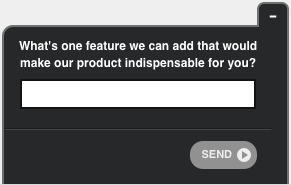
This guest post was written by Kevin Ho. Kevin is a Content Marketer at Wishpond specializing in Marketing Automation, Lead Nurturing, and Conversion Rate Optimization. Follow him on Twitter @mayoshrimp
What’s the purpose of your landing page? Why did you build it?
Hopefully, you quickly answered “to drive users towards a single conversion goal.” That might be to download an ebook, click through on a product page, book a consultation — there are several possibilities.
But in order for users to complete that action, they first have to understand what you’re offering and how it can benefit them. That’s why clarity is key when it comes to landing pages.
But outside of waiting for the conversions to roll in, how can you drill down and see if your site’s visitors have a firm understanding of your offering? The answer is easier than you think.
Just ask them.
That’s right, instead of agonizing over hours of heat maps or spending weeks A/B testing your bullet points, why not just prompt users with a good old fashioned question? After all, we’re all people right? Why not start treating each other like people instead of some crazy science experiment?
If you’re interested in optimizing your landing pages the old fashioned way — with real user feedback — then you’re in luck. This article will break down the 5 best questions to ask users in order to help increase your landing page conversion rates.
Landing Page Question 1: How clear are you on what this page is offering?
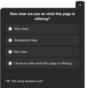
If clarity is key, then “how clear are you on what this page is offering” strikes right to the heart of whether your landing page makes sense or not.
If you ask this question, consider limiting the answers to a few multiple choice options, so you can get a simple breakdown of how your users are feeling about the page.
Options can include:
- Very clear
- Somewhat clear
- Not clear
- I have no idea what this page is offering
If a large proportion of users are responding anything other than “Very clear” then you know that you have an issue with your core messaging.
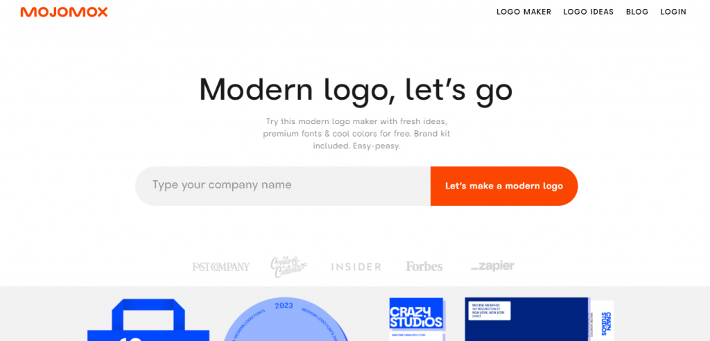
To fix this, test out a new landing page headline. Since your landing page headline will generally be the most prominent piece of text displayed, it’s imperative that your headline quickly and easily communicates the core value proposition of your product.
Another tip is to A/B test your hero image. A hero image showing a product used in context can sometimes help users to visualize how your product works while reinforcing your headline.


Original hero image
New hero image
If you’re certain both your hero shot and headline are clear then try moving on to simplifying the bullet points on your page to clearly communicate how your product can benefit a specific type of customer.
Watch: How to Create in Context Surveys
Landing Page Question 2: In one sentence, can you describe what this product is?
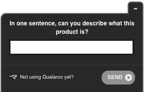
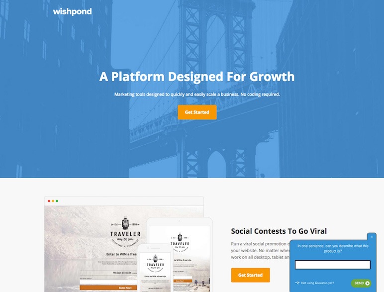
As marketers, it’s easy to get caught up in the new features that you just released or to shift your messaging to align with your ideal customer, rather than your current customer. That’s why asking users “In one sentence, can you describe what this product is?” on one of your landing pages is so useful.
You might be surprised to hear some of the feedback you get. Simple questions make it easy to determine how clear your landing page is while at the same time probing for a new user-generated headline.
Because at the end of the day, your users are the ones that will buy your product, so speak to them in their language.
Landing Page Question 3: Does this page contain the information you’re looking for?
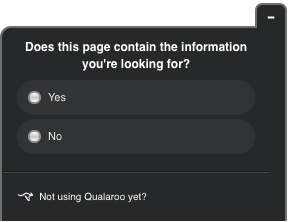
Whenever a user arrives on your landing page, unless they clicked on something by accident, they’re invariably looking for something specific.
But what exactly they’re looking for might not always be clear.
There’s a general rule of thumb in landing page optimization that says the easier the ask, the shorter the landing page. For example, if you’re only asking for an email address for an ebook, you might just need a short page that doesn’t scroll past the fold. If you’re selling a high-end service, you might need a long page equipped with a number of testimonials, personal guarantees, etc.
Yet sometimes you might be unsure if you are providing all the information that you need to users in order to convert. That’s why asking your users “does this page contain the information you’re looking for?” is so effective.
Rather than shooting in the dark about what you think your users will need in order to convert, this question will help you drill down to see if their expectation matched your pages reality. If not, it might be time to add additional information to get clear on what exactly your users want to see.
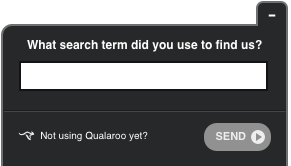
Landing Page Question 4: What search term did you use to find us?
In October of 2011, Google announced that it would no longer tell webmasters the specific keywords users were searching for when they navigated to a page via search.
So what did that mean for marketers?
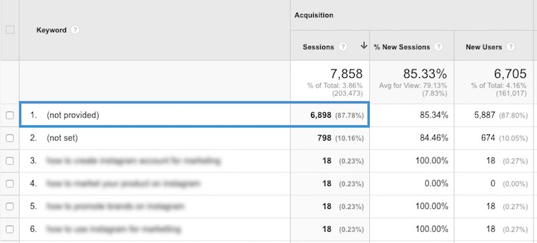
It meant we now had a huge blind spot in terms of what keywords to optimize for from landing pages with high amounts of SEO traffic.
But there’s a quick remedy. Just ask your visitors, “What search term did you use to find us?”
Using the information provided from users, you’ll be able to get a clearer understanding of the keyword path people are taking to find your landing pages. Equipped with this new level of knowledge, you can then invest SEO resources to double down on those keyword opportunities.
FREE. All Features. FOREVER!
Try our Forever FREE account with all premium features!
Landing Page Question 5: Choose which option fits you best:
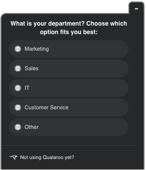
One of the main pillars of a high converting landing page is having a targeted understanding of who exactly you’re talking to. And asking users to segment themselves using the question “choose which option fits you best” is one of the best ways to achieve that.
For example, at Wishpond we might ask users: “What is your department? Choose which option fits you best:”
- Marketing
- Sales
- IT
- Customer Service
- Other
Based on the responses we gather from a landing page, we can then refine the benefits of our product and the core messaging of the page to reflect the team most likely to be viewing the page.
Putting it all Together
The more you know about your visitors, the better you can tailor your landing pages to touch on their specific pain points. You can refine your messaging, and help optimize the overall positioning of your product or service.
As a starting point, try asking these 5 questions to get more information from your users to determine who they are, what they’re looking for, and how to best communicate with them:
- How clear are you on what this page is offering?
- In one sentence, can you describe what this product is?
- Does this page contain the information you’re looking for?
- What search term did you use to find us?
- Choose which option fits you best
Are there other questions you’ve use to ask visitors? Have you tried optimizing a landing page using questions?
Share your experiences in the comments below!
Related Read – Here’s a comprehensive list of the Best Customer feedback tools for 2026 and beyond.
FREE. All Features. FOREVER!
Try our Forever FREE account with all premium features!

 We'd love your feedback!
 Thanks for your feedback!


